Competitive Analysis
After learning about the client and their competitors, I conduct research on different boat dealerships in the Central Florida area. I learn what kind of messaging and branding the competitors use. This process let’s me get a really good understanding of the industry and what is needed to stand out and crush the competition.
Inspiration
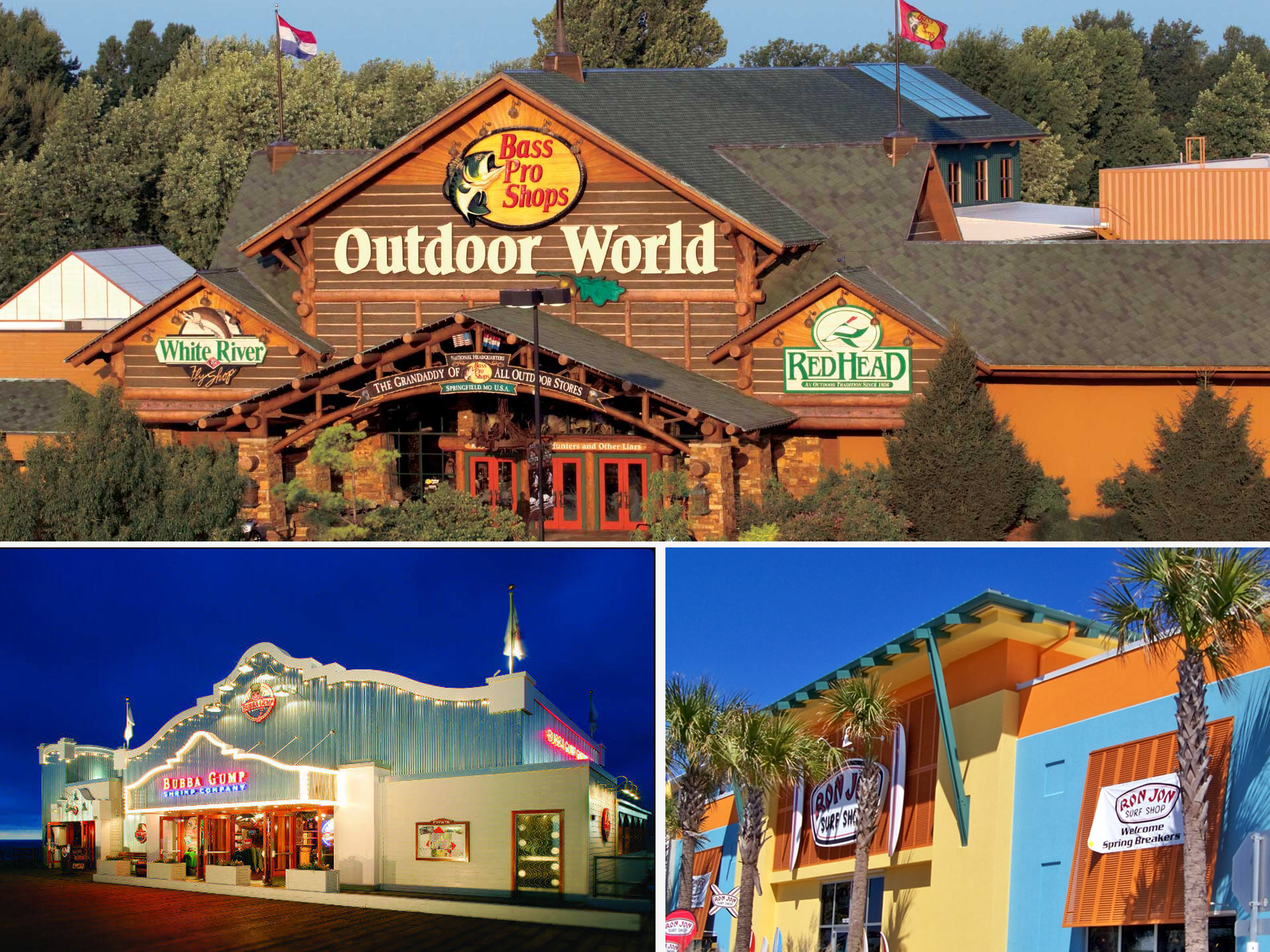
After learning about the client and their competitors, I set out to do some research on companies in and out of the clients industry. For the building concepts, I was inspired by Bass Pro Shops. Similarly, I wanted to theme the building to have elements you would see at a marina such as lighthouse and dock pilings.
Concepts
Brand Attributes: Adventurous, Valuable, Quality, Bold
With the different research collected, I use the information as my foundation for constructing logo concepts. I was inspired by the name and wanted to elevate it with a strong logo mark. Some ideas I had for that was creating different illustrations of speed boats as presented in the concepts below.
Final Logo
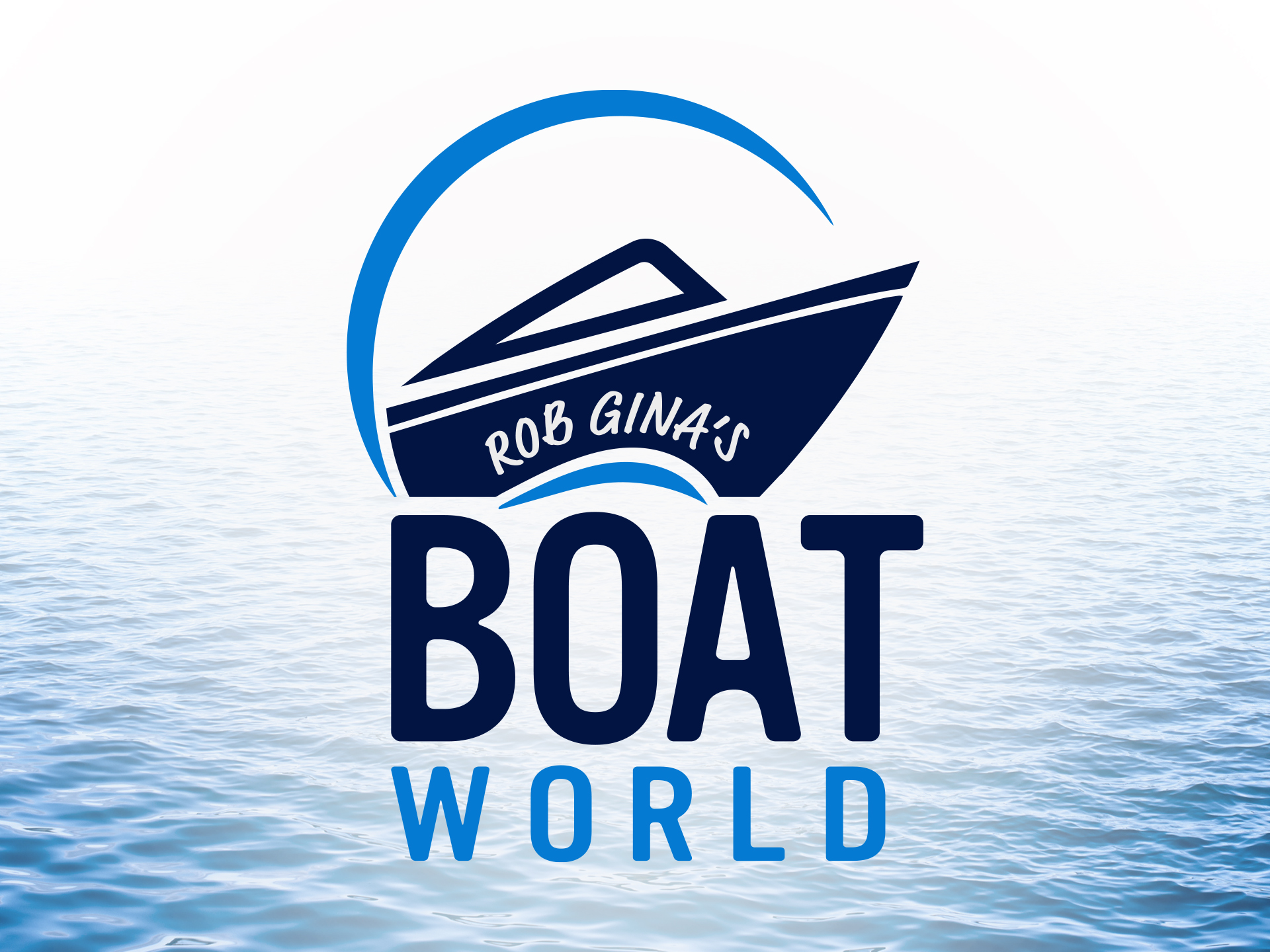
The new logo highlights the company’s name using powerful imagery of a boat speeding off with waves splashing beneath. The waves form a circle coming up around the boat that is a representation for the world.
Color scheme
The color palette extends the personality of the brand beyond the name and logo. I wanted to represent taking a boat out on the water, which was achieved with the color blue. The dark blue is associated with expertise, power, and integrity. While the bright blue is associated with fun, adventure, and serenity which are all the feelings one might have of being out on the water.
#021542 – Oxford Blue
#057bd3 – Bright Navy Blue
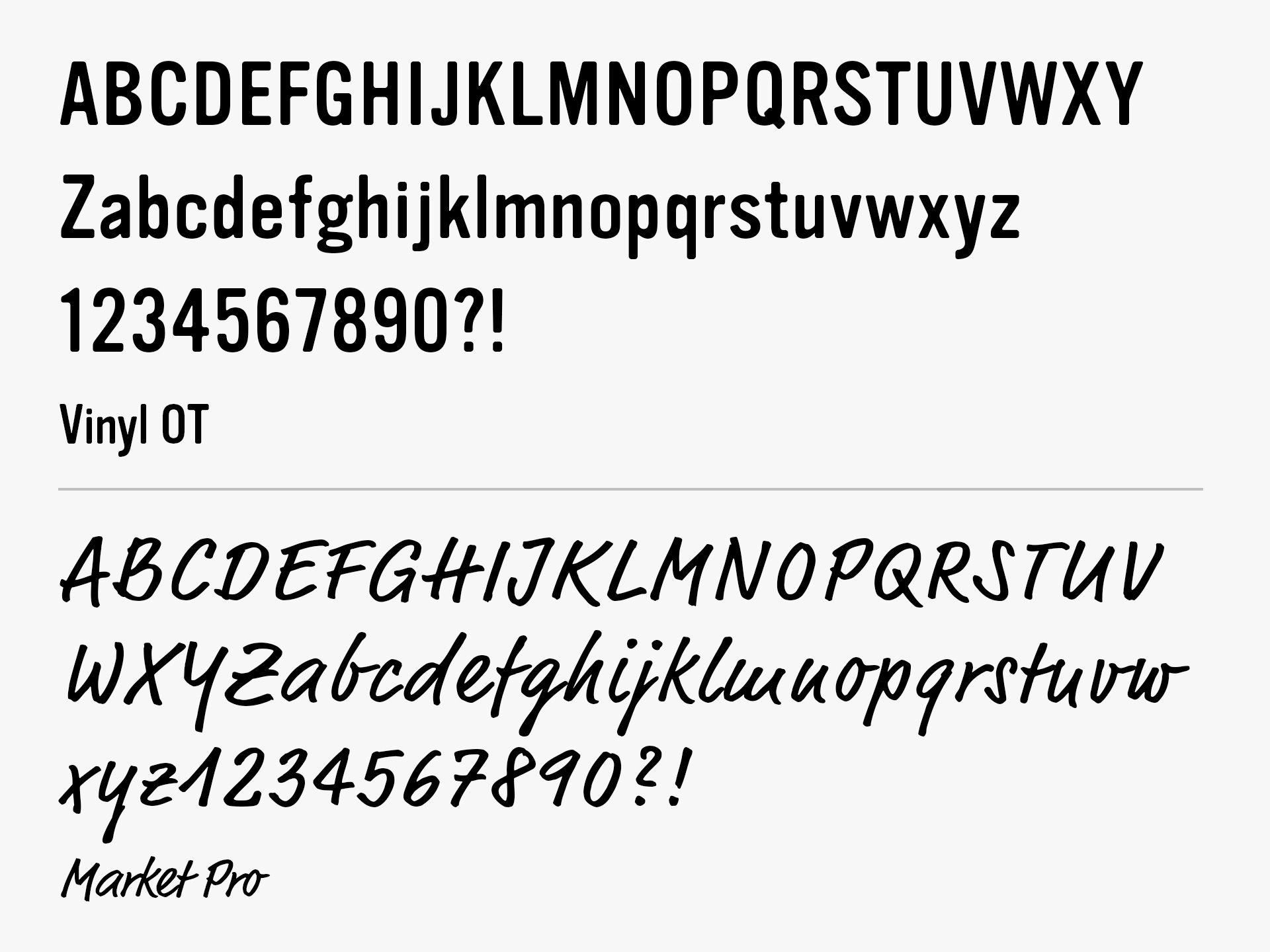
Typography
After careful deliberation on the best typography to use, I knew I really wanted to set apart the owner’s name from Boat World’s. I realized by using a brush styled font across the side of the boat image, that it resembled it being painted on its side. The modernized font below for Boat World is bold and distinct. The “A” creates a point that suggests the appearance of the bow of a boat.
Building Inspiration
For the building concepts, I was inspired the most by Bass Pro Shops. Similarly, I wanted to theme the building to have elements you would see at a marina such as lighthouse and dock pilings.
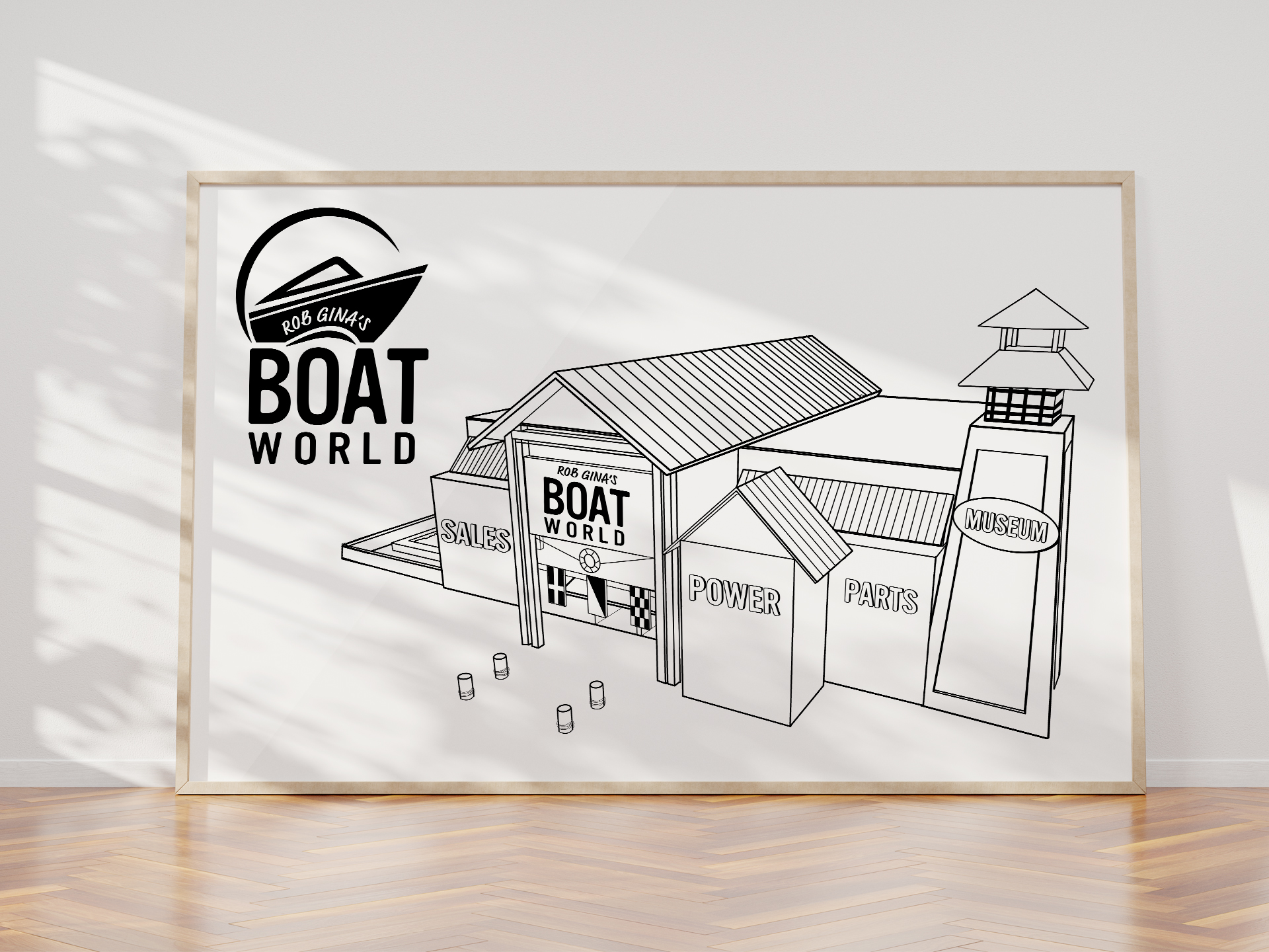
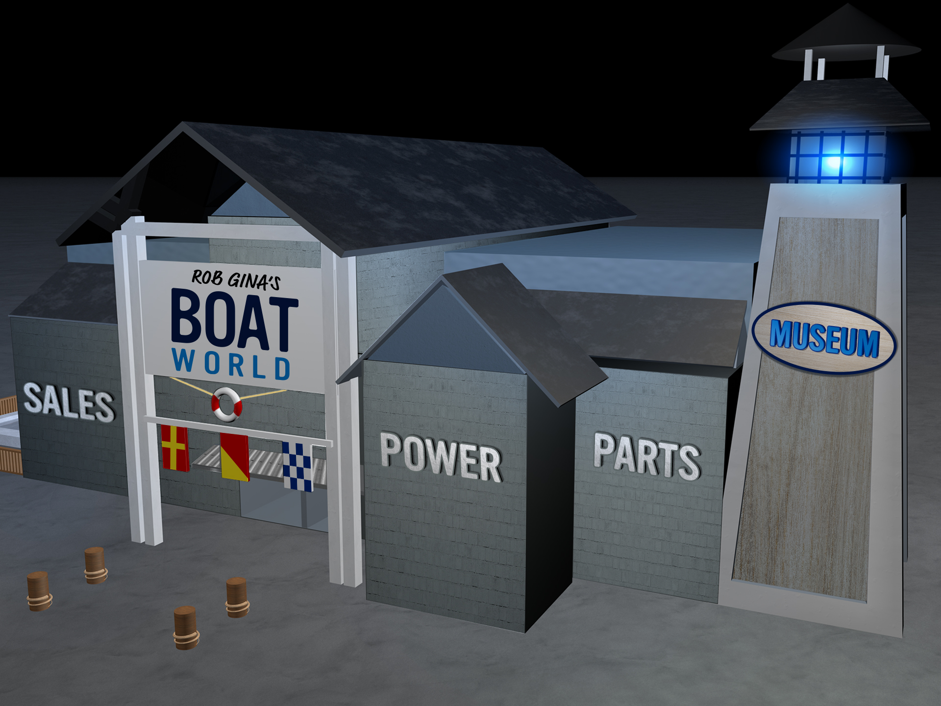
Sketch & 3D Models
Using Illustrator and Cinema 4D, I developed some concepts of the building. The building features a small fountain on the side of the building to play with toy boats and on the other side a lighthouse which inside can be entered through to see the boat museum. The three flags that hang below the business sign are nautical flags that spell out “R-O-B.” In front are four small wooden posts with rope around (for blocking parking), to give the building sort of a marina feel. Above the hanging nautical flags is a lifesaver. The awning above the main two doors, is textured with tin similarly like an old fish shed.