Competitive Analysis
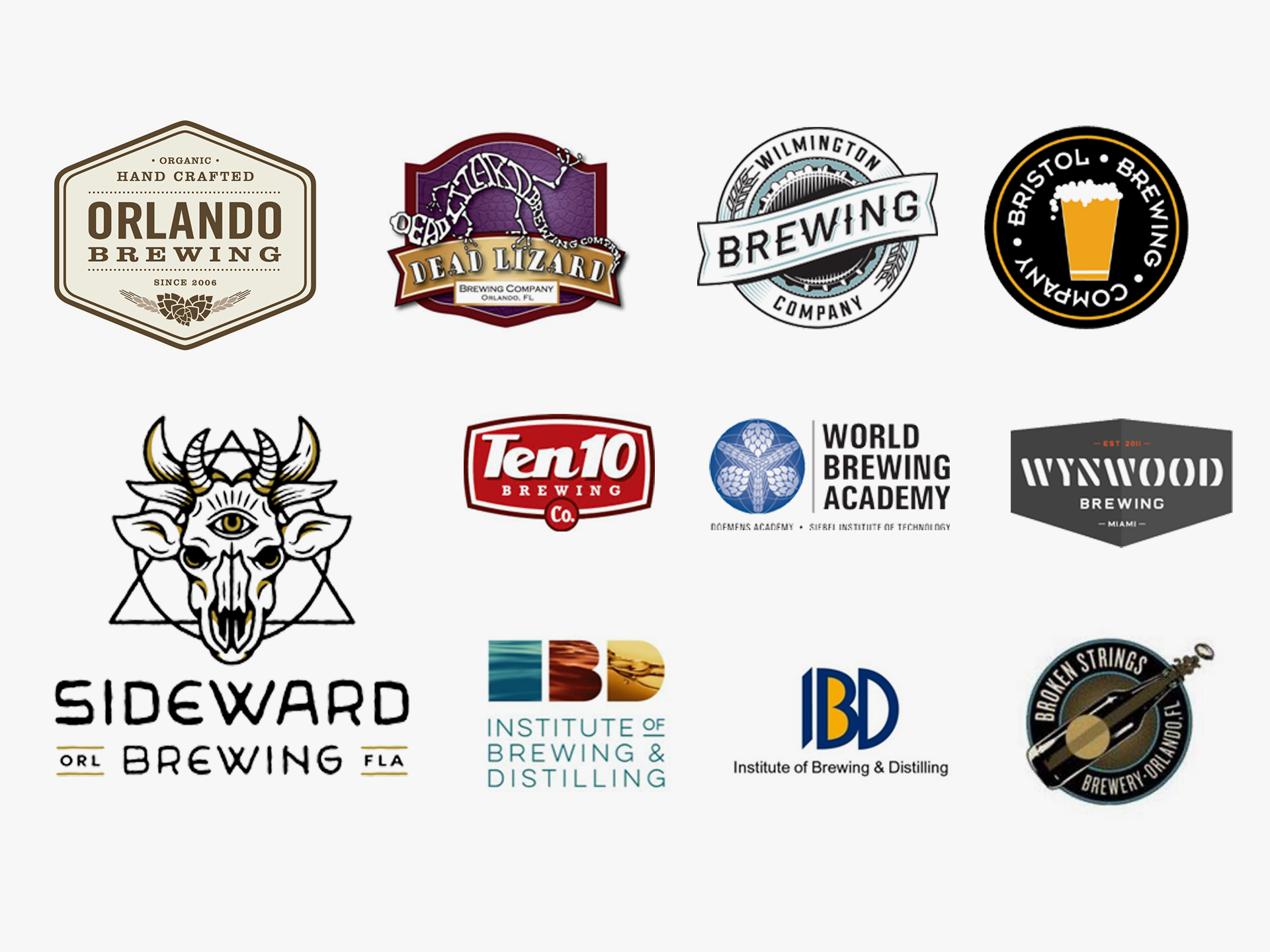
As part of my discovery process, I took a look at BIA’s competition; other breweries and institutes such as those pictured below. In order for BIA to stand out from their competition it was important to create something unique, fresh and modern.
Concepts
Brand Attributes: Informative, Quality, Valuable, Fun
After researching various logo treatments, I was ready to start putting together some logo concepts. The goal was to create a logo mark that portrays BIA as being committed to the quality of its beer and education of brewing.
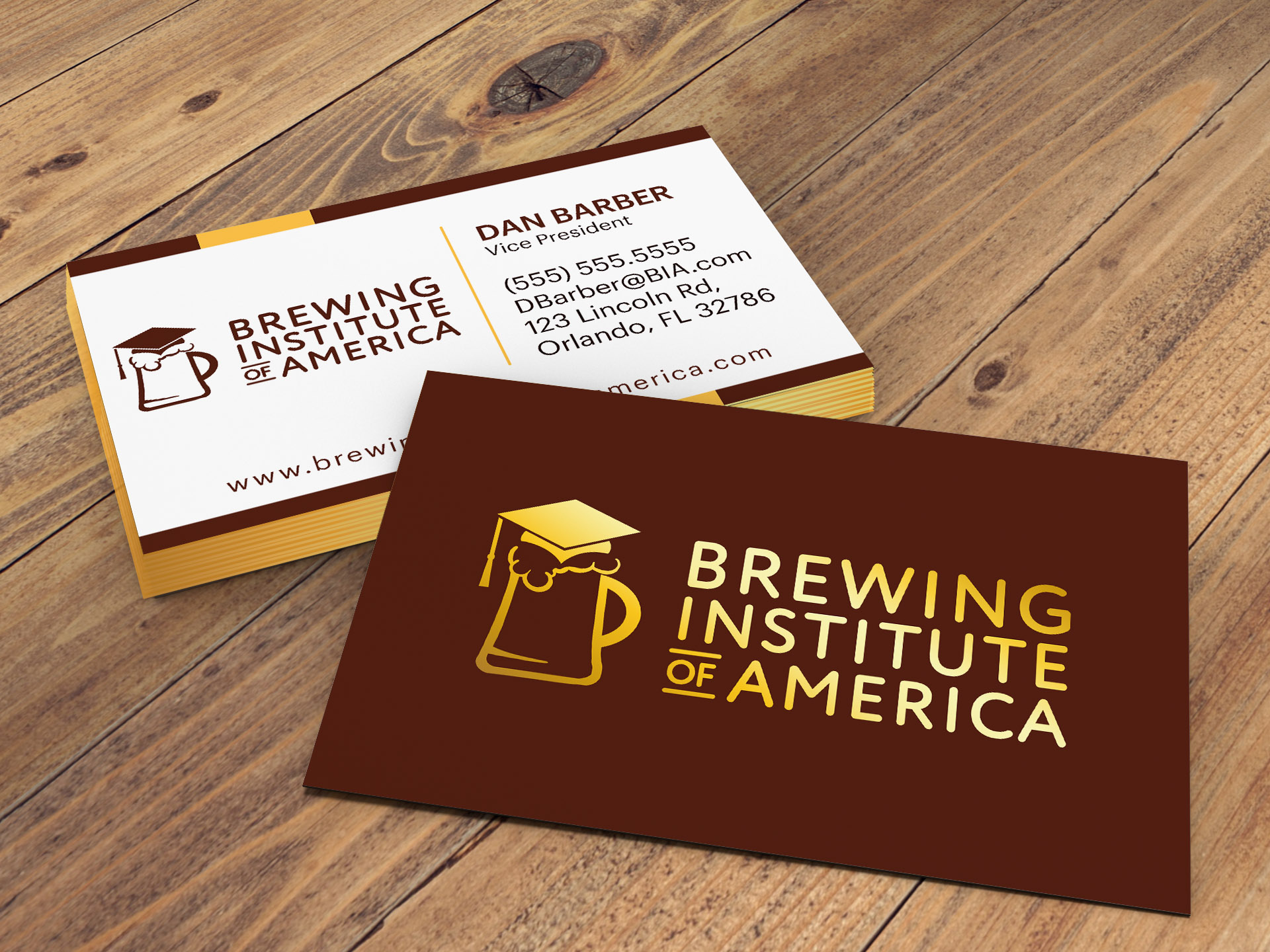
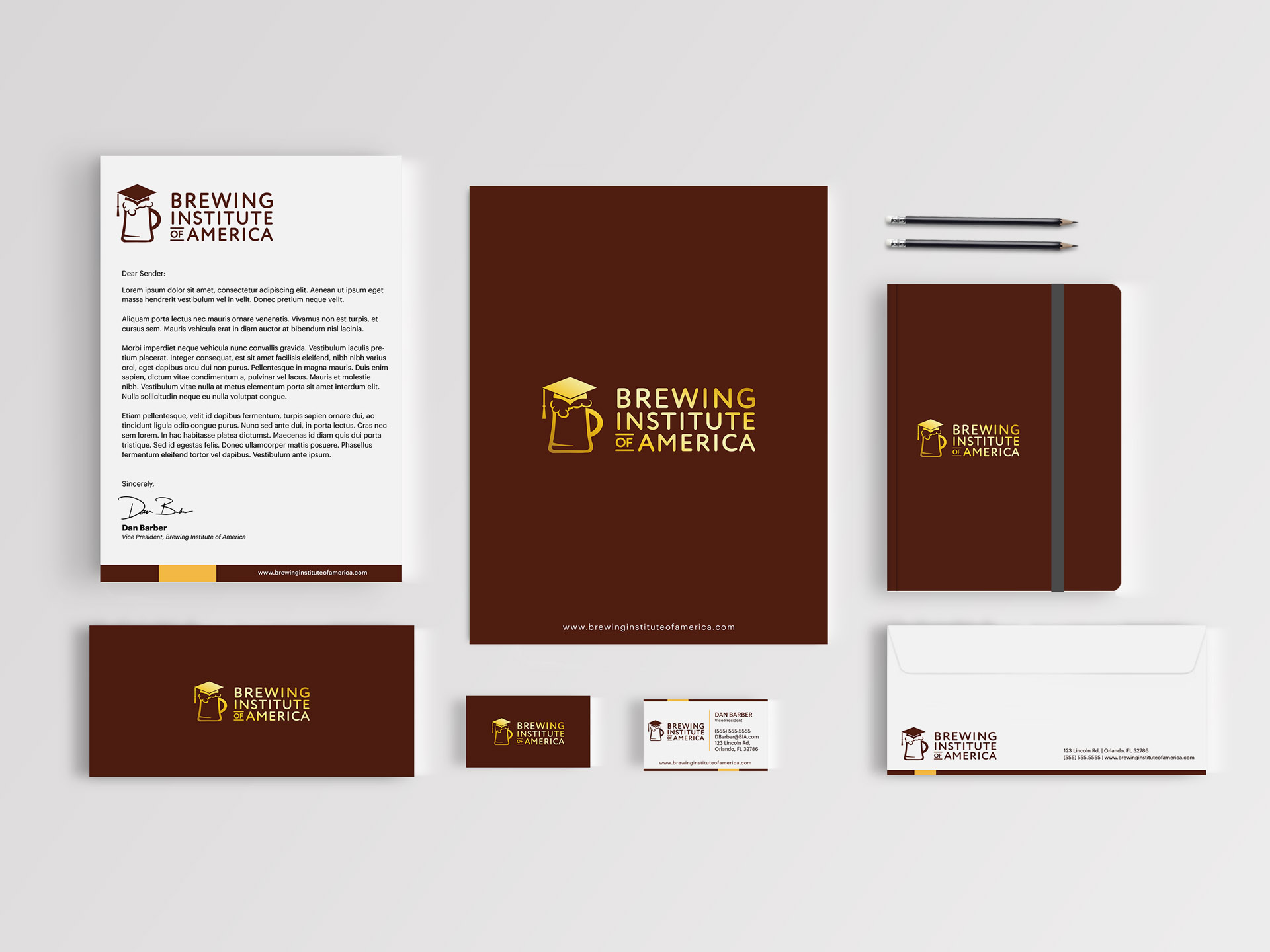
Final Logo
The beer mug with the graduation cap represents Brewing Institute of America’s core idea to give the person a proper “beer education.” The long term objective is to be nationwide where the logo can become just a logo mark. It was crucial that the logo mark be easy to recognizable for what the client does for business.
Color scheme
The brand’s brown and yellow colors compliment nicely to give BIA a feeling of dependability and reliability, The brown is steadfastness and with an earthiness vibe which felt appropriate giving barley must be cultivated from the earth. The gold yellowish color represents the nice golden color of the beer.
#541f11 – Caput Mortuum
#ffc248 – Maximum Yellow Red
Typography
The font for Brewing Institute of America, contrasts the playful tone for the image portion of the logo. Even though it is fun because the subject matter is beer, it still is nonetheless getting an education in it. The serif font represents the established and reputable business of Brewing Institute of America. That not only will you have a good time, but will walk away knowing a ton more about beer from people who are knowledgeable.
Printed Collateral
Branded Statement Collateral
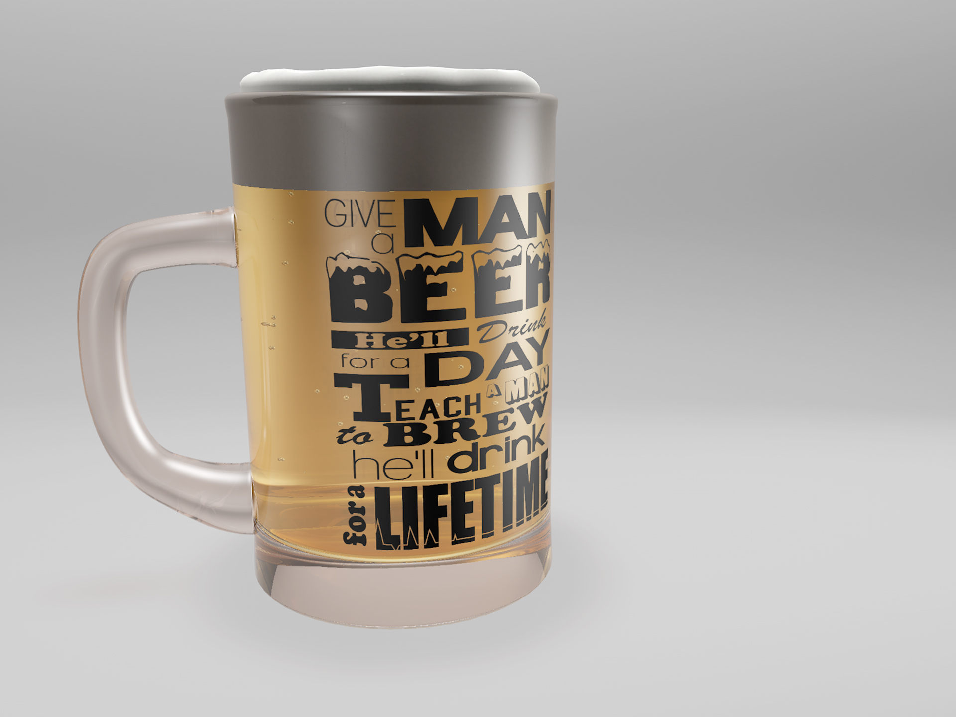
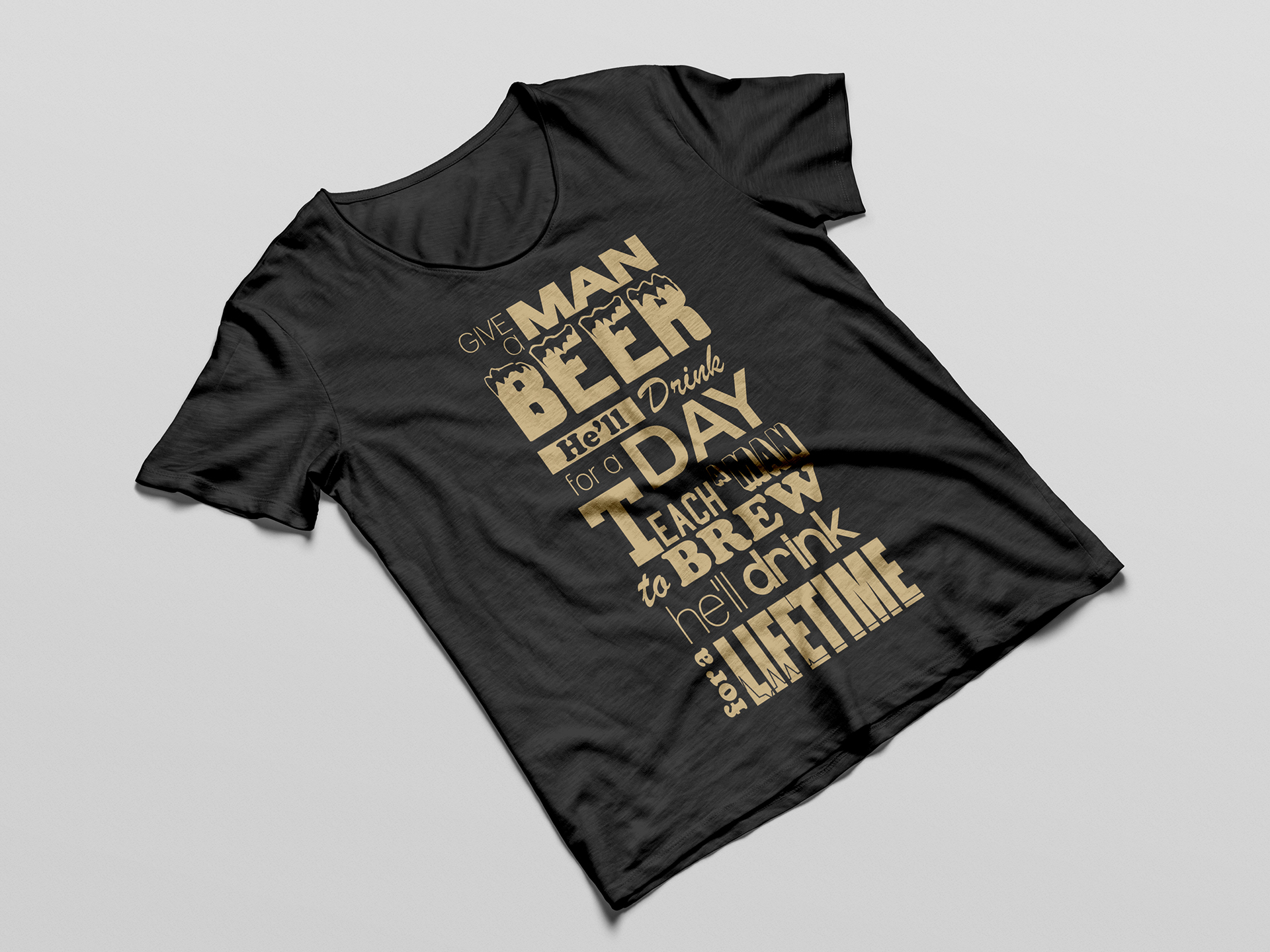
BIA’s philosophy and brand statement is “Give a man beer he’ll drink for a day. Teach a man to brew he’ll drink for a lifetime.” Various fonts were laid out in a vertical fashion creating a more dynamic means of reading the statement. The font for “beer” has a frost top to represent the foam that sits at the top of the beer (also known as beer head). As for the “lifetime” font, I created a pulse that associates with the meaning of the word for life. After coming up with some branding for the brand statement, I developed posters, beer mugs and t-shirts to go into their gift shop to be sold.