Competitive Analysis
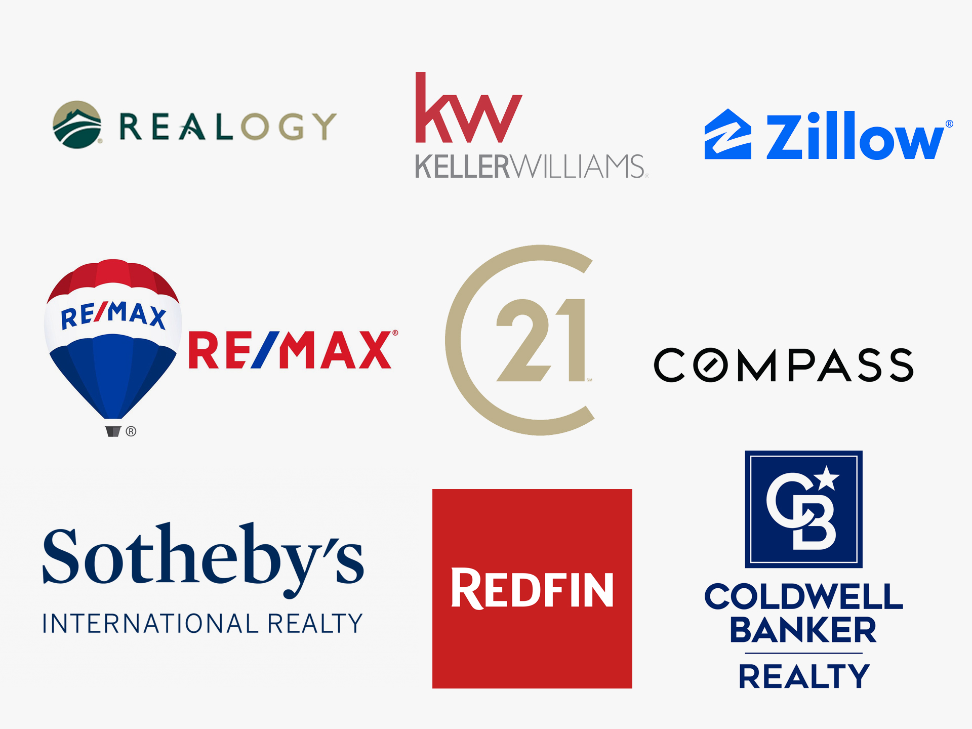
Part of my strategy for having a successful rebrand, is looking at the top competitors for eXp Realty. I focused my efforts on their messaging, colors, typography and imagery used.
Logo Concepts
Brand Attributes: Agent Success Obsessed, Innovative, Sustainable, Modern, Growth
The objective was creating an approachable, friendly yet professional and trustworthy brand. eXp wanted to still keep some characteristics of the old logo. The solution I came up with was keeping the same color palette as before and using a similar san serif font.
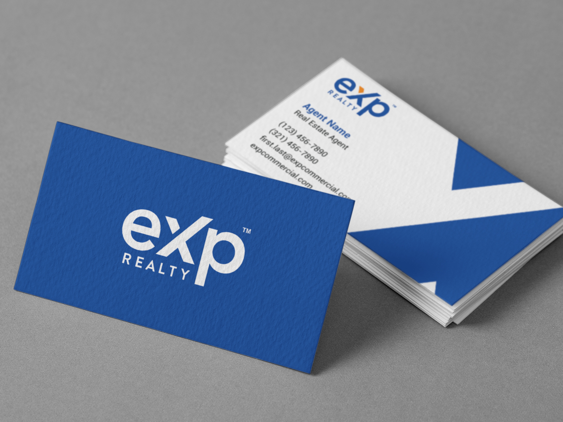
Former Logo
New Logo
The branding was no longer contemporary and did not adequately reflect the company’s overall identity for being innovative and the real estate brokerage of the future. It was using very outdated stylization for the logo.
The new logo is bold, uses thick typography which conveys eXp’s strength and resilience as a business and the solidity of their platform for the success of their agents and staff. The X mark with the ascending line represents the company’s rapid and exponential growth as a global organization, the trajectory of the company and its agents. At the same time, the disconnected piece of the X looks as if it is a packet of data flowing into their brand, representing their digital platform. Lastly, the X can also be seen as a celebratory person, with the disconnected piece forming a head and the extending line becoming an arm raised in triumph.
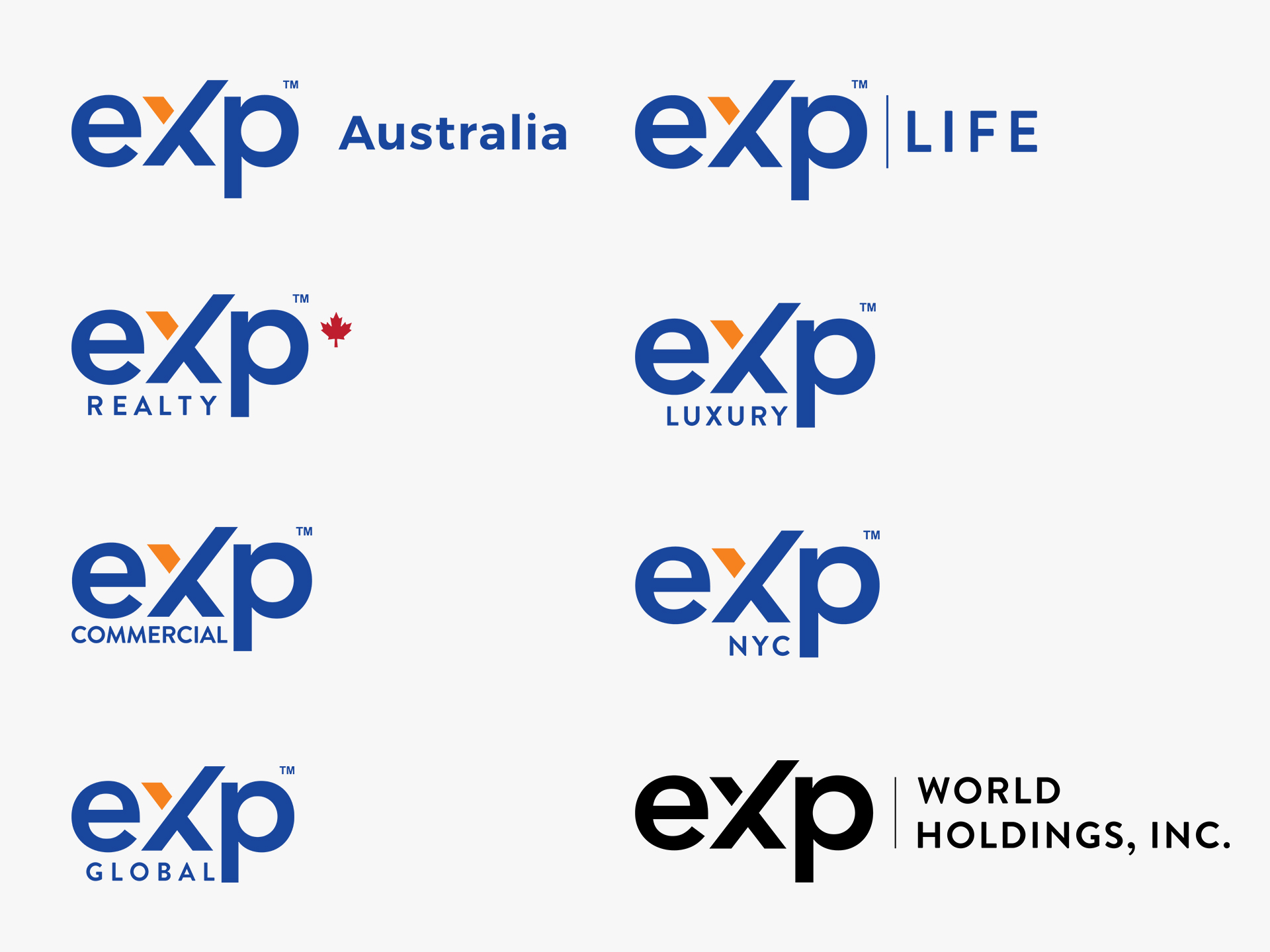
Secondary Logos
Once a new logo was established. Next, was creating a series of templates for the different sub-brands. Below are some of the variations of the new branding. There were over 50 logos created.
Color scheme
The primary color palette works as a very important brand element as it helps to tie in all the elements, assets and templates created for eXp. The blue, which is mainly used, represents a feeling of being clear and reassuring. It can be seen in the logo and in all eXp assets, and drives brand recognition and cohesion. The orange is vibrant and dynamic. It’s an action color that is meant to draw attention to the most important UI elements, such as buttons, as well as tasteful accents in the brand pattern.
#19469d- Cobalt Blue
#f5821f- Princeton Orange
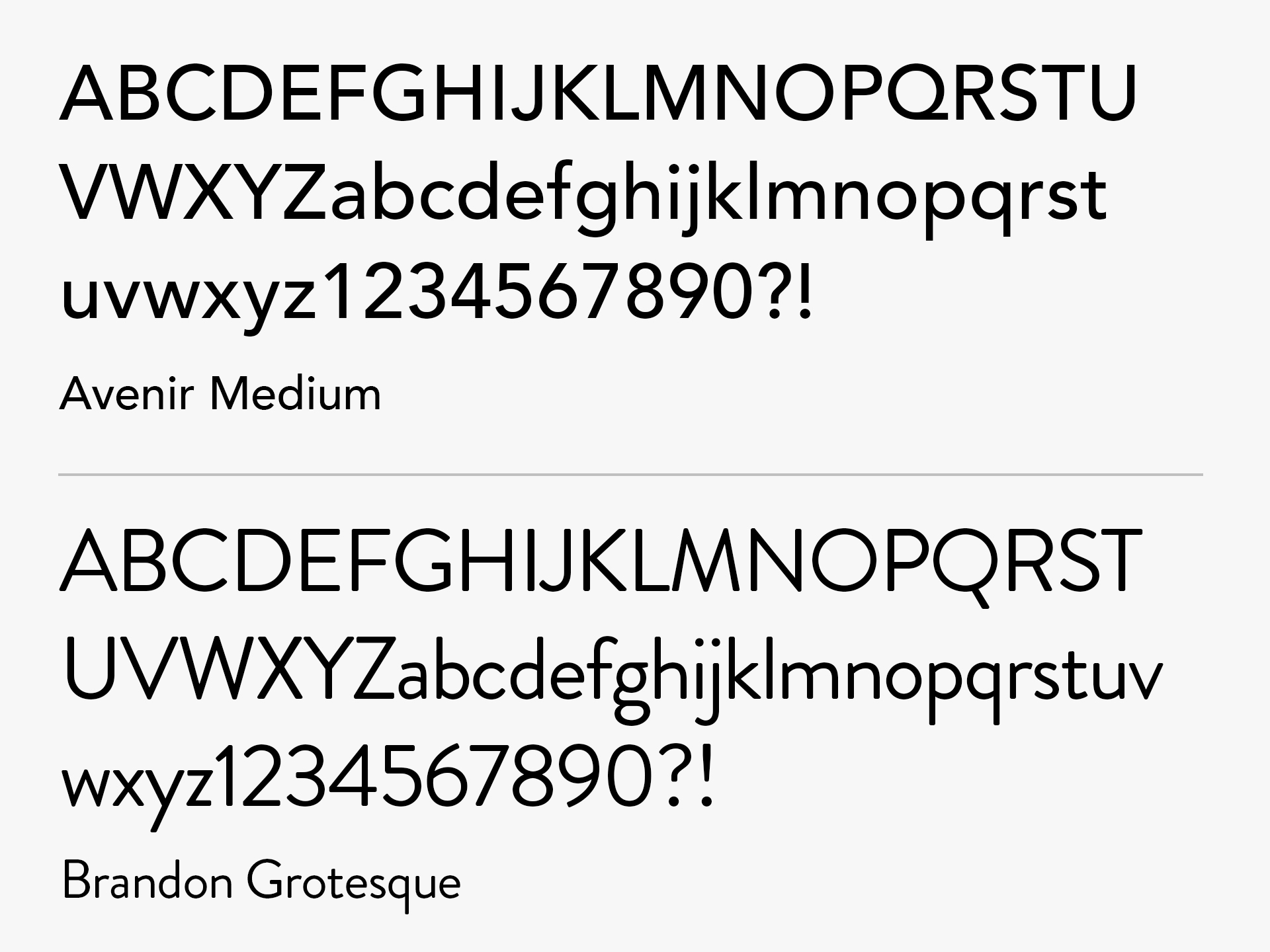
Typography
The modern typography was used as an essential tool in the development of eXp’s brand identity. The two fonts Avenir and Brandon Grotesque, was selected for eXp logos and all of its existing brands. The third font, Roboto, is utilized across all of eXp’s communications due to it being highly versatile and best optimized for web. This worked in creating a distinct and cohesive look for eXp Realty.
Brand Pattern
Next phase was creating a brand pattern in order to maintain a memorable brand recognition and create cohesiveness on all of eXp’s collateral. It is comprised of different sections of the “X’ in the logo and is meant to convey growth, positivity and a forward-looking mindset by extending the upper right ‘arm.” For flexibility, I created a single X and multiple eXp pattern.


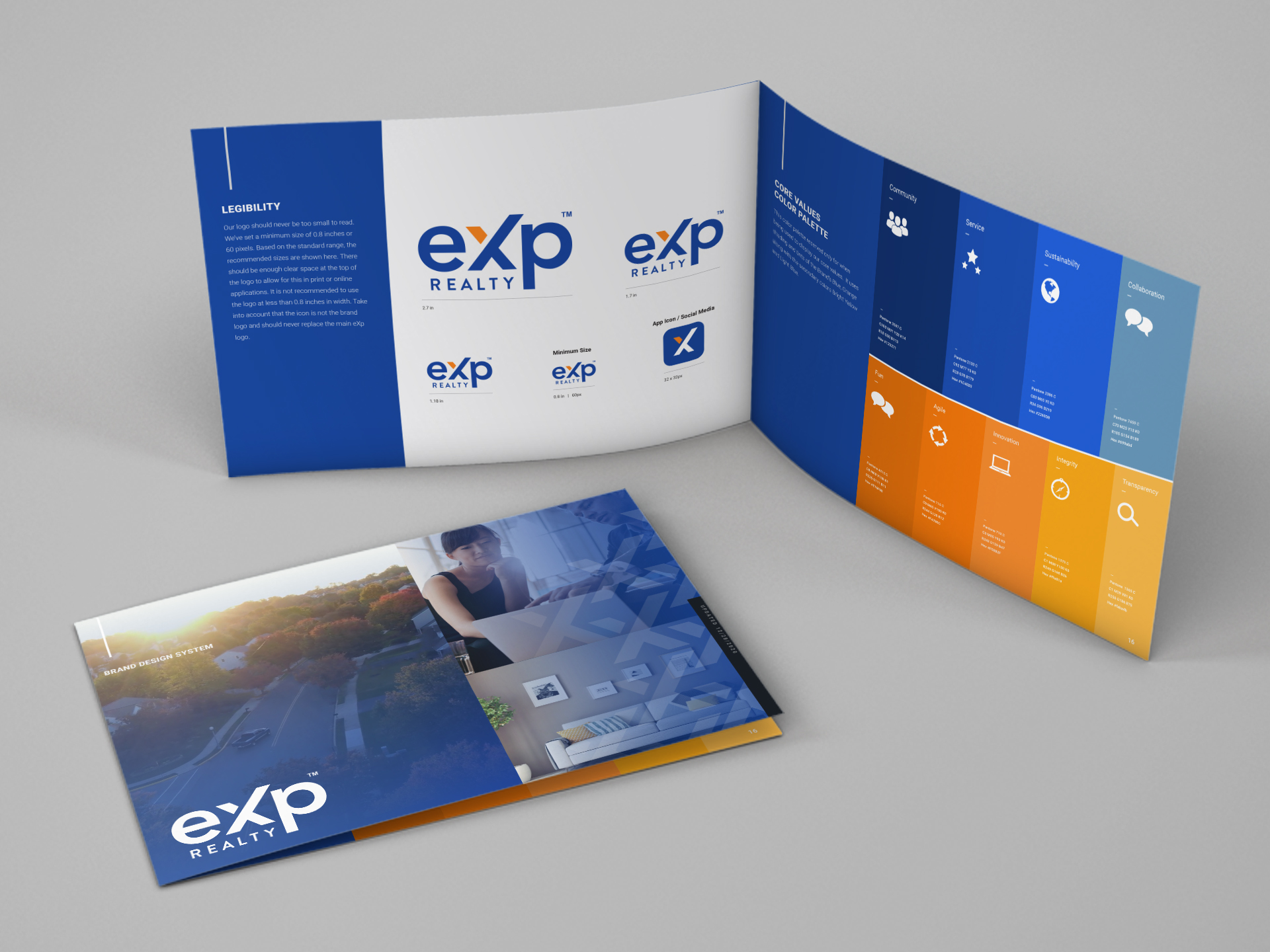
Brand Guidelines
After creating an improved brand identity for eXp Realty, the next task what to establish some guidelines of the proper use of the branding. I created two sets of guidelines for external and internal communications. The external guidelines is a condensed version of the internal guidelines with different language meant for their agents. Below is the internal guidelines version.
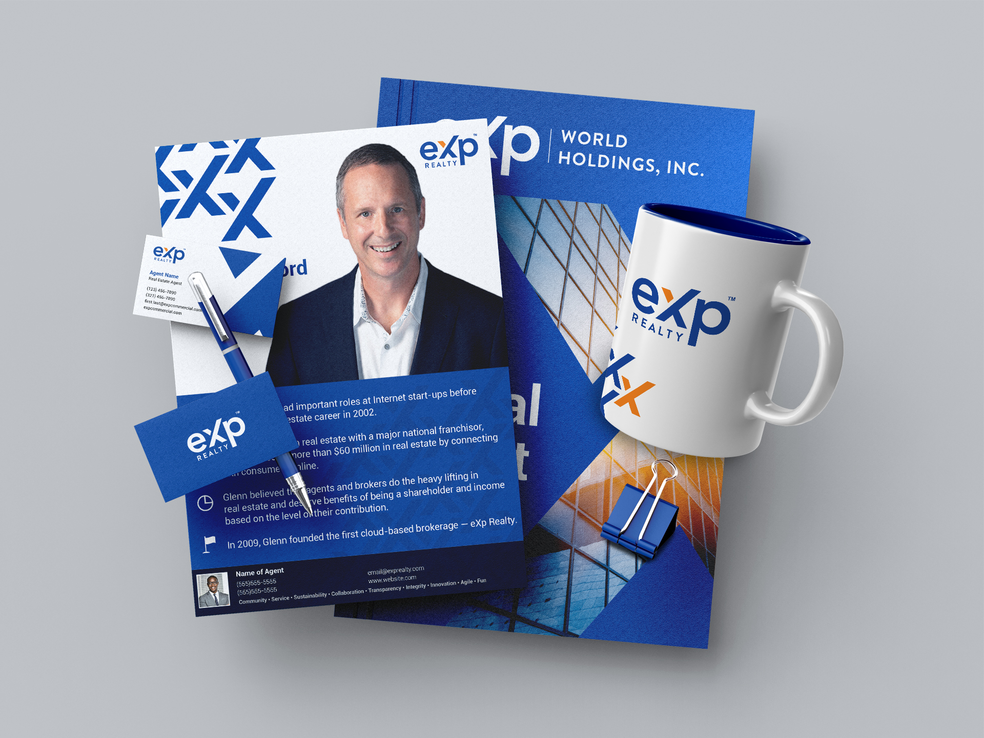
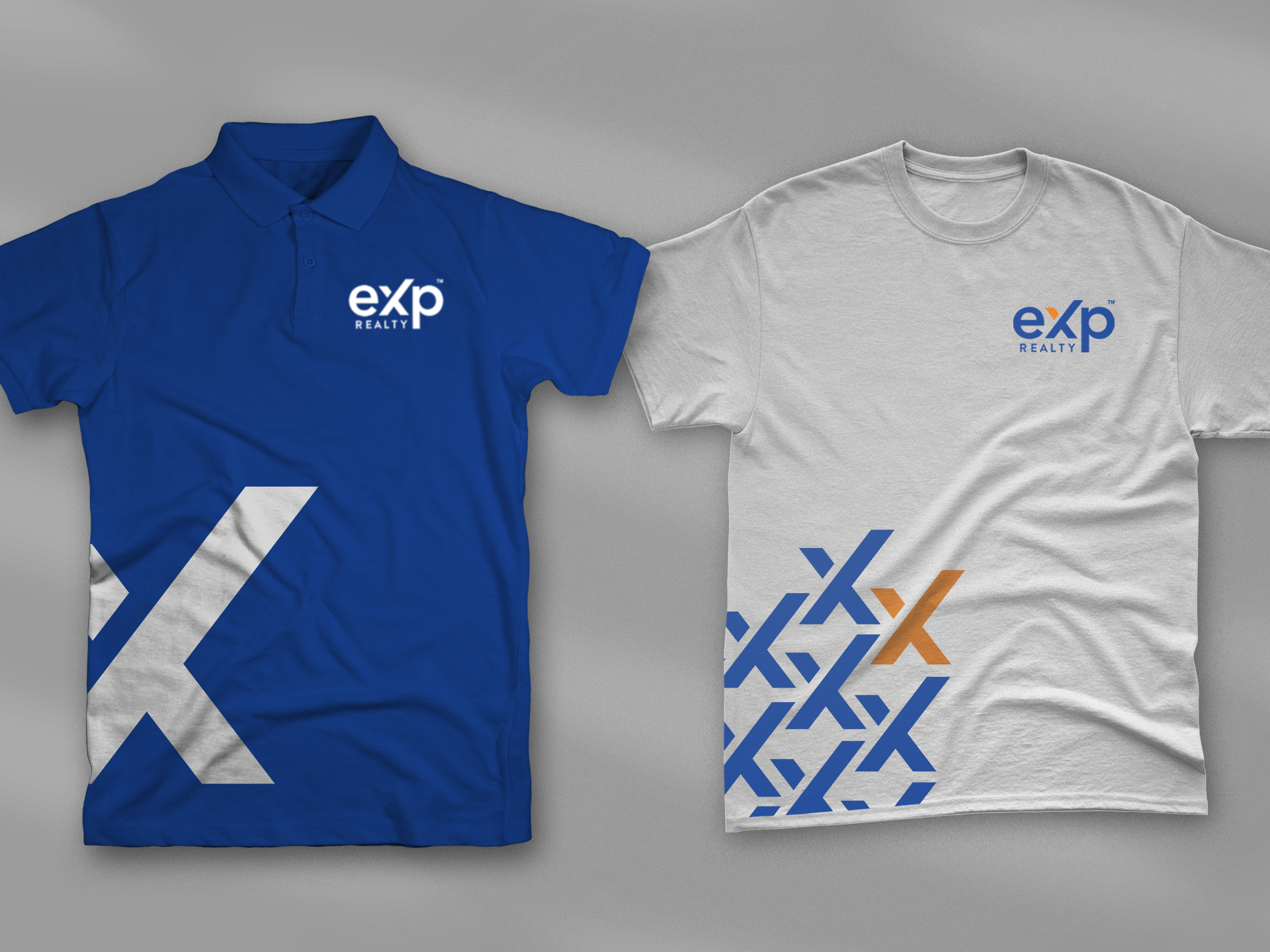
Printed Collateral, Merchandise and Apparel
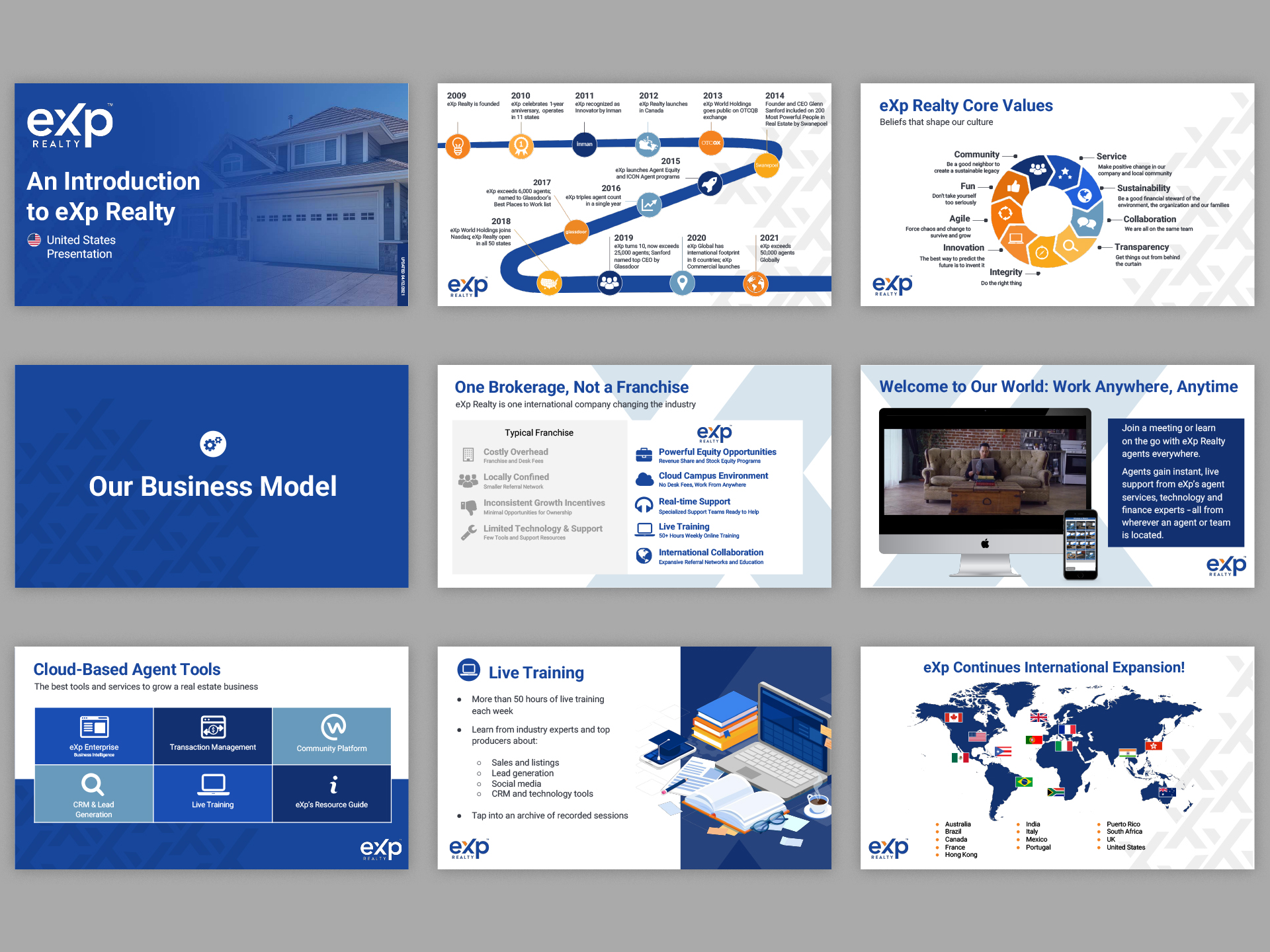
Presentations
Digital Graphics
Virtual Billboards
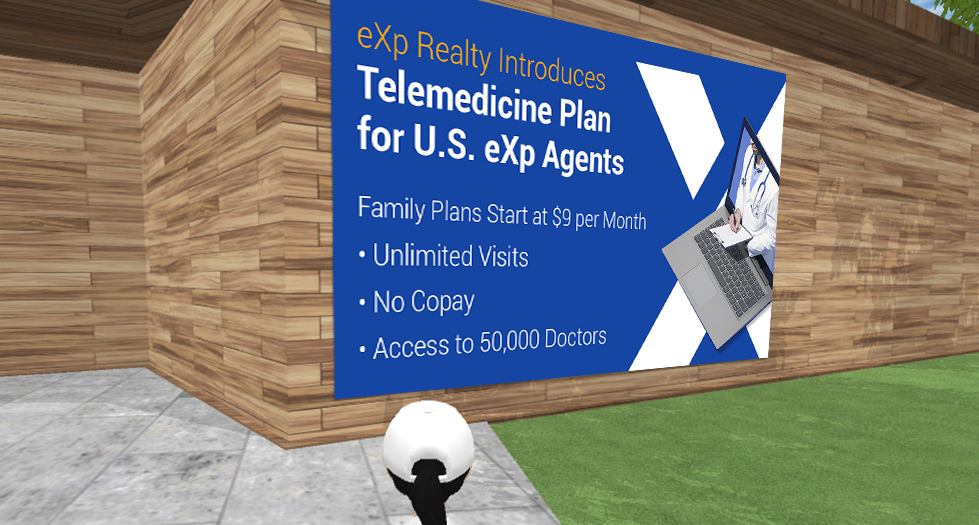
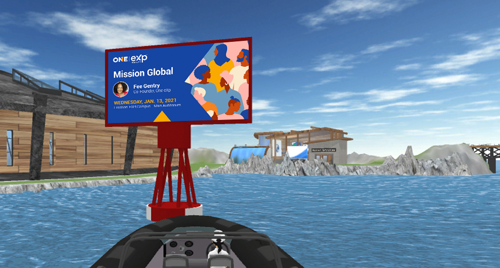
Part of my daily projects would be creating billboards that were displayed on eXp’s virtual campus called “eXp World.” These would be used to promote events and other company announcements.
eXp offers a telemedicine plan to its agents, which is the global leader in virtual healthcare. Agents receive service via videoconference with no copay, unlimited visits and 24/7 access to more than 50,000 physicians. The objective was to educate agents of the newly introduced plan and what the benefits are to signing up. The graphic uses a bold headline to attract along with a few bullets to highlight some of the attractive benefits and uses imagery to reinforce the messaging.

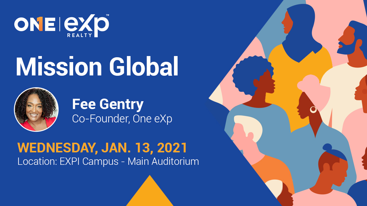
At eXp, agents and staff are committed to building the most diverse and inclusive real estate brokerage in the world, where all views are respected and encouraged. Recently, the company announced its ONE eXp initiative to support career development, promote fair housing principles and provide networking opportunities that encourage cultural awareness. As part of this initiative I was asked to create billboards along with other collateral to remind agents and staff to make positive change, be transparent and act with integrity.
Social Media Graphics
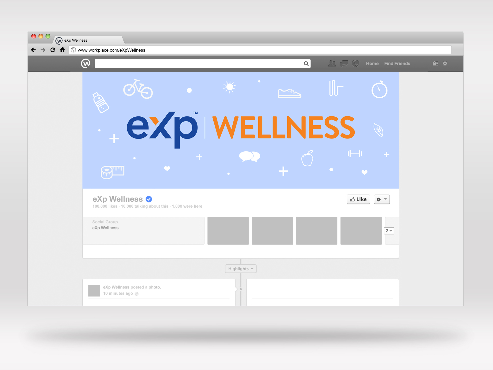
eXp Wellness, located on Workplace, was opened as one of eXp Realty’s fun social groups on workplace to engage the agents and promote wellness. I was tasked to create a clickable virtual billboard to go up in the world that directs agents to join the group on Workplace along with associated branding like a social cover for the group’s page. Within just a few months of the group opening it grew over 1,000 members.
During the holidays, I created these fun shareable holiday greetings that would be posted on eXp’s social media and keep agents engaged.
Email Newsletter Ad
Part of the logo redesign involved collected submissions from agents, staff and agencies as a contest for choosing a new logo. My logo was selected as the top voted logo and as displayed above is the official new logo for eXp Realty and its sub-brands. This ad I created below with a countdown timer was emailed out in our weekly newsletter to encourage submissions.
Video Graphics
As part of eXp announcing their expansion overseas, I created this short video to hype up their agents. The video was shared across their social media channels.
eXp Events
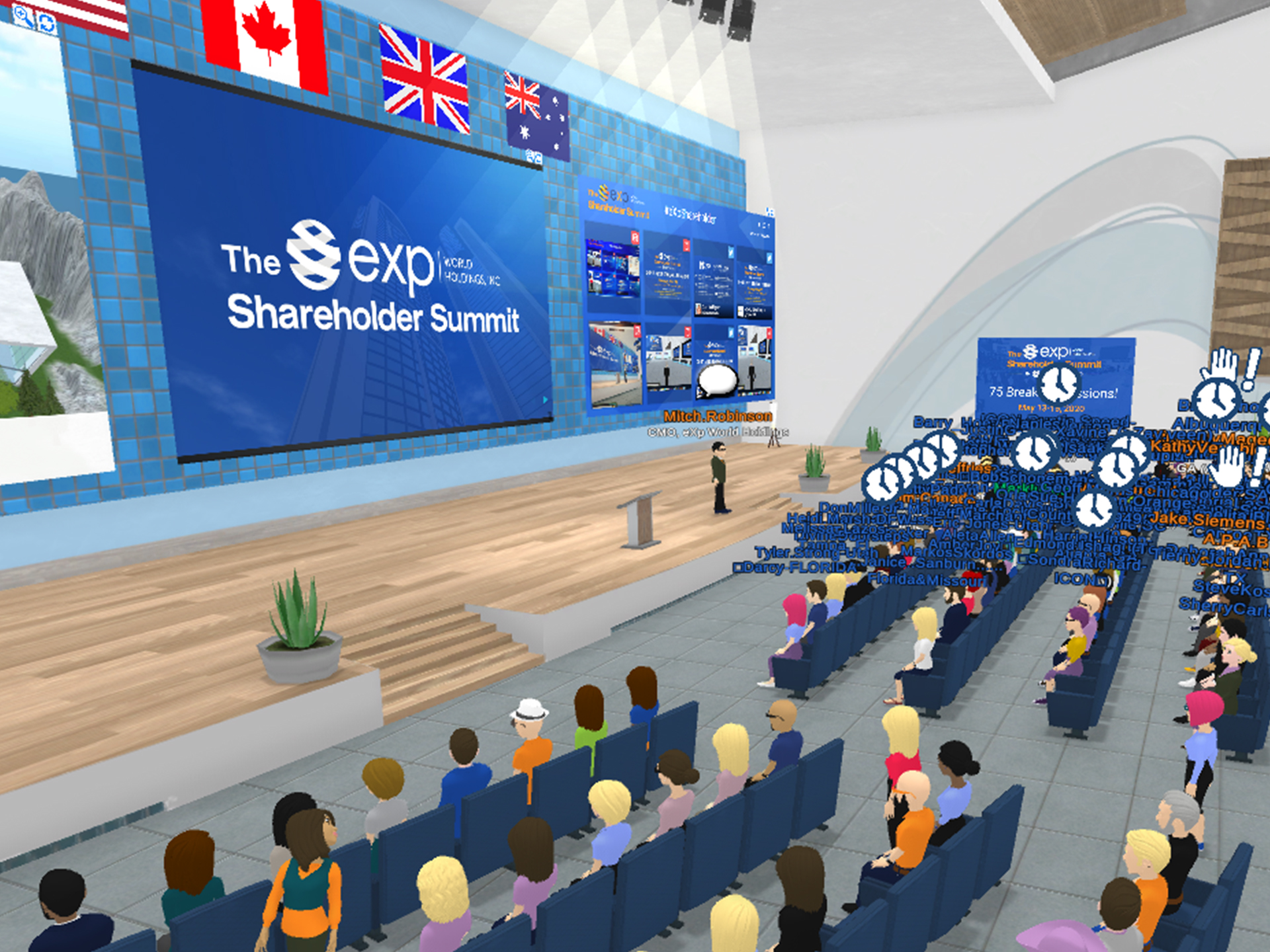
The eXp Shareholder Summit
eXp World Holding’s annual business-focused event for current and potential shareholders. Guests receive updates on eXp World Holdings and its companies, and have the opportunity to meet company leadership and members of the board of directors as well as eXp Realty agents, brokers and partners. In addition, the event provides useful content to help agents run a sustainable and productive business. The goal for these events is that every single person leaves with a better understanding of the amazing accomplishments of the past and the incredible growth trajectory ahead.
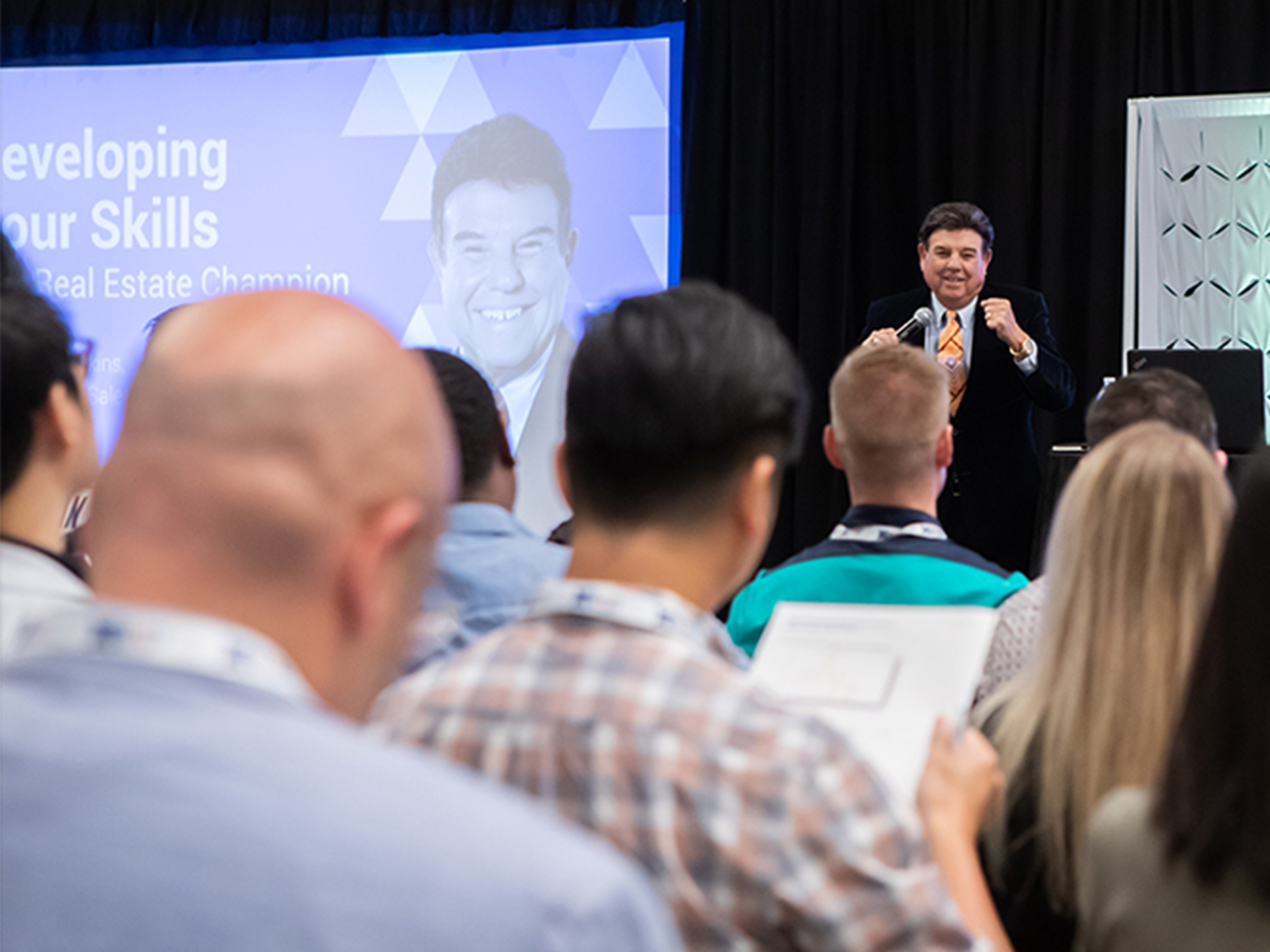
EXPCON
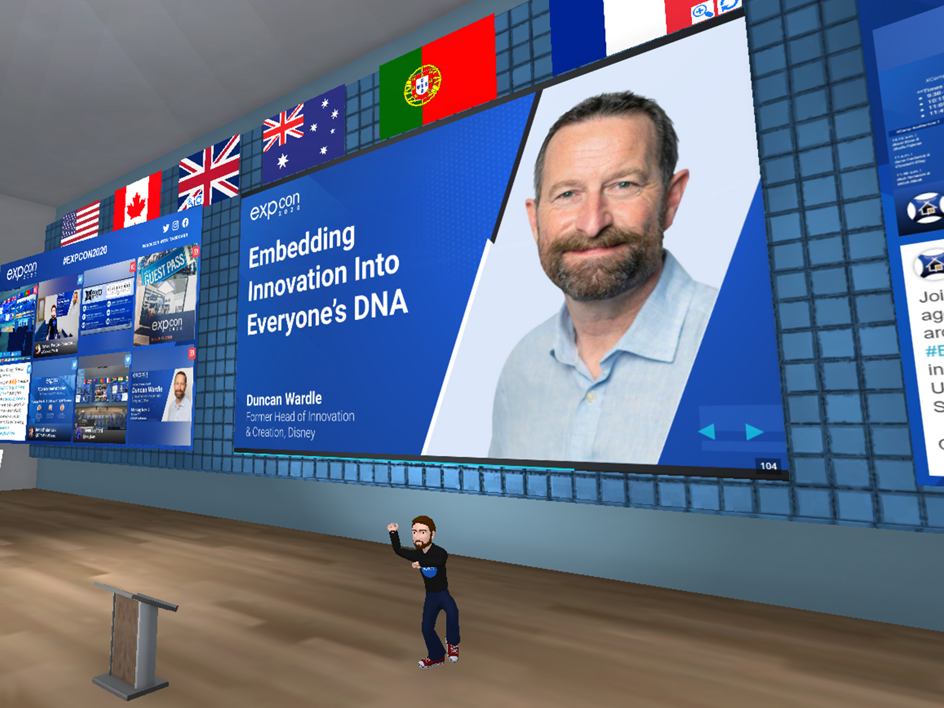
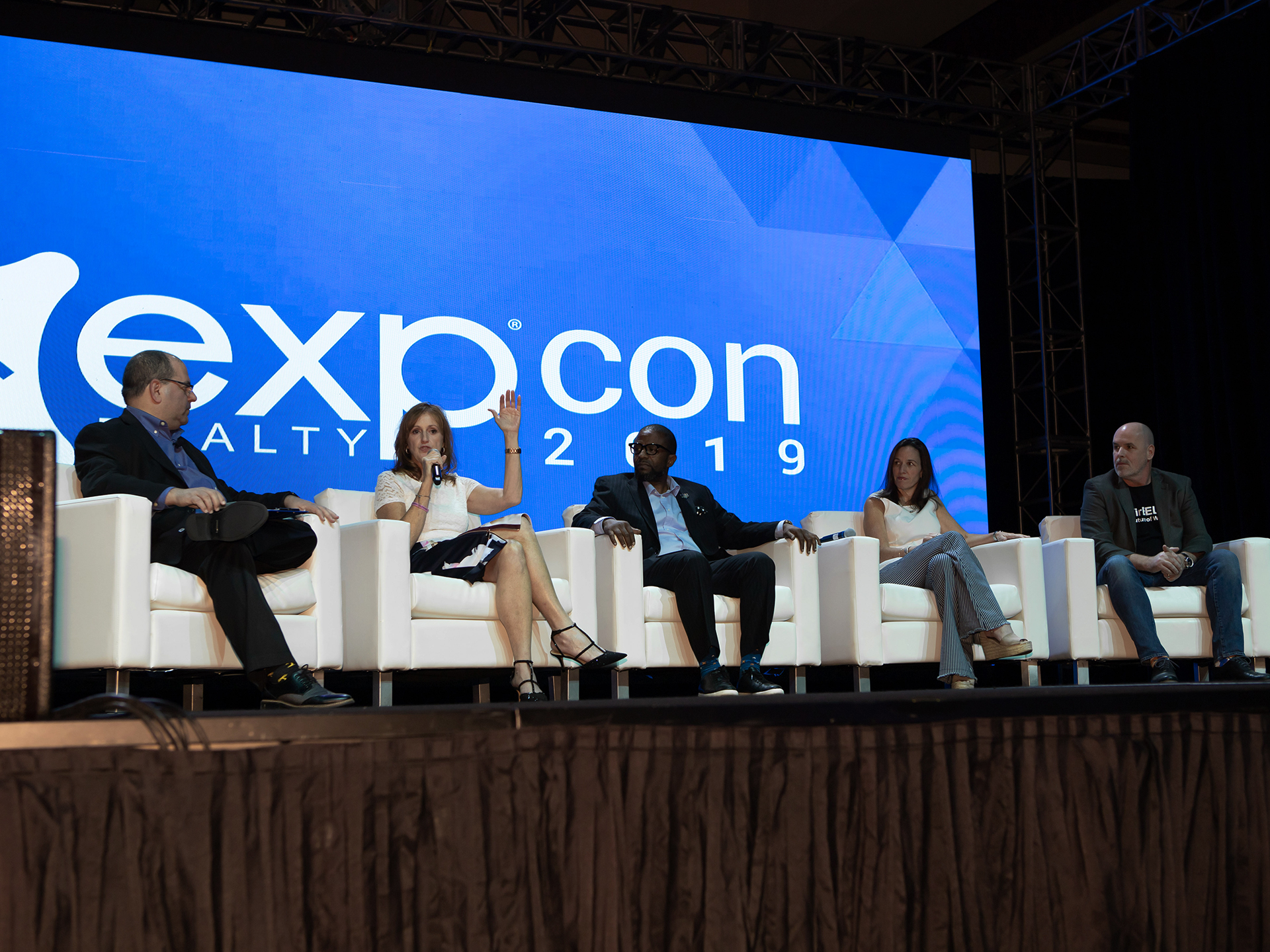
Allows the opportunity for agents to connect with eXp industry leaders and other real estate agents. The three day event consists of a Gala awards dinner, where eXp Realty awards top producing agents within the company. This includes a presentation of the ICON agent awards, top humanitarian, top mentor, and more. Followed by a general session which is led by the leadership team, special keynote speakers, and includes breakout seminars that are led by the most influential agents within the organization. In addition, there are different networking activities agents can attend after each general session.
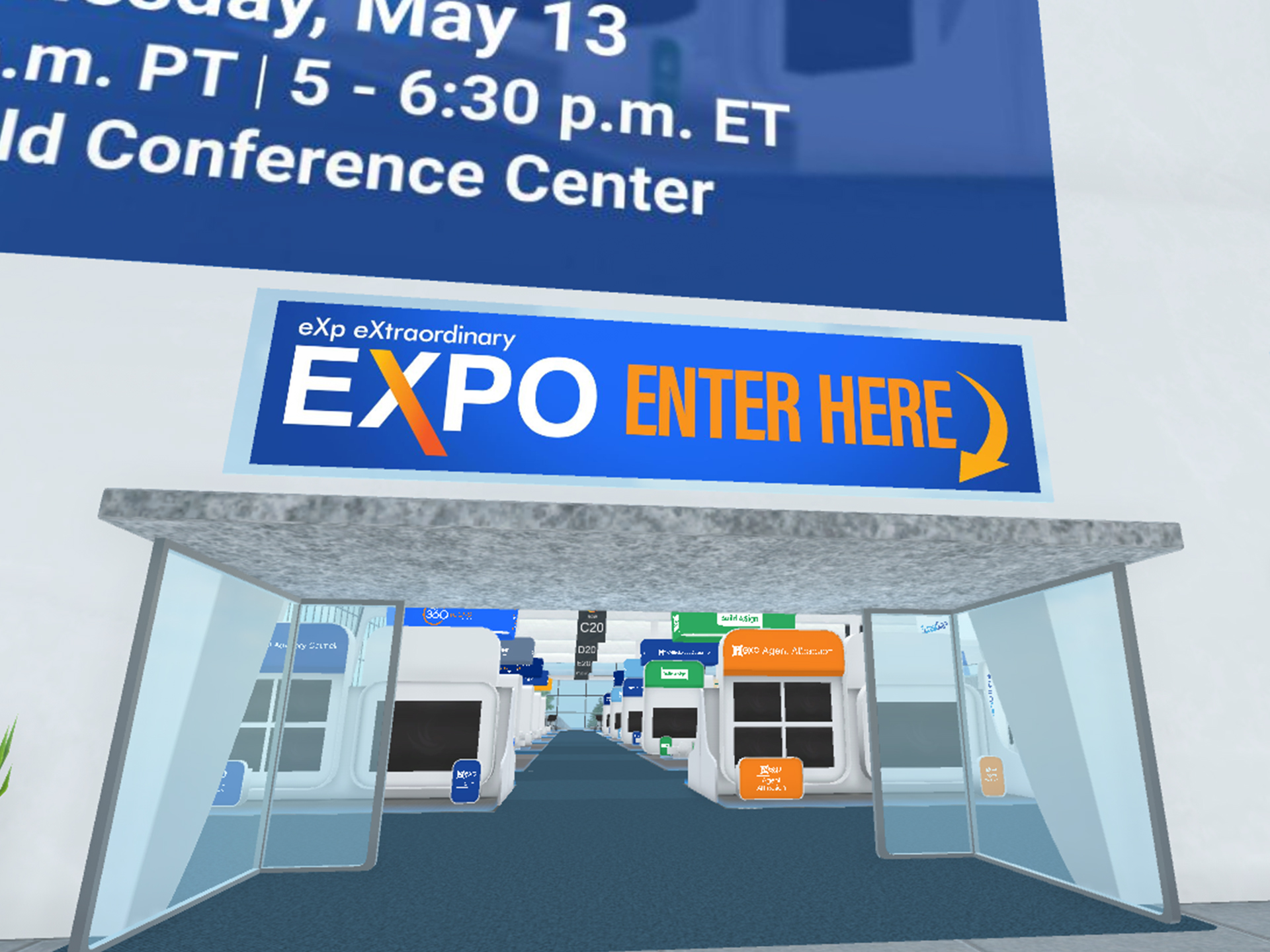
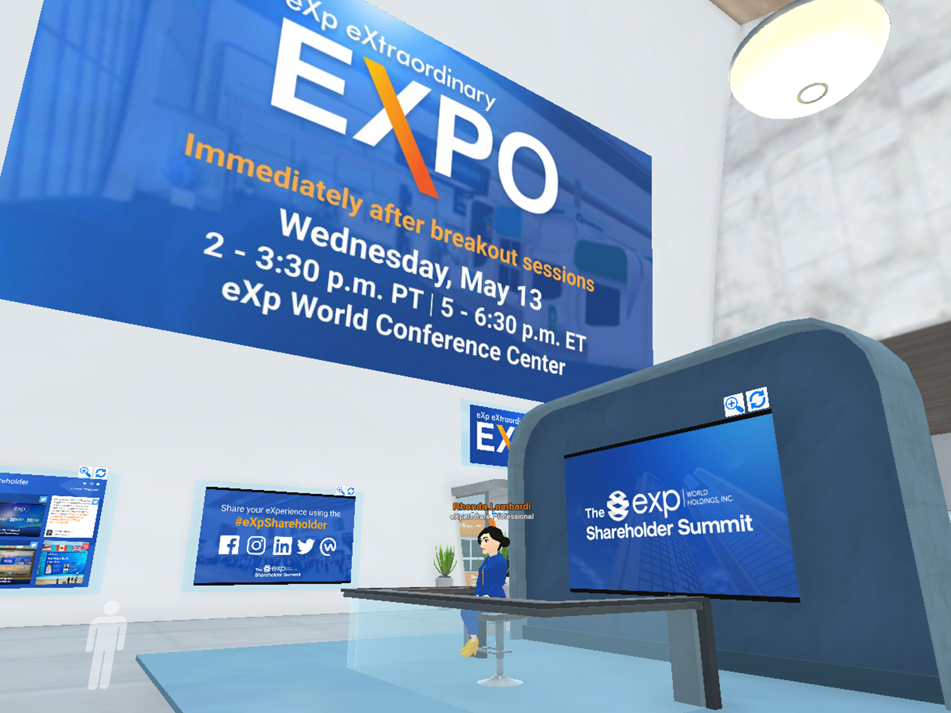
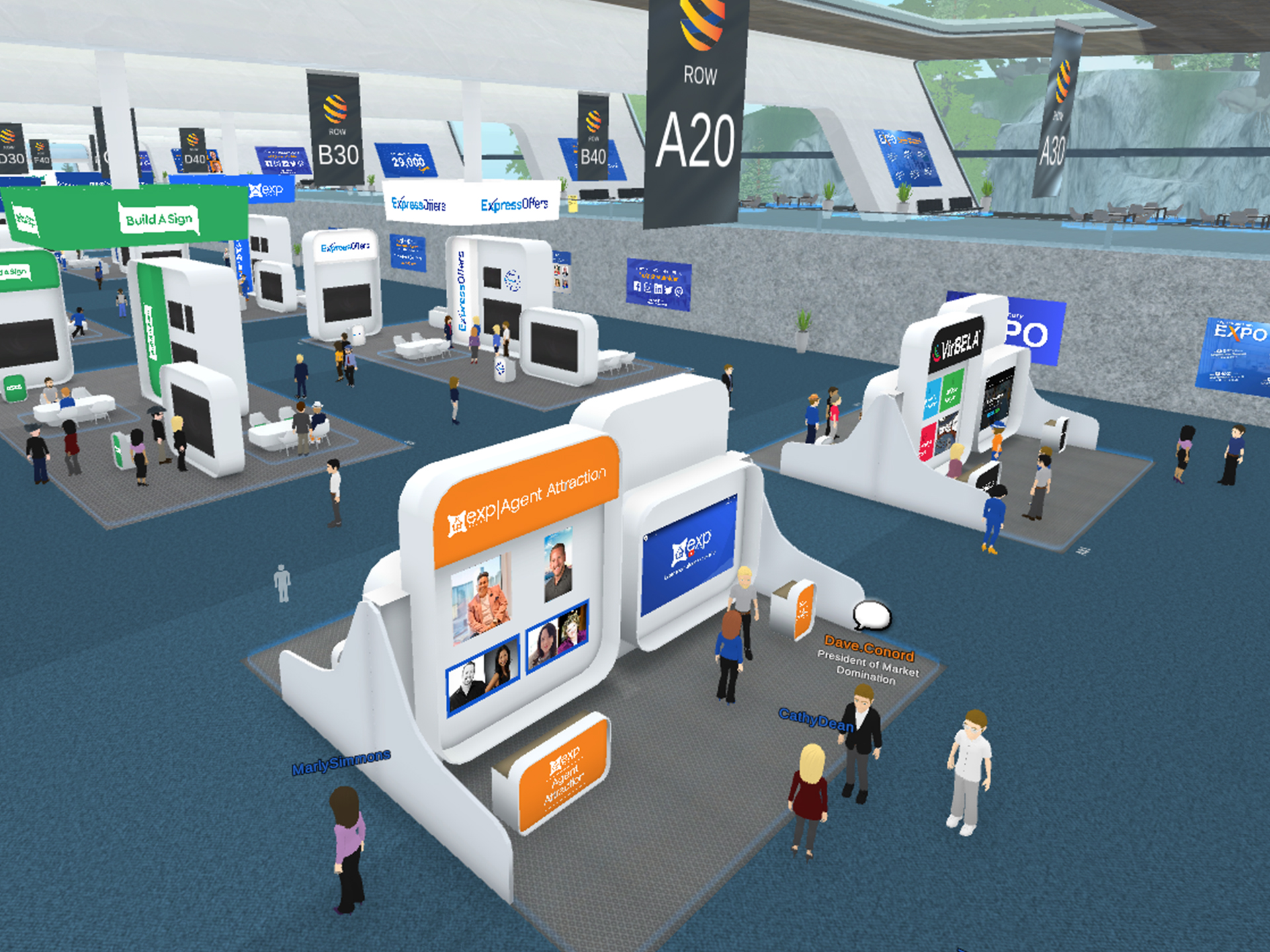
The 2020 eXp Shareholder Summit
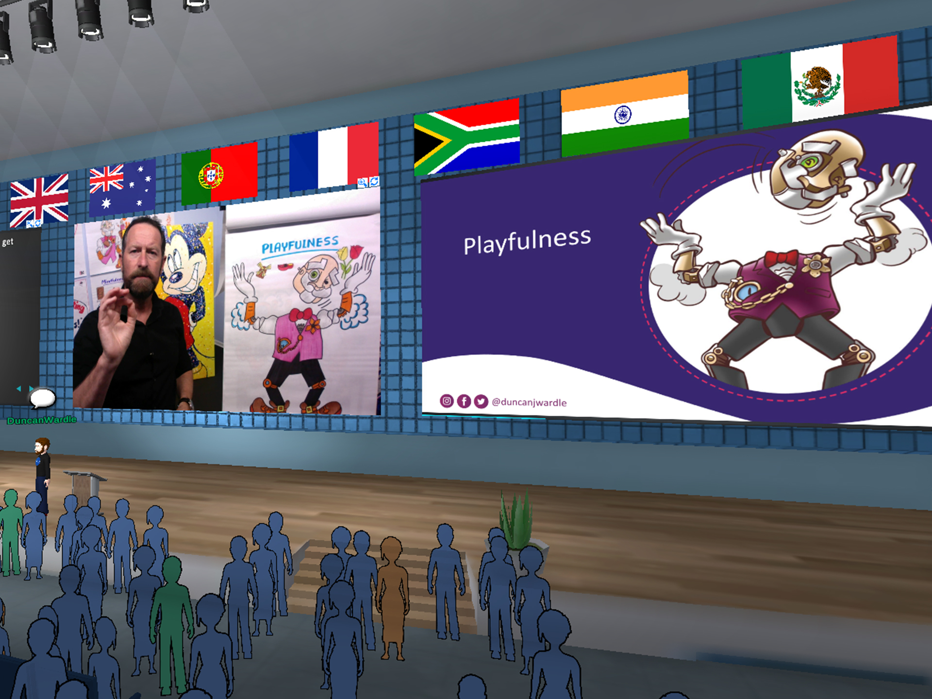
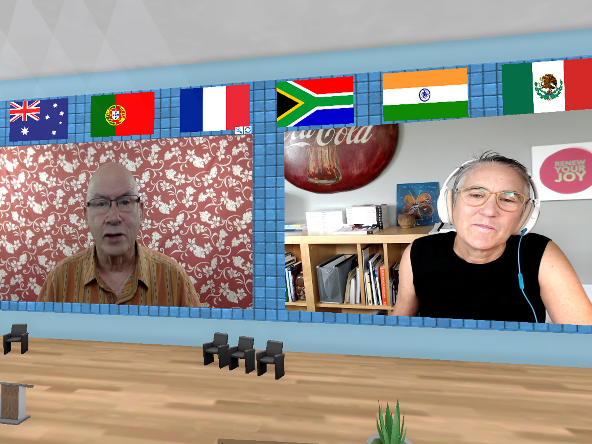
This was eXp’s first fully virtual event held in the eXp World campus powered by VirBELA. I created presentations for the general session, signage for the different booths in the expo, virtual billboards, social posts, website ads and recap video of the event.
Click to watch the full 2020 Shareholder Summit here.
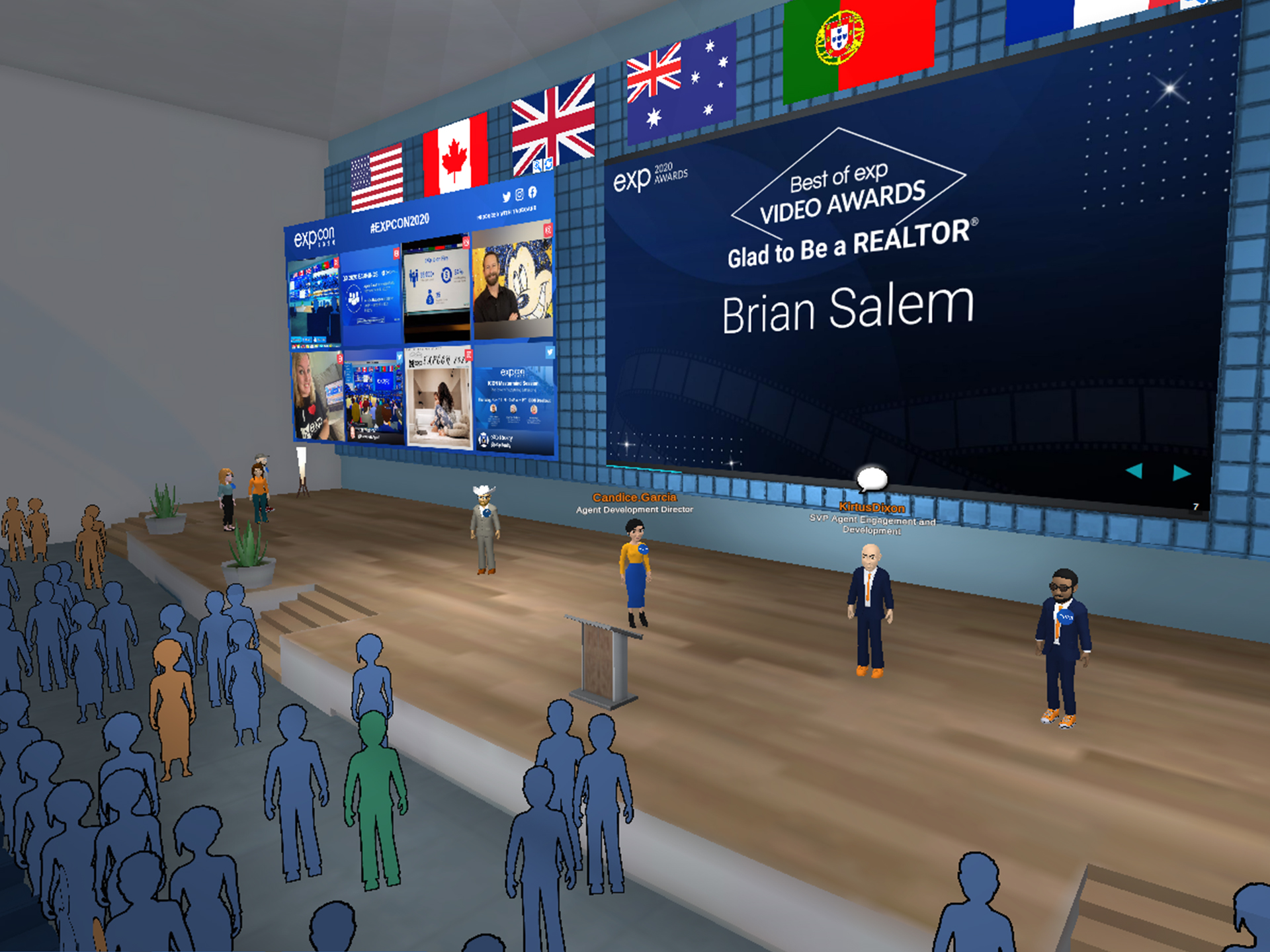
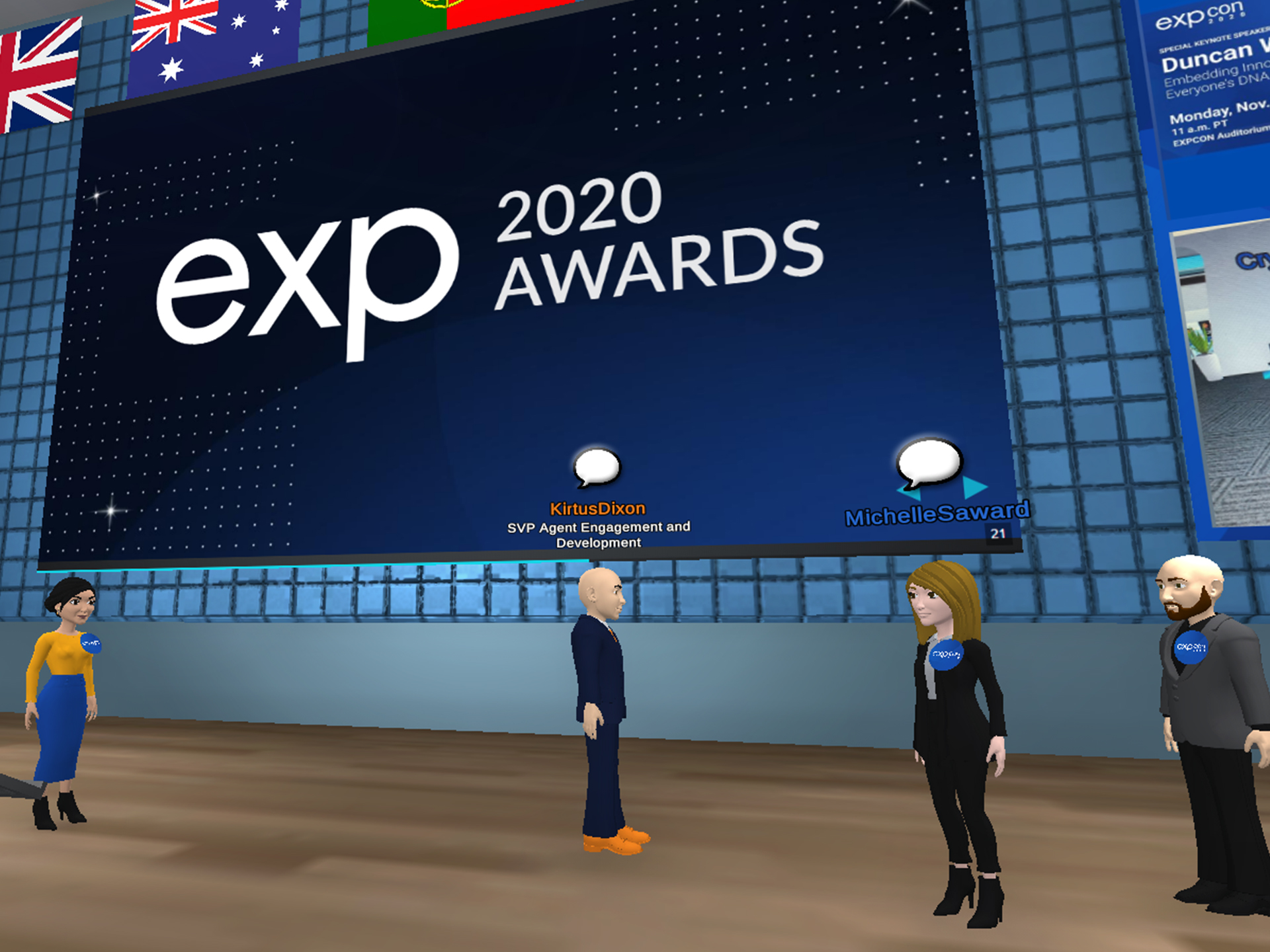
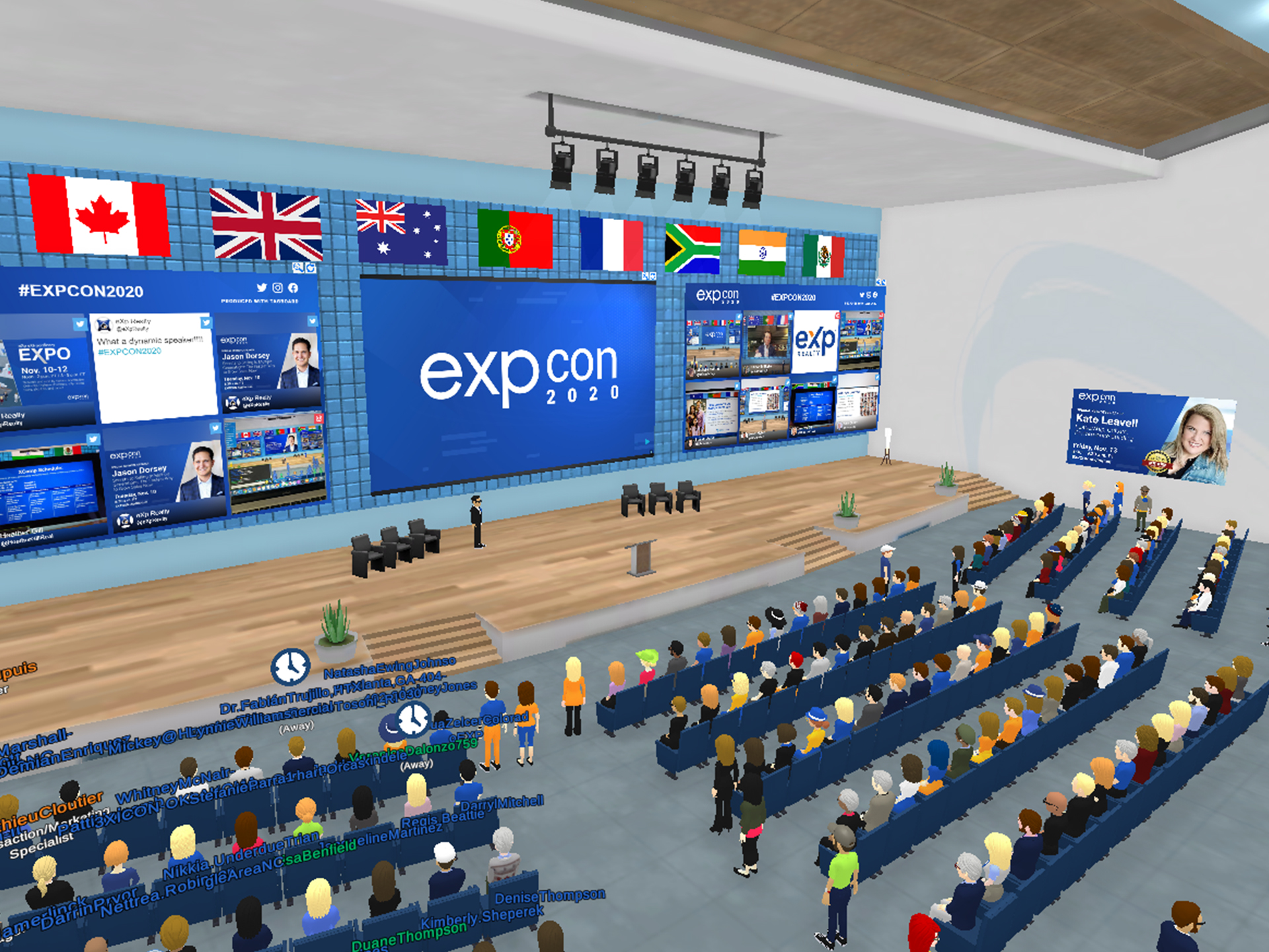
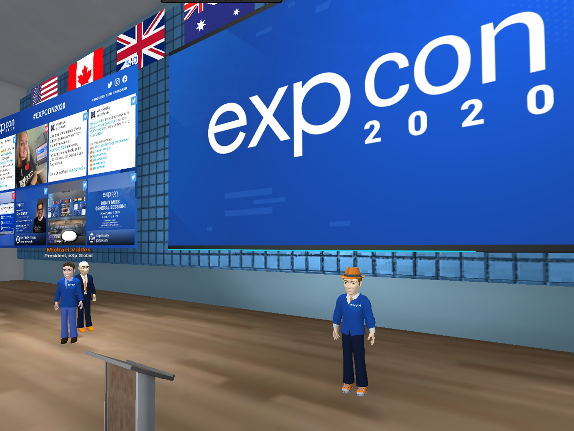
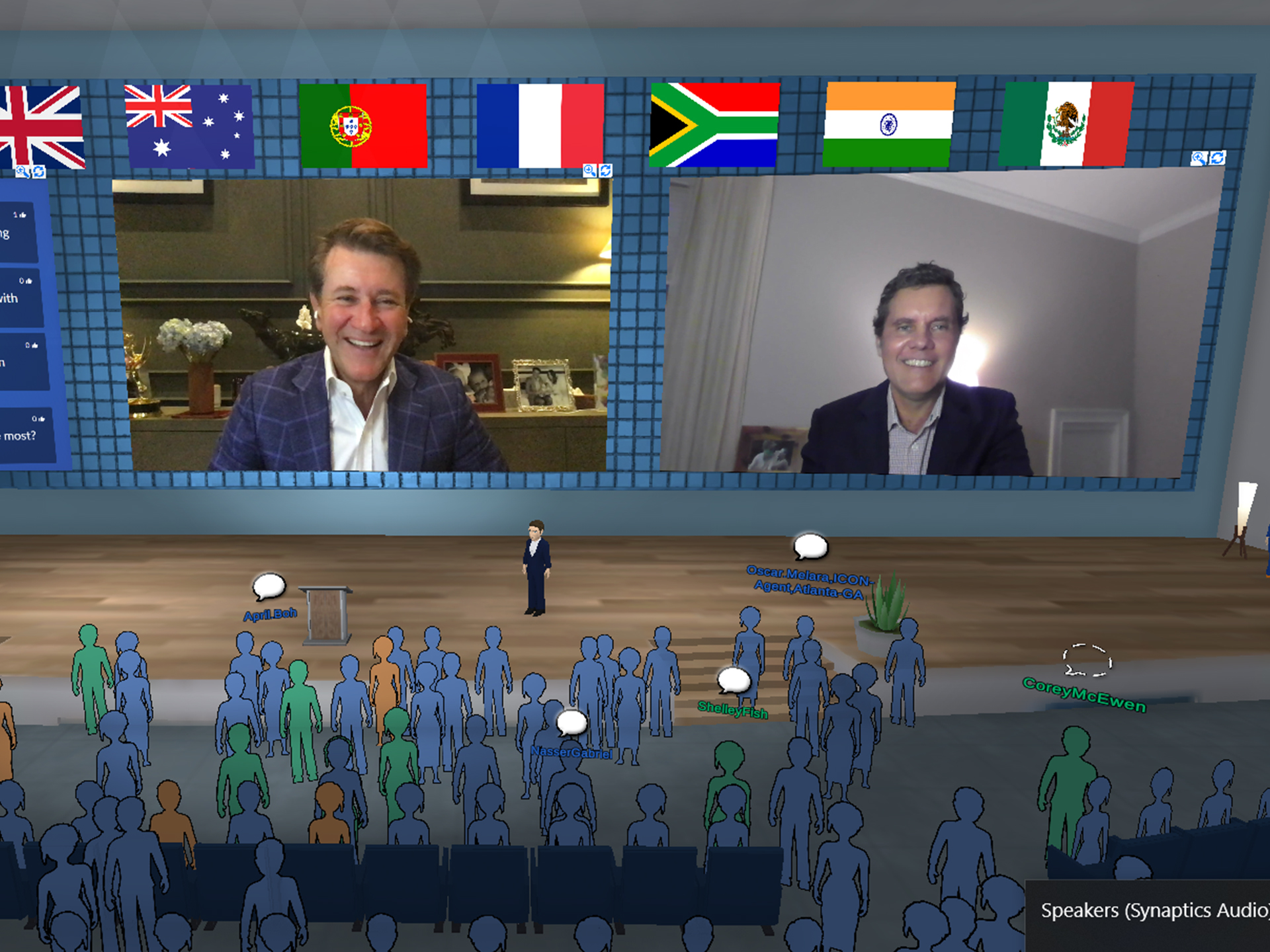
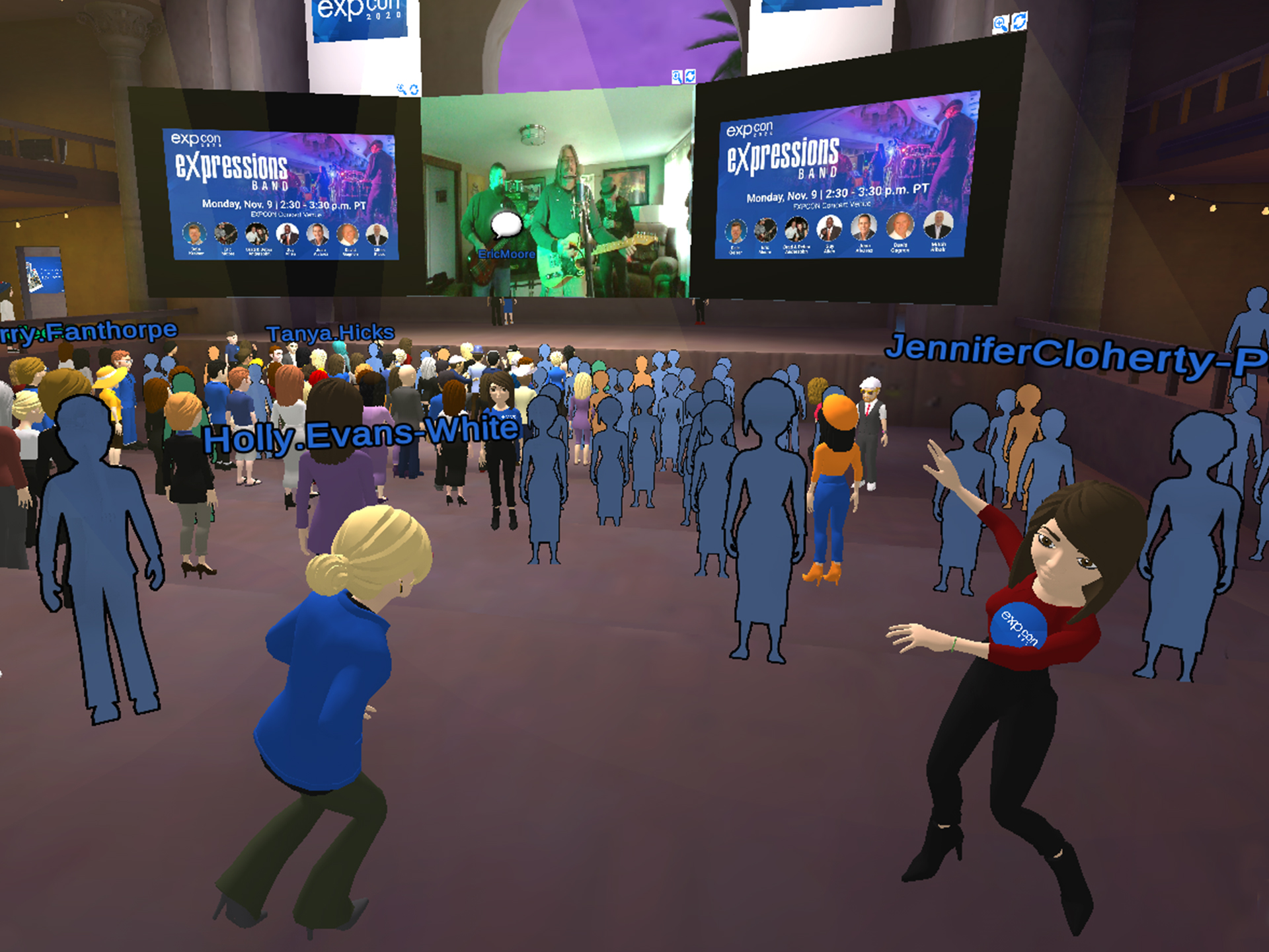
2020 EXPCON
This was eXp’s second virtual event held in eXp World. Some changes were made to the event logo used from the previous years to reflect the new branding. This event had over 8,000 attendees that watched in eXp world and online.
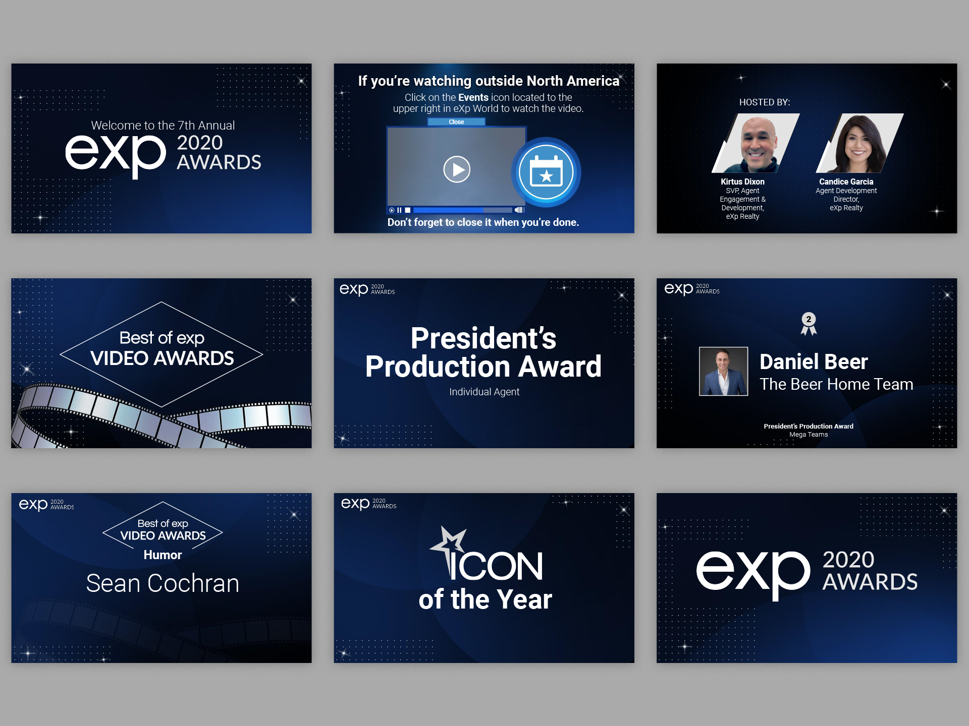
Presentation Slides for Dinner Award Gala
The first day of the event is kicked off with a Dinner Award Gala which presents eXp Realty’s top-producing agents and announces the Best of eXp Realty Video Awards for creativity exhibiting the company’s core values of community, service, sustainability, collaboration, transparency, integrity, innovation, agile and fun. This event is very formal so it was crucial that the branding invoke the feeling of being upscale and luxurious. Creating a gradient using the brand’s blue and black gives a look of grandeur to the design. In addition, there are patterns of circles and flares that are to represent stage spotlights along with faint swirls in the background which provide a bit of depth and symmetry throughout the design.
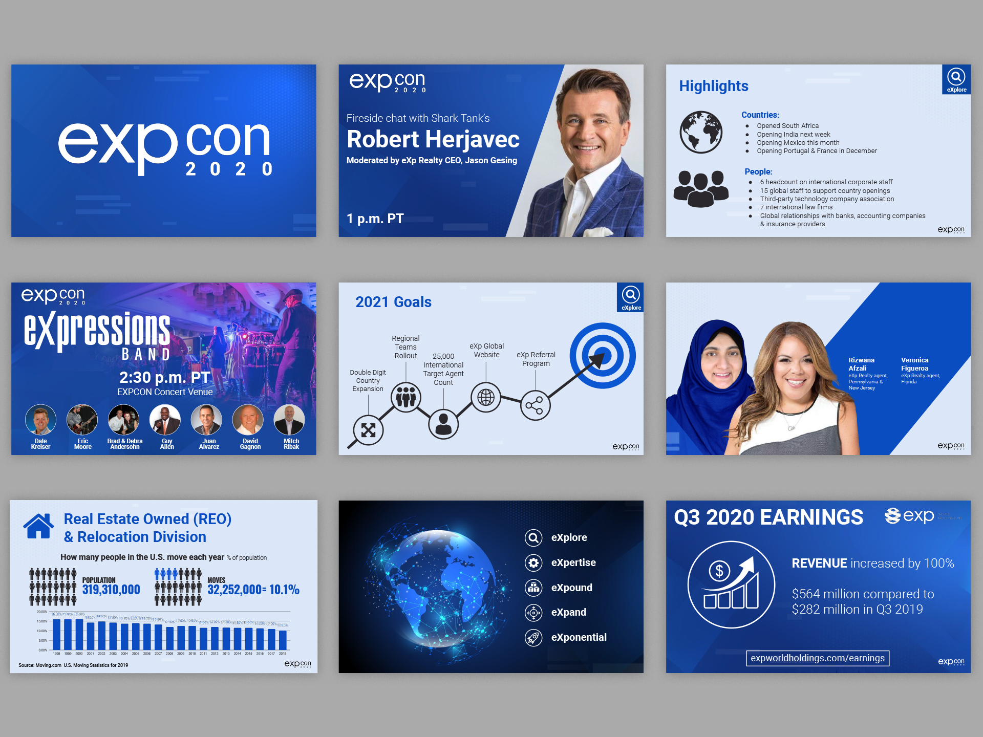
Presentation Slides for General Session
Click to watch the 2020 EXPCON general session here.
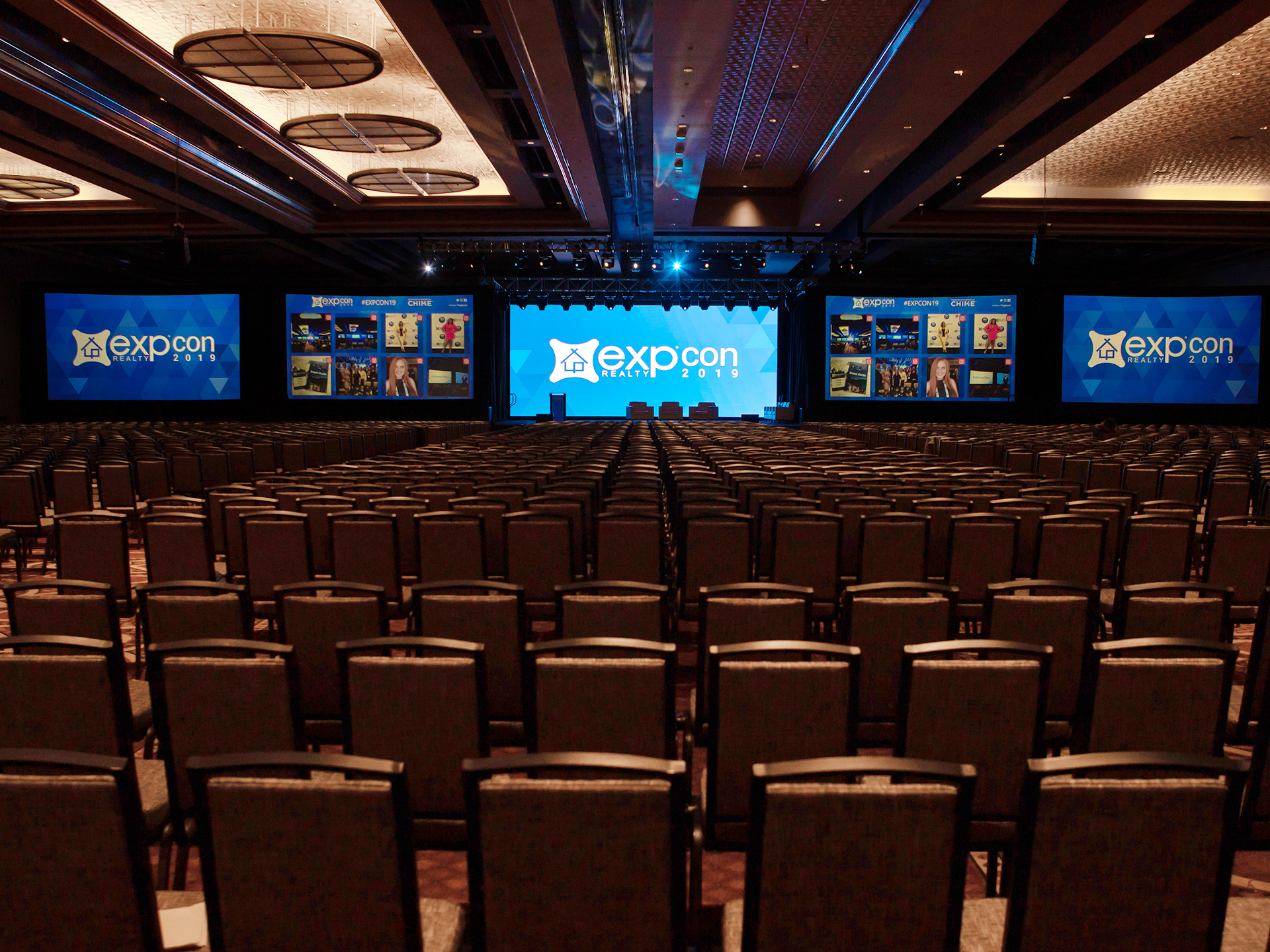
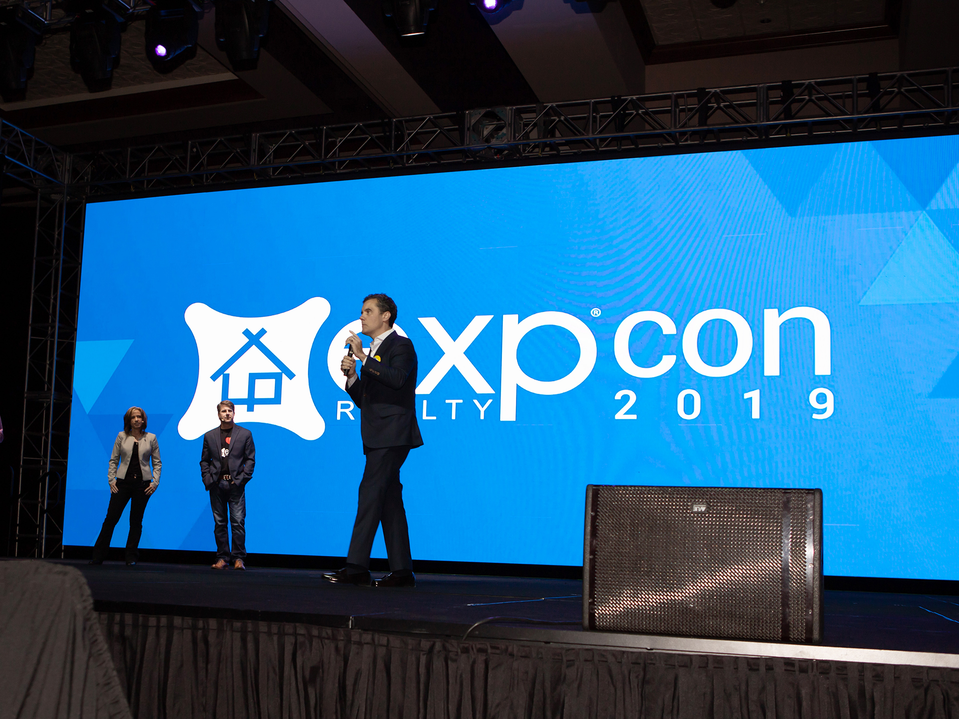
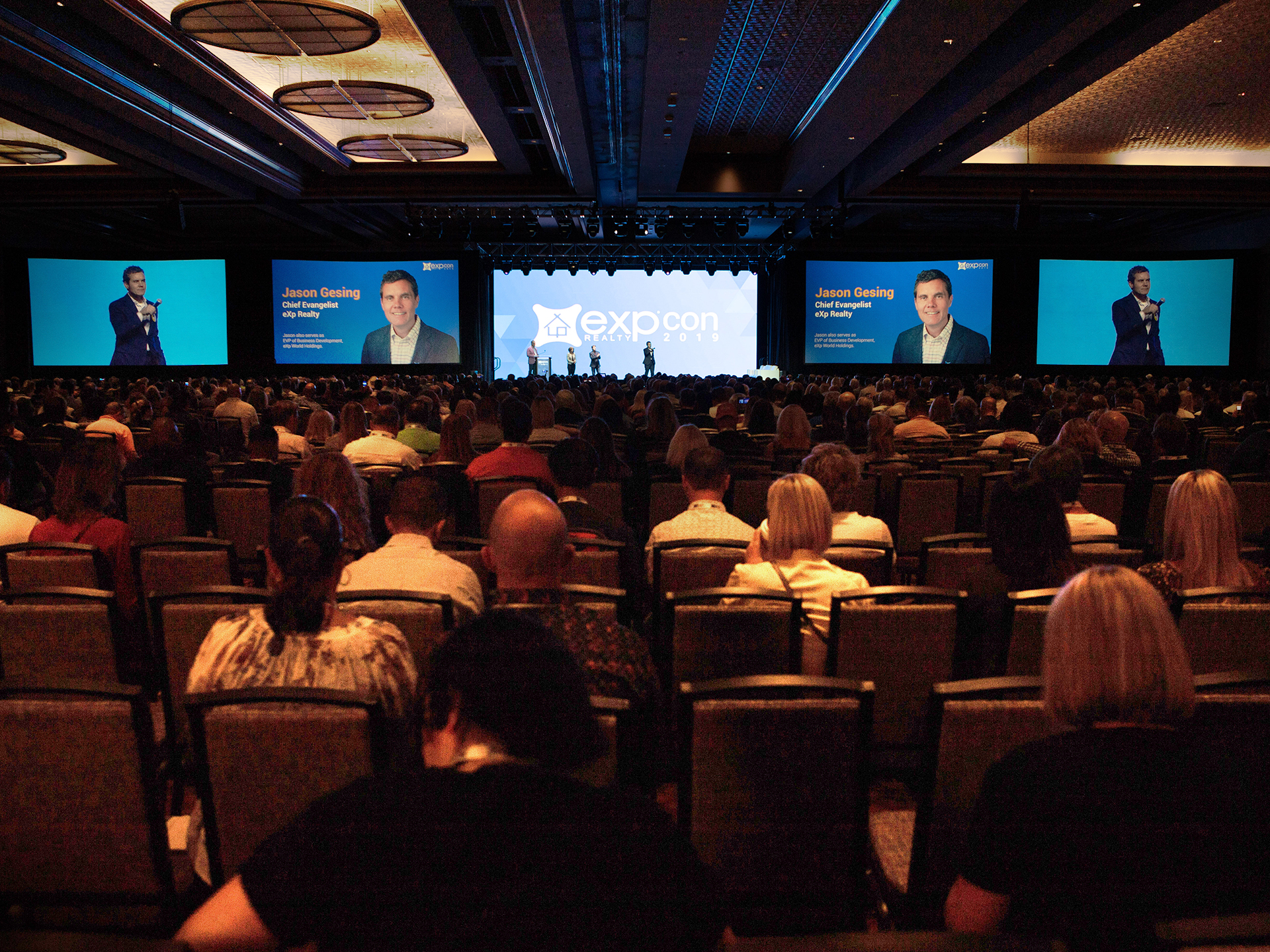
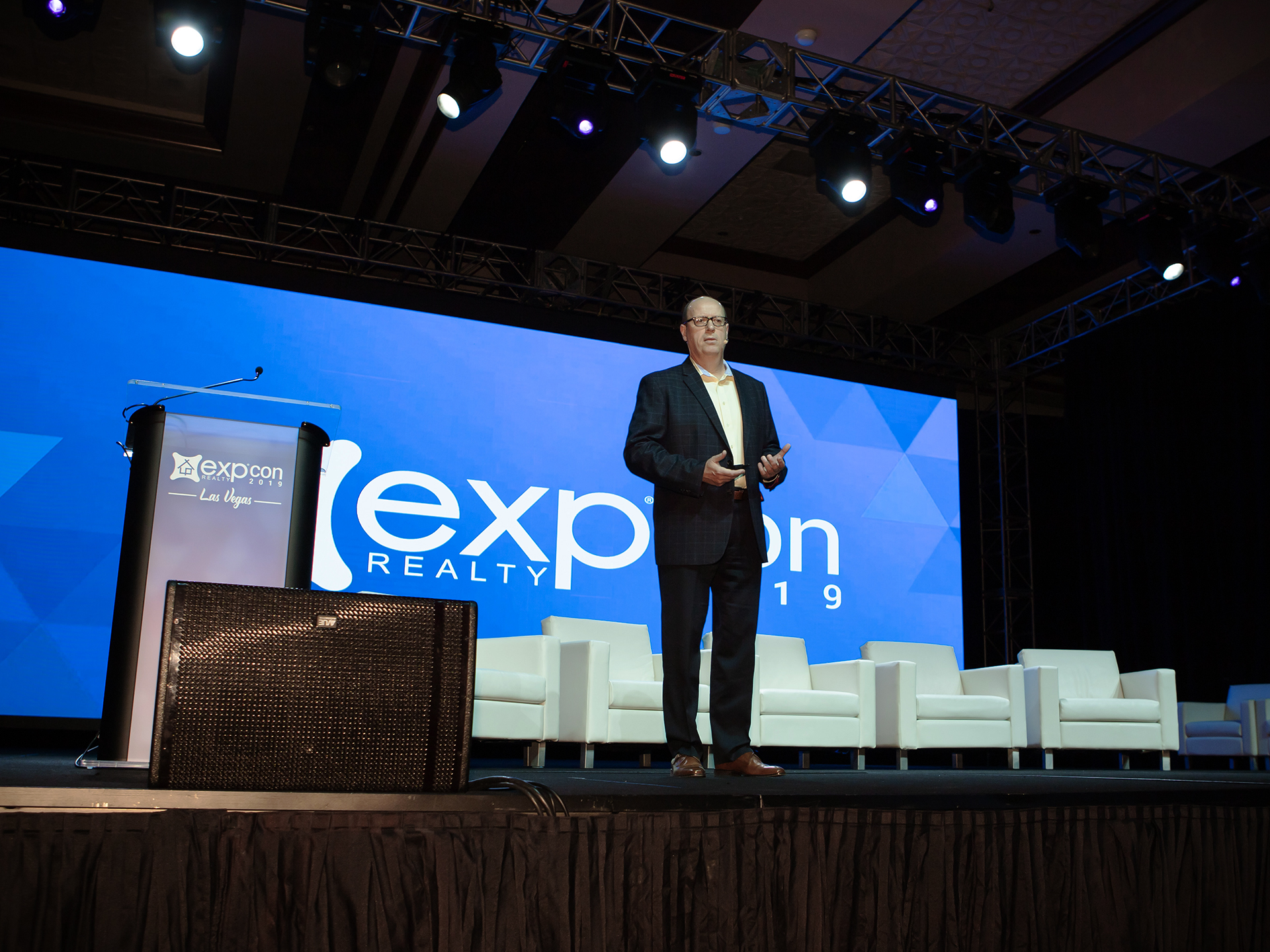
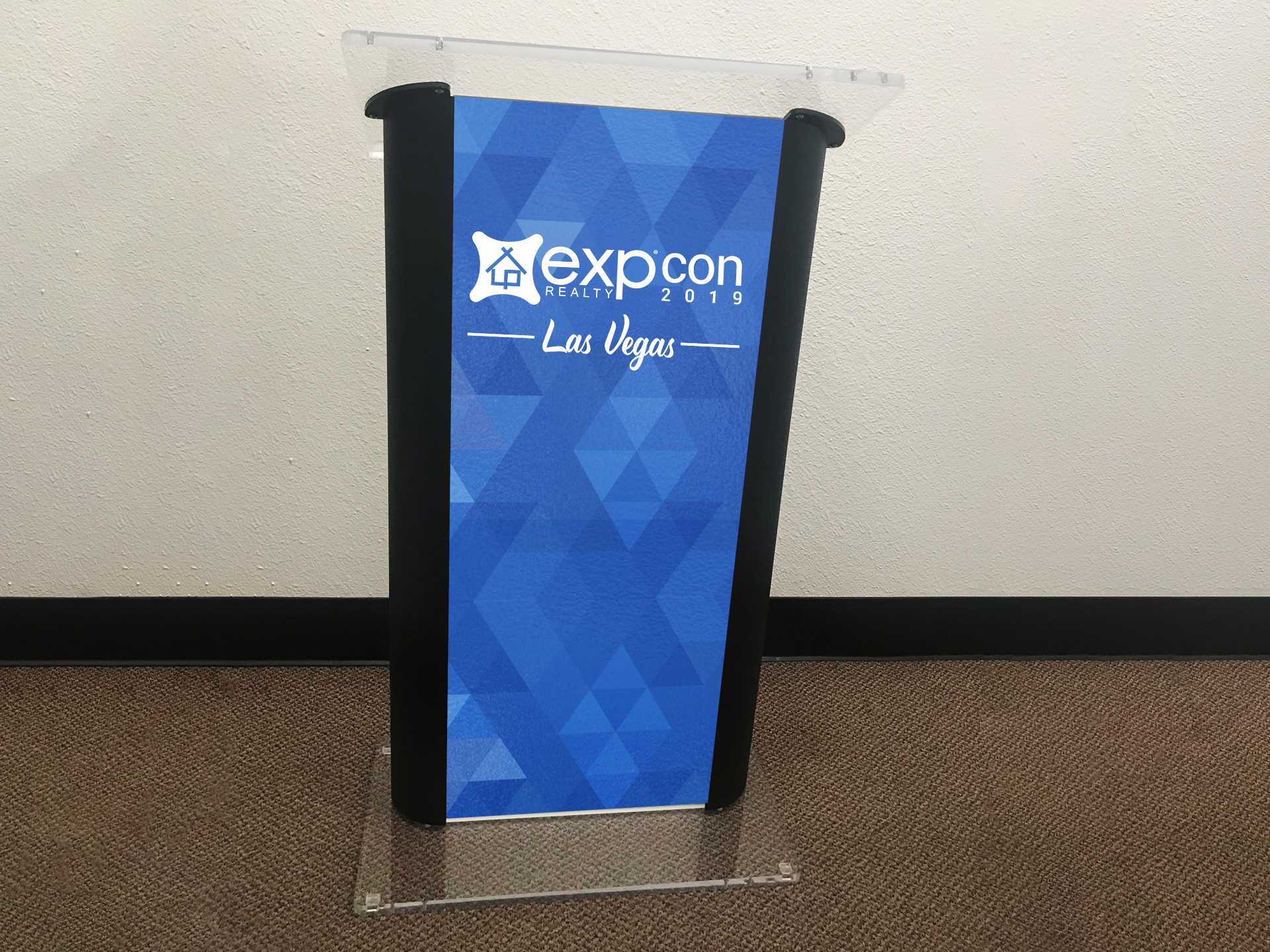
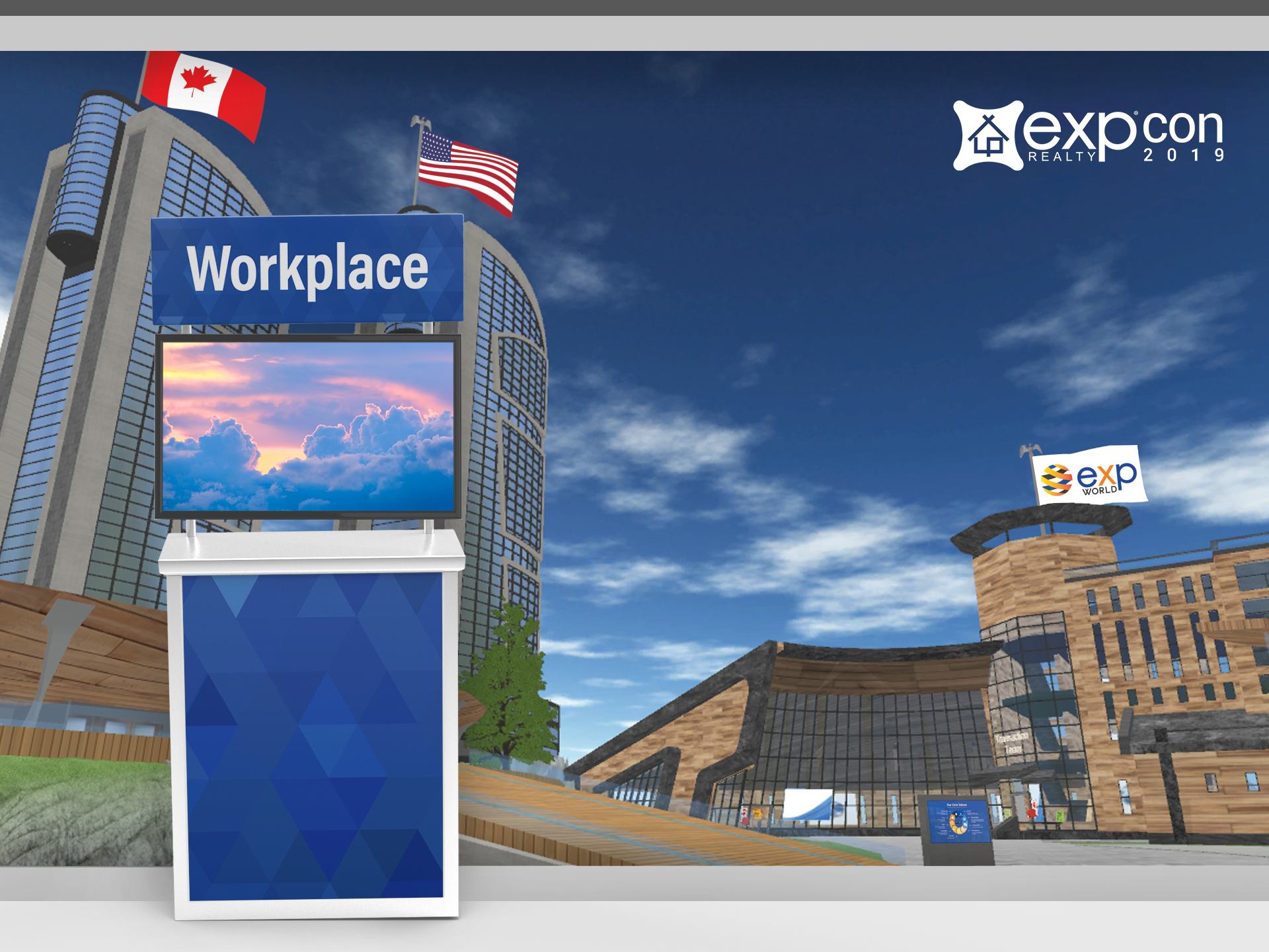
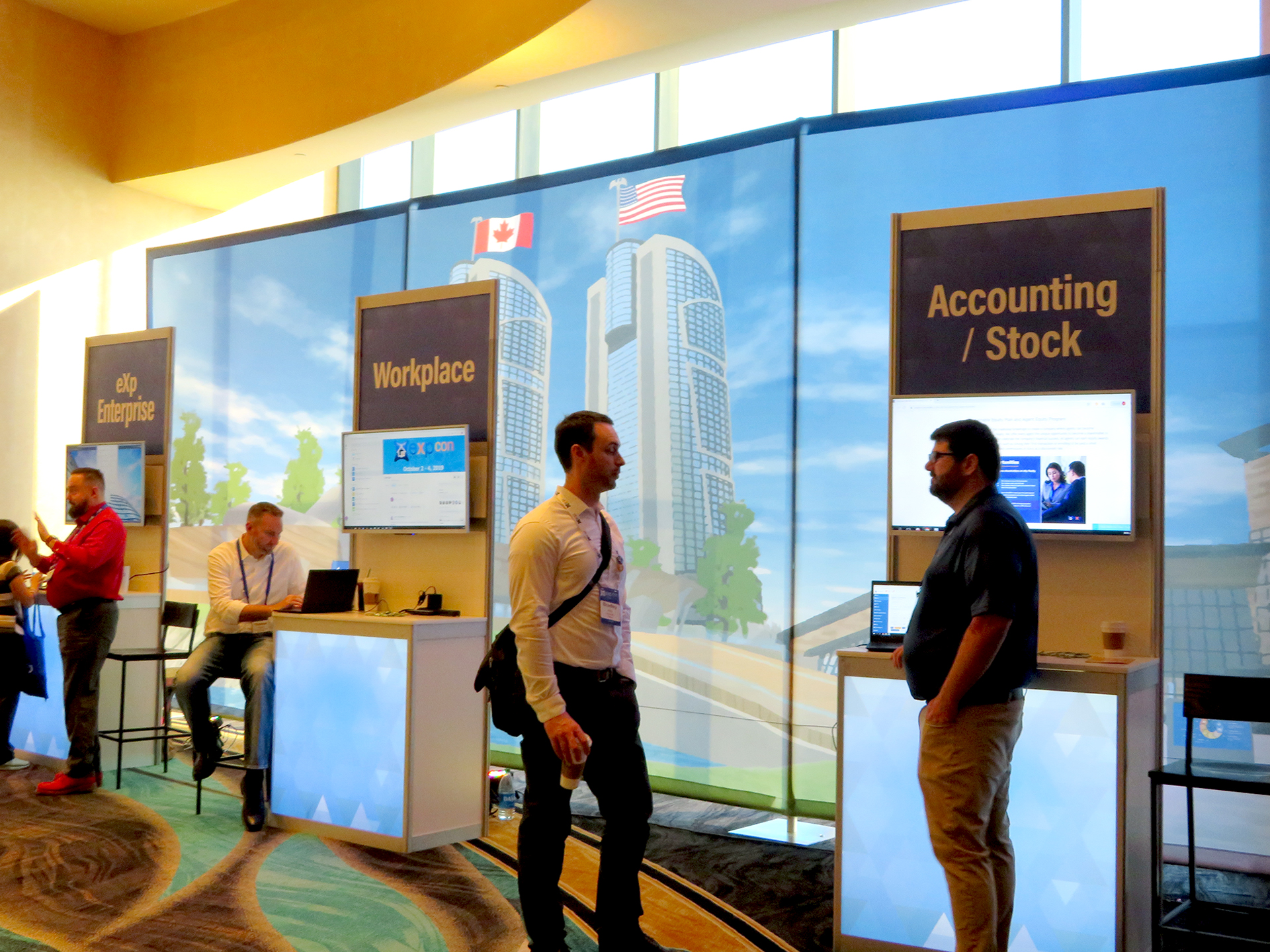
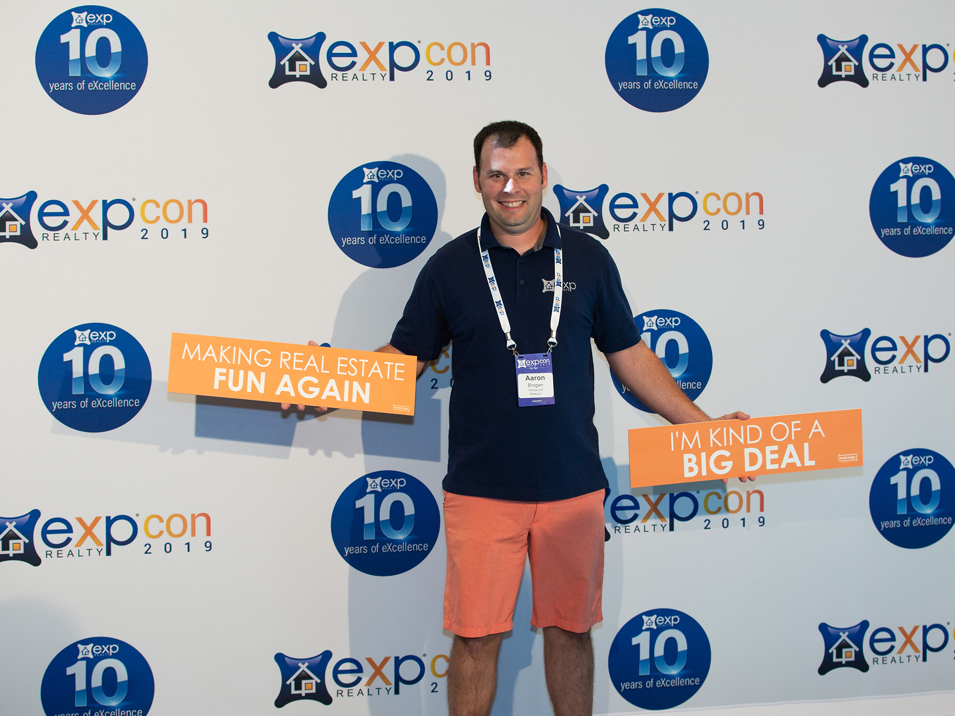
2019 EXPCON
Held as a live event in Las Vegas, Nevada. Over 5,000 agents attended. The branding for this event uses a series of various colored triangles that slant to look like an X which reflects the X in the name eXp. This design creates nice geometric patterns that provides movement for the brand.
To watch part of the 2019 general session click here.
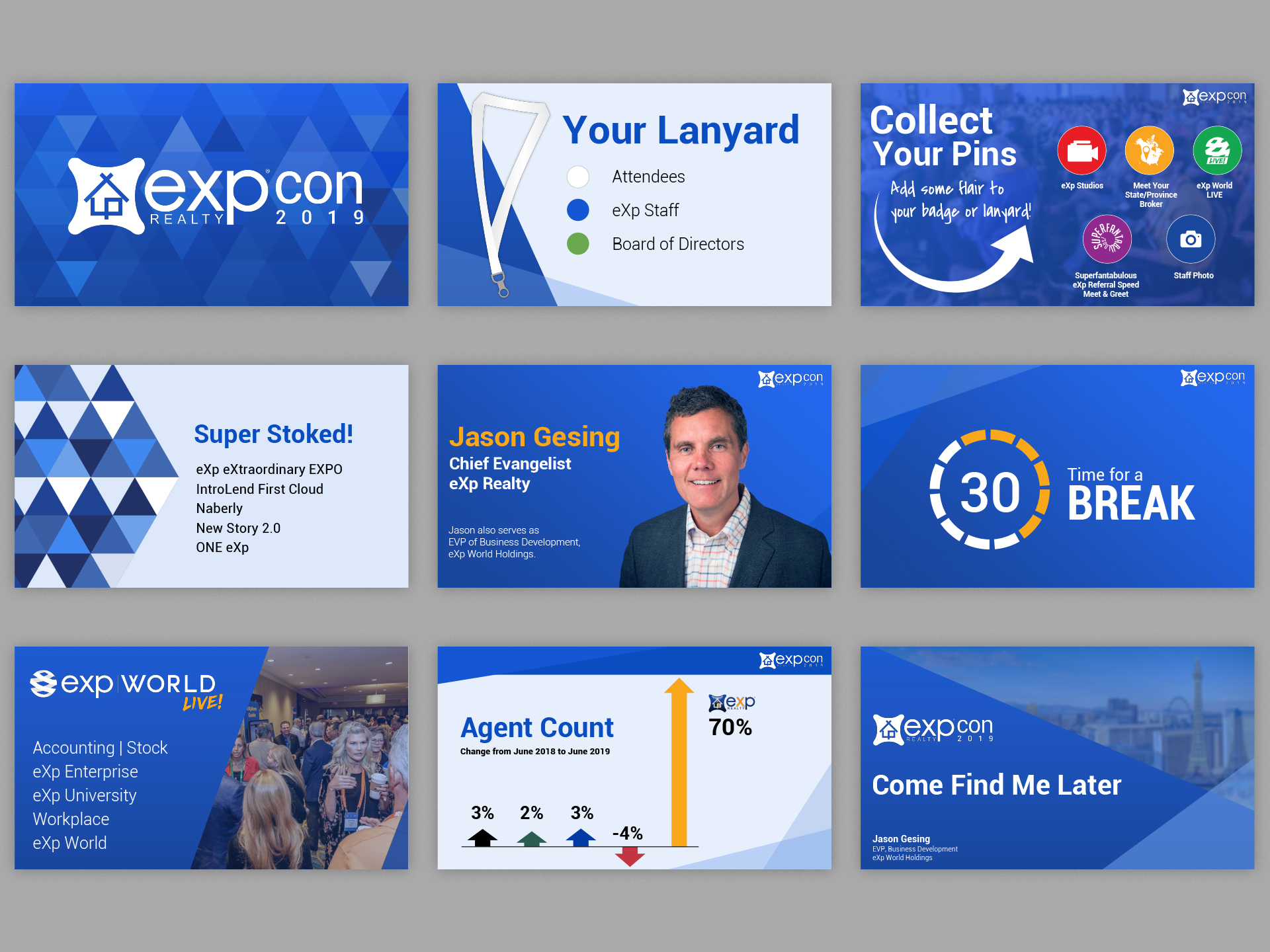
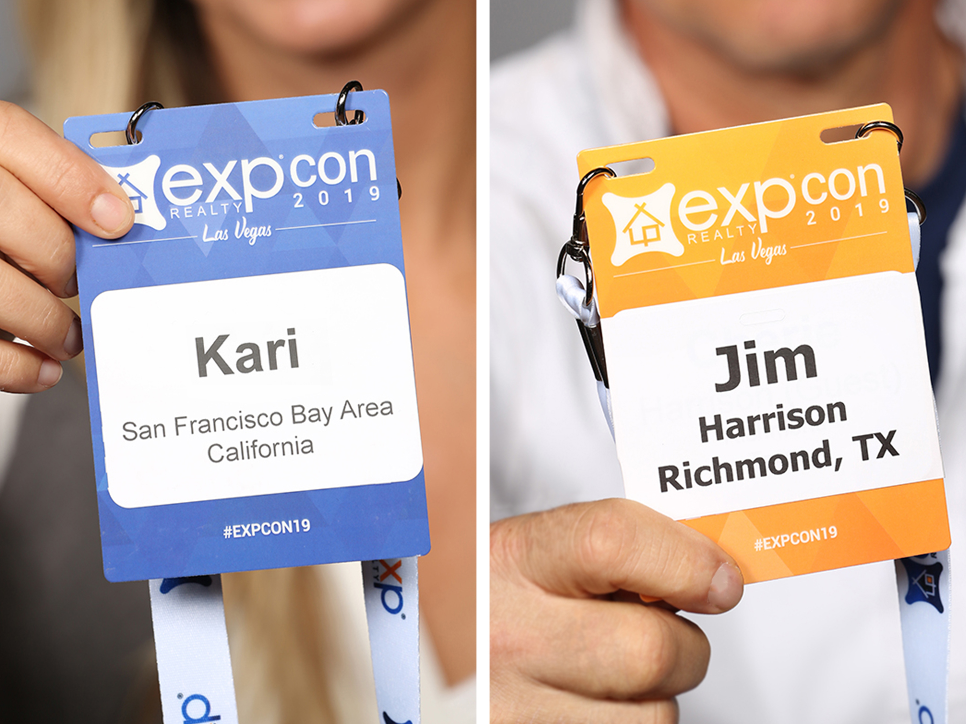
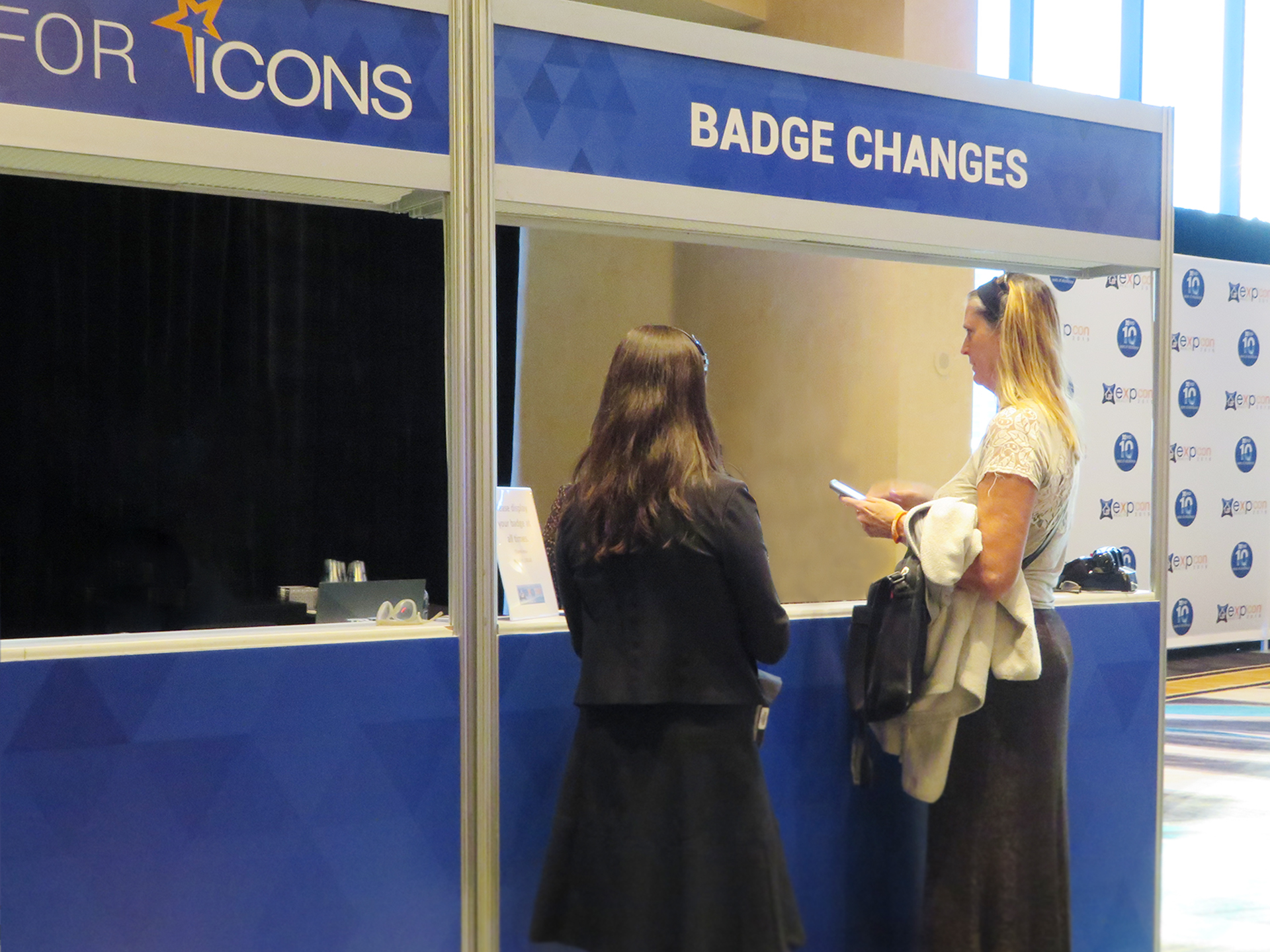
Event Badges & Agenda
Two types of badges and agendas were created. The blue was given to paid attendees while the orange was for guests that were able to attend a limited portion of the event.
Signage & Backdrops
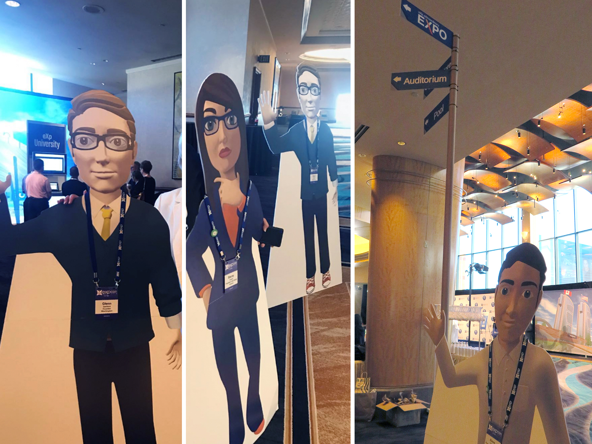
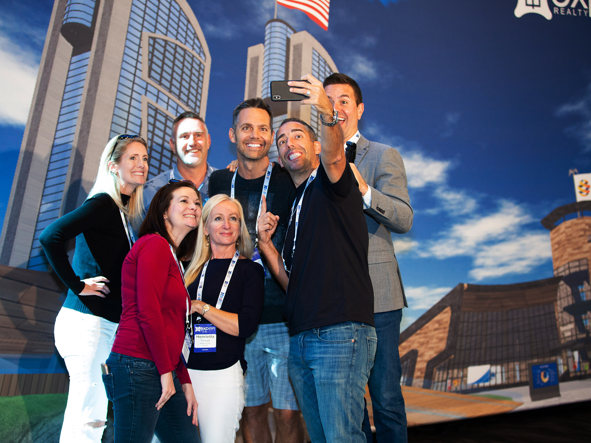
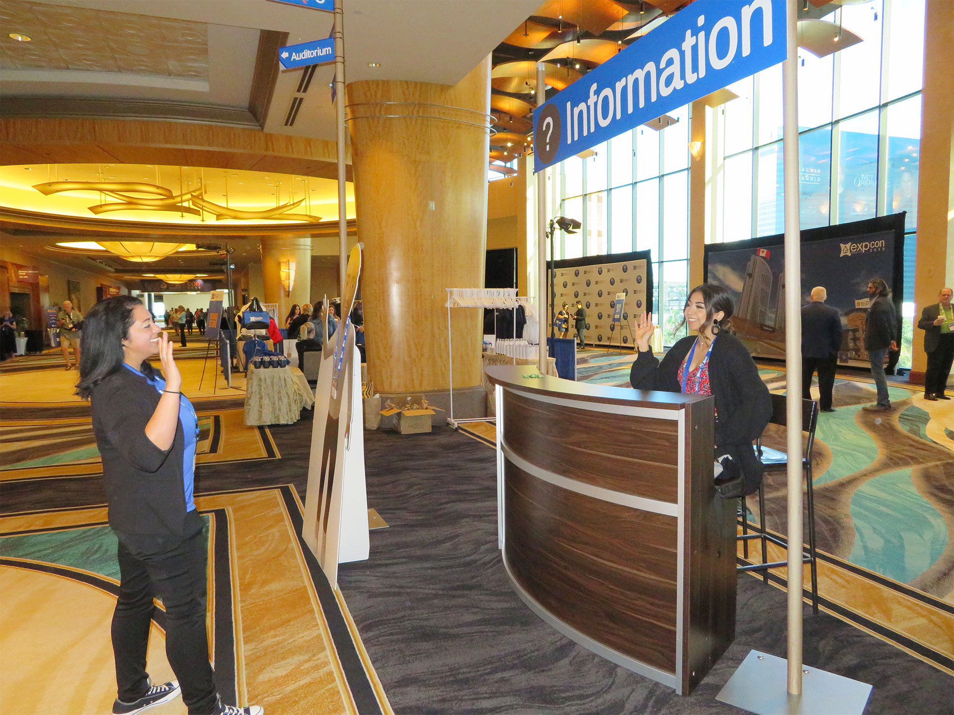
Selfie City Station
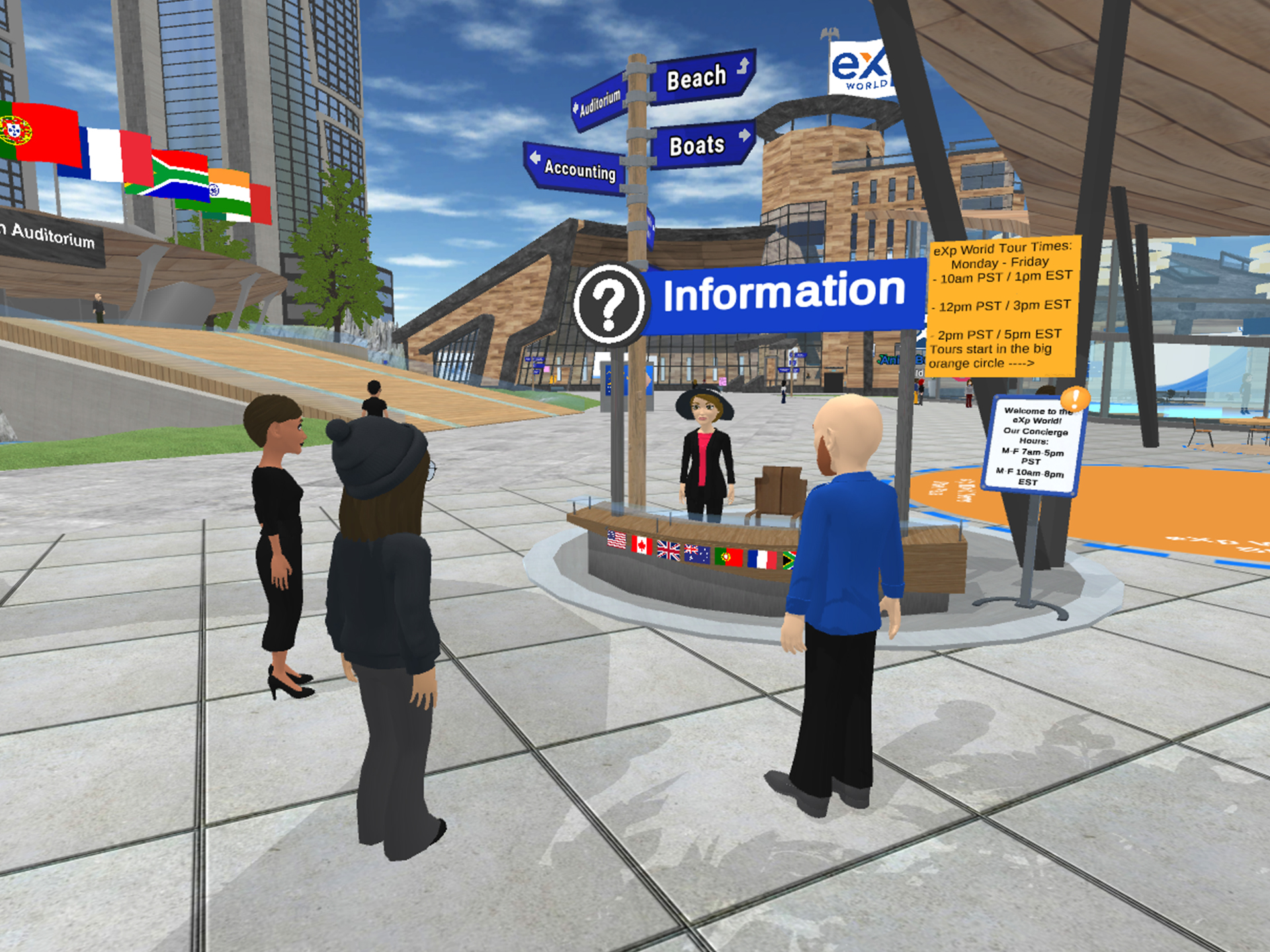
A fun opportunity where agents come up and take a selfie with an avatar of the companies founder Glenn Sanford and leadership team amongst various themed backdrops. Since, the avatar’s in eXp World are too low resolution for a life size print, the project required drawing the avatars in the required proportions to achieve the best quality. Signage and directional posts were made to resemble objects found in eXp World but brought to life in the selfie city station.
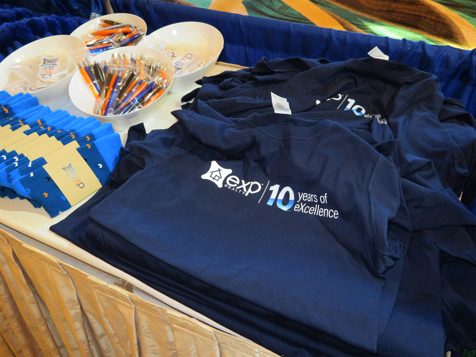
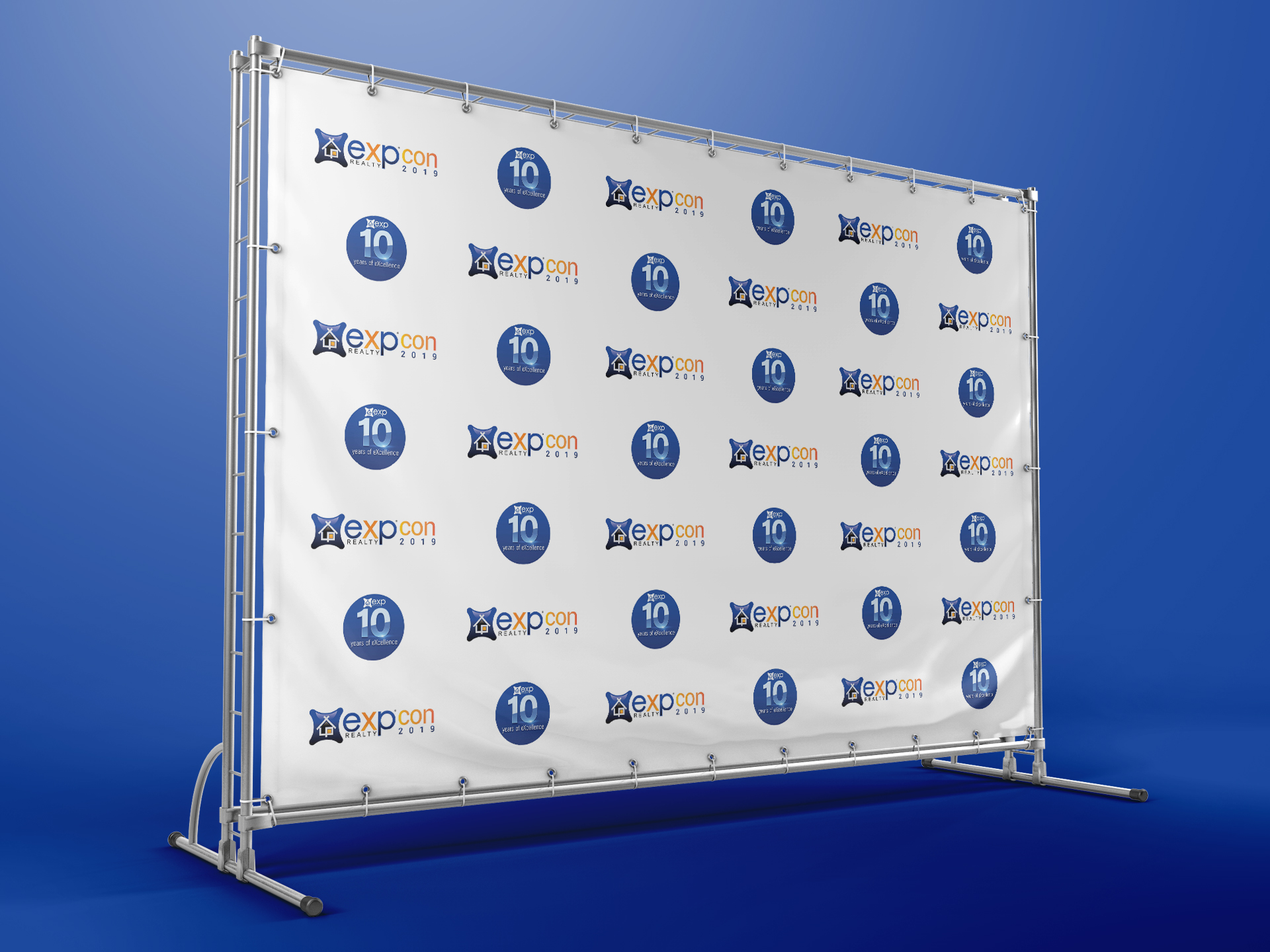
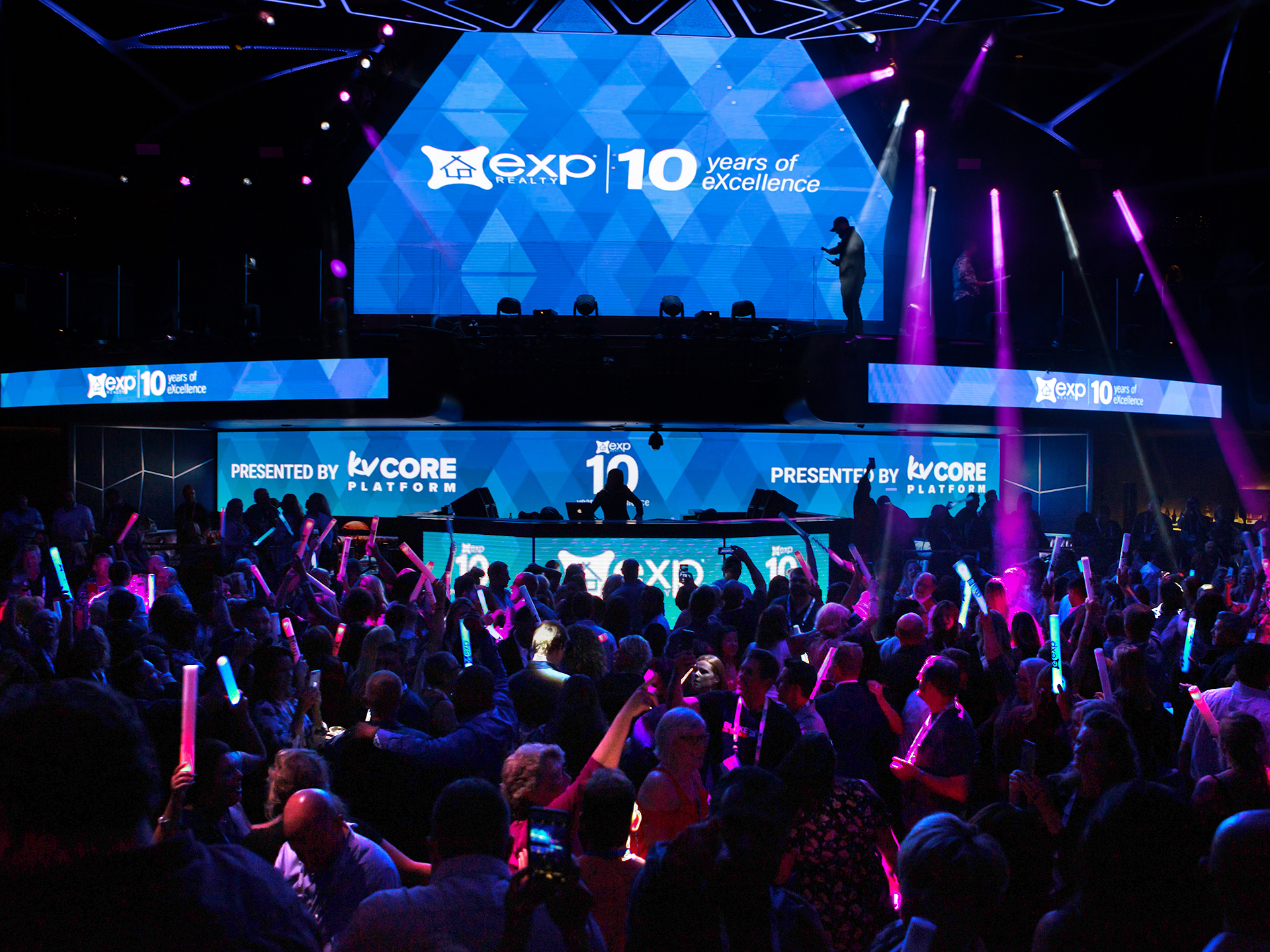
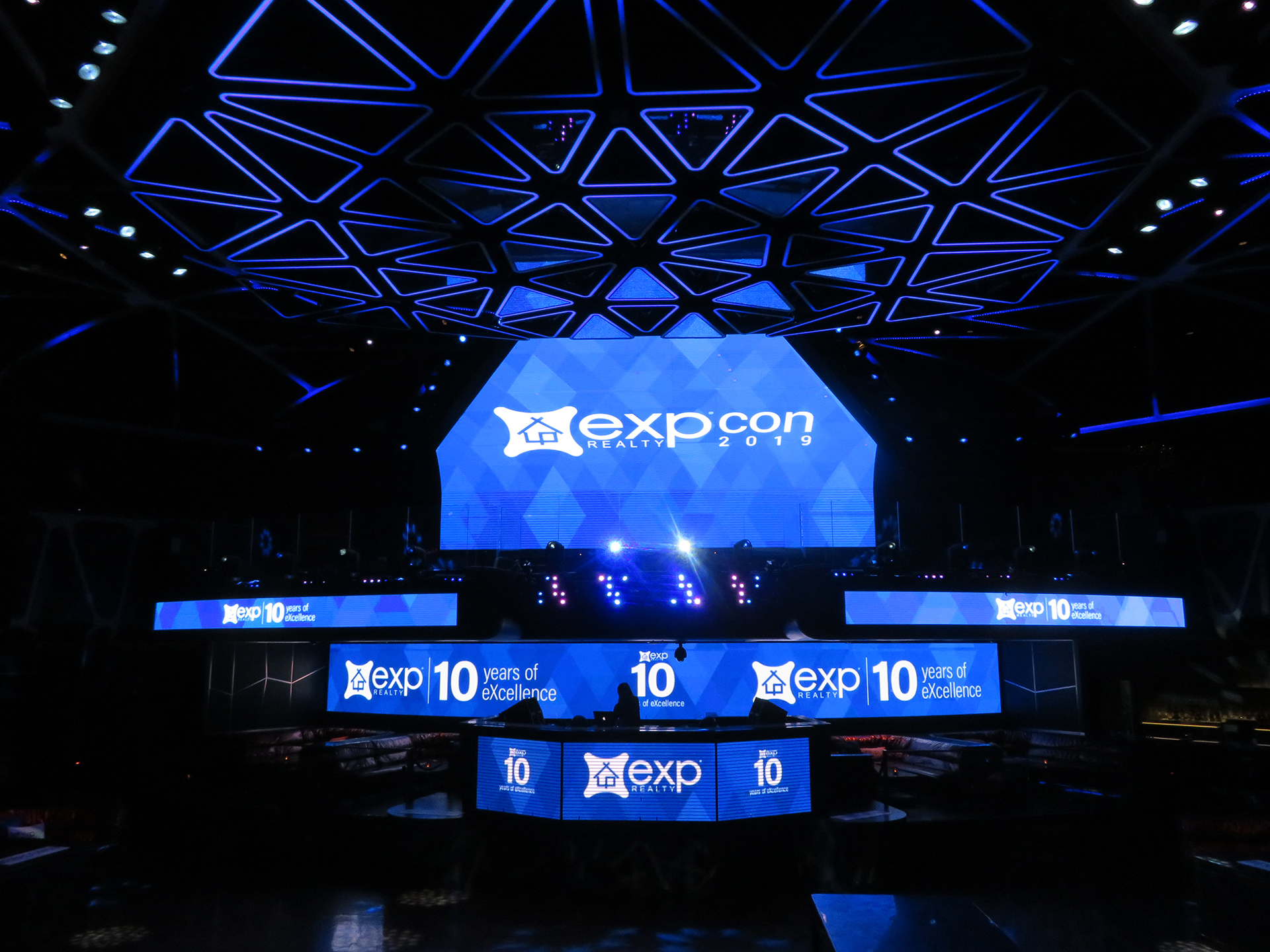
10 Years of Excellence
eXp celebrated its 10th anniversary at EXPCON’s annual event. For this special occasion, eXp wanted branding to commemorate ten years of being in business.

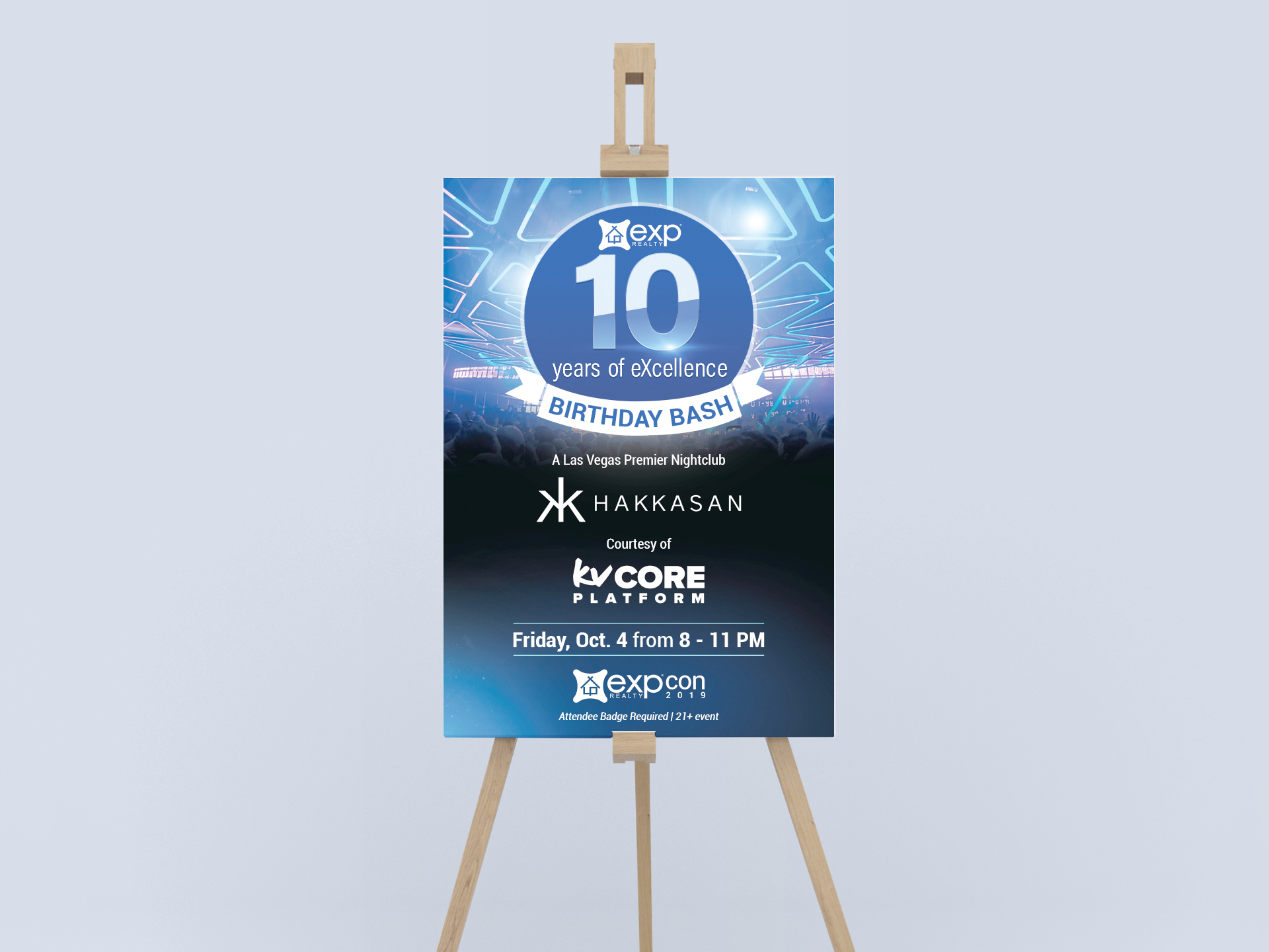
Nightclub Screens
eXp threw an after party inside MGM Grand’s massive nightclub Hakkasan in which over 2,000 agents attended. The logo and themed pattern for the event were displayed on all of the nightclub’s screens.
Branded Apparel