Competitive Analysis
Before getting started on any work, I first research fonts, colors and other fitness logos as inspiration and direction for the brand.
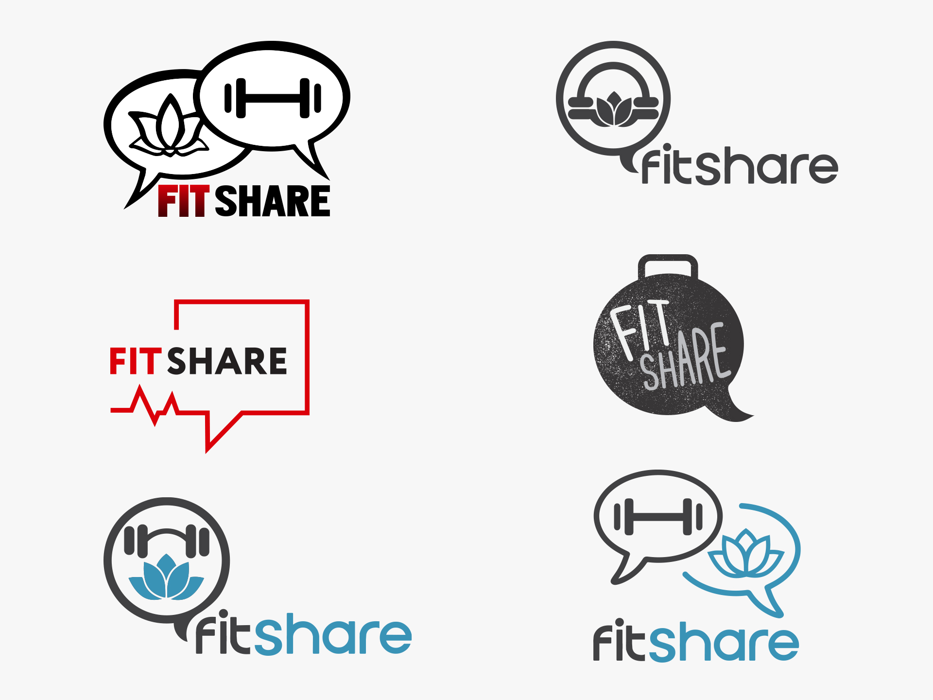
Logo Concepts
Brand Attributes: Active, Bold, Collaborative, Strong, Lifestyle, Inspiring
After doing a competitive analysis of different logos, and learning the client’s preferences and styles, my next step is putting together different concepts that really capture the brand’s attributes. Below are different logo concepts I came up with.
Final Logo
The logo represents the wide span of topics that Fit Share covers. The logo portrays this through depicting a barbell and lotus flower in the chat bubbles.
Color scheme
The grey represents weights and symbolizes strength and power, while the contrasting light blue demonstrates a tranquil aura for yoga.
#414042 – Jet
#3994b7 – Blue Green
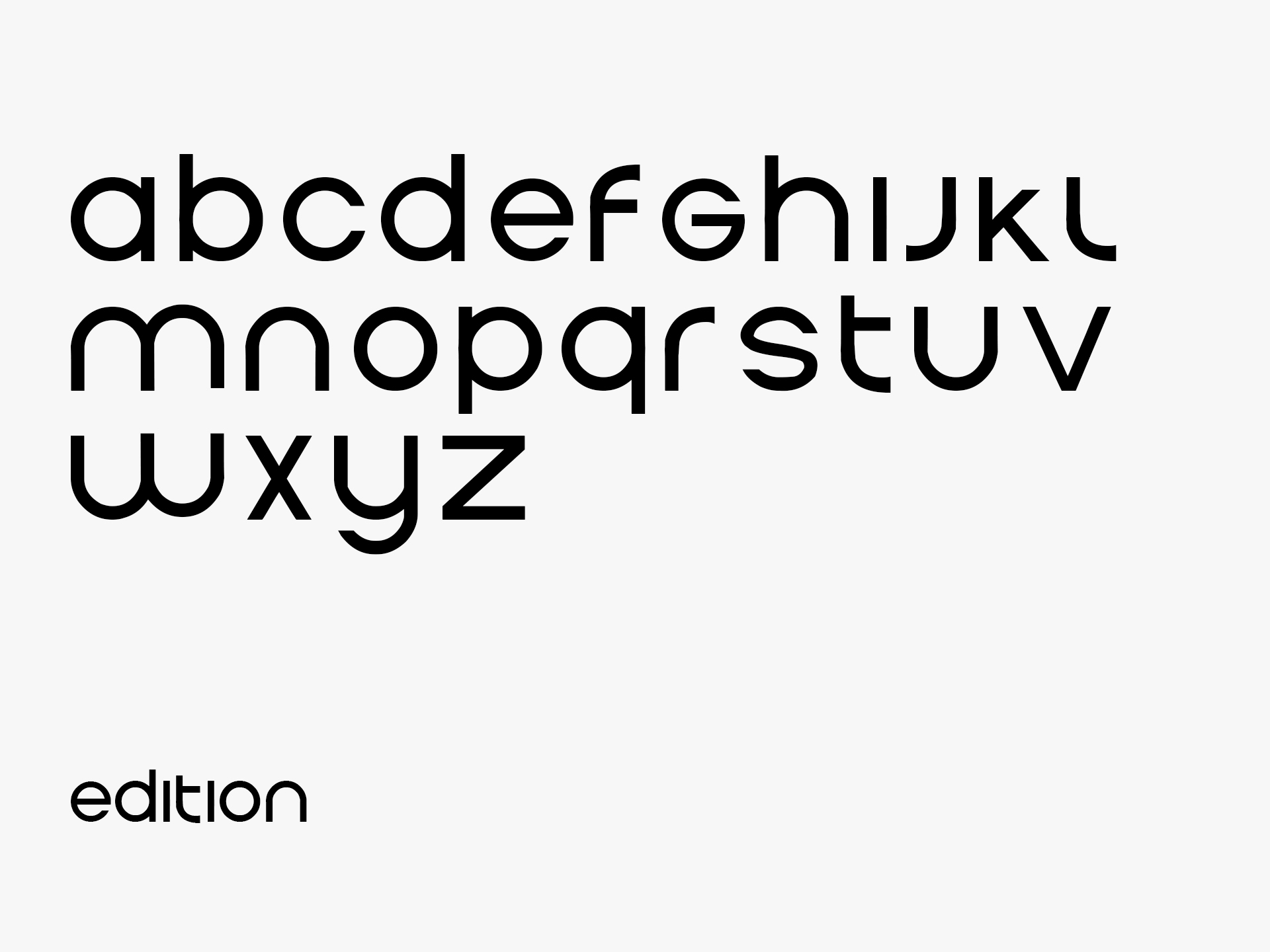
Typography
The selected font has a clean modern approach that translates well on many platforms. By using a rounded font, this compliments the weight and rounded end points of the logo mark. In addition, the curvature of the different letters of the typeface is styled to look like people bending in different athletic positions.
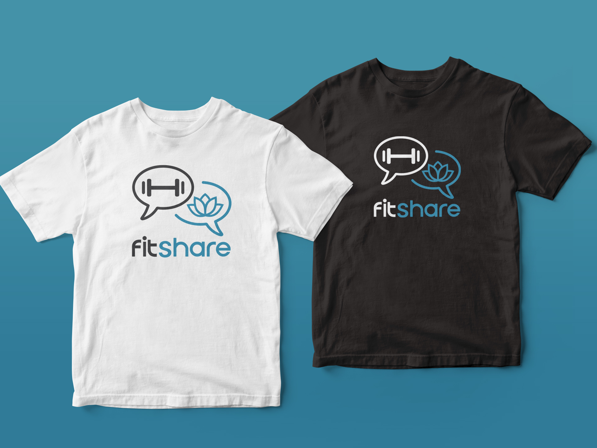
Apparel
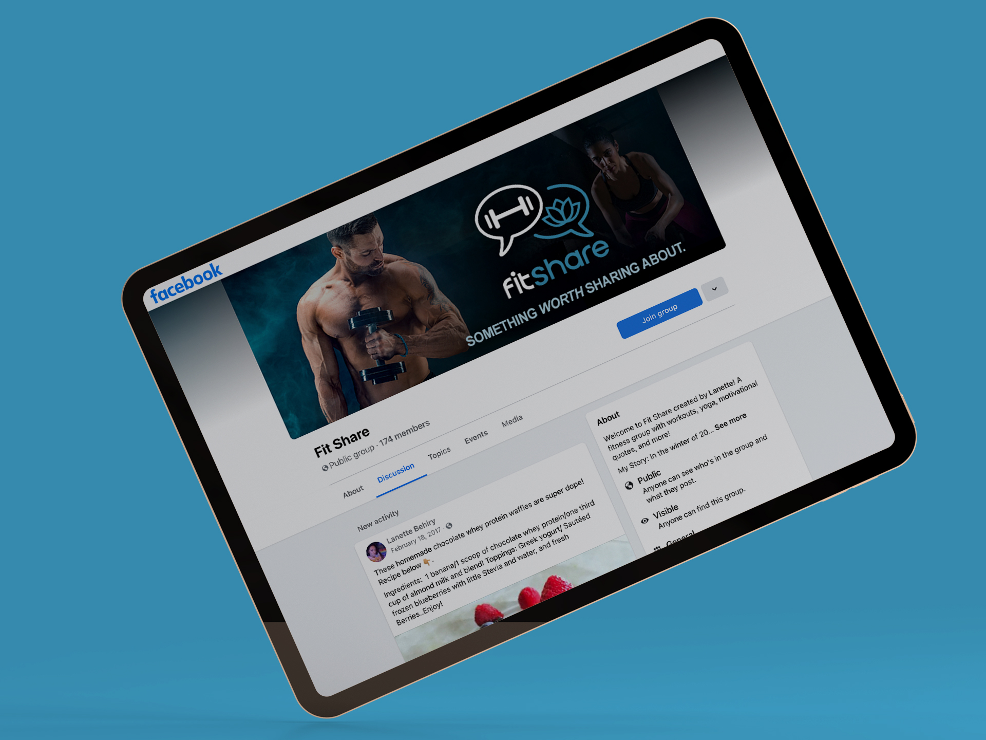
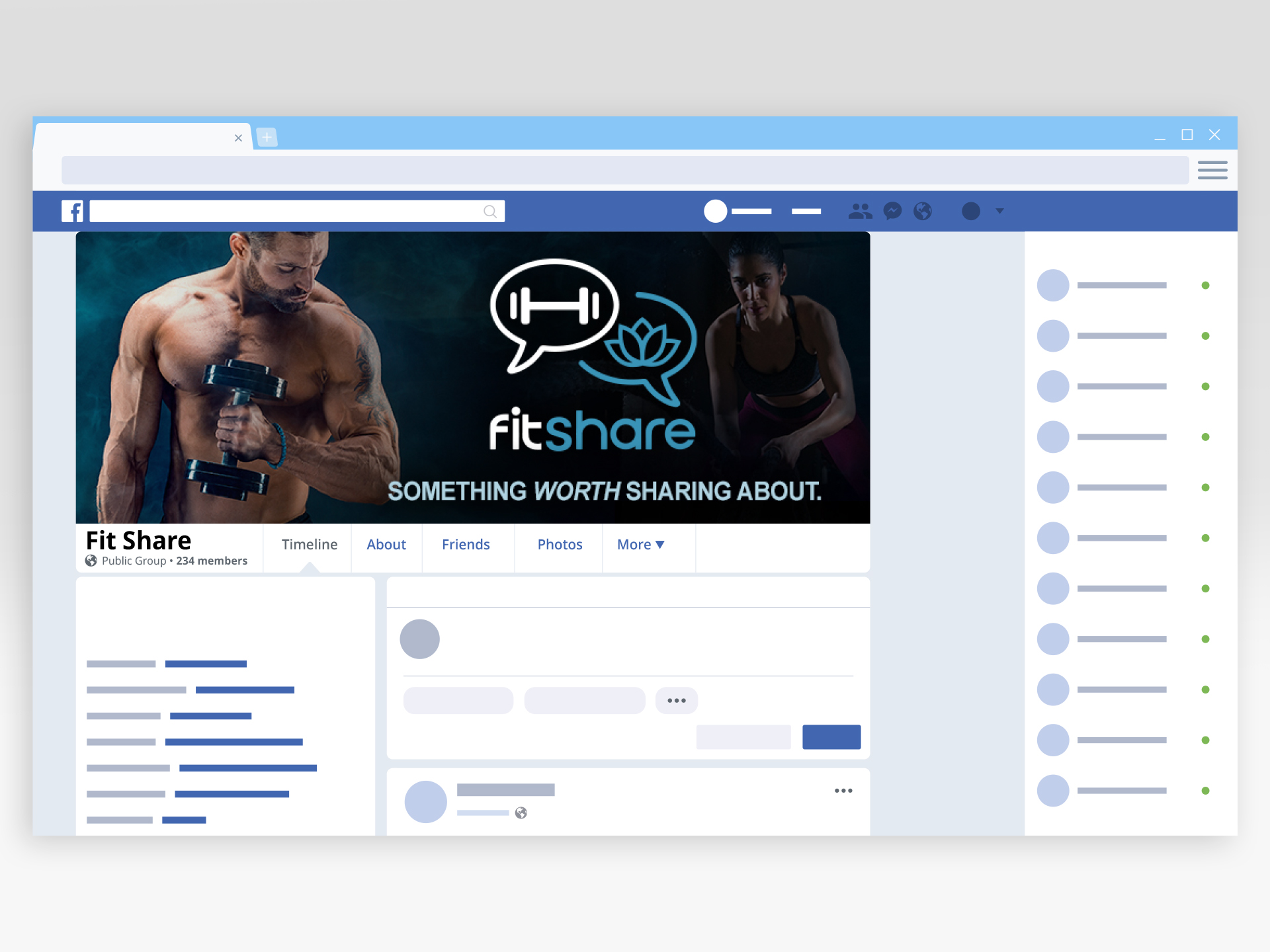
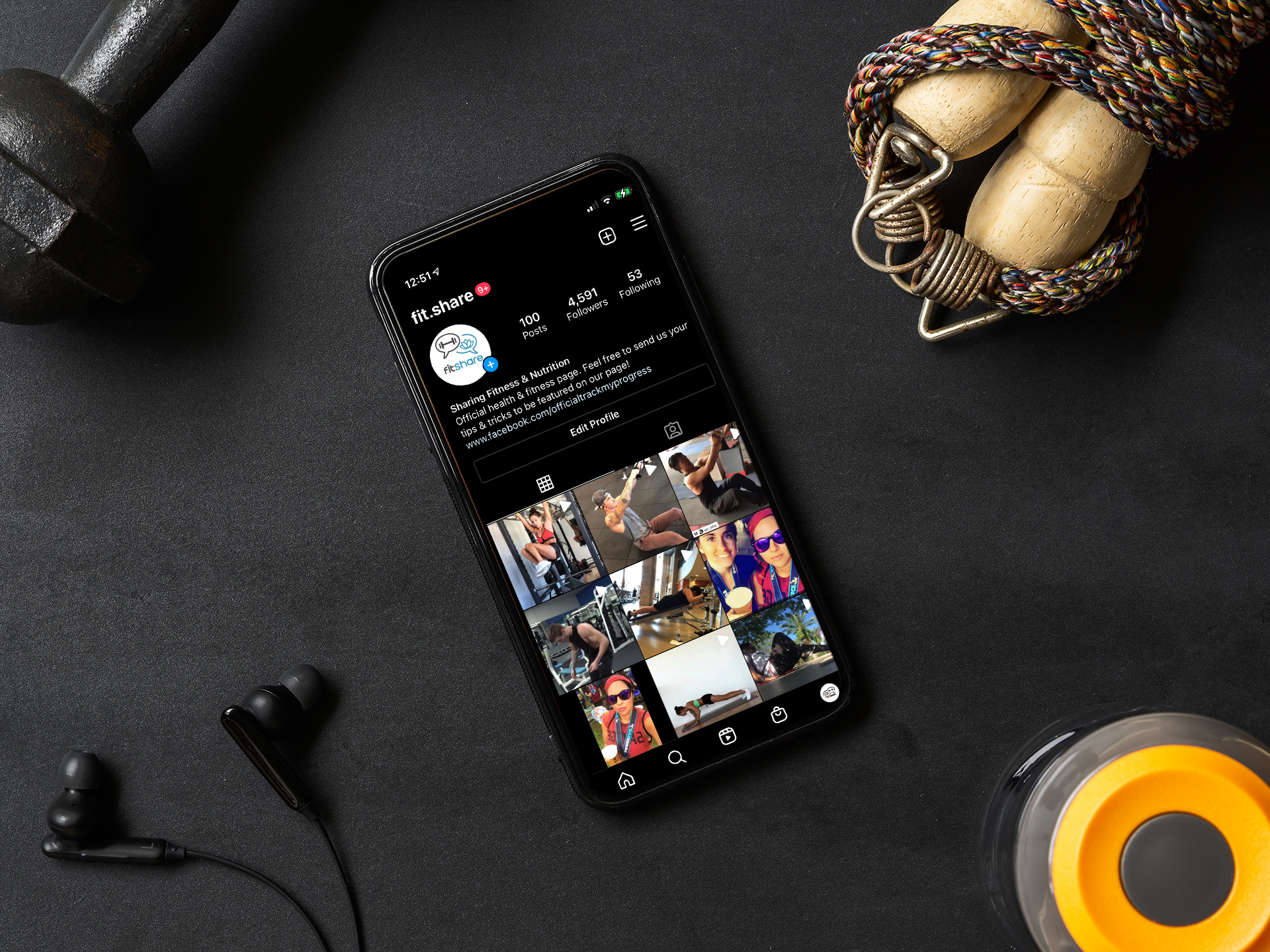
Social Media Graphics