Competitive Analysis
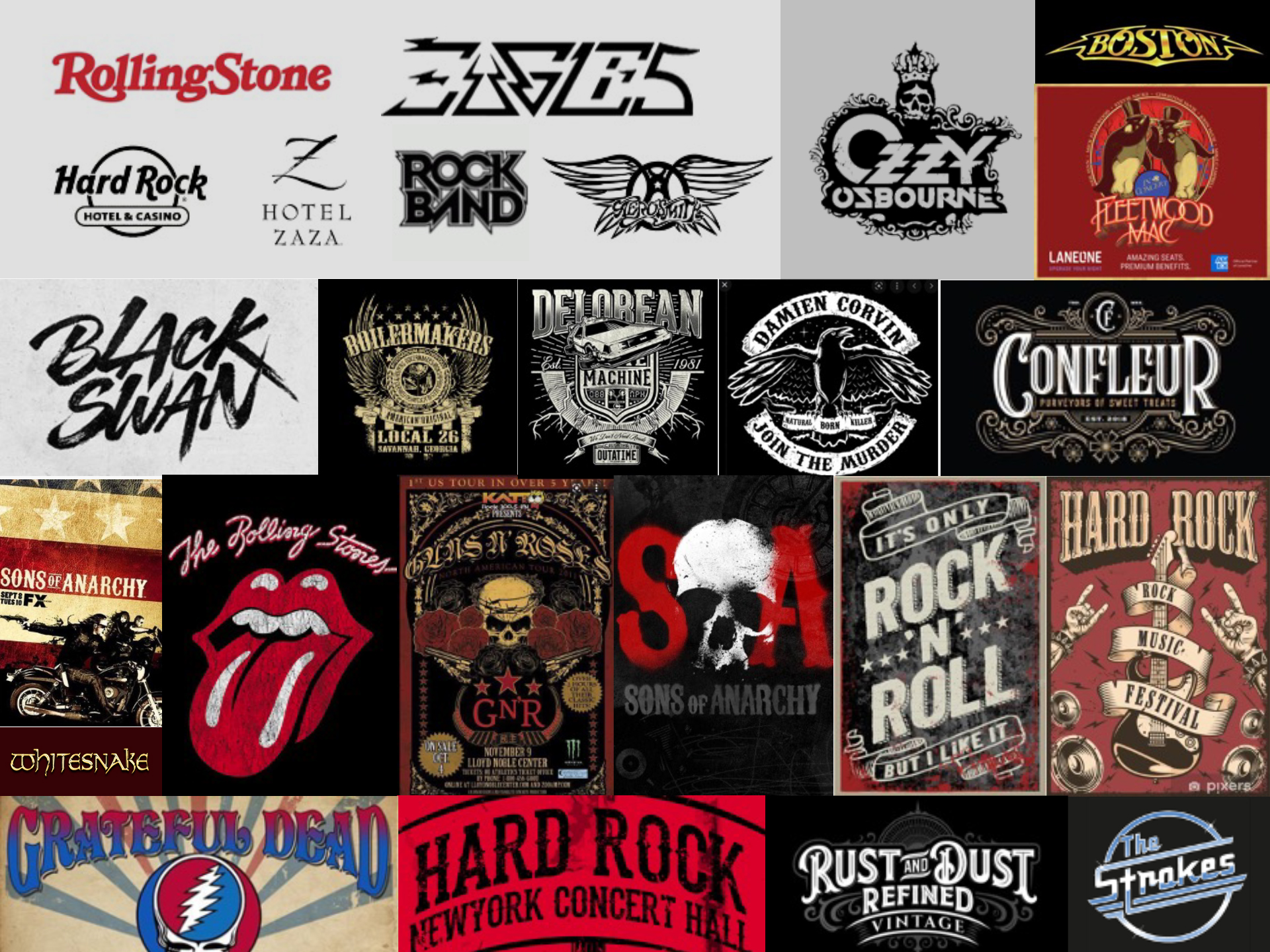
Before I embark on the development of the logo rebrand, I like to get a good understanding of the market. As part of my research, I look at different logos and branding from HTM’s competitors and similar brands in the Law Firm and personal development industry.

Inspiration
To help focus my logo solution efforts, I to engage in a logo activity with the owners to gauge what their likes and dislikes are. One thing for certain was that they did not want to have a buttoned-up corporate looking type of branding. This was one of the major pain points they had regarding the former logo. The owners gravitated to the style of that classic rock and roll image since it really embodies an attitude of being not part of the establishment, free-spirited, rebellious and bold.
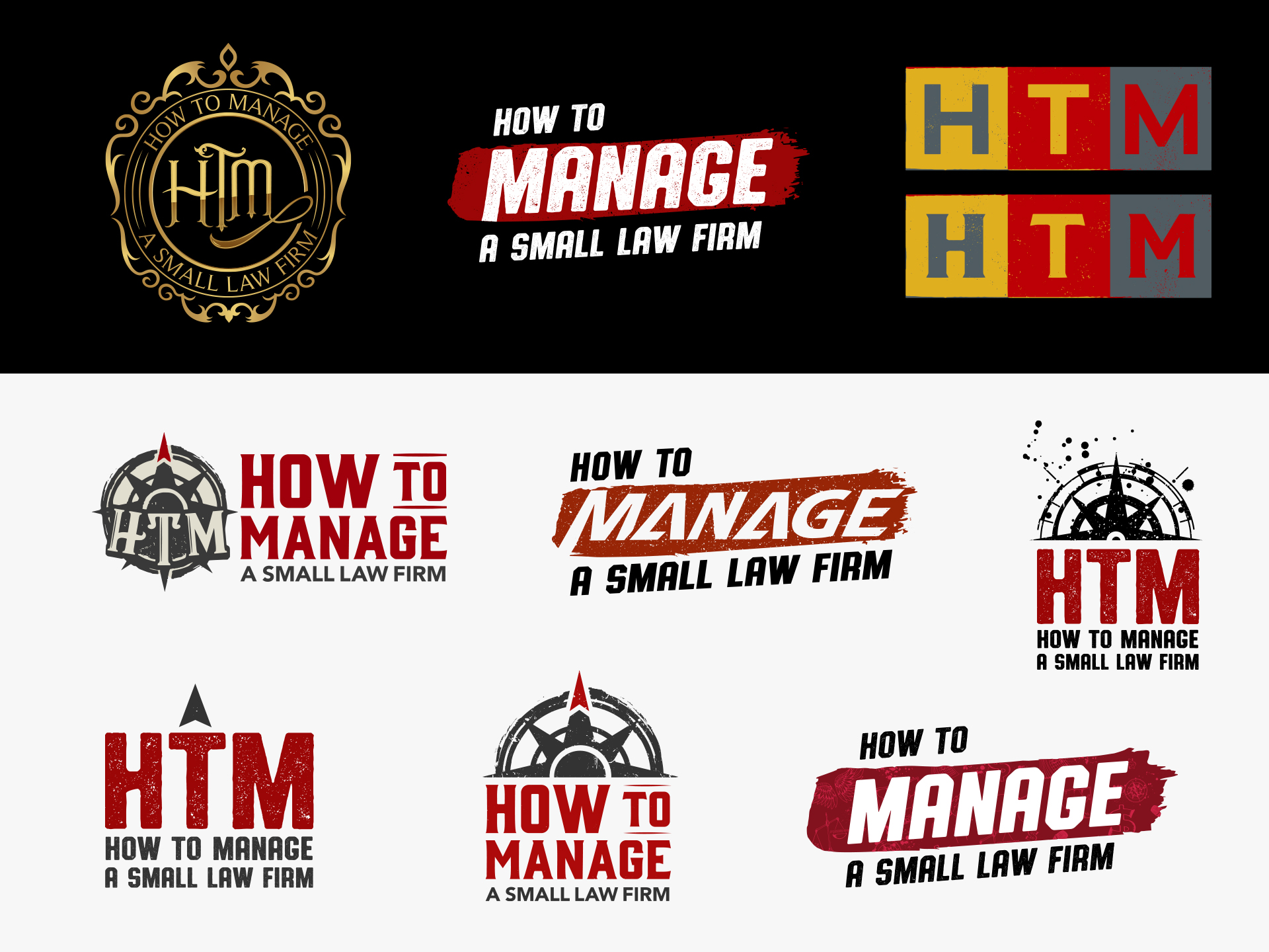
Logo Concepts
Brand Attributes: Unapologetically ambitious, bold, relevant, relentless toward goals, intentionally purposeful
HTM’s motto is that they are an inclusive community that’s exclusive because it’s for people who don’t fit in; especially people who don’t fit the norm. Rebels WITH a cause. Their comment is to providing a safe place for inexperienced entrepreneurs who are committed to growing a successful business, that happens to be a law firm.
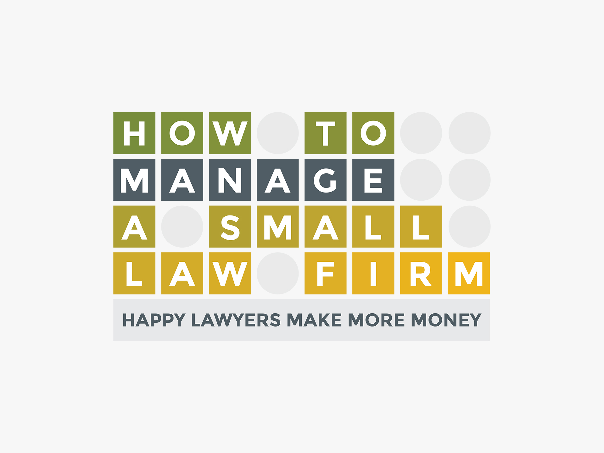
With HTM not wanting to be viewed as part of the “establishment,” it was imperative that logo reflect that in the look. This logo did not hit these objectives and so it was imperative to rebrand. After doing some brainstorming with RJon Robins, the owner of How to MANAGE a Small Law Firm, we moved in the direction of having the logo reflect a very rock and roll style. Below are some initial drafts that were created to reflect this look and feel.
Former Logo
The original logo uses very traditional looking type along with pretty bland imagery, the company knew a rebrand was necessary to reflect the true nature of their business – which is anything but traditional.
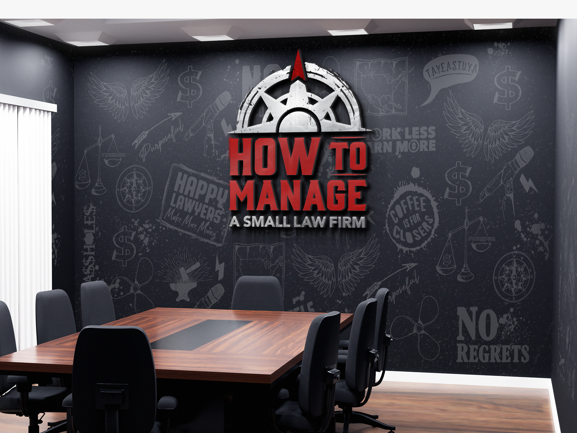
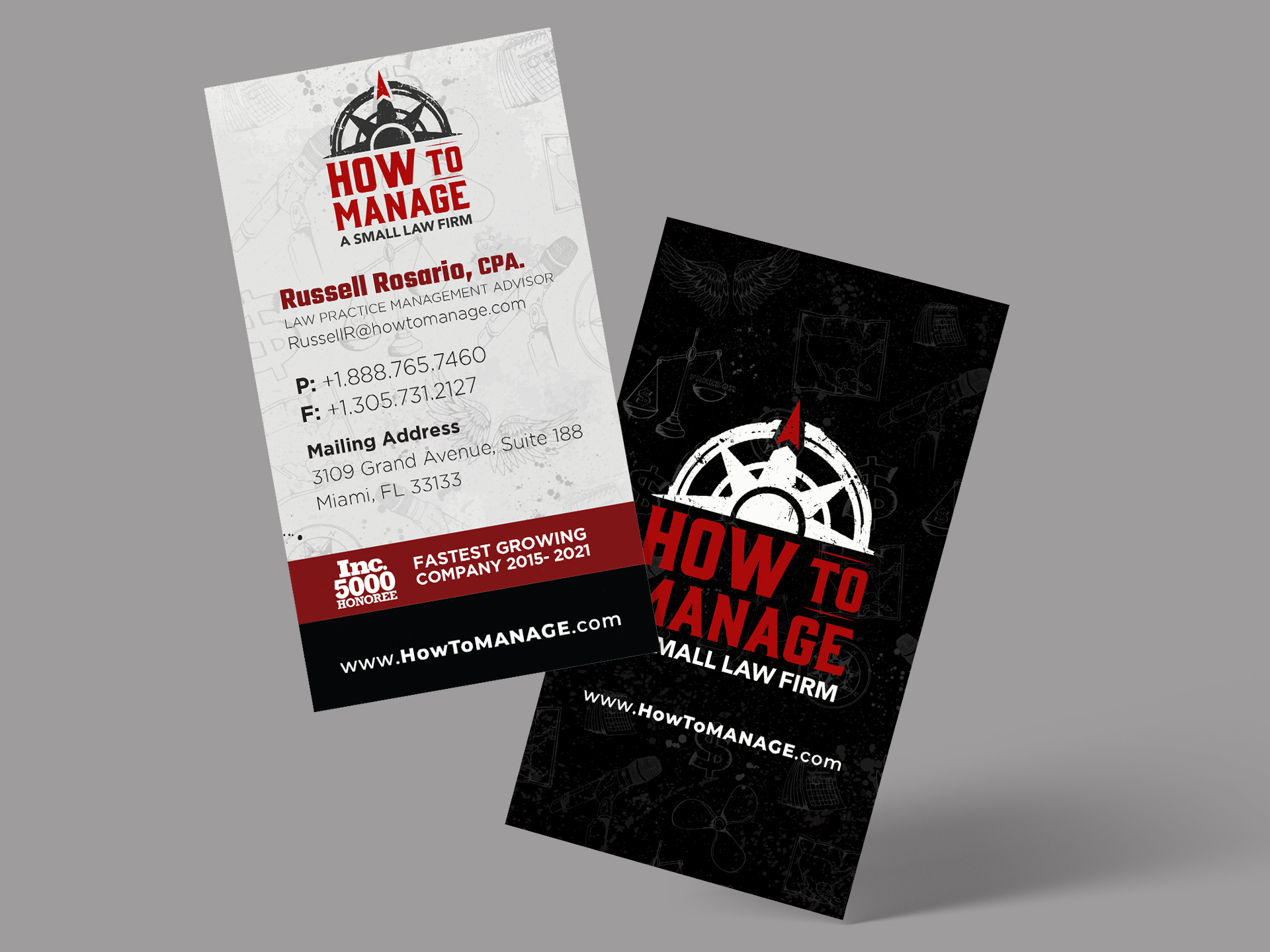
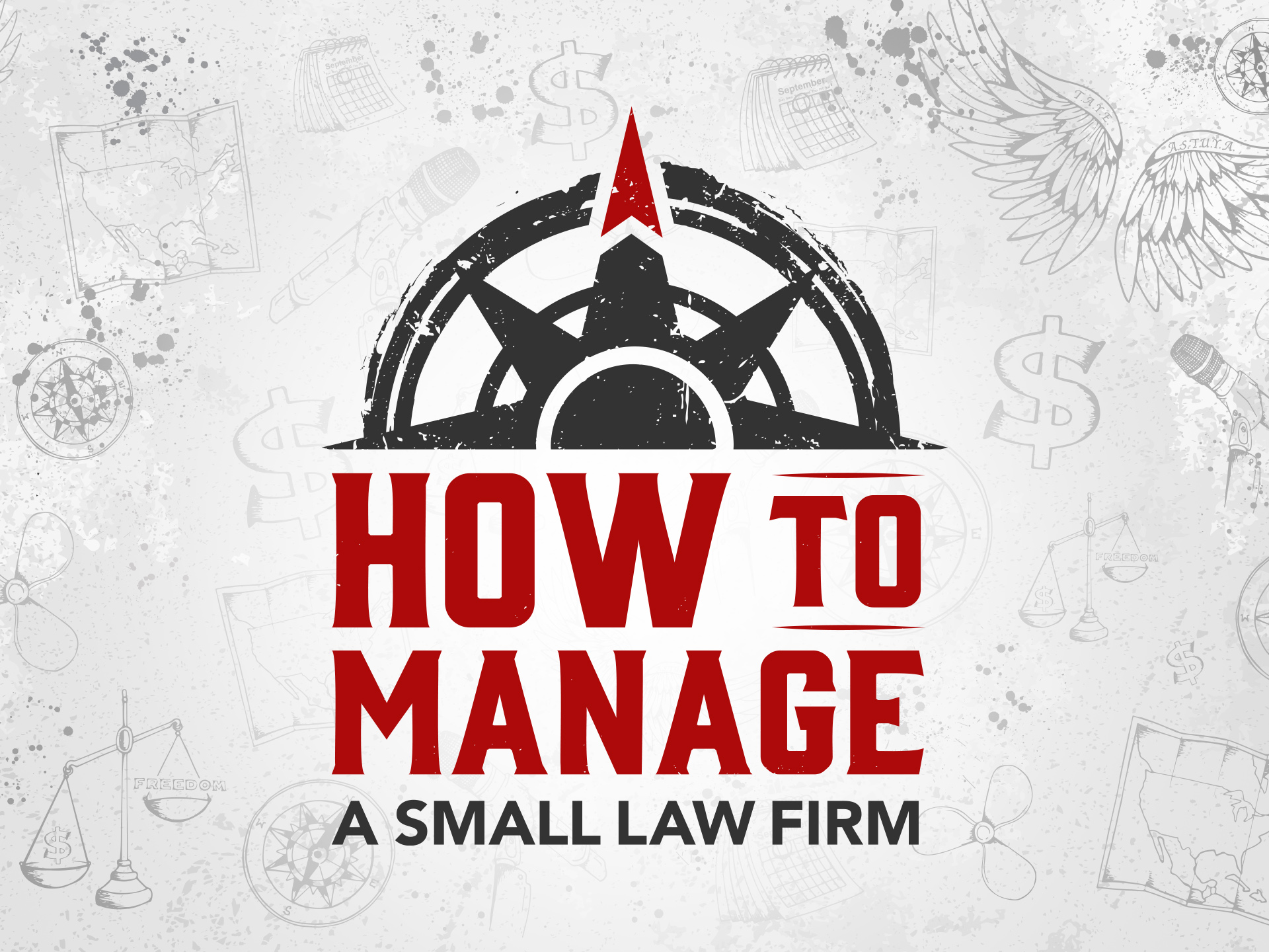
Final Logo
The red marker above the compass represents true north. Finding true north is essential for accurate navigation. Similarly, HTM acts as a true north for their members by guiding them in the right direction of their business and personal goals.
Color scheme
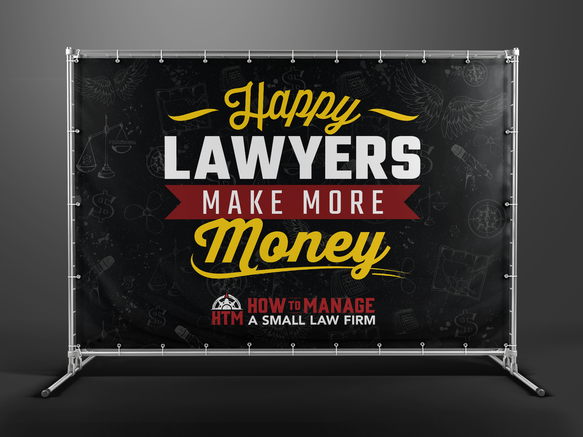
The grey and red color palettes compliment one another creating a very bold look that is very rock and roll. The color red in the logo represents blood. Since creating a successful business is no easy task and requires blood, sweat and tears. In other words, HTM is not meant for lazy people who aren’t willing to put the work in.
#ad0b0b – Rufous
#333333 – Jet
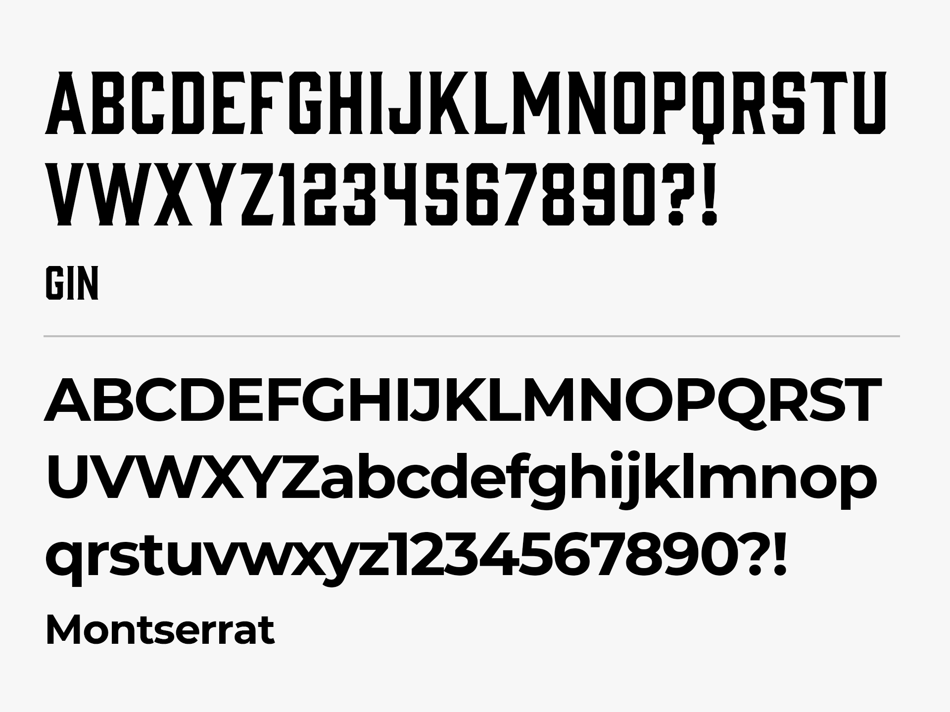
Typography
The font was selected for its bold energy to match the same energy that HTM portrays as not being timid but unapologetically relentless towards their goals. Also, the thickness of the font symbolizes HTM’s strength to uplift and empower others.
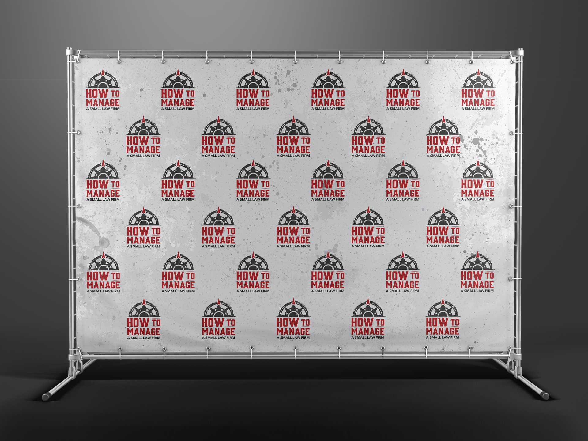
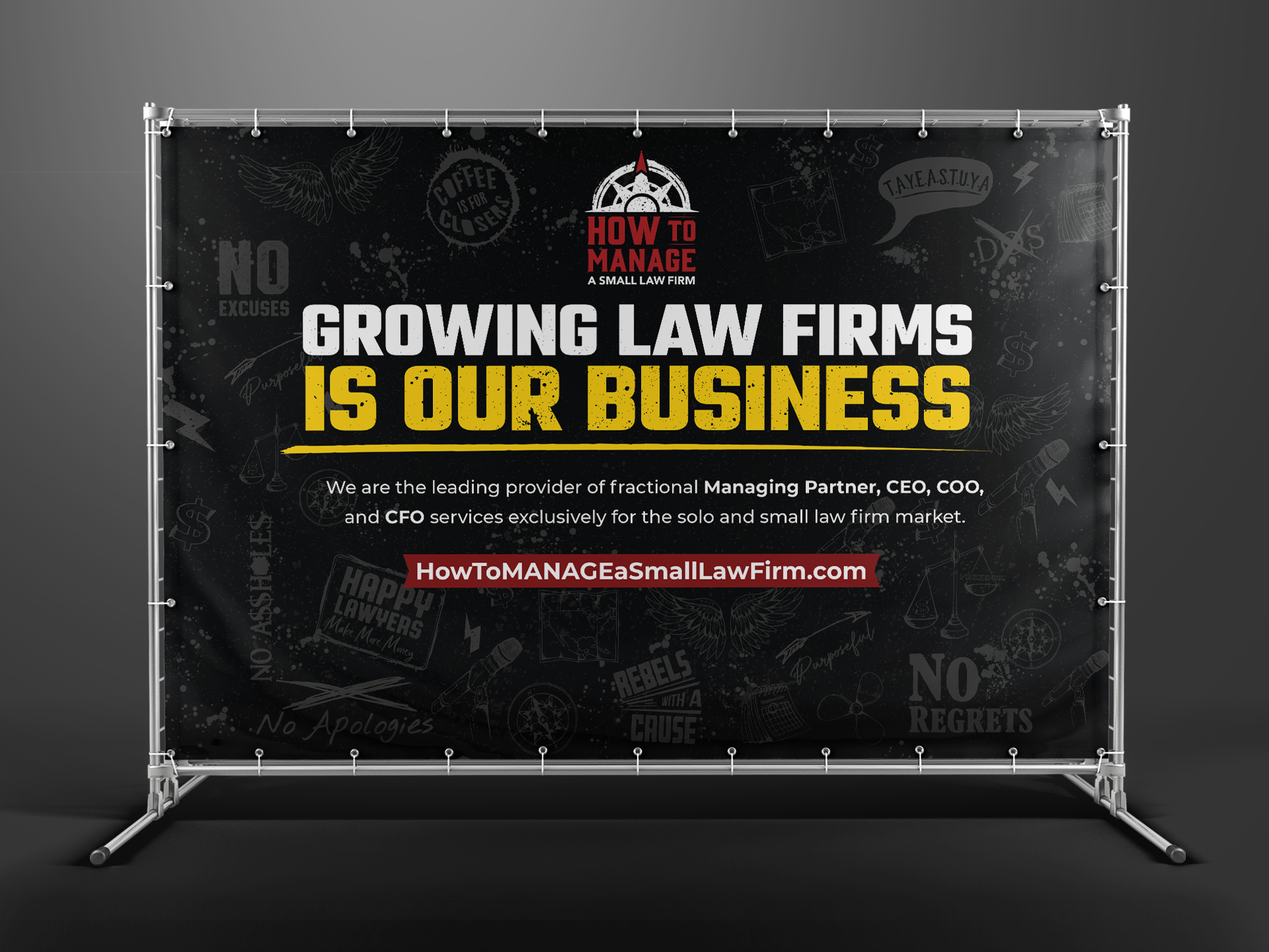
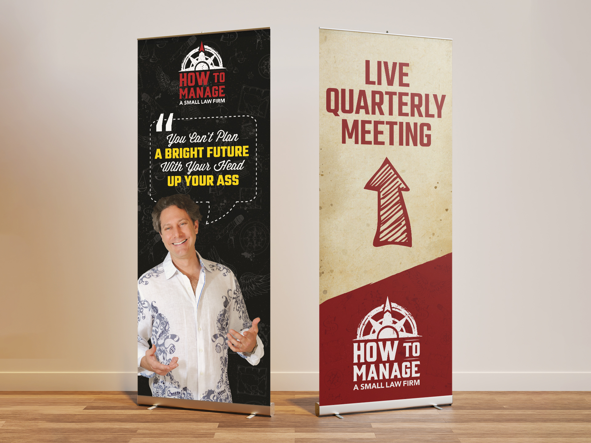
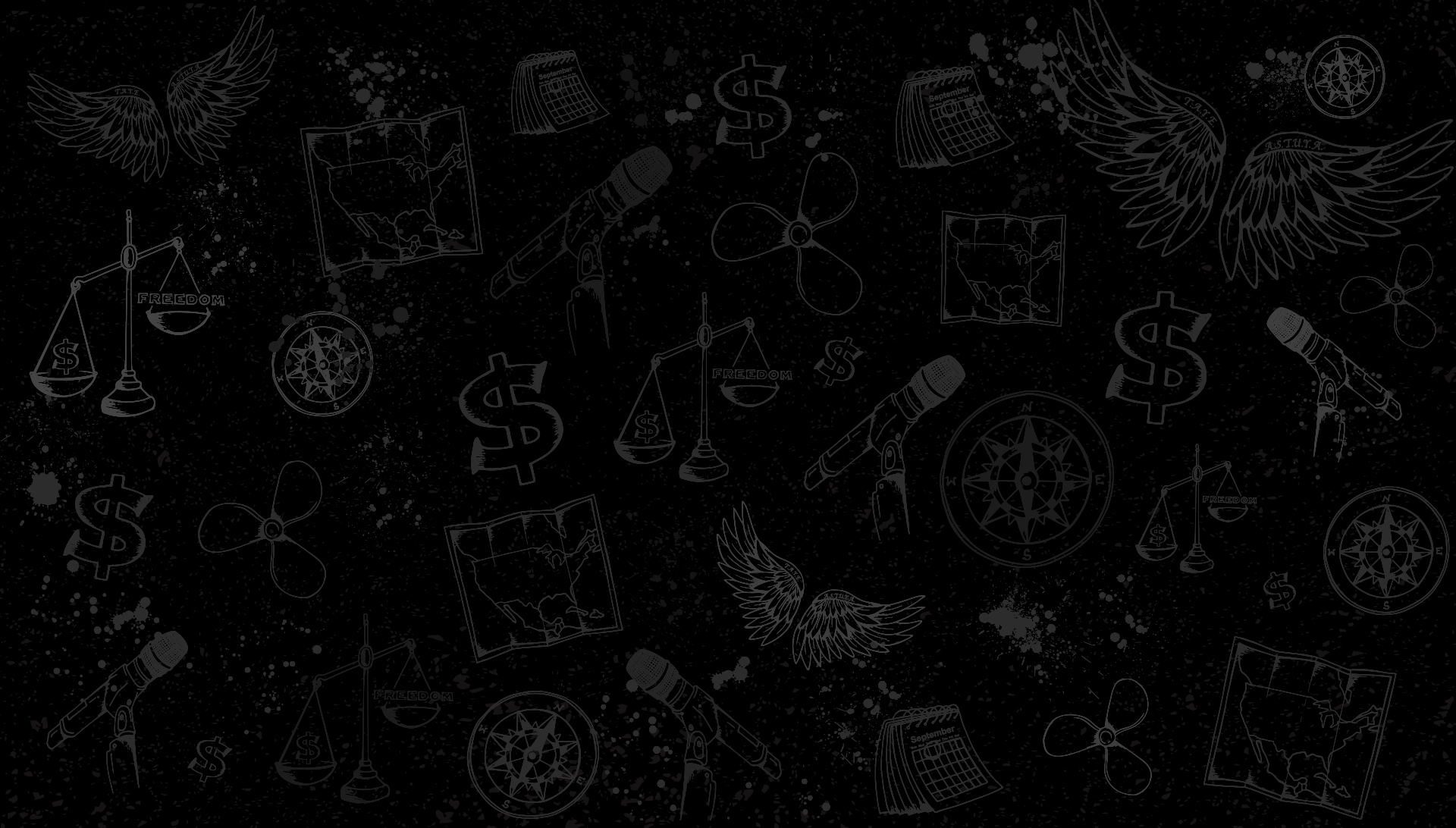
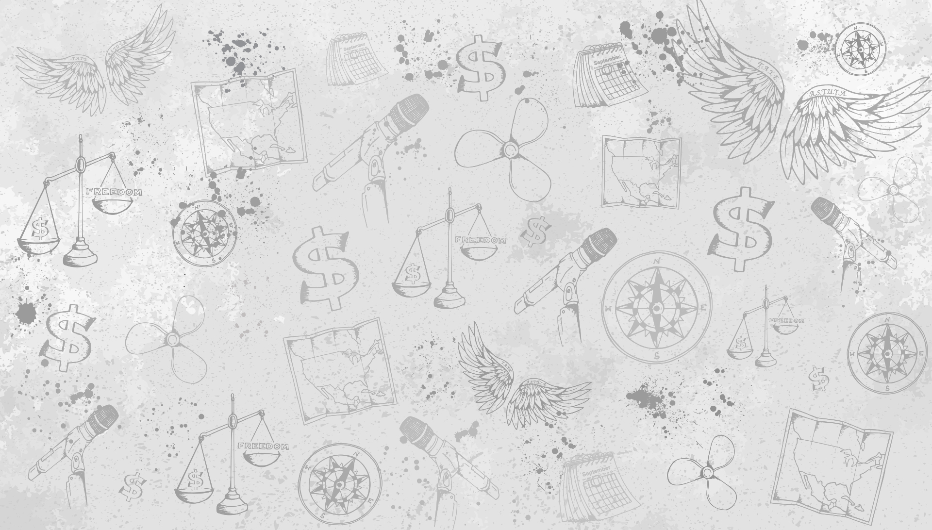
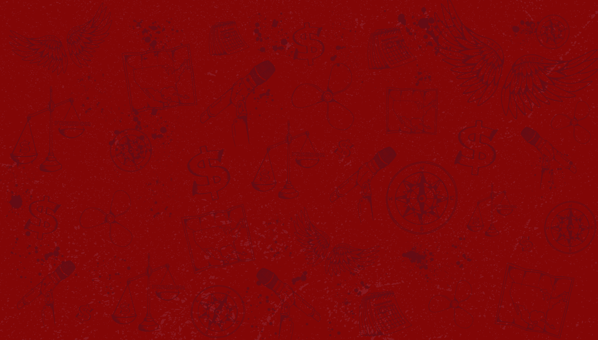
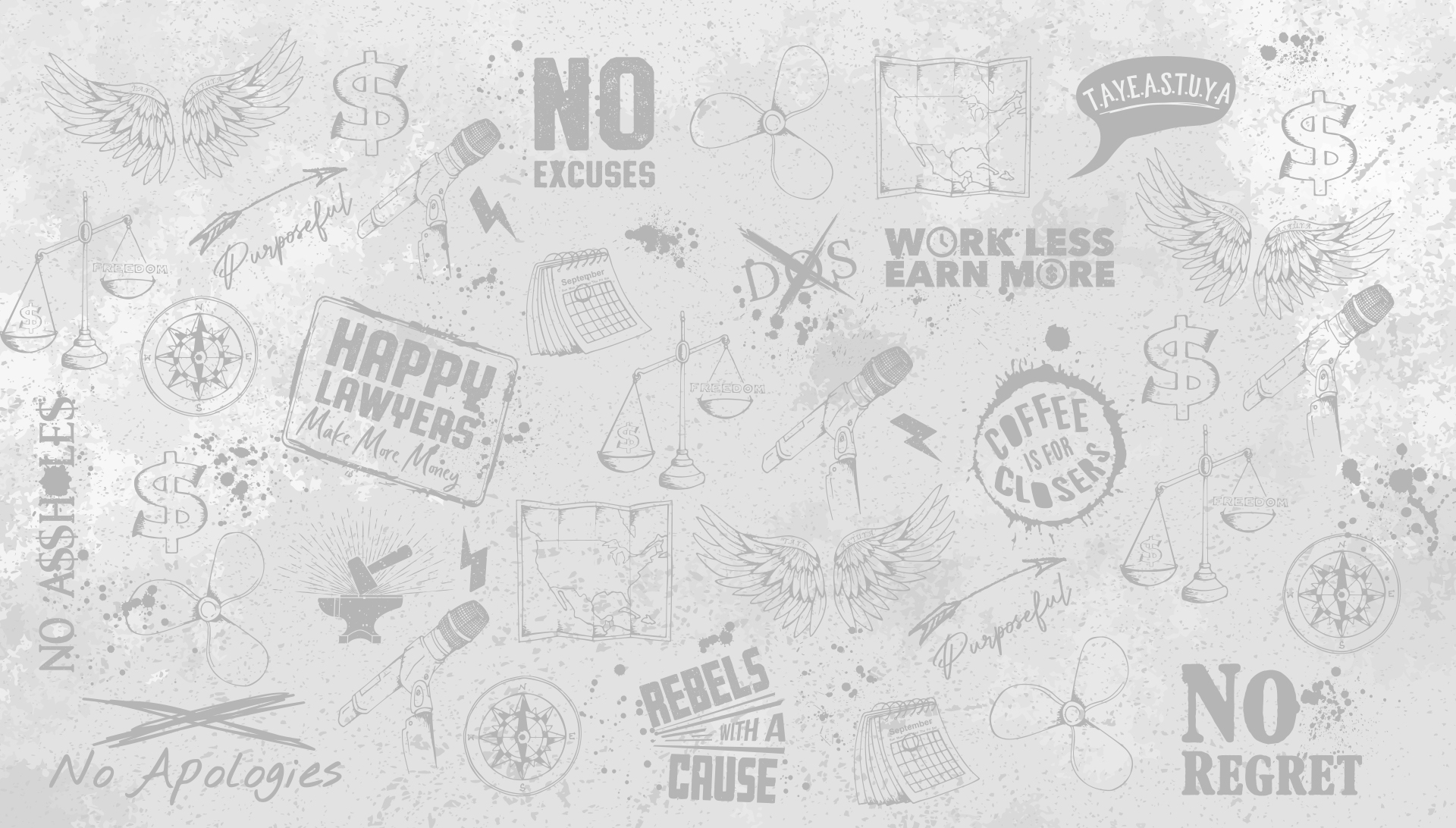
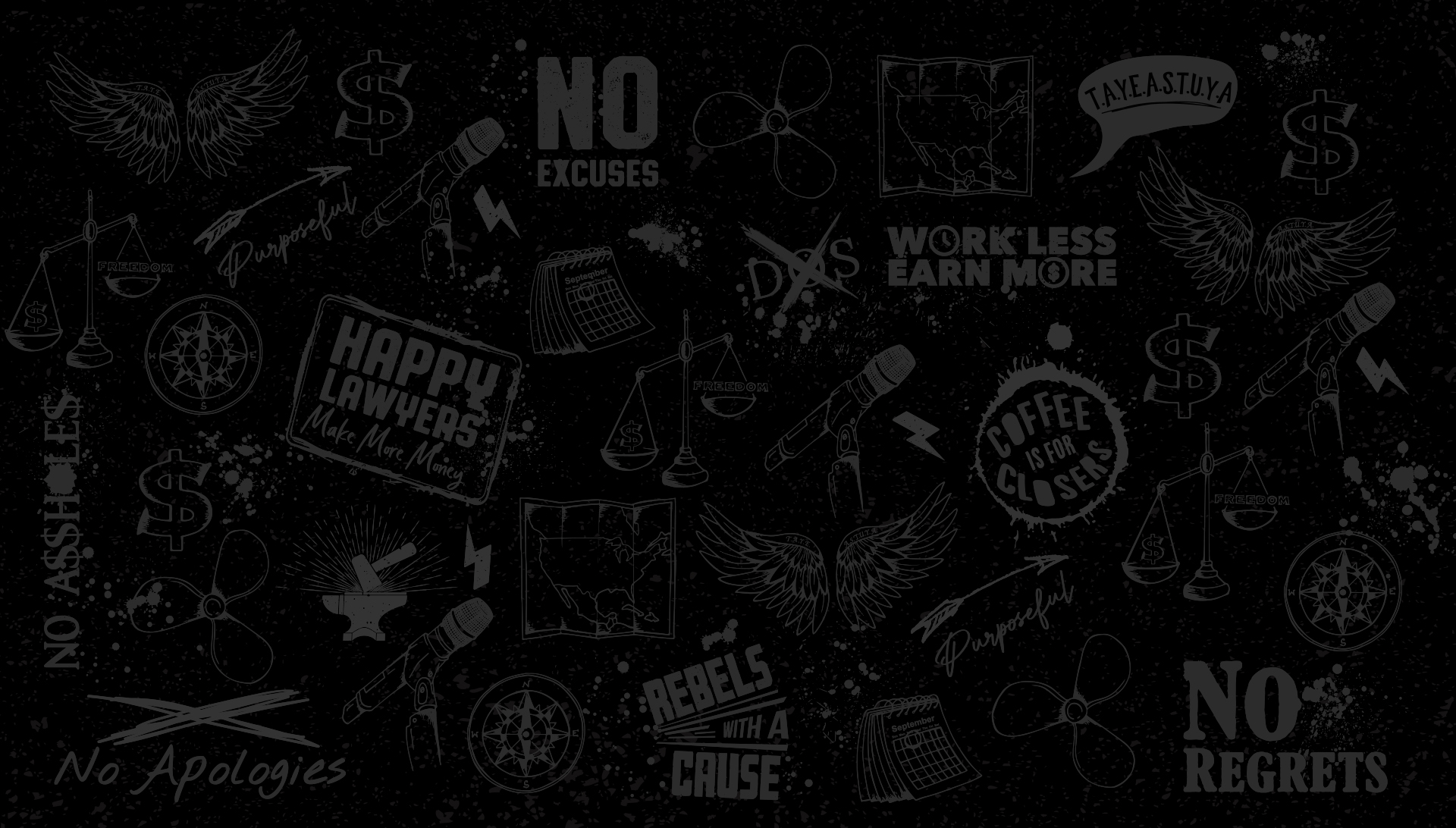
Branded Pattern
In addition to the logo, HTM also wanted to have an accompanying brand pattern to make the brand easy to identify and be used on all graphic materials.
Similarly to the logo, the goal was to have a design that really conveys that rock and roll feel. It needed to feel gritty and really bring out the personality of the amount of work and drive it takes to push a clients business to the next level. That it isn’t always pretty and you will get your hands dirty. First part of the process was creating various illustrations to be used as the pattern. Each icon represents something special for the RJon’s journey and meaning of his life.
The scales of justice is to communicate that the freedom is more important to him than money. The microphone is his legacy and origin story, he made the life for himself by speaking into a microphone. The propeller is about his love of boating and being self-propelled. The compass signifies of knowing where you are going. The calendar is to symbolize the fact that we have a limited amount of time on our hands and also circles RJon’s sons birthday. The map pays homage to all of the locations RJon spent traveling cross-country pursuing his career and goals. The wings which represent freedom, says on it “T.A.Y.E.A.S.T.U.Y.A. which is an acronym for “Take All Your Excuses And Shove Them Up Your Ass” which he claims is the where your freedom lies. Additional icons were created mirroring the company’s personality and mottos.
Version one of the brand pattern used only the icons with some ink spats. Which was inspired from the companies manifesto. Then created variations of the design available in light grey and red.
Next, I added an alternate version that uses some of HTM’s catch phrases that have been used in their manifesto along with terms that have been used at different events and other marketing communications.
Branding Guidelines
Brand Implementation