Competitive Analysis
Part of my discovery before getting started on creating a logo for Munay, is to take a look at local and top competitors in the industry. I look at messaging, typography, color and layout to get a good idea of common similarities across different brands.
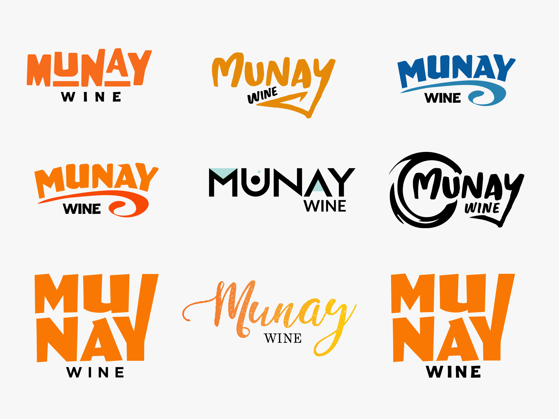
Logo Concepts
Brand Attributes: Traditional, Quality, Bold
After conducting research on the competitors and searching the internet for inspiration, I came up with some logo concepts that reflects Munay’s brand and objectives.
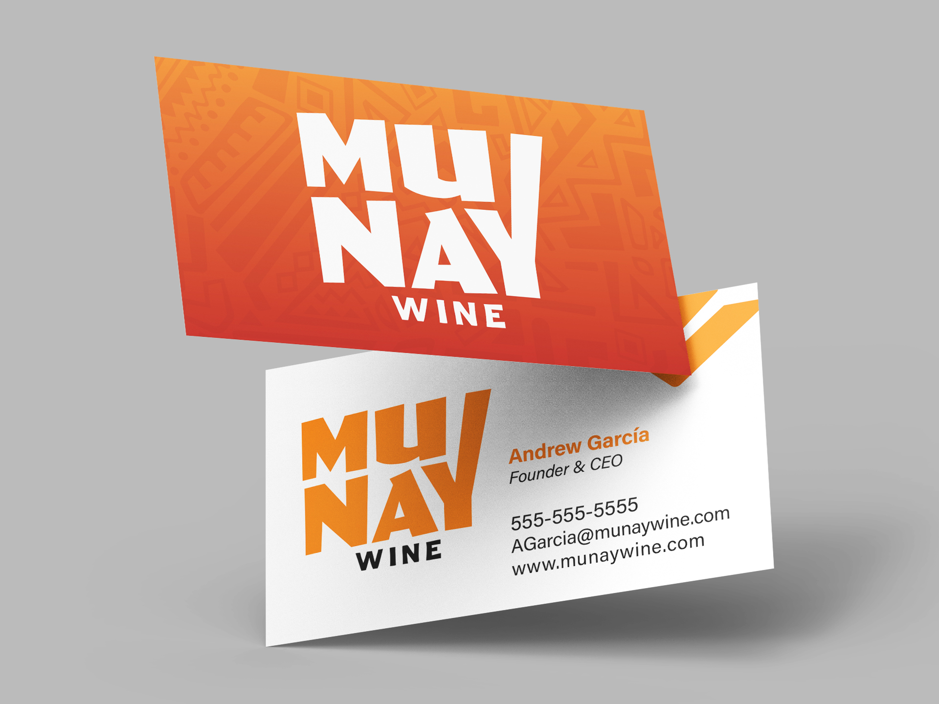
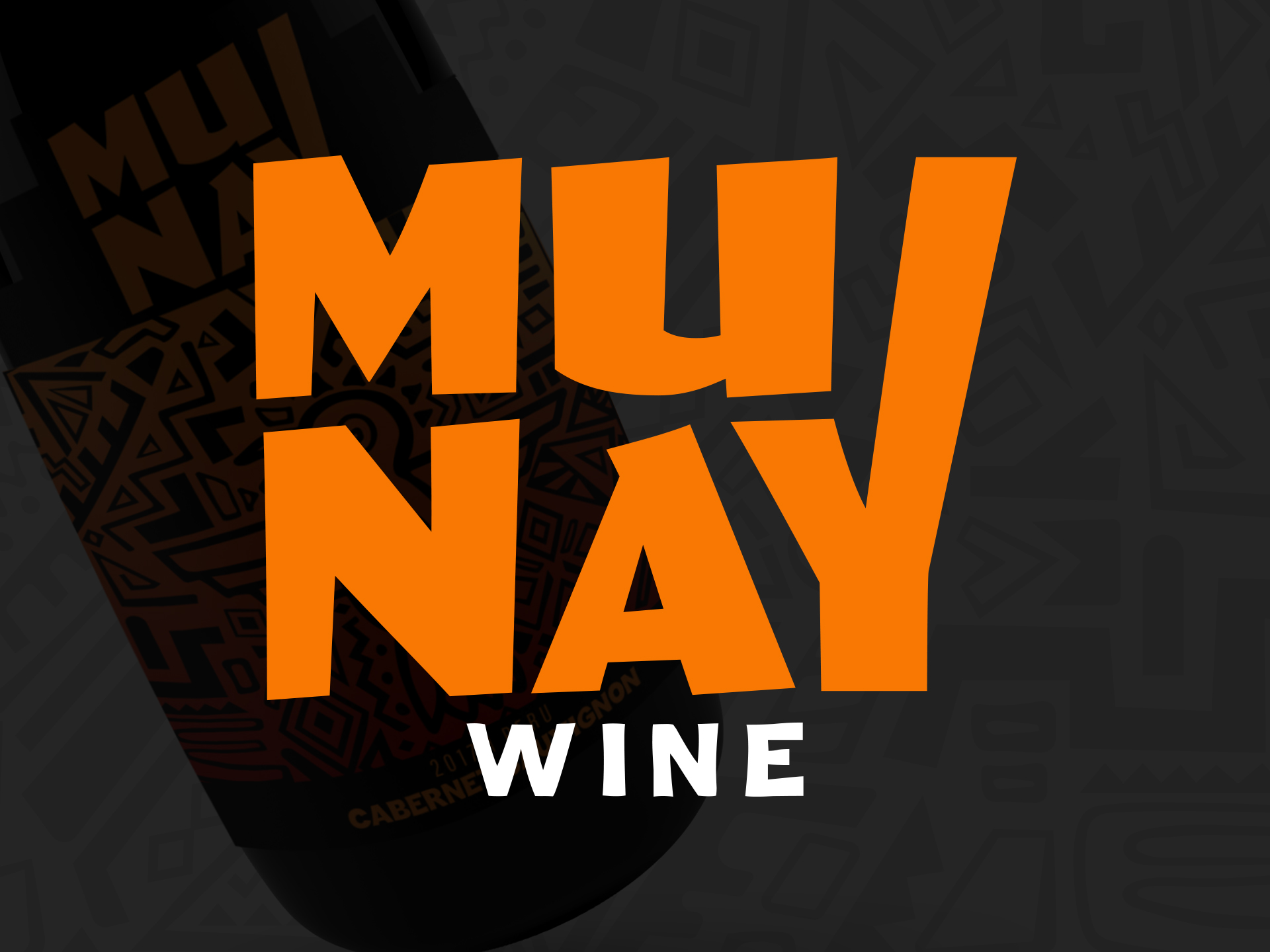
Final Logo
The logo was designed to be flexible, legible and impactful. It hits the mark with being bold but also has a playful quality with the letters being stacked to create a break similarly to a syllable which creates visual interest in the design that is meant to resemble shapes formed in a tribal like pattern.
Color scheme
In my research of color, I realized that the color in the Túpac Katari Indians, and indigenous tribe in the upper regions of Peru, viewed orange as a representation for tradition and society. Eastern traditions, view the color as family and love. This really resonated with Munay’s brand attributes. The secondary color red, provides creates a nice compliment for the orange and is a nod to the flag of Peru.
#f97803 – Heat Wave
#a10202 – Rufous
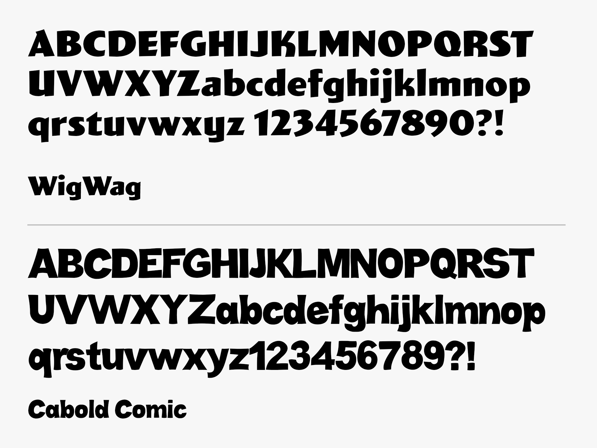
Typography
The fonts selected are bold but joyful and exuberant that are meant to stand out in a highly saturated market. The typography has dynamic lines that extend out that create these interesting dynamic shapes that move and dance in celebration to reflect the energy of the Inca people.
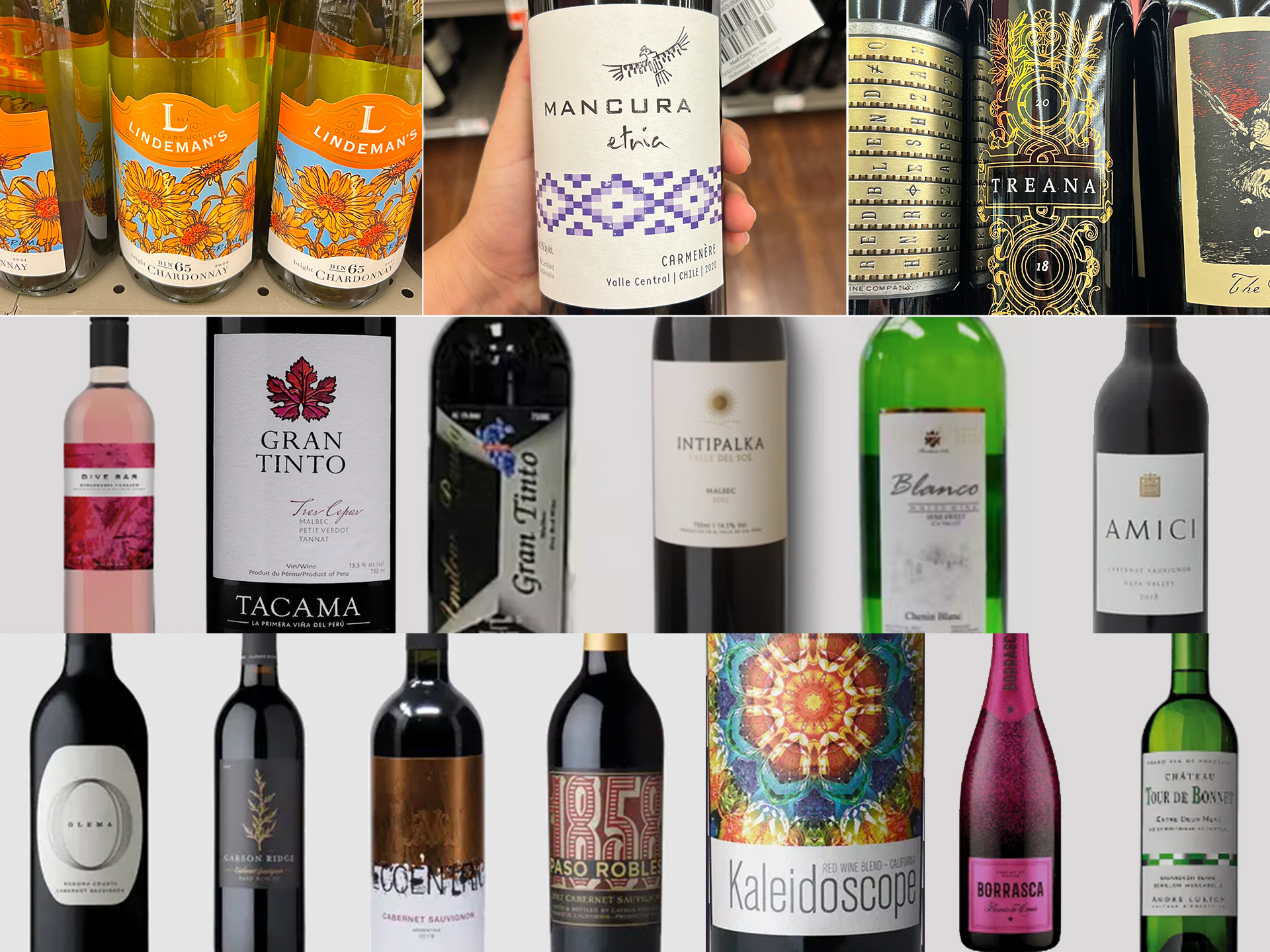
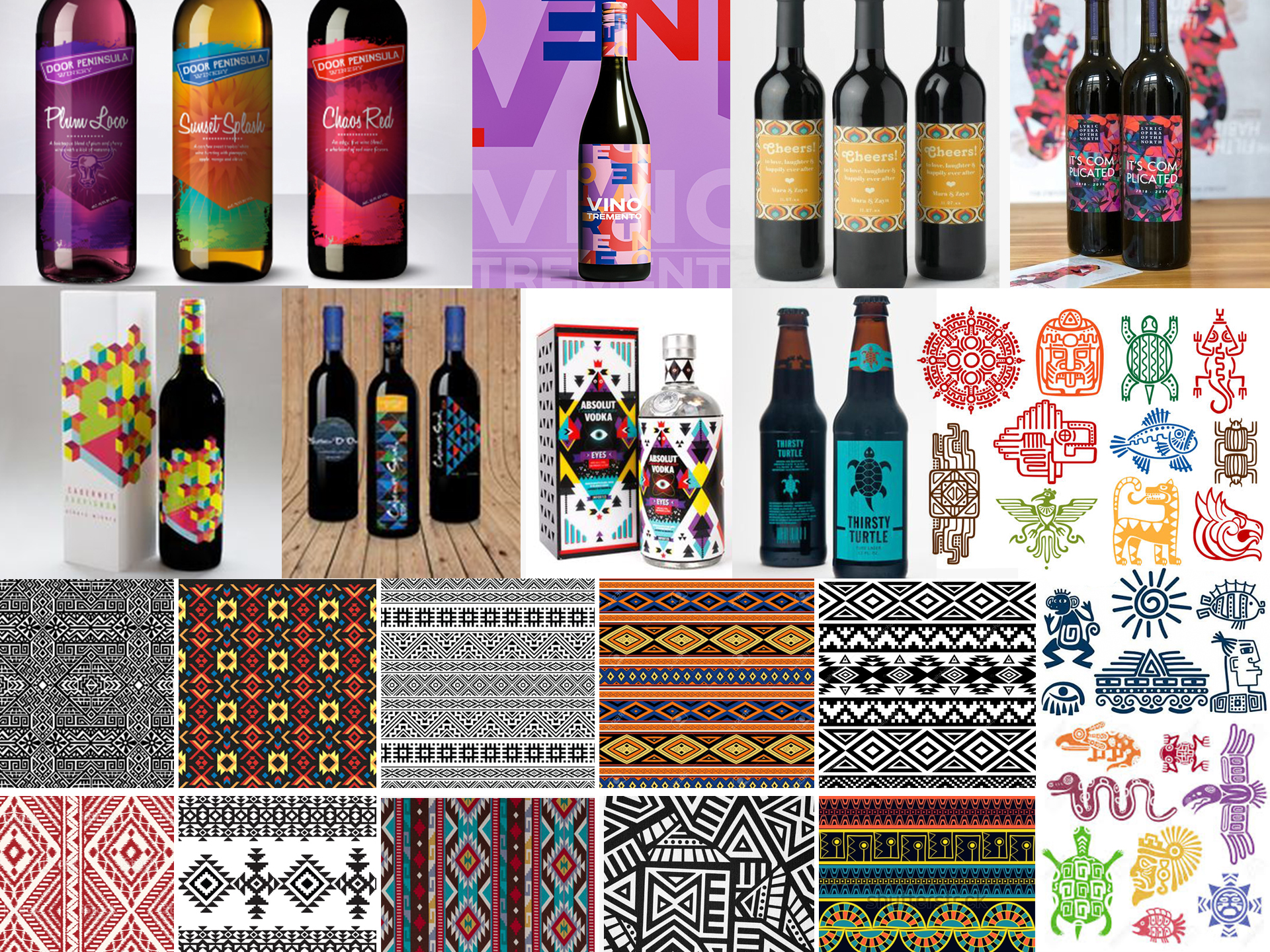
Packaging Competitive Analysis
In addition to my research of competitors in the industry, not only did we focus our attention on type, color and messaging but their packaging and layout. I analyzed the top competitors on a local and global level to review who were the top sellers for wine. An interesting discovery I made was that most of the wines coming from Peru had a very basic packaging design. We decided that a great way to stand out from the competition was to have a lot of color and artwork on the packaging.
Inspiration
After having a good sense of the competition, I searched the internet for inspiration. I reviewed interesting patterns, layouts, and color to provide me some direction for how I wanted to create the packaging for Munay.
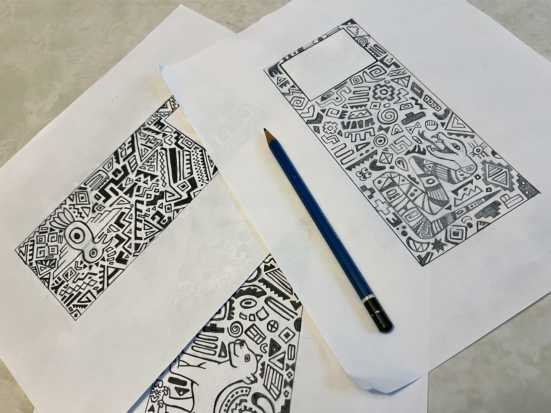
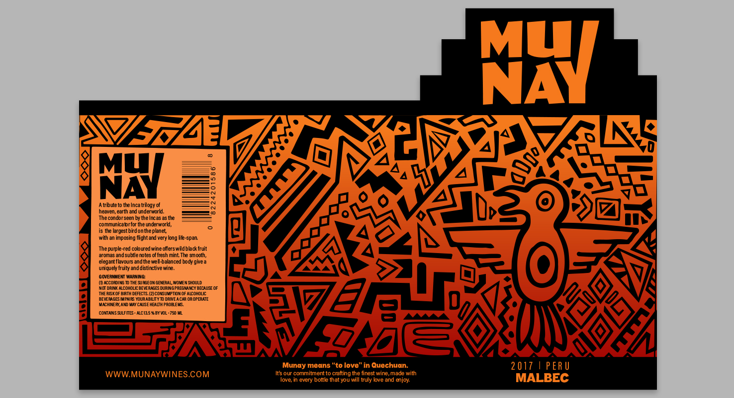
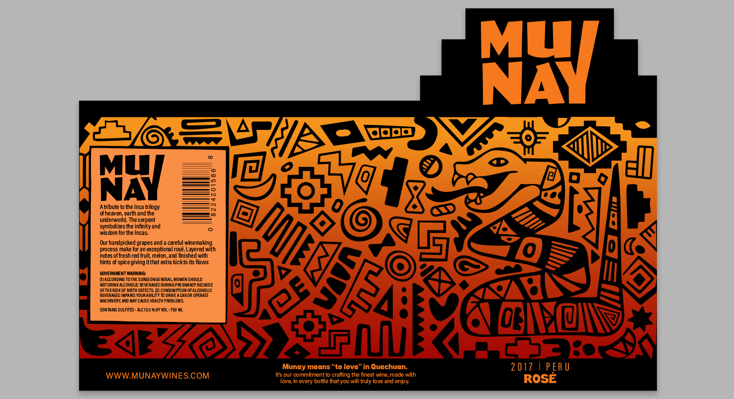
Packaging Design
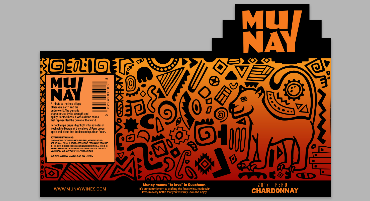
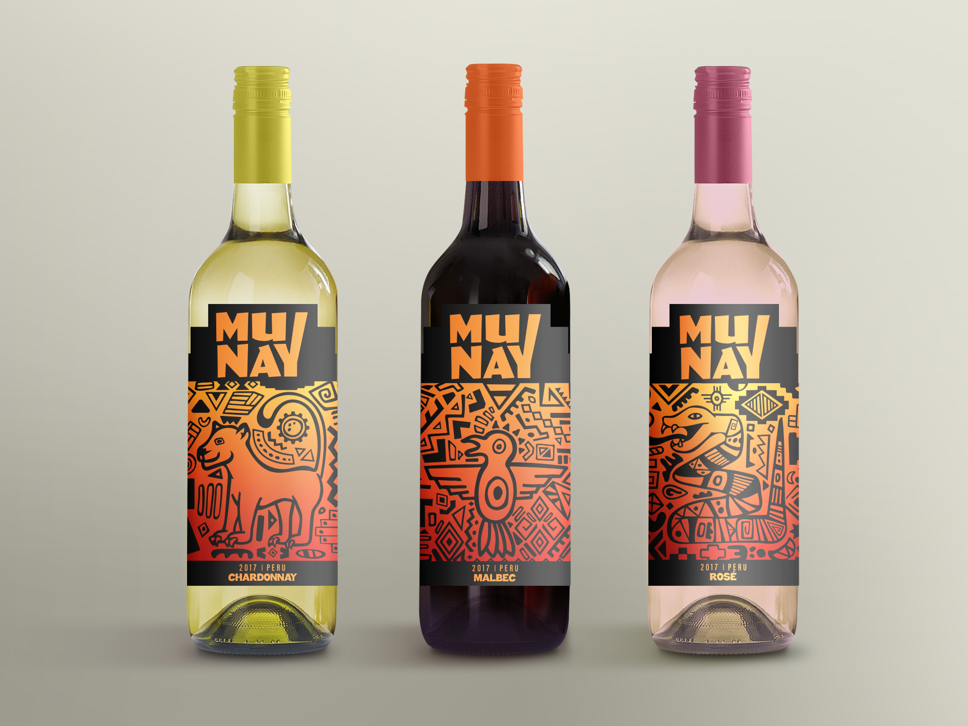
The images below showcase the progression from start to finish of the design for the labels. Every illustrated pattern for the label was drawn on paper, scanned, then vectorized. The shape of the label up top where the logo sits represents a tribal pyramid. Each label pays tribute to the Inca Trilogy, which consists of three sacred animals of the Incas: The condor, puma and serpent. Each have a symbolic meaning that represent: the heavens (Hanan Pacha) where the gods reside, the earth or world of the living (Kay Pacha) where we humans inhabit, and the underworld (Uku Pacha) or the world of the dead.
Branded Icons
These shapes were inspired by some of the native symbols seen across historic relics found in Peru. The branded elements created, in addition to Munay’s logo, establishes a distinctive look for their brand that can be easily recognizable when applied across any of their advertising materials.
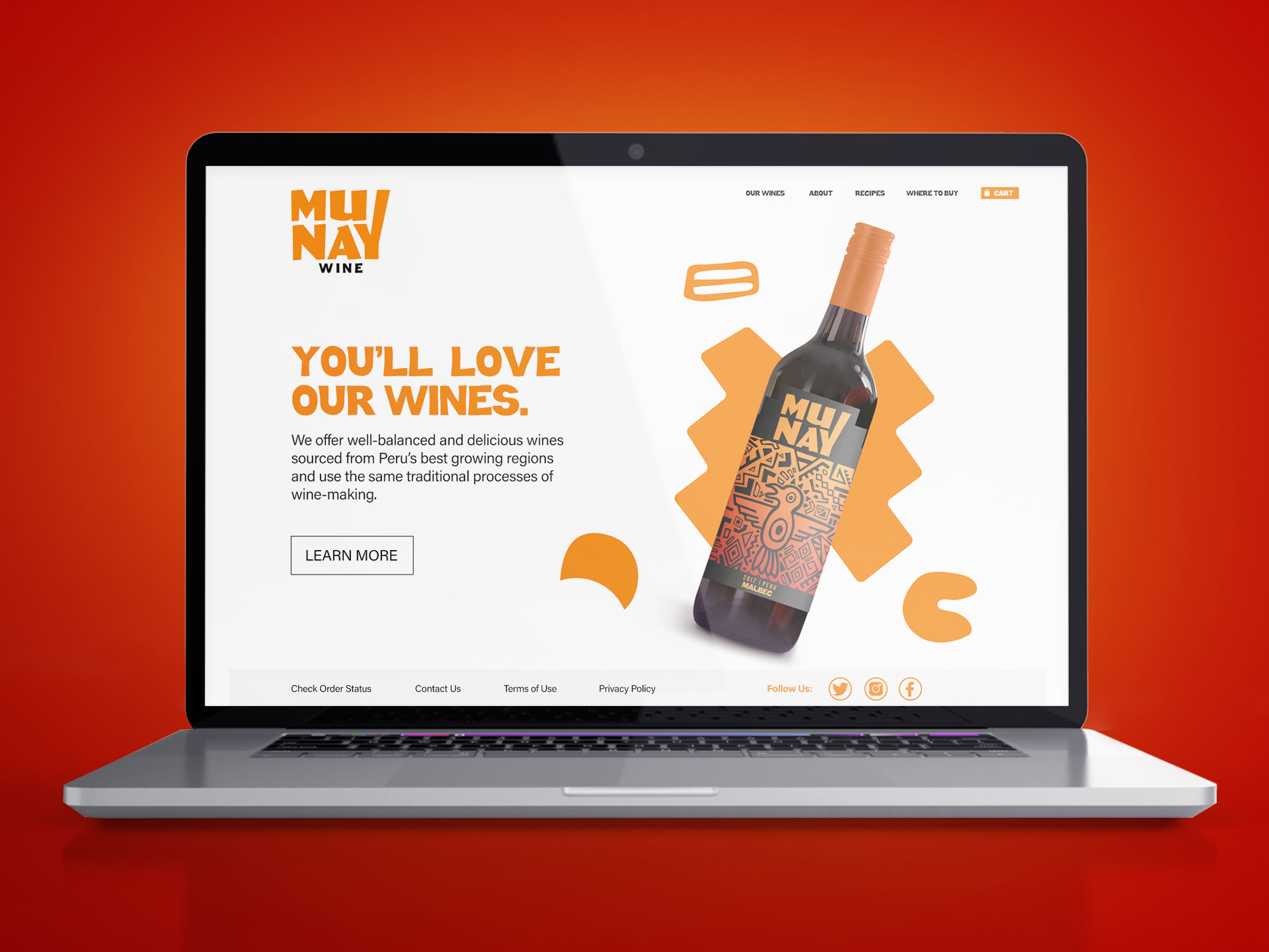
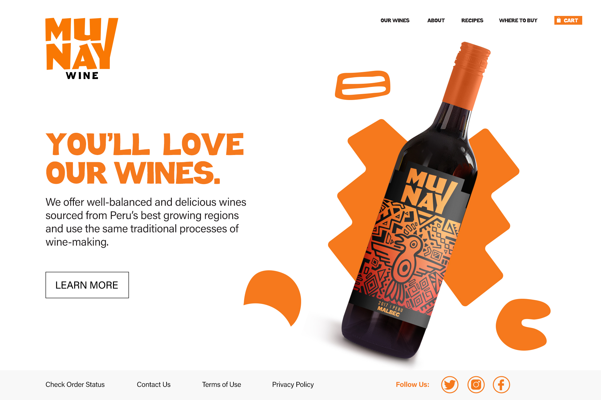
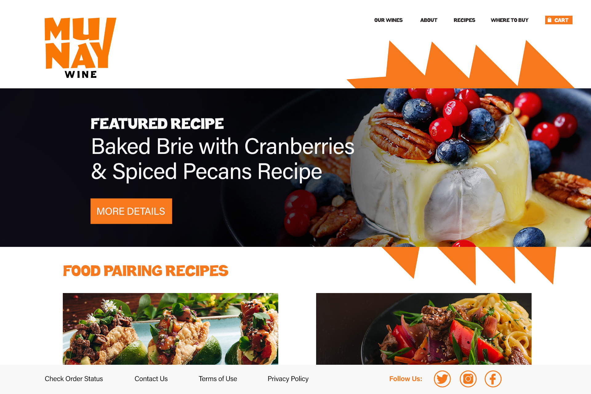
Printed Collateral & Website Design