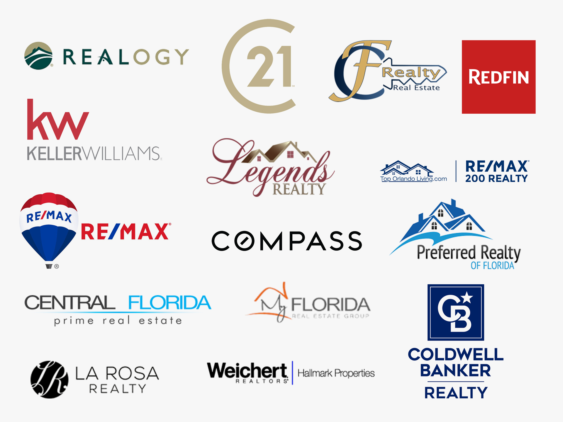
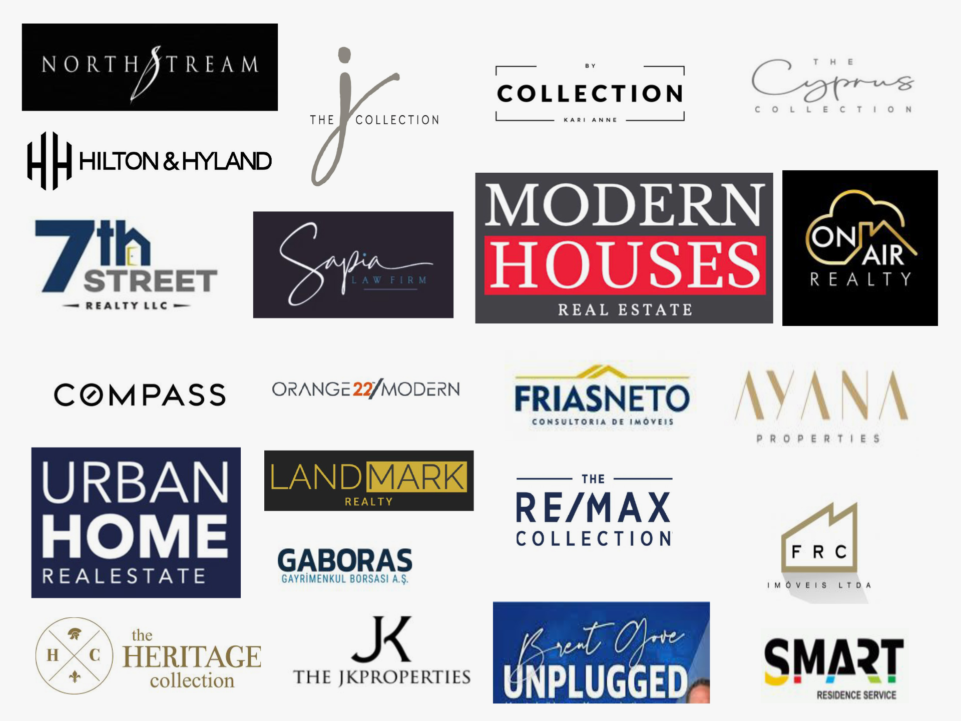
Competitive Analysis
Through my history of working at eXp Realty, I already had a pretty good understanding of the industry and the major competitors. For The Funk Collection, I wanted to take a deeper dive by researching who their competitors were on a local level. During my research, I look at the competitors messaging and branding to discover what are their strongest and weakest points.
Inspiration
After researching their competitors, I learn about the company’s history, mission, services, and goals so that I can better design a logo that will really resinate with them. Once I have a clear picture, I drafted up a mood-board of favored logos to to get a good feel of the client’s preferences and styles.
Logo Concepts
Brand Attributes: Luxury, stylish, sleek, sophisticated, ambitious, bold, caring
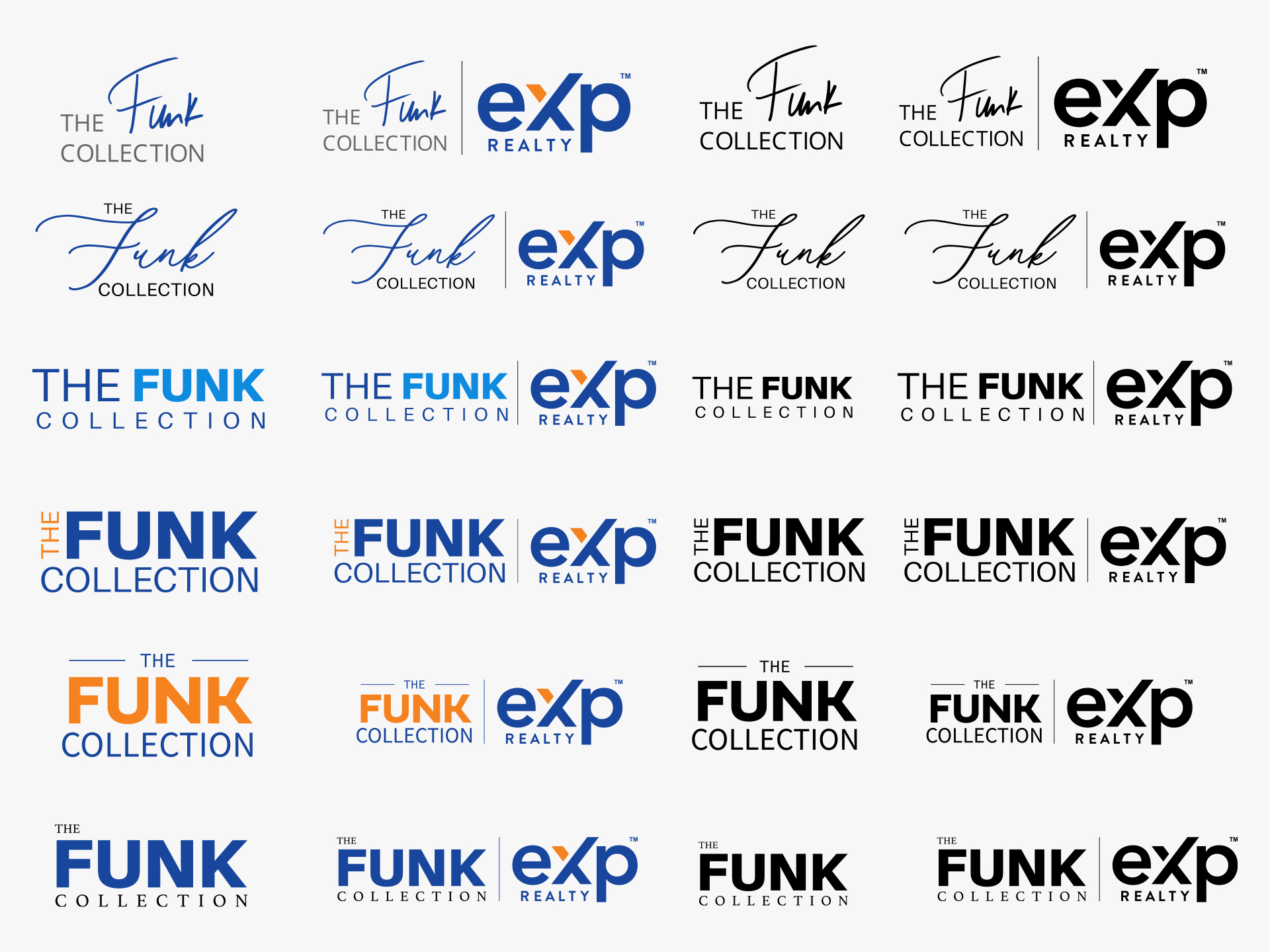
After working through the brand exercises, I was ready to get started creating some logo concepts. The issue with the previous branding was that it didn’t emphasize the name Funk enough. The goal was to create better visual hierarchy for the logo. I played with different styles of fonts, weights and colors on the Funk letters in order for it to stand out.
Former Logo
The old font had very outdated type and stylization. The brokerage name was overpowering the design and was causing the name The Funk Collection to become inconsequential and not very versatile.
Final Logo
This fresh new look for The Funk Collection, uses a clean modern typeface. “Funk” is now the focal point rather than the brokerage name. The logo is more flexible, more legible and more impactful.
Color Scheme
In order to achieve a cohesive look with eXp Realty’s logo, the client favored using the same branded colors. These colors refreshed the Funk Collection’s brand and creates a greater sense of energy.
#19469d – Cobalt Blue
#f5821f – Princeton Orange
Typography
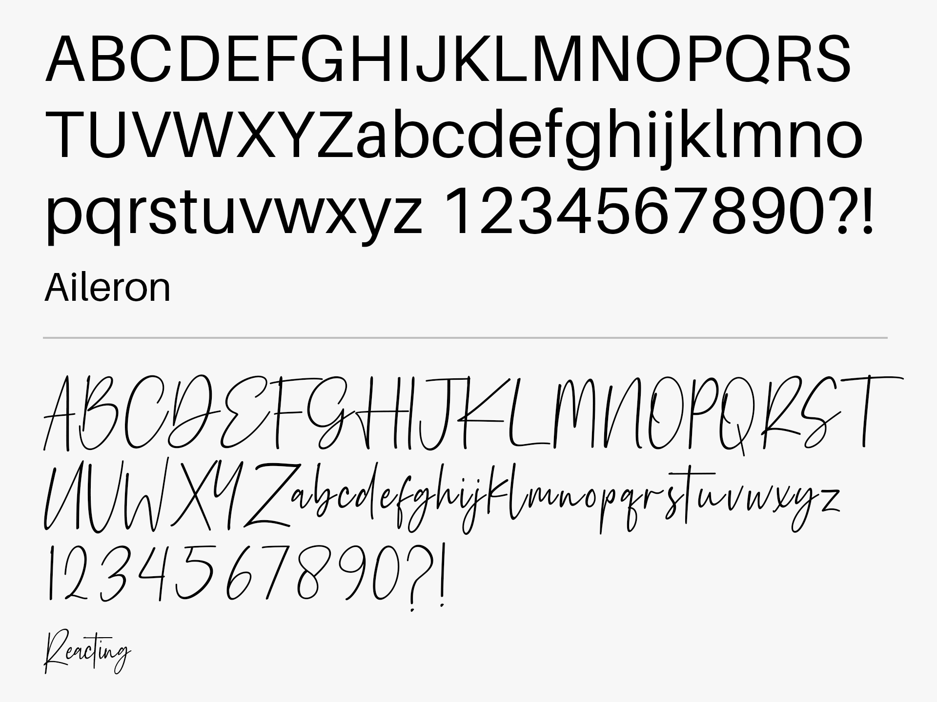
Aileron, which was used for the logo, modernized the look for The Funk Collection. It compliments the brokerage logo with having similar properties in its weight, width, curves and x-height.
The Funk Collection wanted to have an additional font to be used as part of their branding efforts. They loved the look for the website for Hard Rock Hotel. I looked at similar fonts that felt would best elevate the brand. Paired with Aileron, it invokes a feeling of luxury.
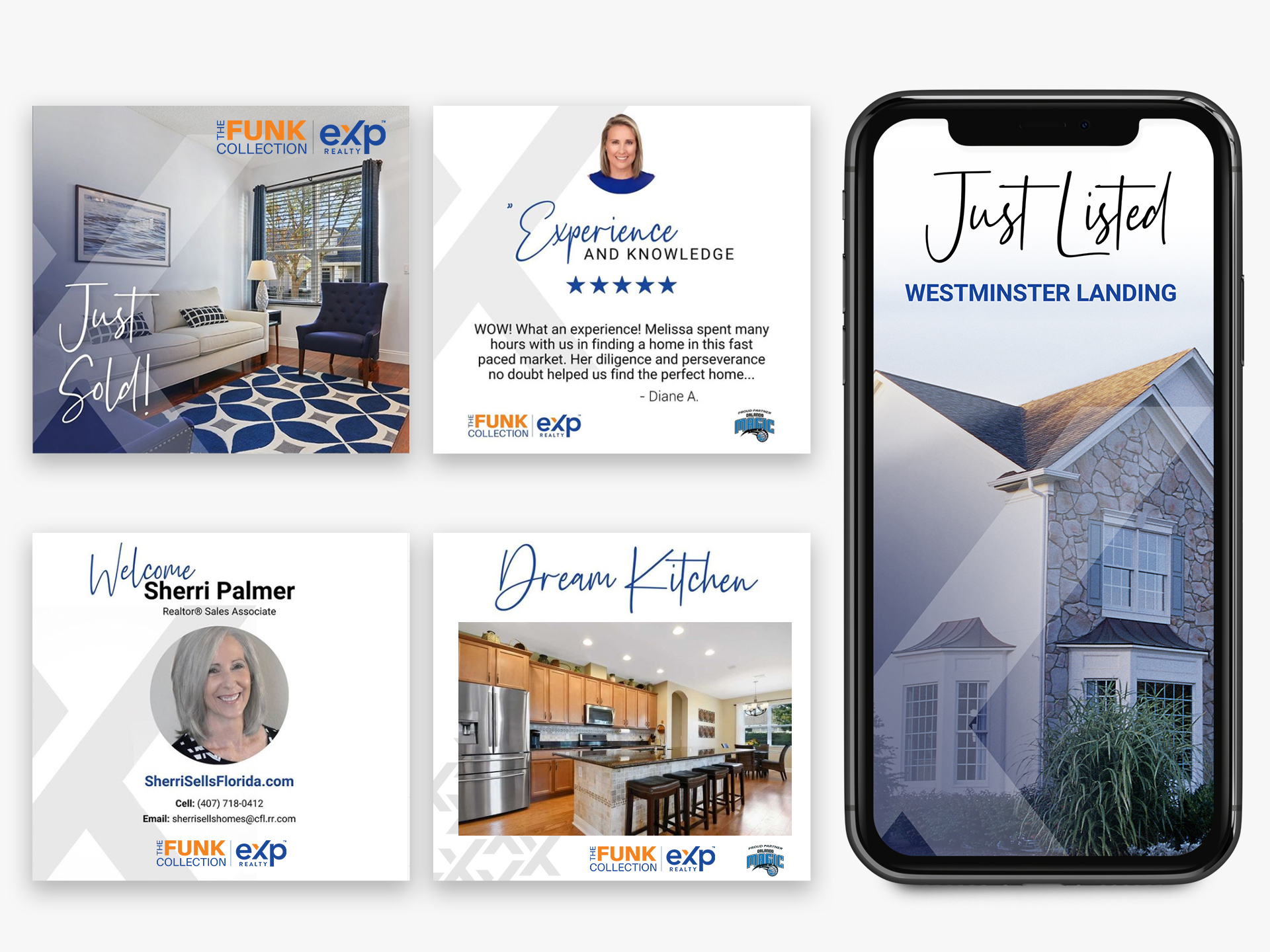
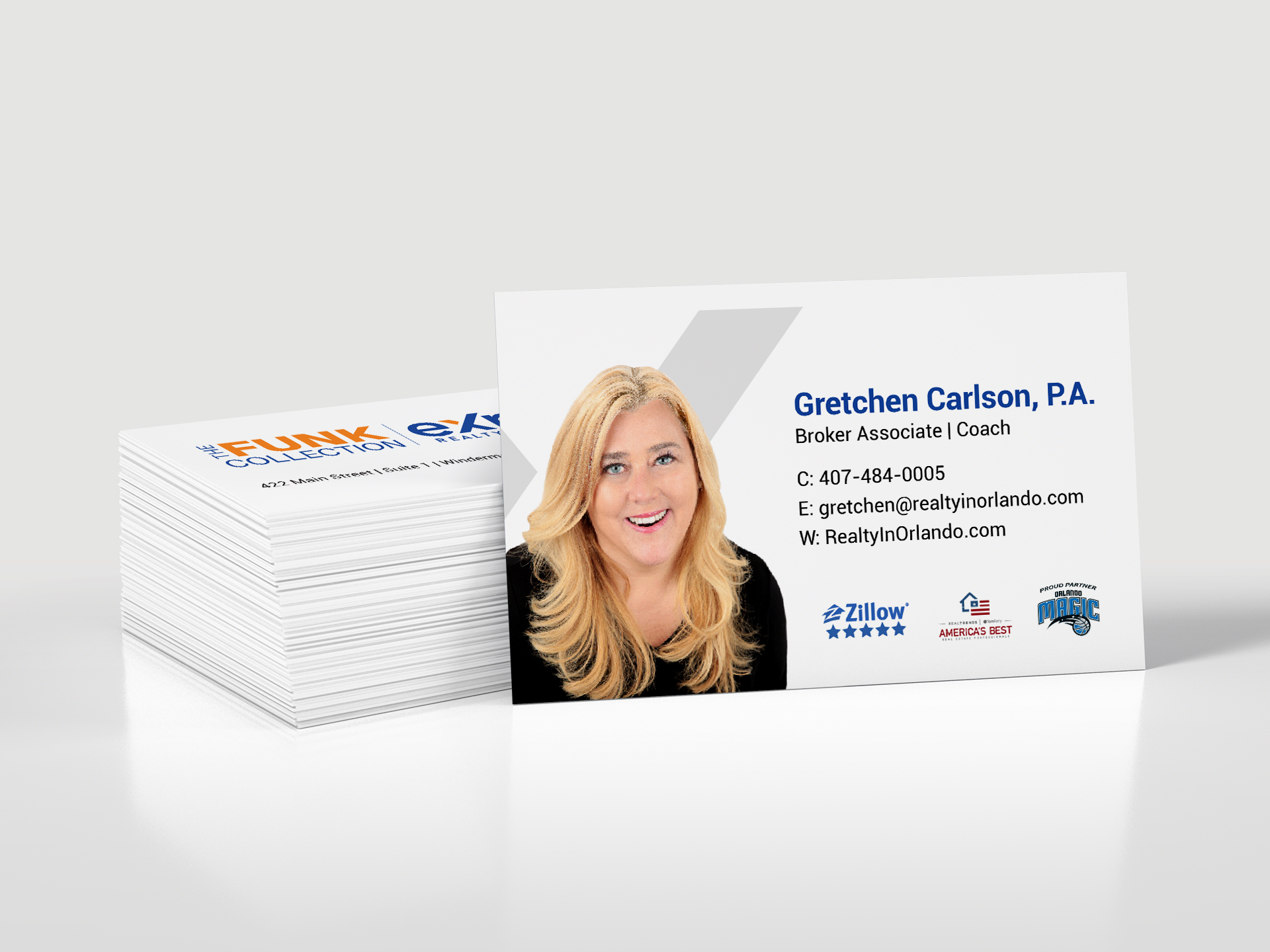
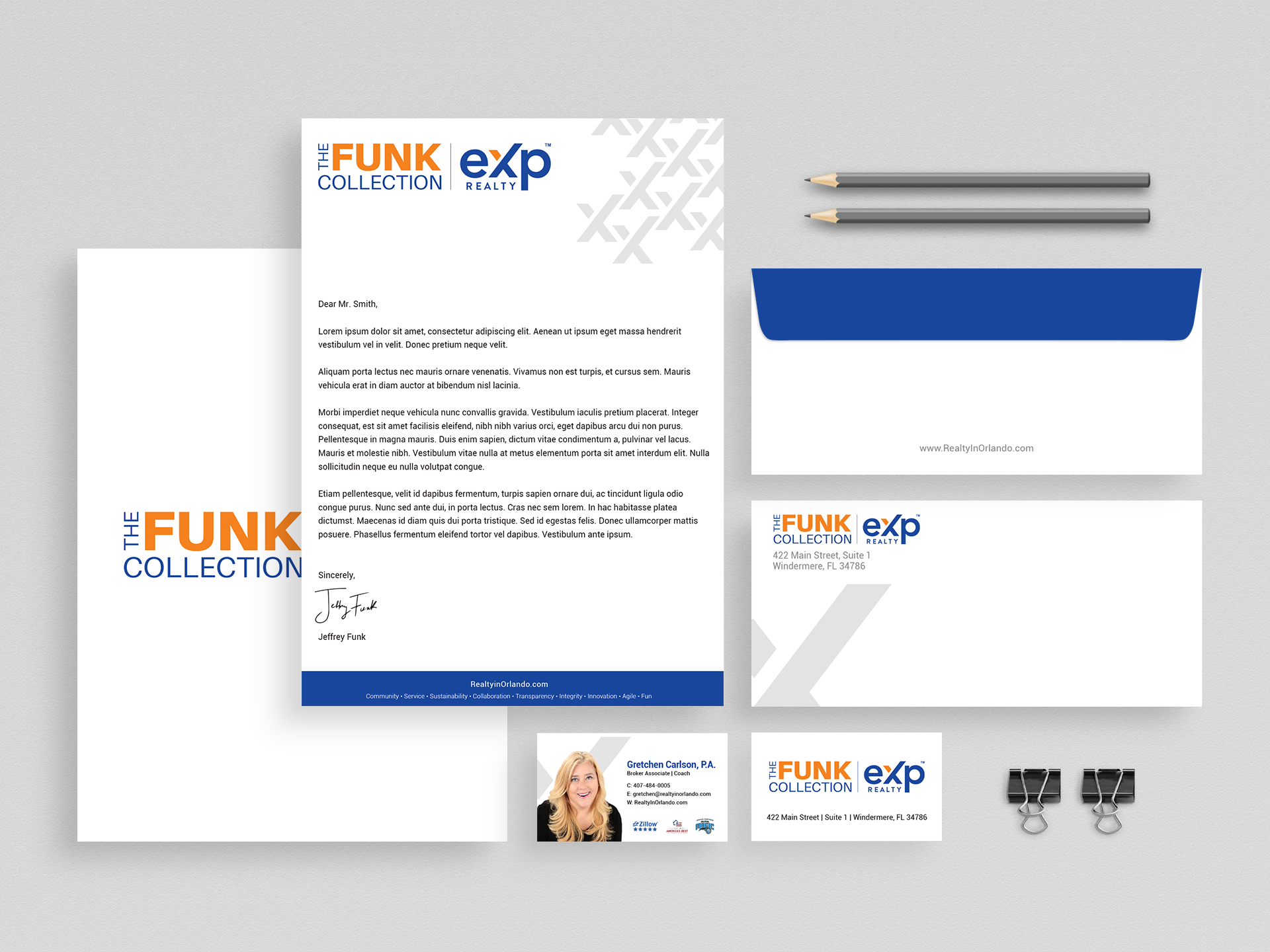
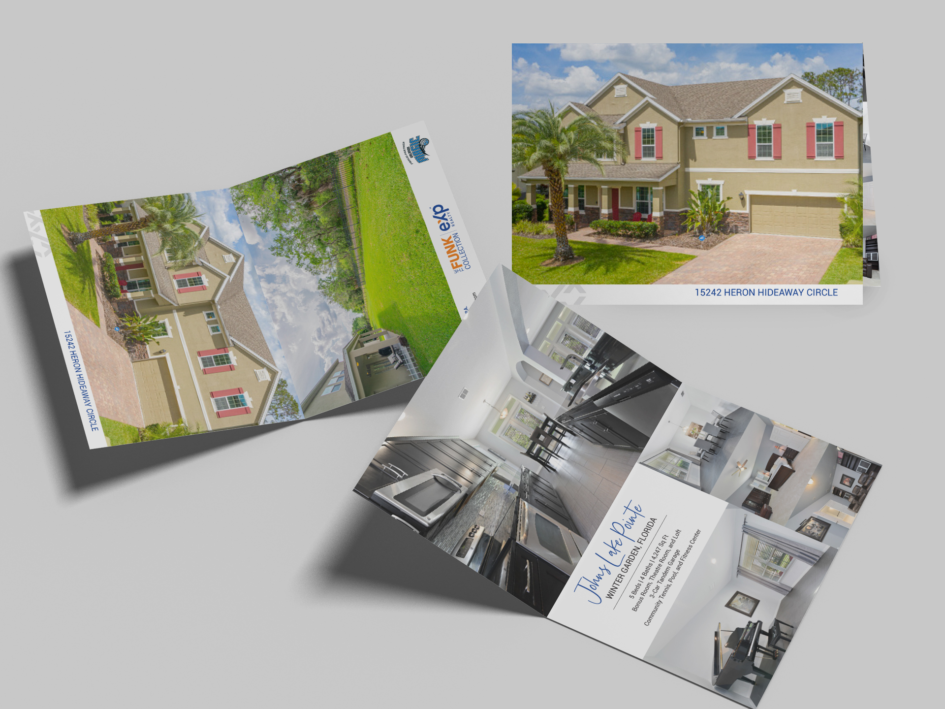
Printed Collateral
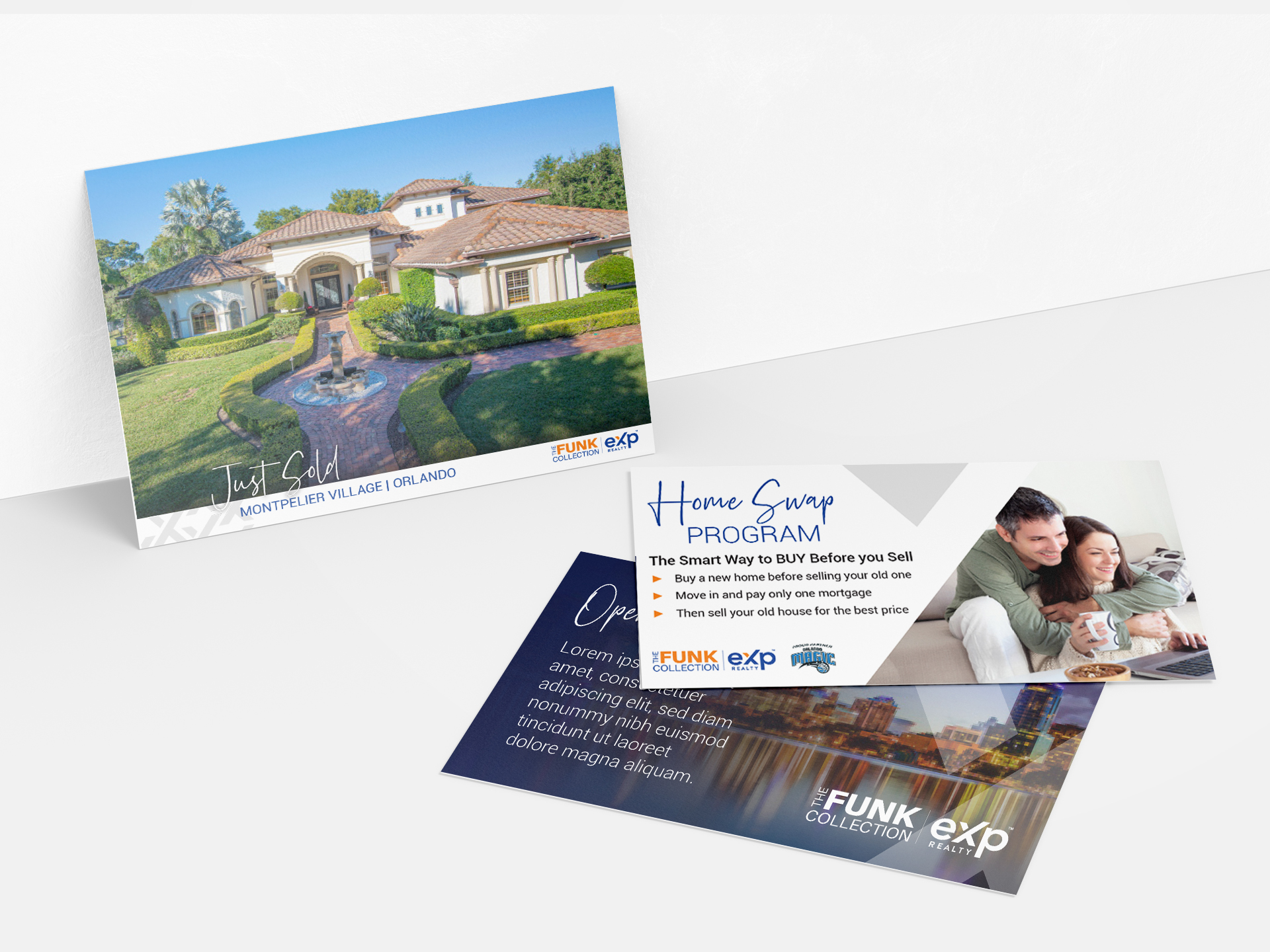
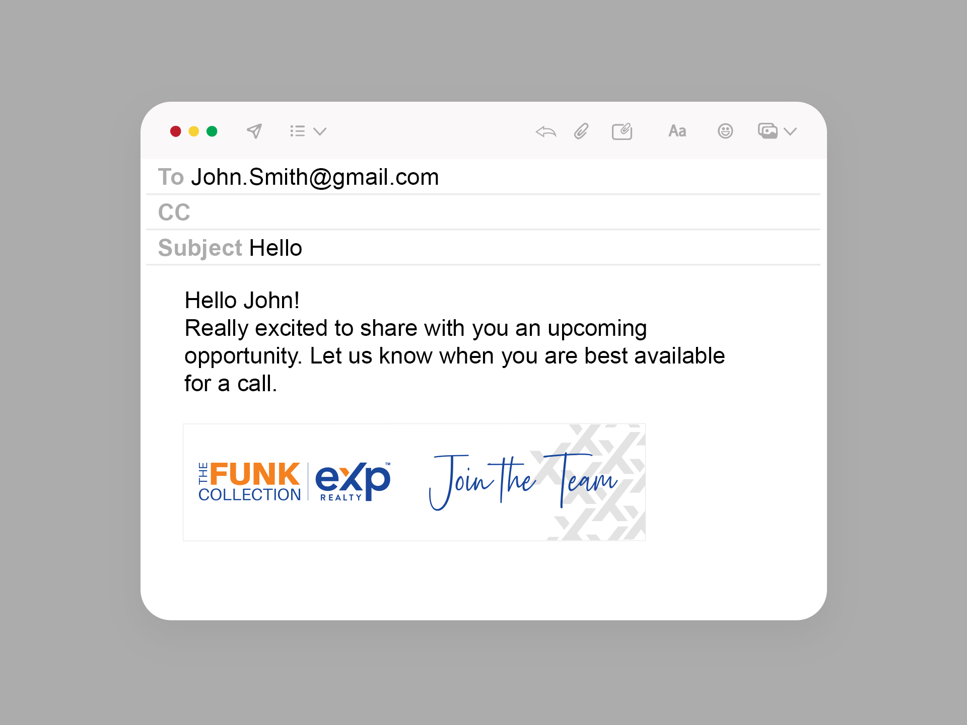
Digital Graphics