Thrive Chiropractic
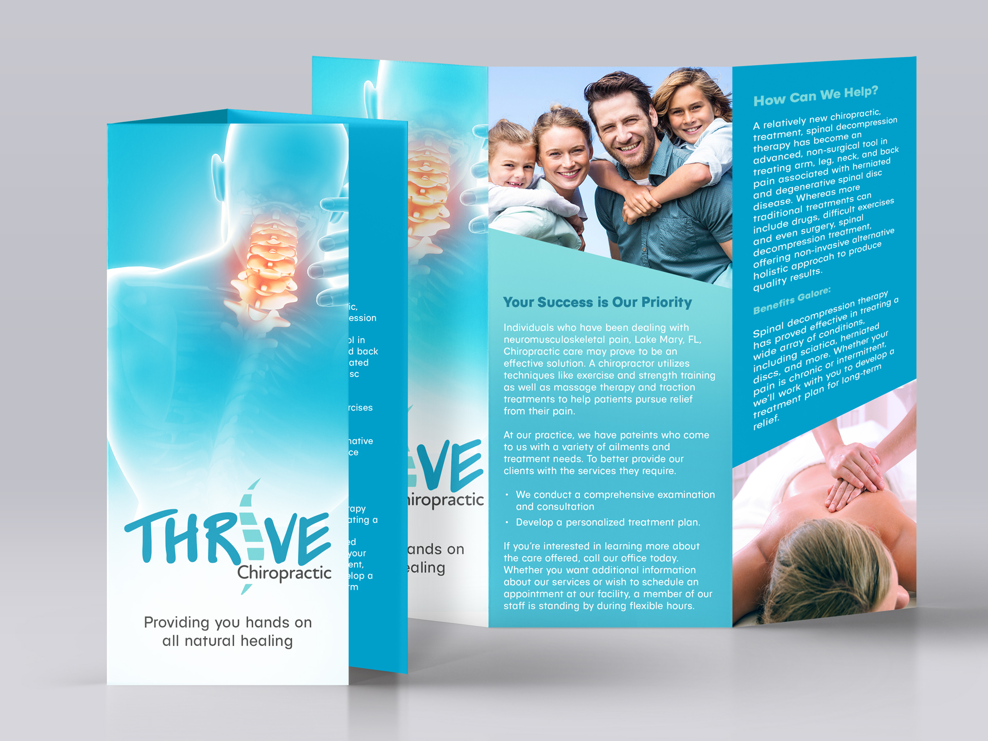
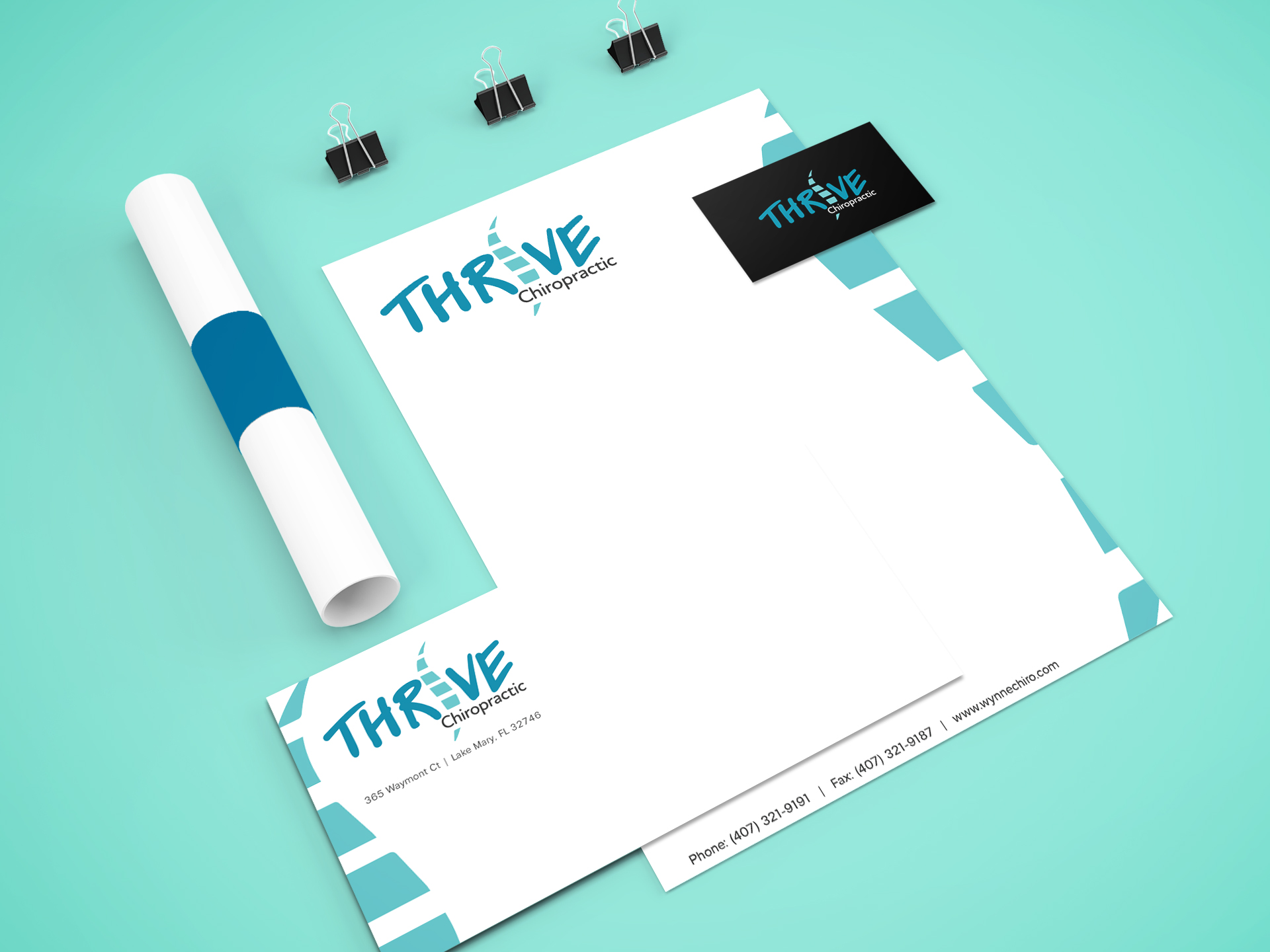
Thrive Chiropractic is located in Lake Mary, Florida. They provide a holistic-based approach to centered wellness. They take pride in helping their patients attain and maintain optimum health levels throughout their time at the clinic and beyond. They use natural non-invasive, low-force practices which focus on alleviating lower back pain, muscle stiffness, chronic headaches, weight management, arthritis, spinal conditions, fibromyalgia, auto injuries, sports injuries, and many more established and complex conditions. Thrive’s mission is to gather their patients medical background, build trust, and transparency by implementing a tailored care plan for their needs. Thrive reached out to me to help rebrand their logo and print materials. My goal was to deliver collateral that was aligned with the brand while also providing the correct information.
ServicesLogo Development, Brand Identity, Marketing CollateralYear2017

Competitive Analysis
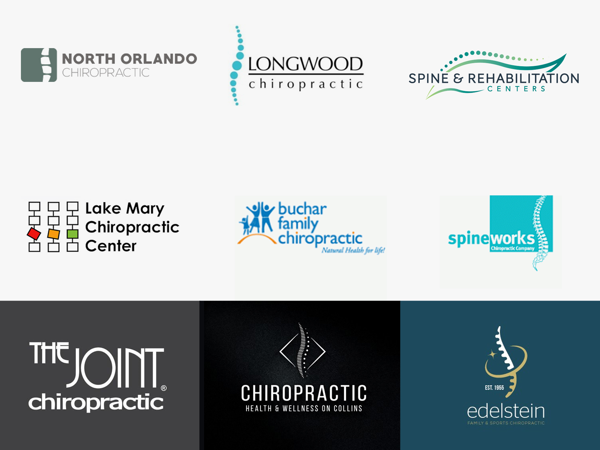
Before embarking on creating logo concepts, I first learn about the competition in Thrive’s space. I check out local competitor’s sites not only at a design perspective but as well as their value props and other key messaging.
Concepts
Brand Attributes: Holistic, Natural, Healing, Community
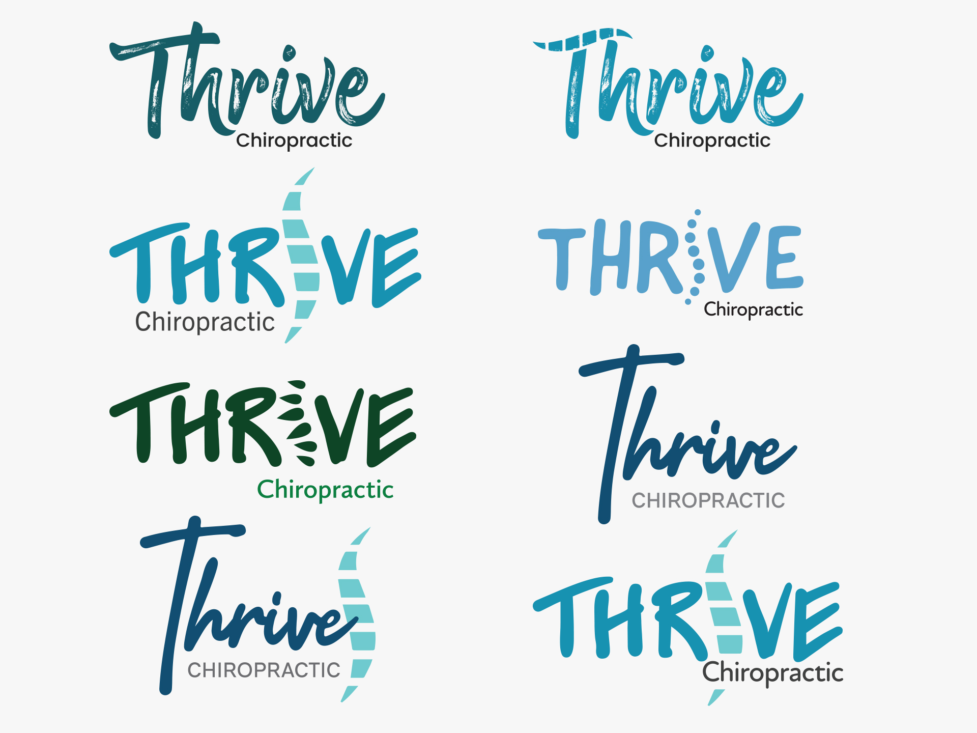
After doing a deep dive of the competition, and reviewing Thrive’s company goals and objectives, I began working on different logo concepts. Since Thrive believes in a holistic approach for chiropractic care, it was important to create logos that really reflect that.
Final Logo
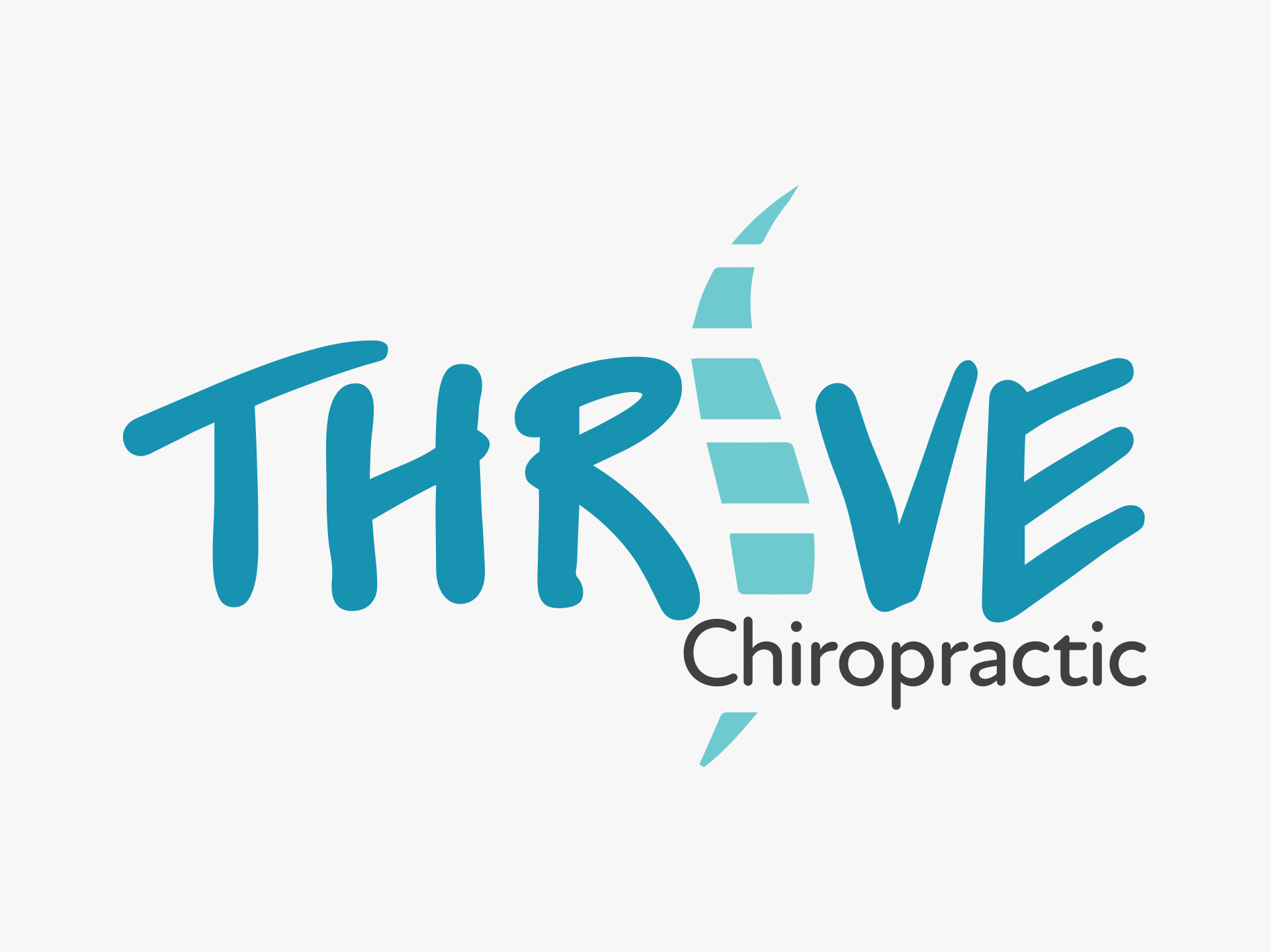
I drew from the inspiration of various Chiropractic logos, to create a recognizable logo mark of a spine as the replacement of the letter “i” in Thrive.
Color scheme
I shared a few color options of the logo with the client, but decided after that it was best to go with earthy colors that echo the brand for Thrive.
#0091b0 – Blue Munsell
#70cbce – Turquoise
#40403f – Jet
Typography
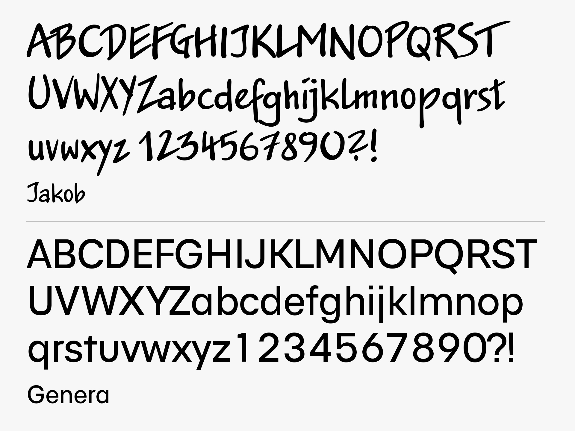
Similarly to how the colors and design have a very natural look, the font below uses a typeface that resembles more a handwritten style which works great with creating that organic appearance.
Printed Collateral

