Competitive Analysis
The first step before creating branding, is through conducting a thorough research on Urban Heroes competitors. Once I’m able to get a good assessment of the strengths and weaknesses of the competition, it provides the ability to strategize how the brand can solve the problem for the same types of customers but in a different way that set Urban Heroes apart from their competitors.

Inspiration
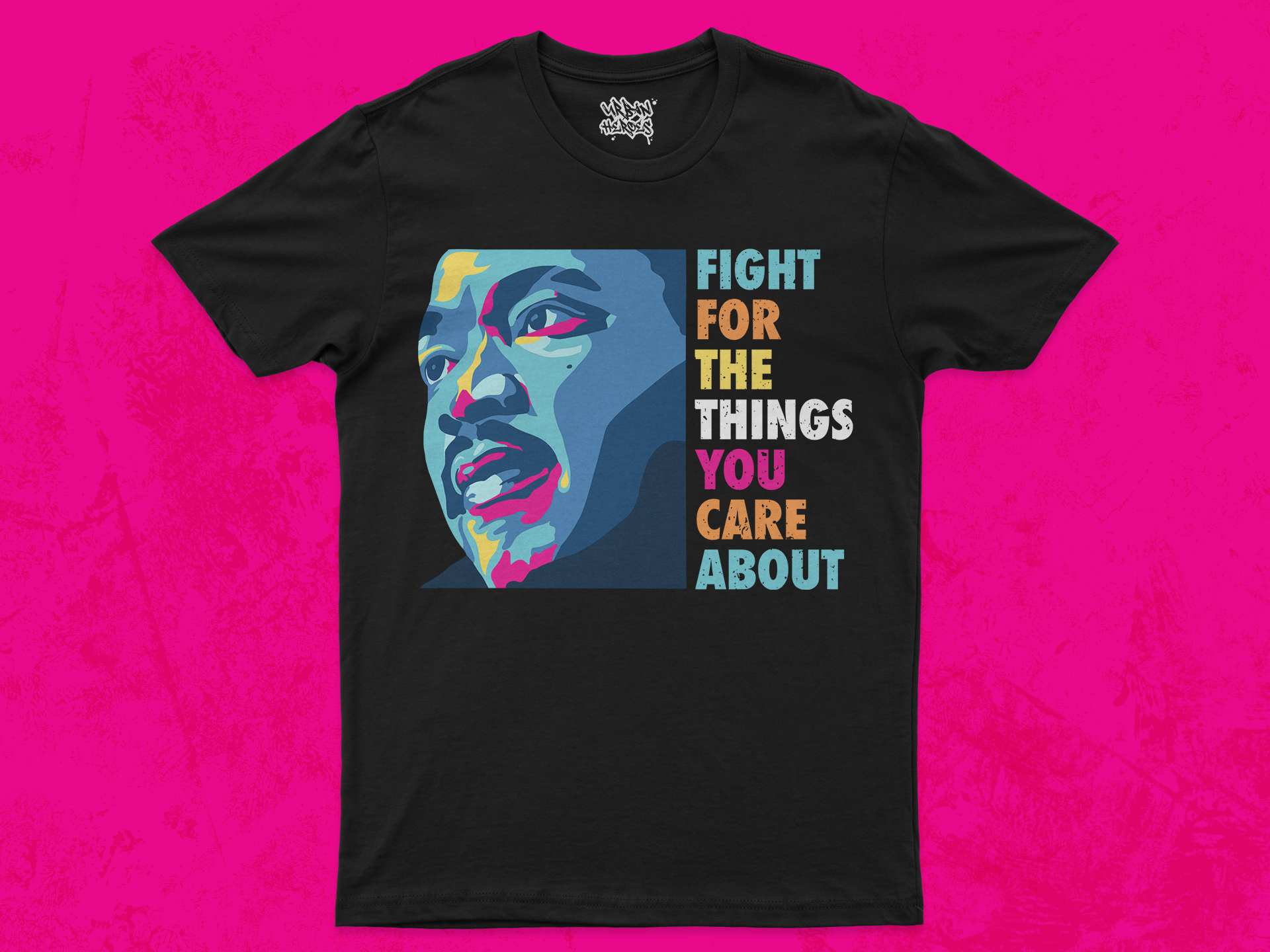
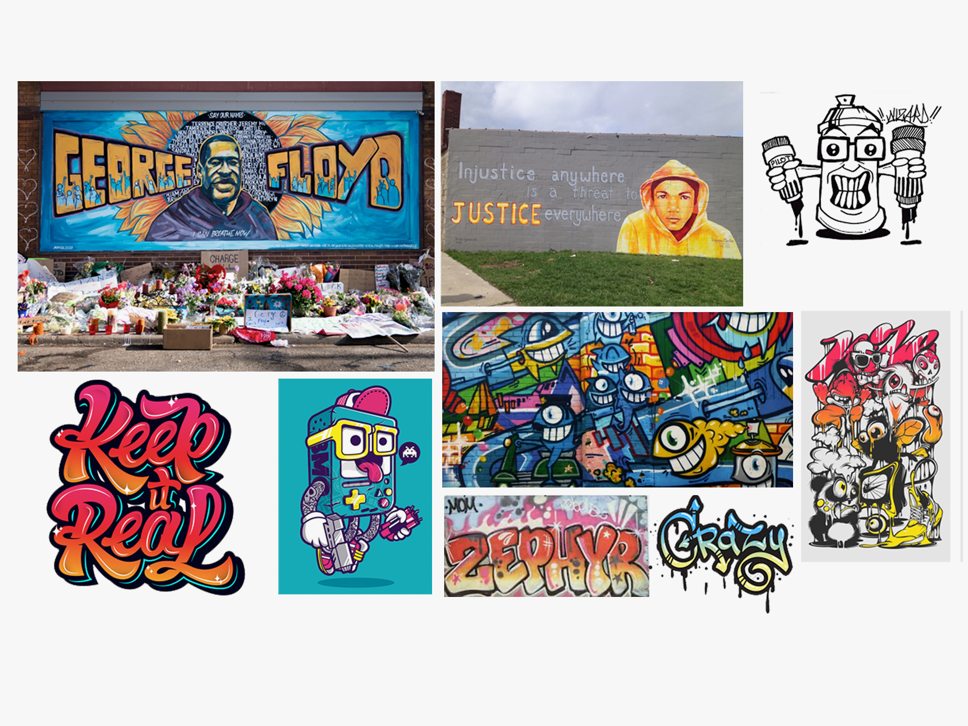
After going over what I discovered from my research with the client, next we looked at different design styles that they would like. I did an internet search on different types of graffiti and illustrations which included BLM street art. I focused on color, typography, and style and presented these concepts to them.
Concepts
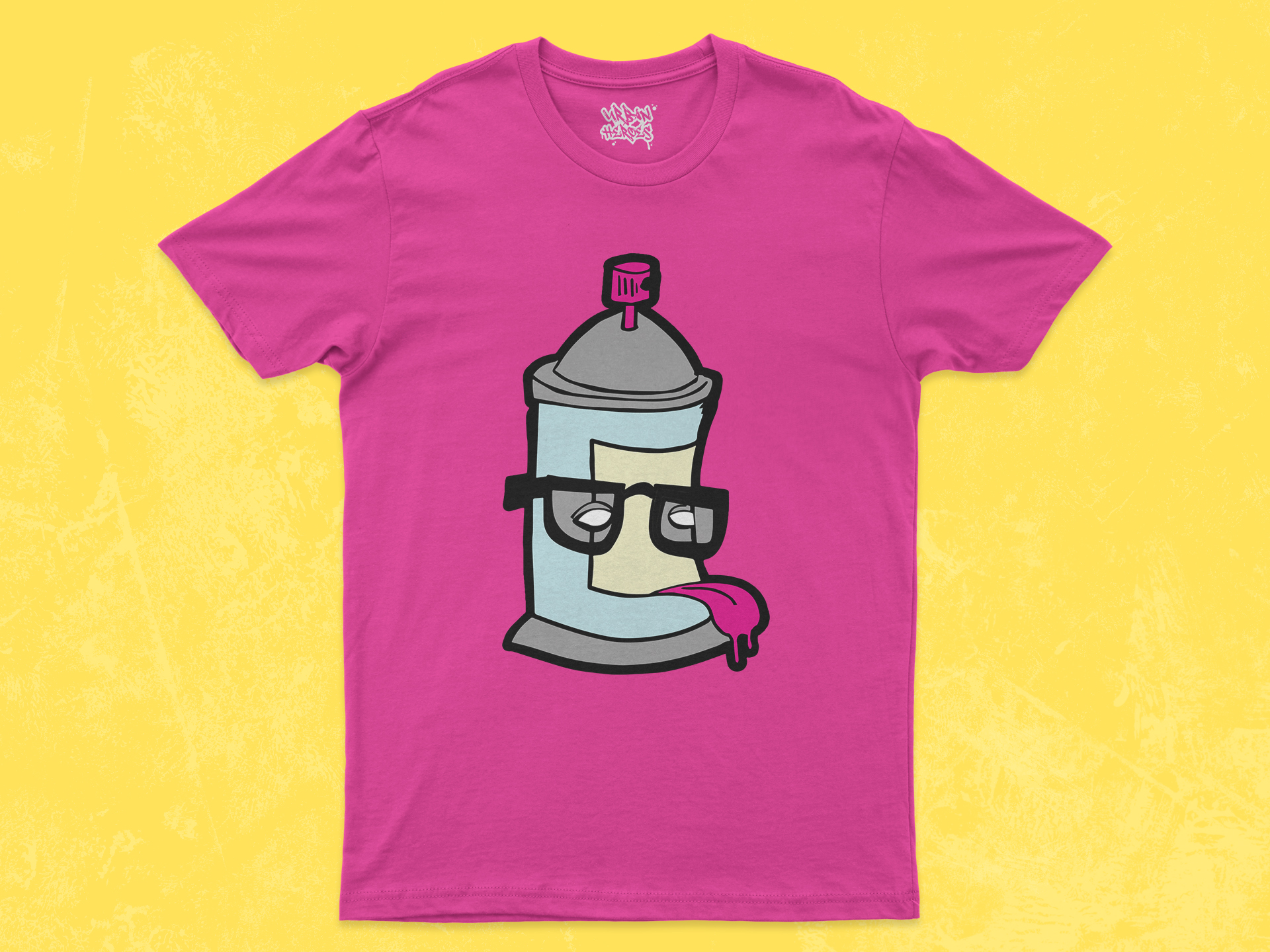
Brand Attributes: Urban, Rugged, Bold, Comfortable
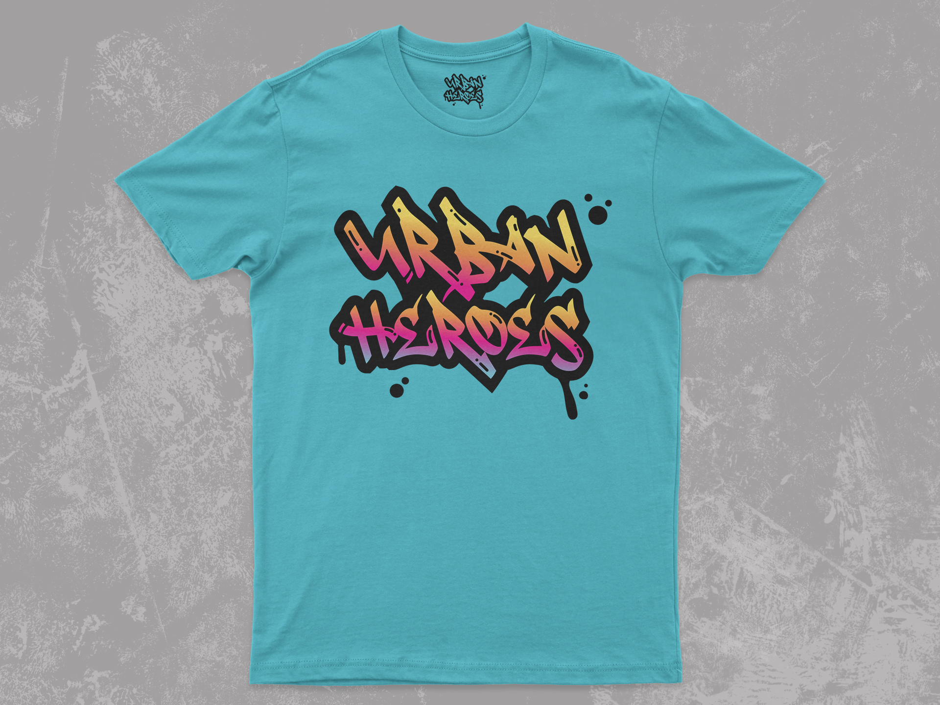
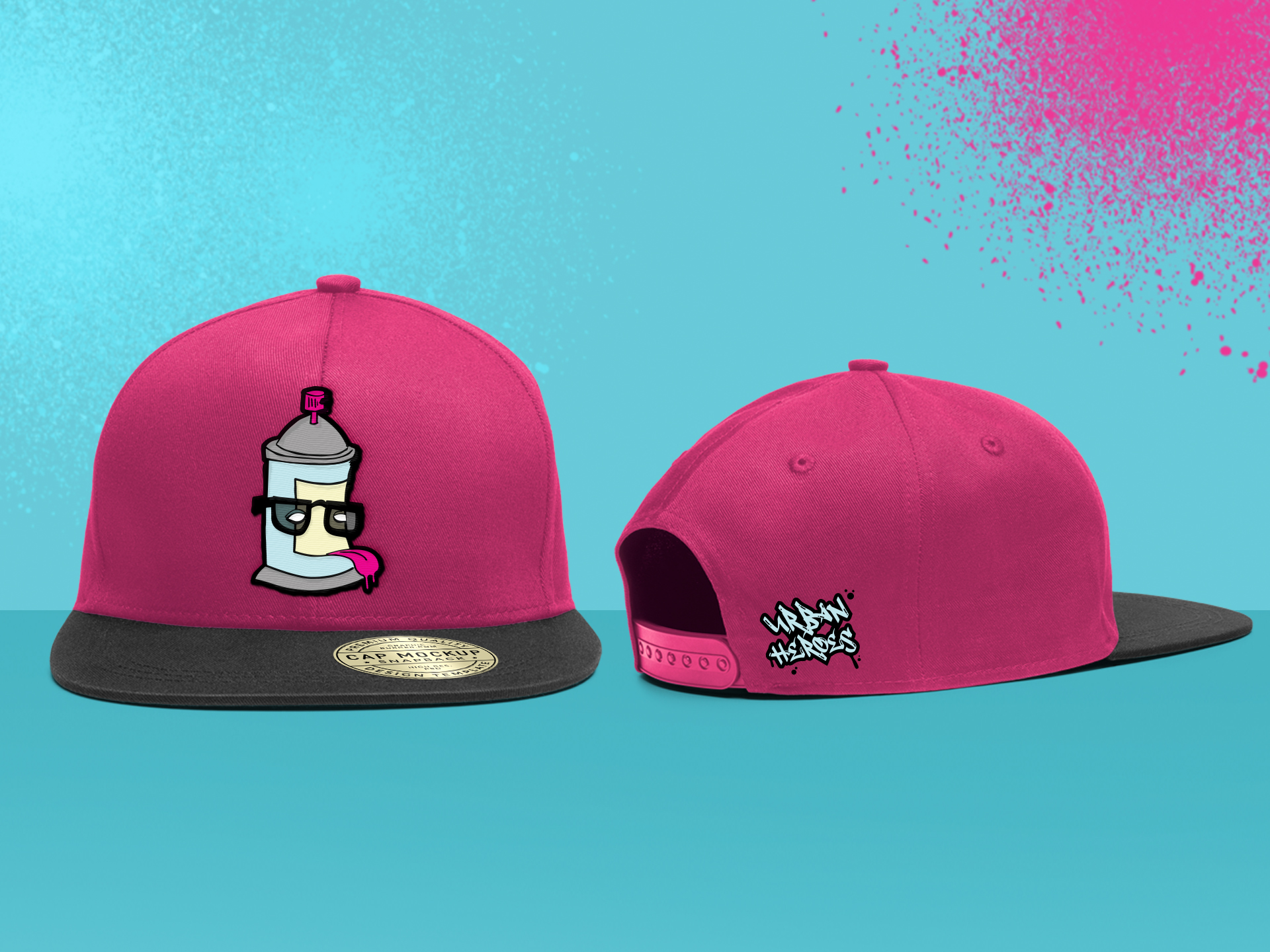
The goal was to establish Urban Heroes as wearable streetwear that messaging can speak to a specific demographic. In the concepts below, reinforces the brand with its use of different graffiti treatments.
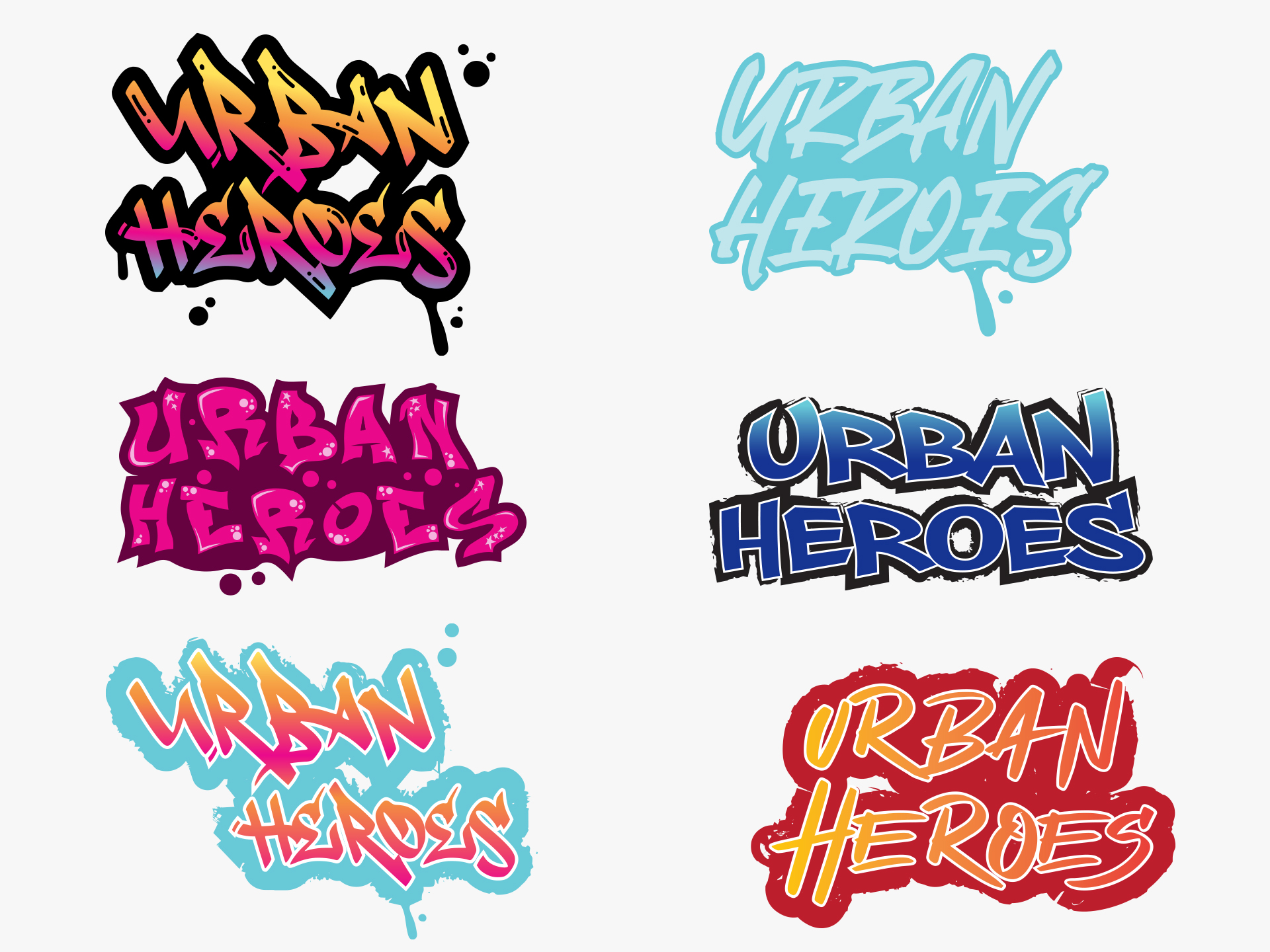
Final Logo
The logo positions Urban Heroes as being recognizably an urban fashion brand. The logo functions as a bold and vibrant face for Urban Heroes brand. The ink splats and drips create visual movement in the piece to appear as if one was or had recently created this tag.
Color scheme
A bright and expressive color palette, was inspired by graffiti and reflects Urban Heroes being bold and culturally diverse. The colors celebrate the vibrancy of city, strategically selected to appeal to a target audience.
#ea098b -Barbie Pink
#68cad8 – Middle Blue
#f3903f – Orange
#ffe25a -Naples Yellow
#a1a0a0 – Quick Silver
#f7f5c8 – Cream
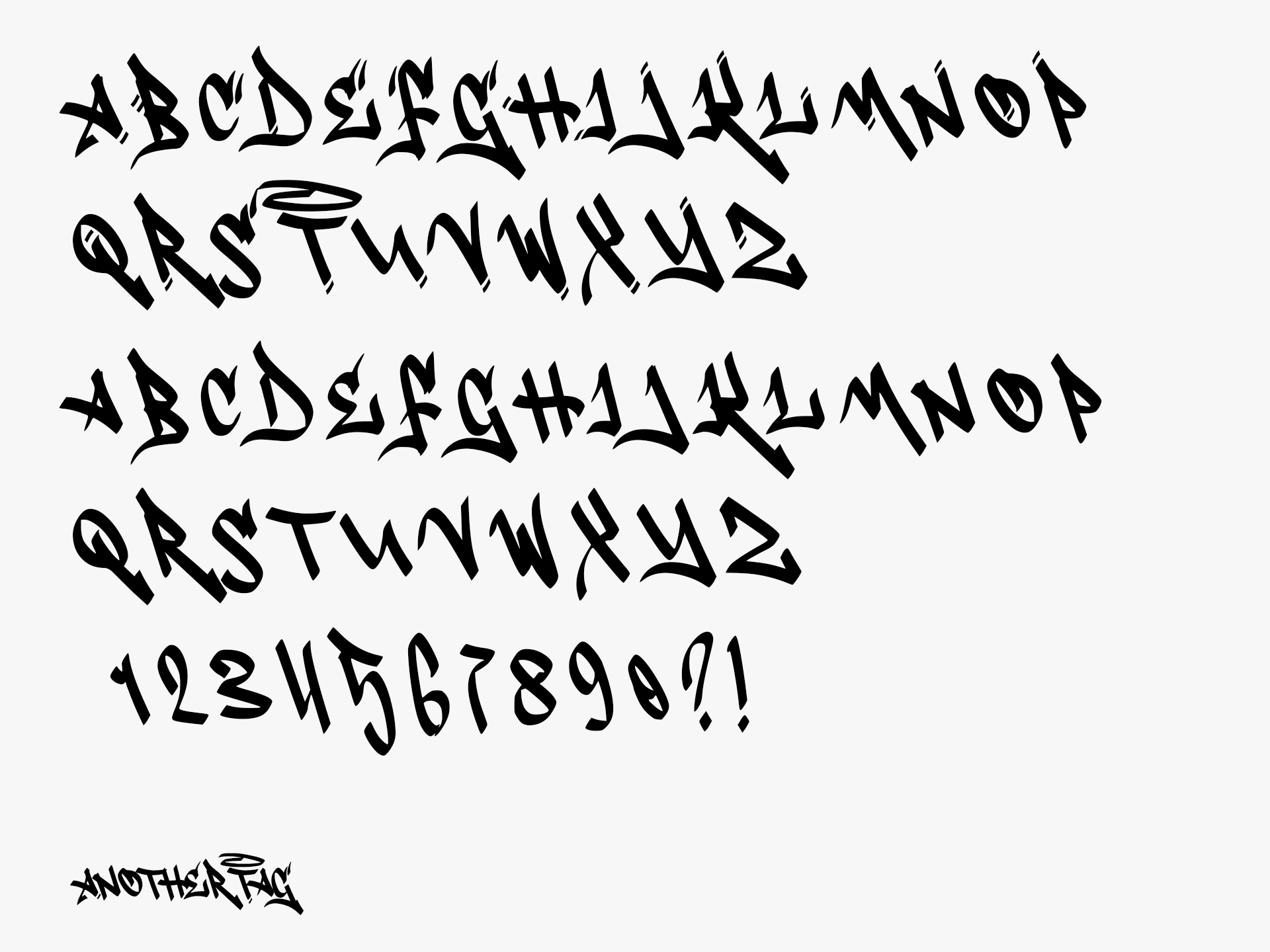
Typography
The unique font embraces the scripted style of graffiti which really distinguishes Urban Heroes collection of streetwear.
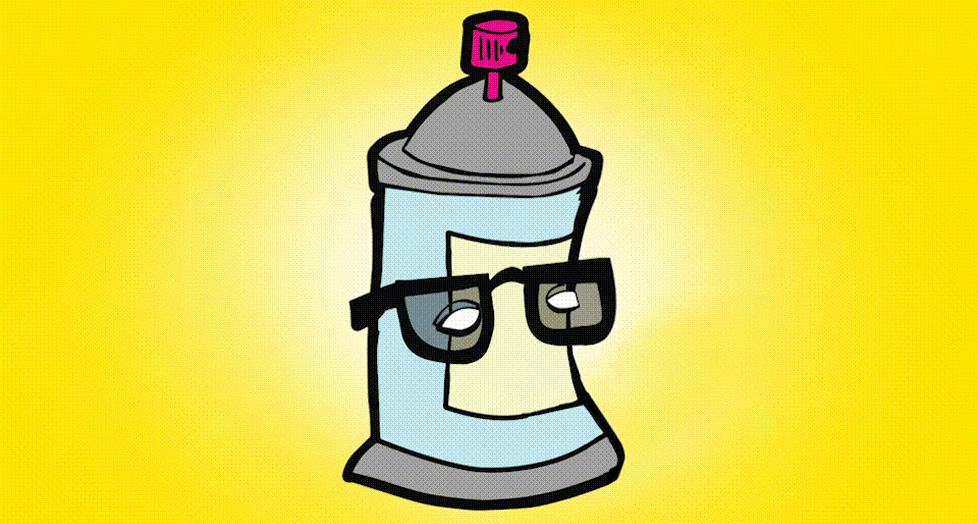
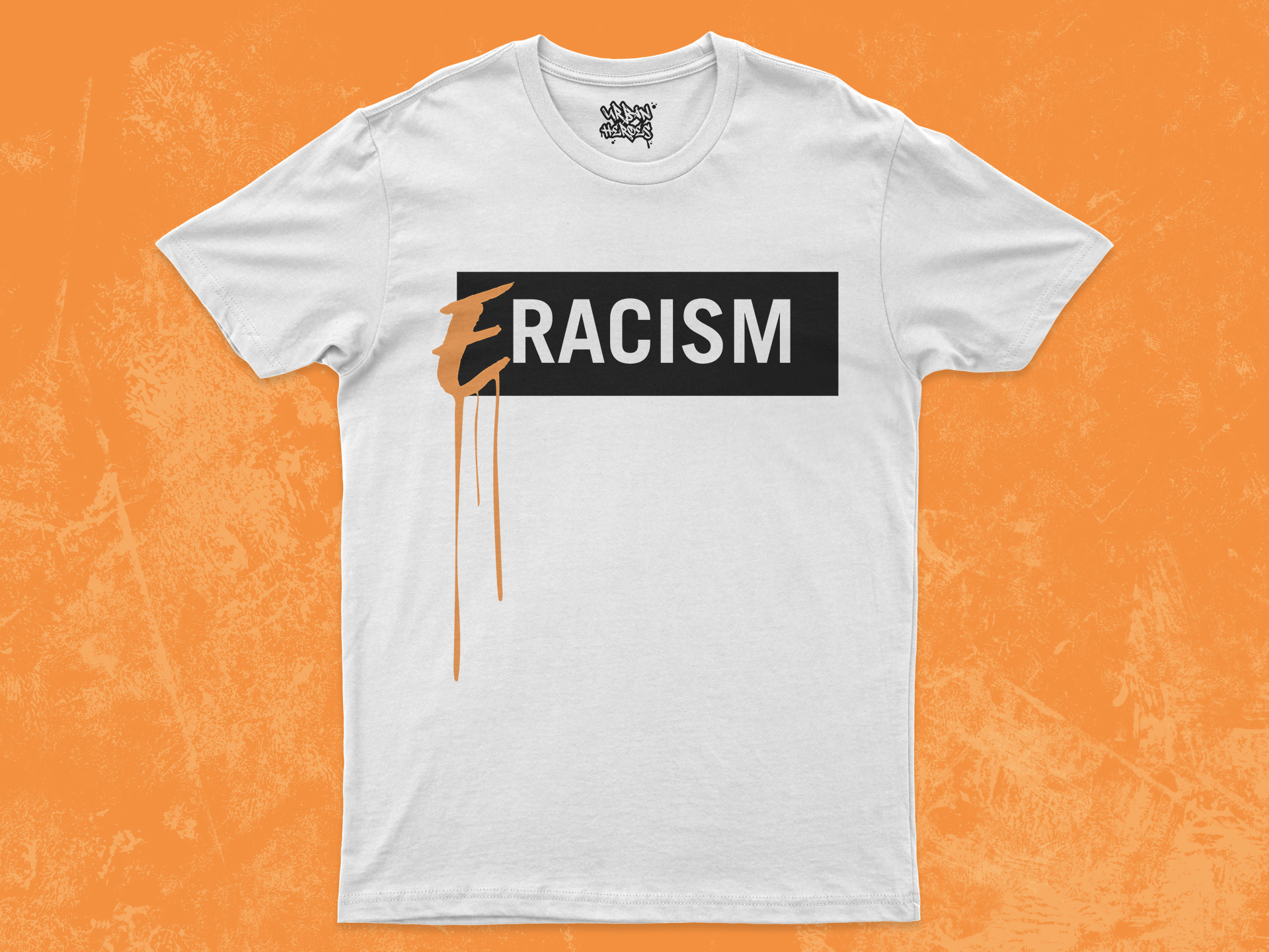
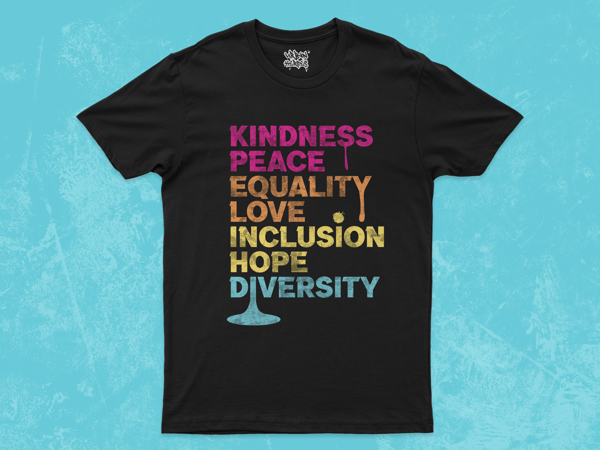
Illustrations & Apparel