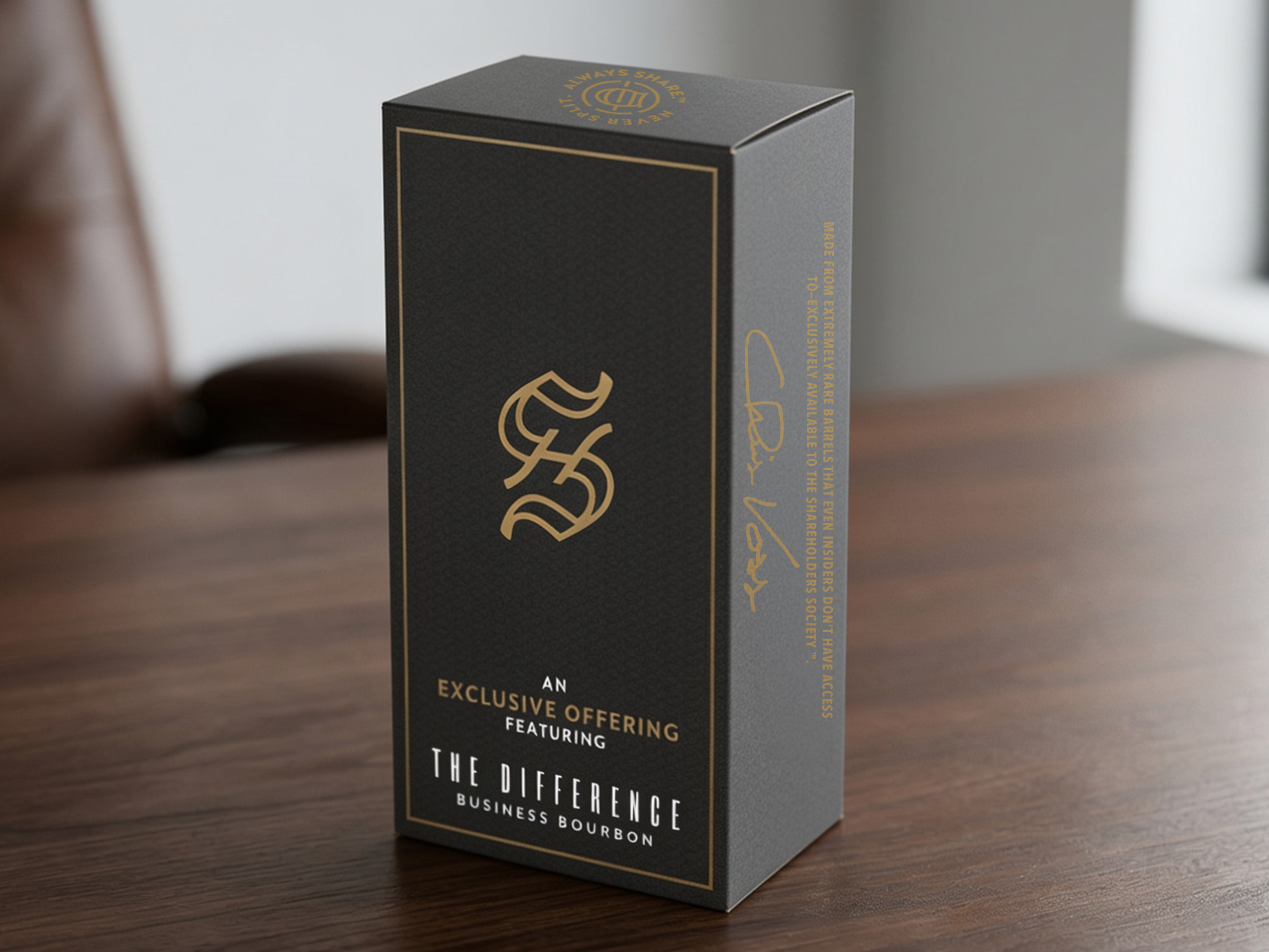
Package Design
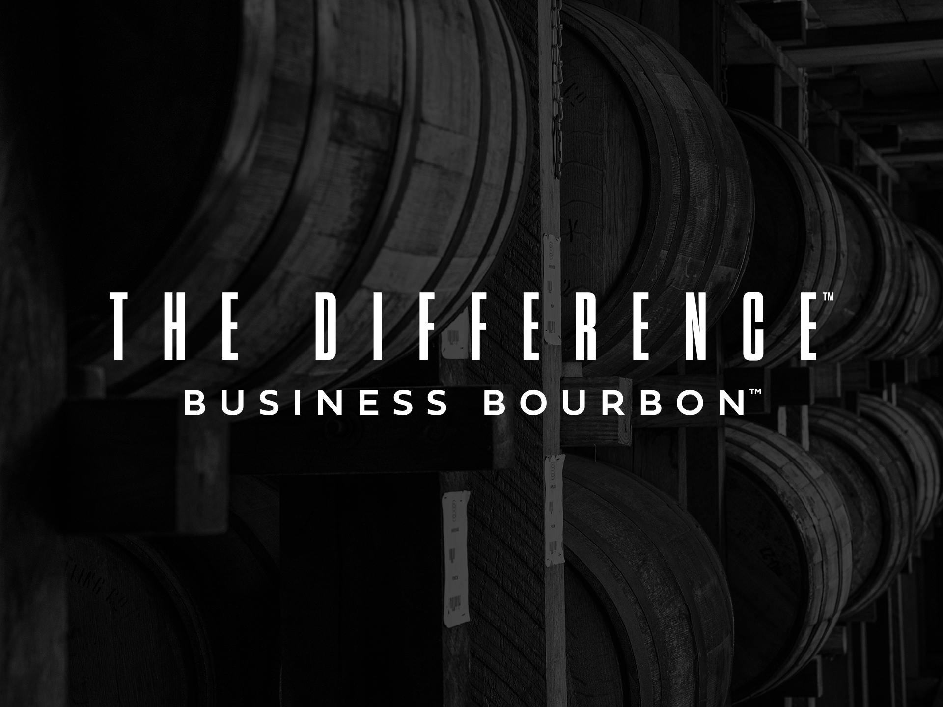
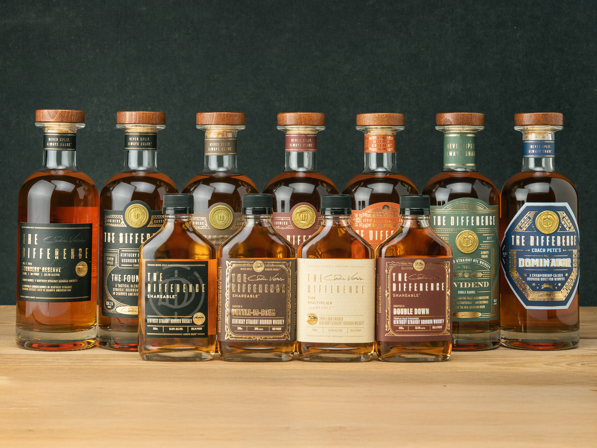
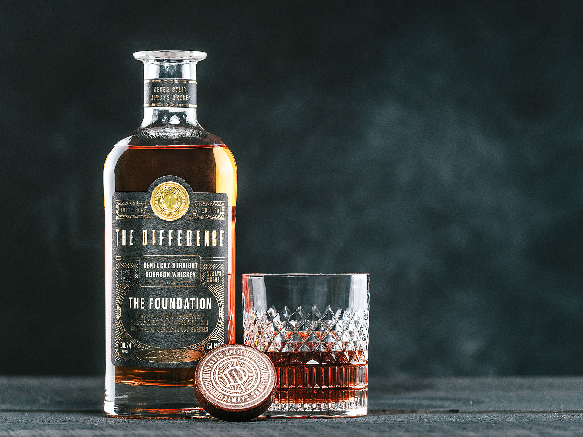
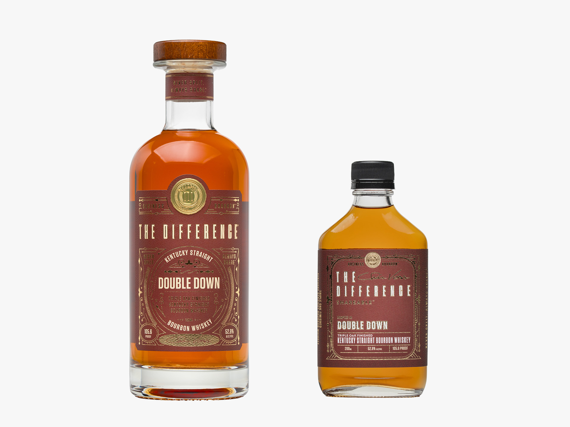
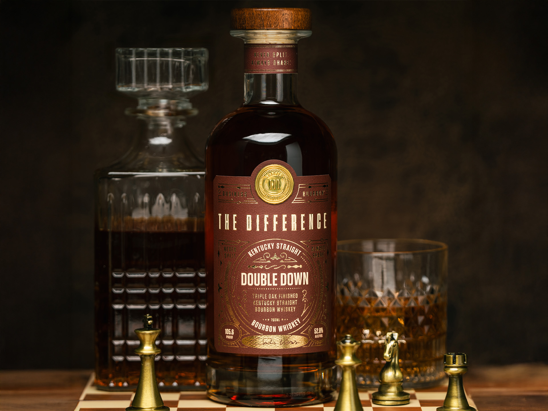
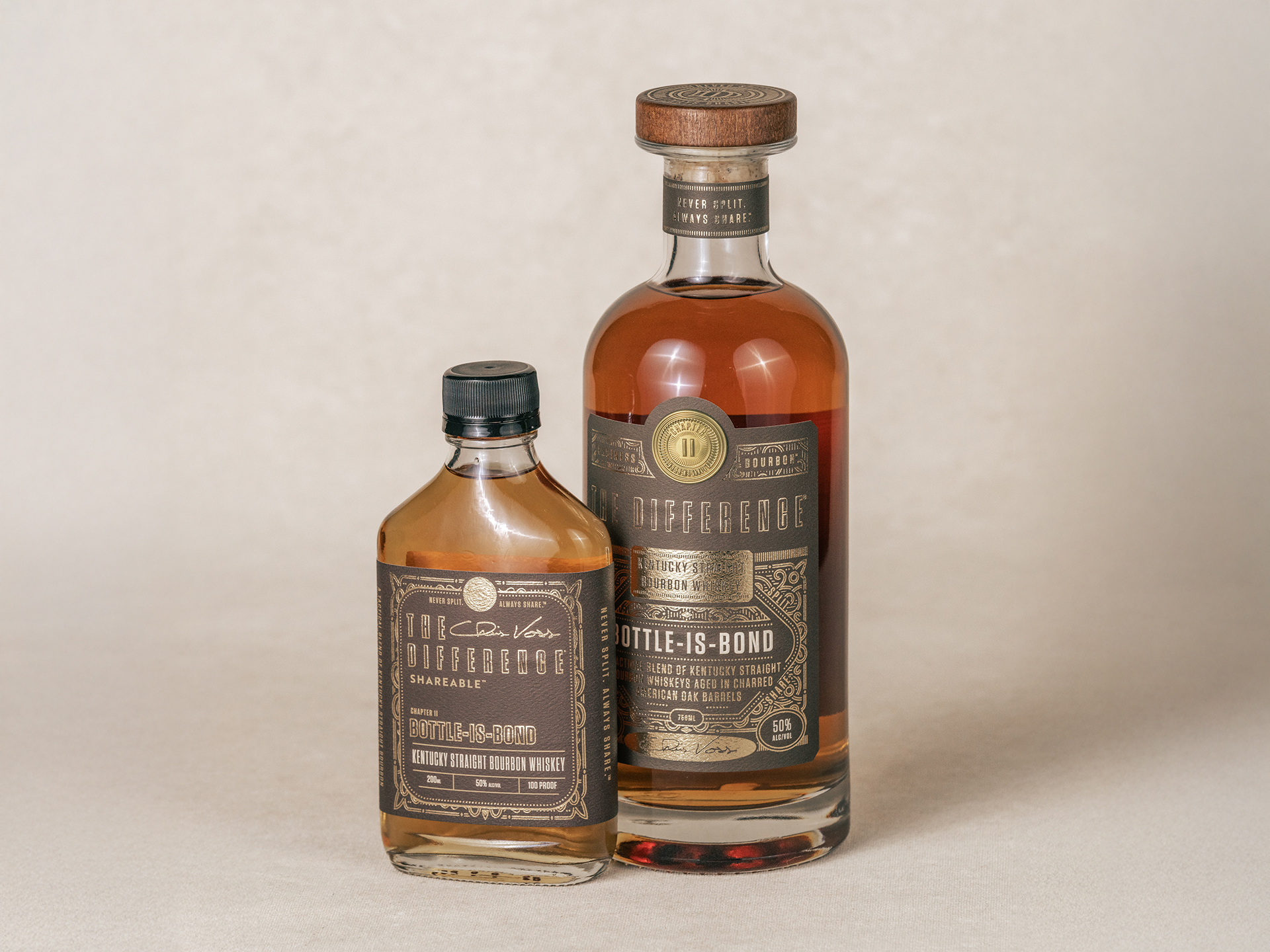
The design challenge for The Difference Bourbon was to move beyond traditional distillery tropes and create a visual language at home in an executive boardroom. To achieve this, I utilized a heavy, architectural bottle silhouette paired with a dual-format presentation. The 750ml bottle, topped with a premium wood and cork stopper, acts as a centerpiece for professional environments, while the 200ml “Shareable” flask was engineered as a tactical tool for gifting and opening doors. The typography leans into an authoritative serif and sans-serif mix, utilizing gold foil and deep, textured earth tones to project prestige. By balancing classic luxury elements with modern touches like integrated QR access, the packaging transforms the bourbon from a simple beverage into a symbol of professional achievement.
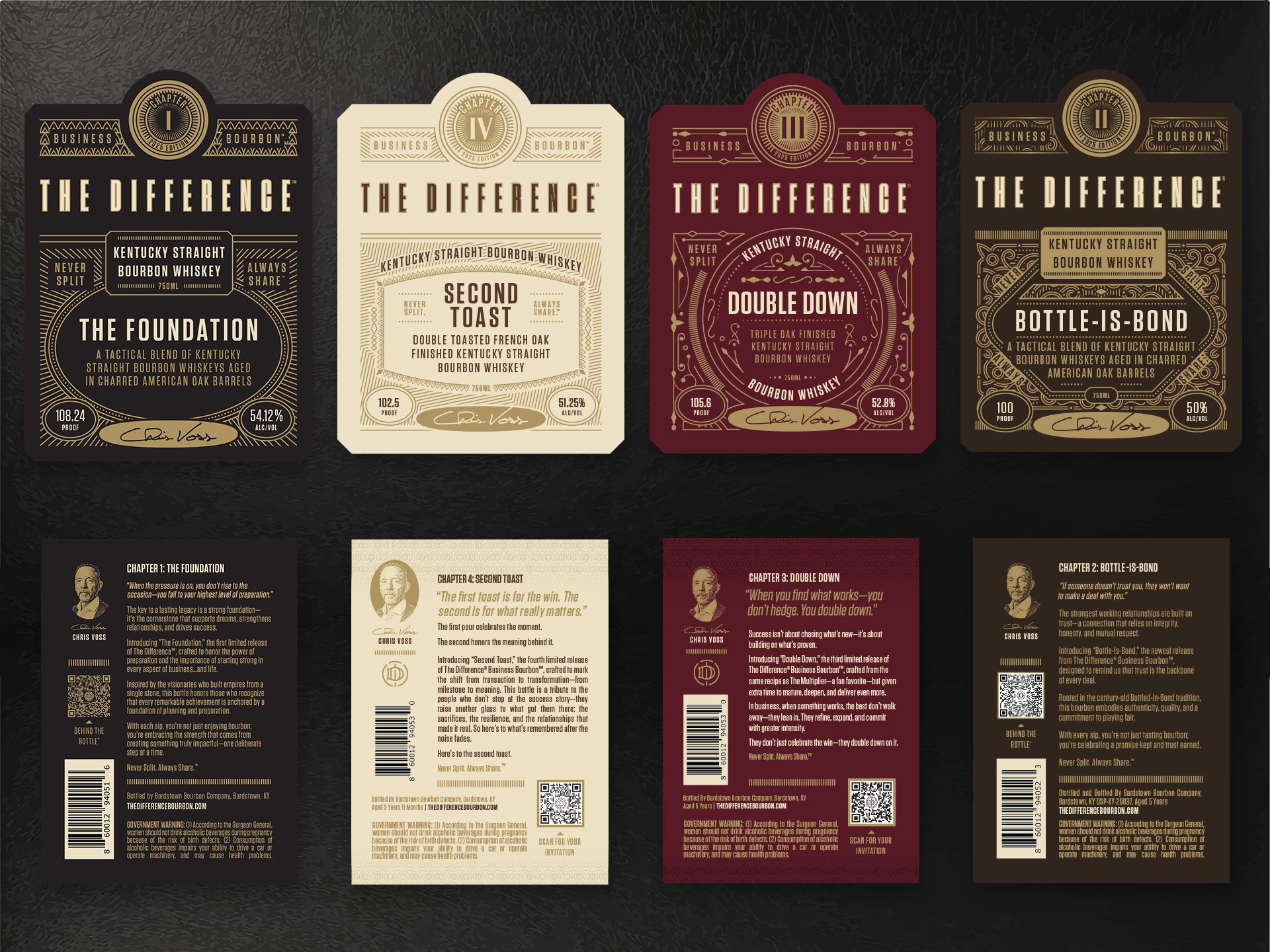
To ensure a cohesive experience across the entire product line, I developed a design system that maintains visual gravity while distinguishing various product “Chapters.” This was achieved through a rigorous color-coding system and varied geometric label shapes—ranging from traditional rectangles to modern hexagons—that all share the same tactile, embossed paper quality. The resulting identity bridges the digital membership model with a physical luxury product, ensuring that every touchpoint, from social media graphics to the bottle itself, reinforces the brand’s core pillars. The final design doesn’t just look expensive; it looks authoritative, successfully positioning the brand as the premier business-centric spirit.


Brand Identity & Packaging Systems
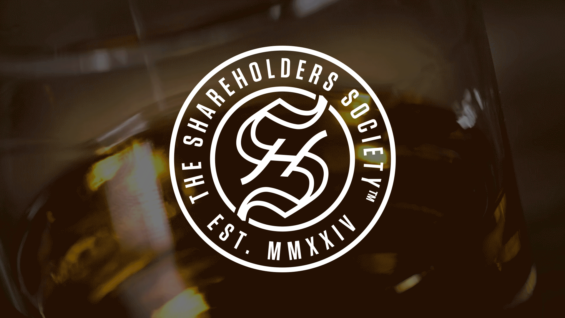
The Shareholders Society Crest
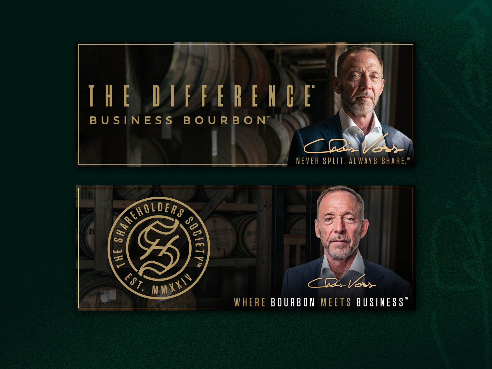
Central to the visual identity is the Shareholders Society Crest, an intricate, architectural emblem designed as a symbol of exclusive membership. The design features a circular, stamp-like crest that evokes the prestige of a historic seal, utilizing a refined matte gold and deep black palette to signal luxury and discretion. At its core is an interwoven monogram where the “S” and “H” seamlessly intersect, representing the alignment of capital, trust, and partnership. Completed with bold, classical Roman typography (EST. MMXXIV), the asset bridges corporate prestige with private club exclusivity. This crest is deeply integrated into the entire ecosystem—from anchoring physical bottle labels to serving as a premium debossed focal point on brand collateral.
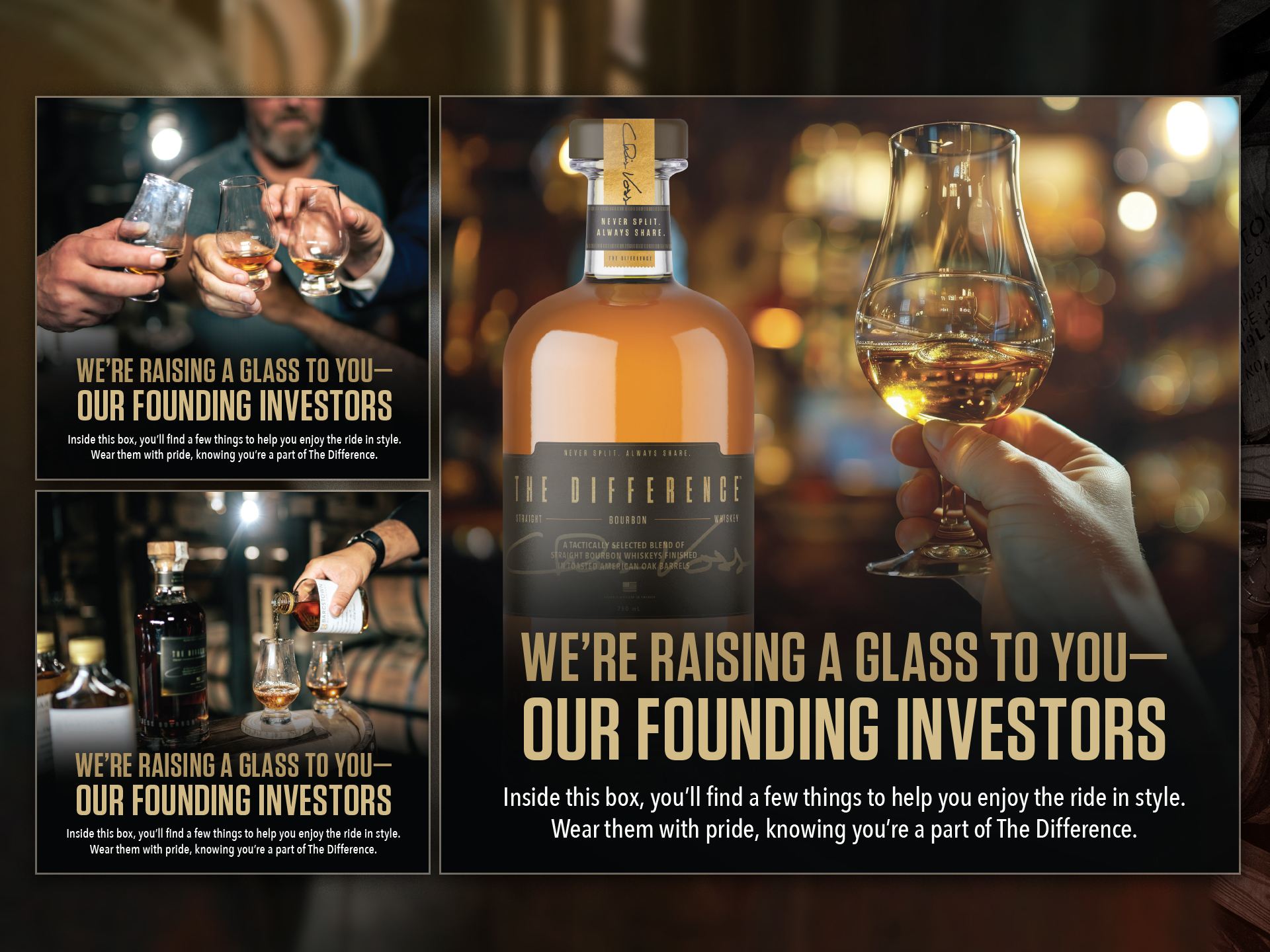
Bespoke Shipper Box
To formally welcome new members into the society, I engineered a bespoke shipper box tailored specifically to accommodate the brand’s unique “Shareables™” format. Navigating the intersection of luxury spirits and high-end networking, this premium packaging system was structurally optimized to securely hold the smaller bottle size designed for dealmaking. Every structural and tactile detail—from the rigid interior inserts to the refined exterior layout—was crafted to elevate the unboxing experience into an impactful first touchpoint for members.
Executive Notebook & Collateral
Extending the brand identity beyond the core packaging, I designed a suite of premium lifestyle items utilizing the same unified visual language. This includes an executive notebook featuring the debossed society crest, meticulously crafted for members to capture breakthrough ideas and strategic notes during networking sessions. These items demonstrate how the sophisticated aesthetic of The Difference can seamlessly scale across functional corporate lifestyle collateral.
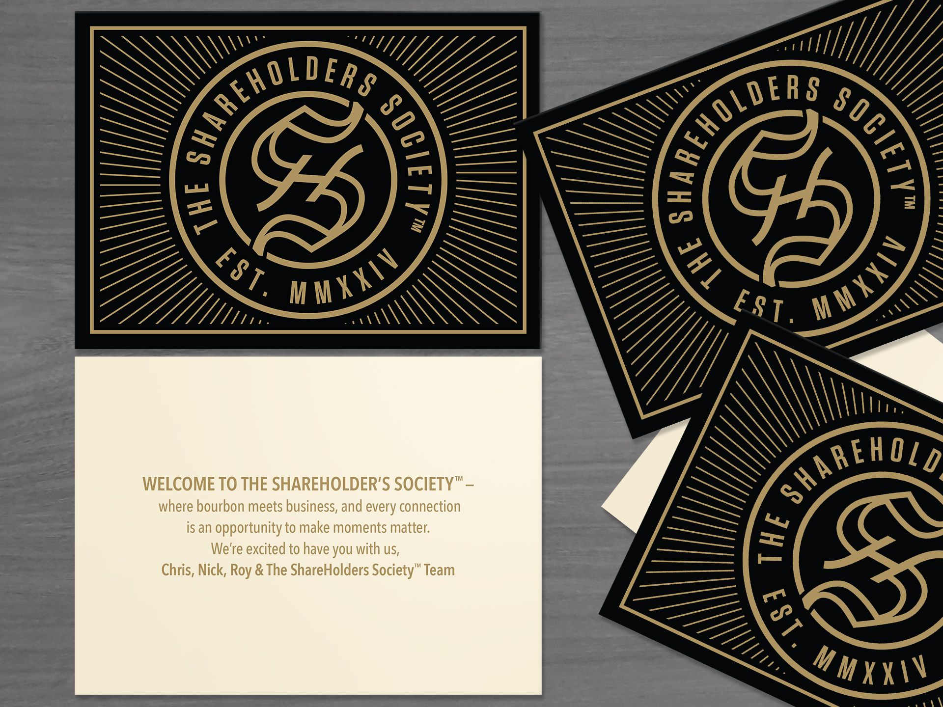
Welcome Notecard
A vital emotional touchpoint within the onboarding experience is the elegant welcome notecard. Grounded in the society’s core philosophy—“where bourbon meets business, and every connection is an opportunity to make moments matter”—the card serves as an official greeting from the founding team. It bridges the physical unboxing with personal connection, immediately establishing an authentic sense of community and high-value access.
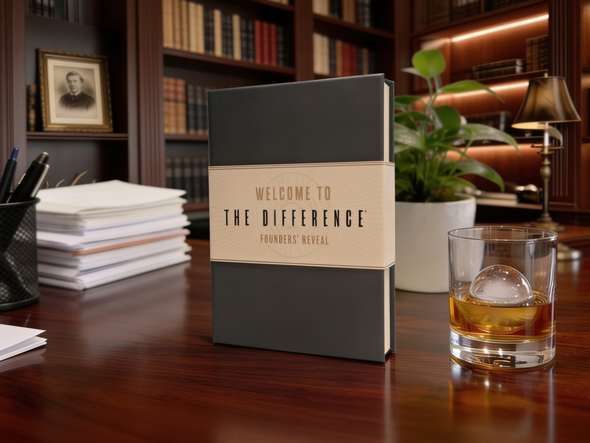
Welcome Kit Box Inserts
These specific cards sit directly inside the welcome kit box, serving as a clean, intentional greeting that introduces the premium merchandise enclosed. The layout was structured to celebrate the founding investors while framing the physical gear they receive.
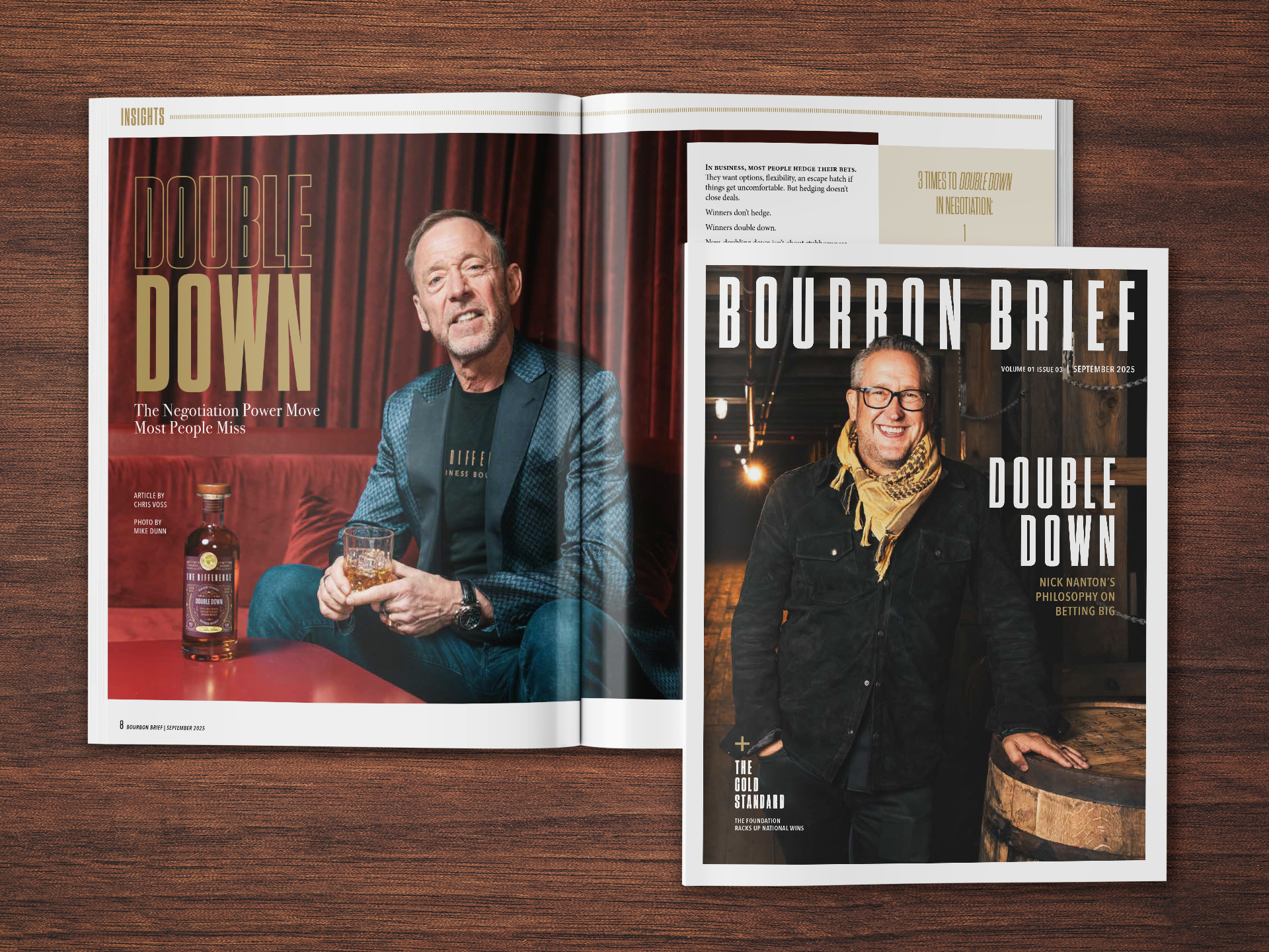
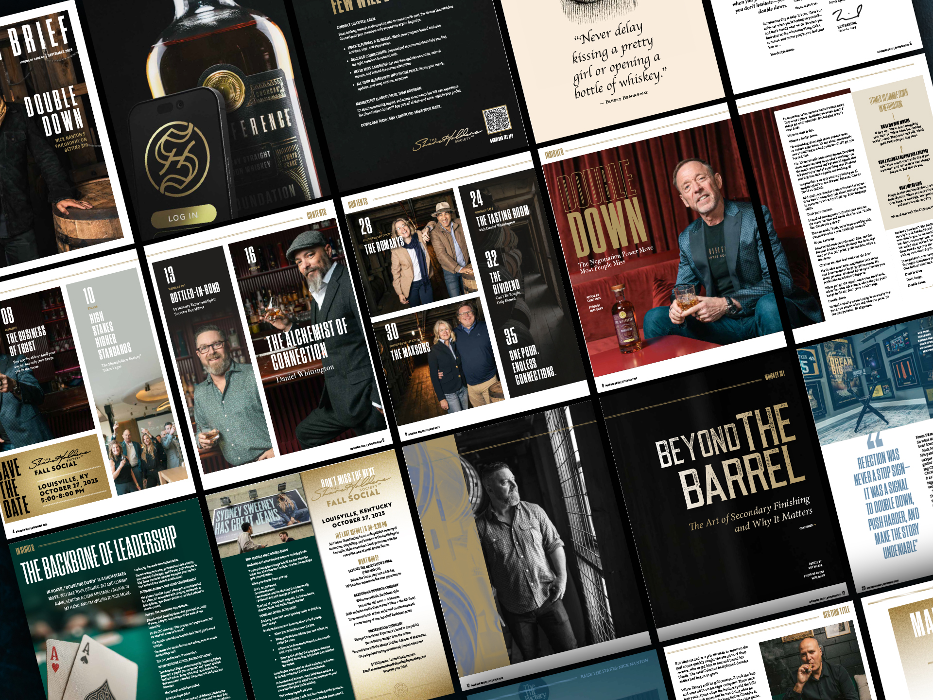
“Bourbon Brief” Promotional Booklet
Completing the physical experience is the Bourbon Brief (Volume 01, Issue 03), a high-end promotional booklet and editorial magazine that serves as the gateway to the society’s broader universe. More than a simple brochure, this print asset functions as a high-touch master guide for members. It features masterclass content on negotiation power moves by Chris Voss, blending insights on “The Art of Secondary Finishing” by spirit sorcerer Roy Milner, and spotlights on elite founding members. Furthermore, it introduces the curated ShareHolders Society™ App ecosystem and previews upcoming off-the-grid experiences, reinforcing that membership is ultimately about community, impact, and unprecedented access.
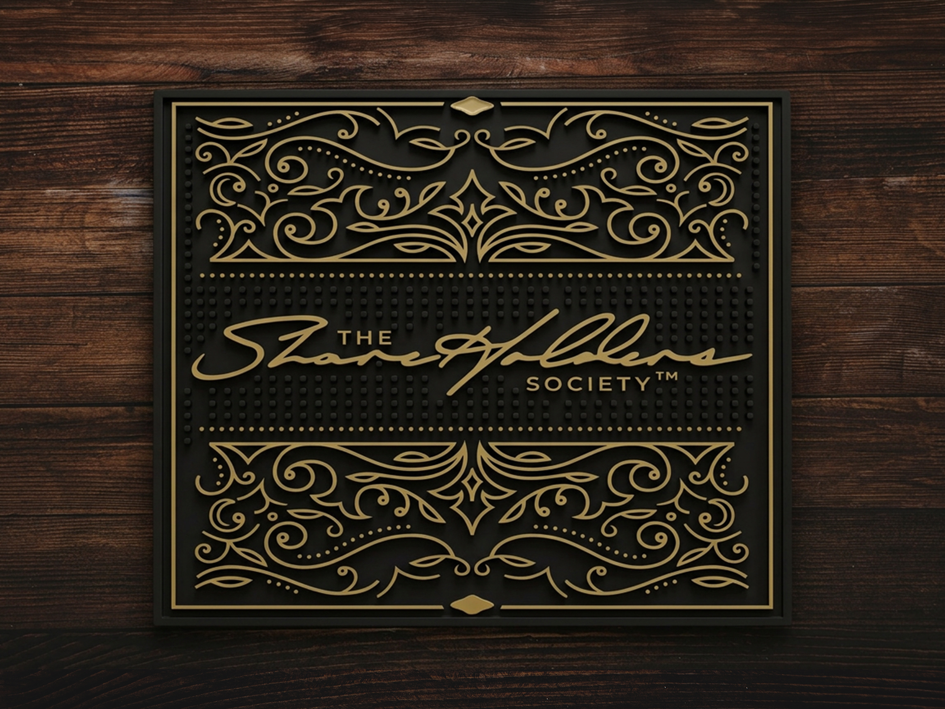
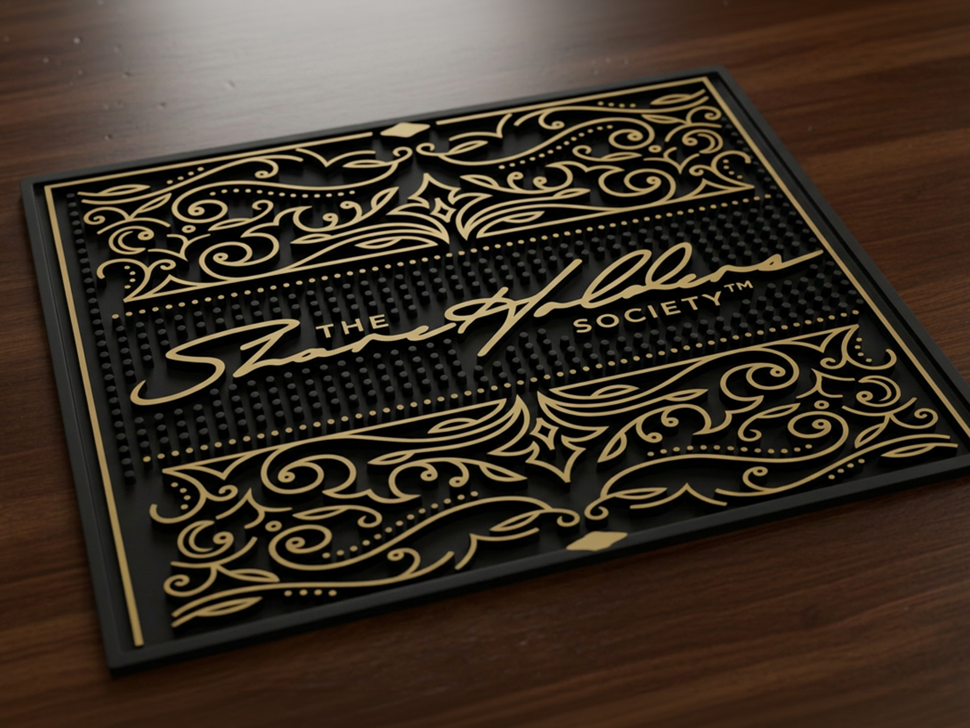
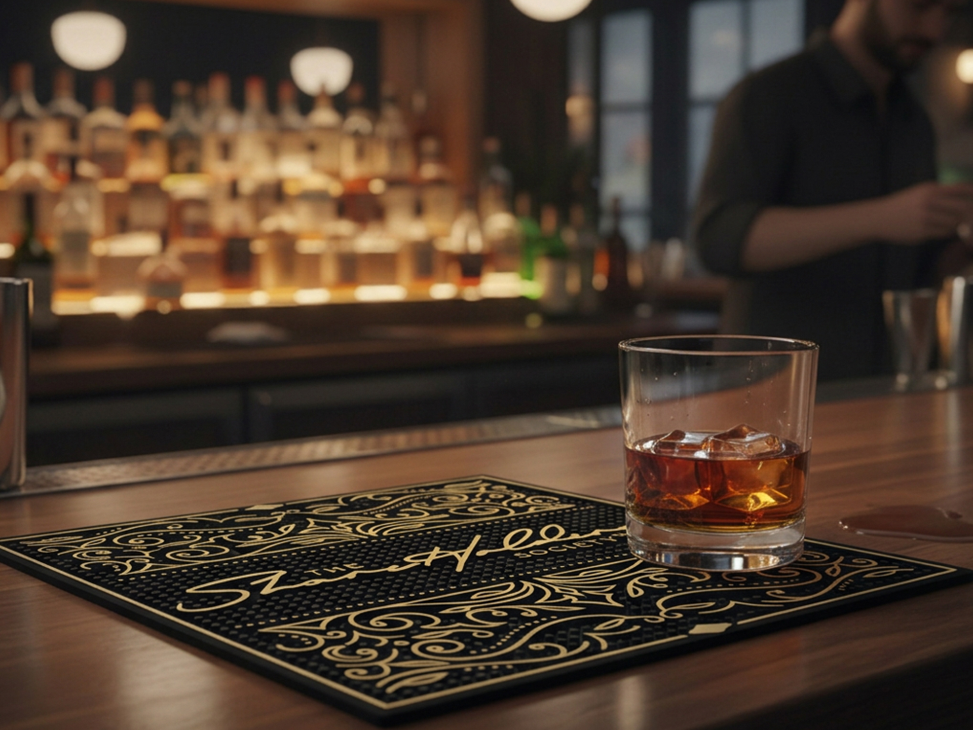
The Shareholders Society Bar Mat
Building on the premium identity, the Shareholders Society Bar Mat serves as a tactile touchpoint within a member’s private office or boardroom. Shifting away from traditional bar aesthetics, the mat features an authoritative black and gold palette with intricate, architectural line work. Every design choice, from the clean serif typography to the gold-foiled appearance of the scrollwork, reinforces the brand’s executive tone. By centering the “Shareholder Society” wordmark, the mat transforms a functional object into a symbol of membership, ensuring the brand commands a presence even when the bottle is put away.
Digital Design & Media
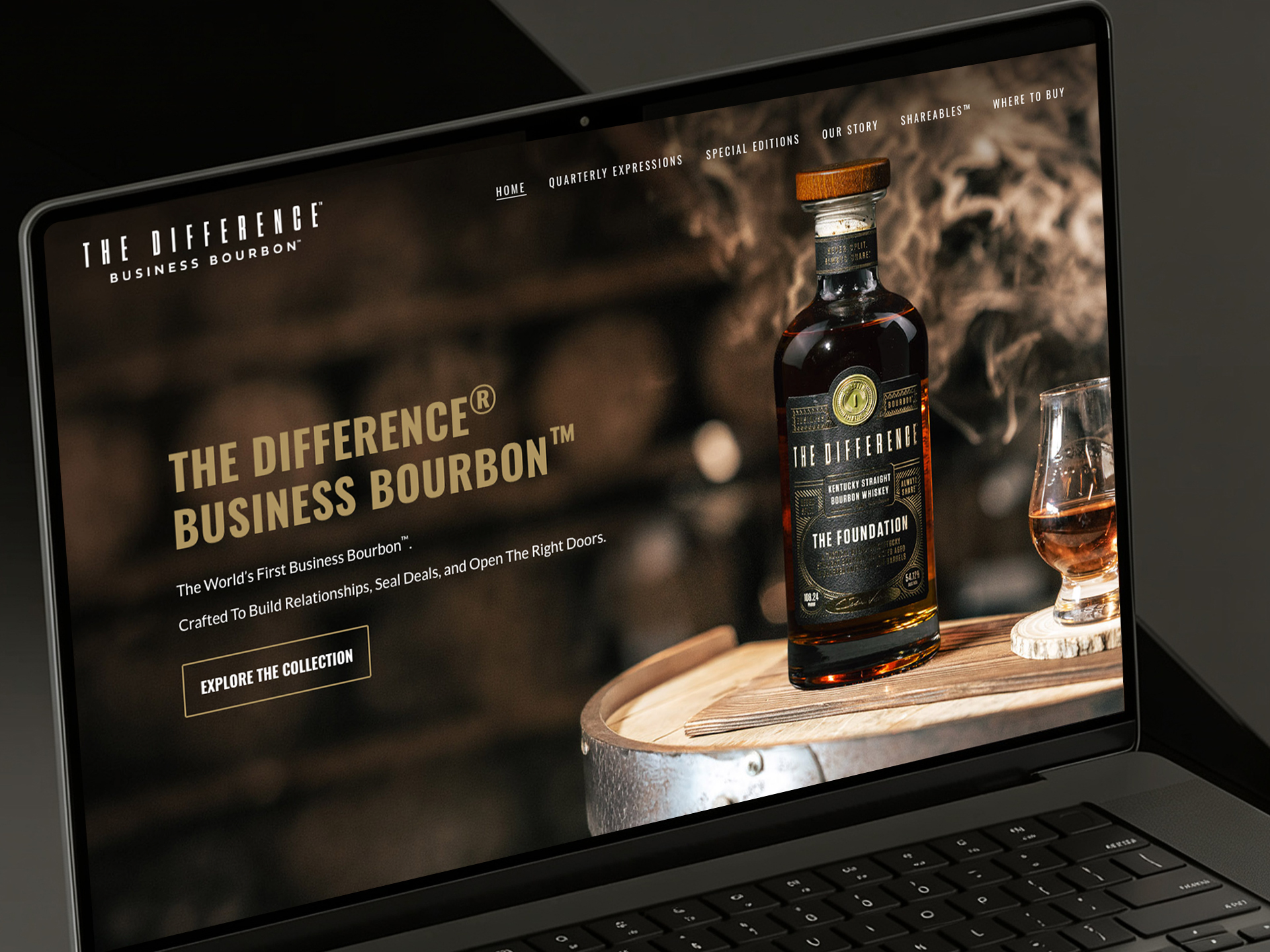
The online presence for The Difference Bourbon demonstrates how a physical design language can dictate an entire digital footprint. The website seamlessly adopts the dark, moody atmosphere established by the bottle’s design, utilizing core typography, metallic accents, and high-end geometric patterns to guide the user’s journey. It stands as a flawless digital translation of the brand’s identity, allowing the sophistication of the physical packaging to command attention on the screen.
To extend this executive presence into daily corporate outreach, I designed a suite of email signatures that translate the brand’s identity directly into the inbox. These cohesive layouts seamlessly balance a sophisticated barrel-room backdrop with Chris Voss’s signature negotiation philosophy, “Never split. Always share.” By pairing the brand’s core identity as a business bourbon with the exclusive, gold-embossed Shareholders Society seal, the design transforms routine email correspondence into an impactful, branded touchpoint where luxury spirit and high-stakes business meet.