Competitive Analysis
To ensure MoonLite Chocolate Co. entered the artisan market with a distinct competitive advantage, I executed a strategic brand audit targeting both boutique bean-to-bar operations and high-end spirit producers. This research centered on breaking down the visual identities of existing brands—specifically tracking how they utilize iconography, color systems, and structural packaging to command premium pricing. By mapping these design choices, I identified a clear visual gap in the market: while most luxury competitors rely on sterile minimalism, they often fail to capture emotional or cultural warmth. This insight allowed us to deliberately craft a contrasting visual identity for MoonLite that pairs high-end, upscale elegance with soulful, geometric motifs, setting the brand entirely apart.
Furthermore, this analysis provided a roadmap for engaging the specific lifestyle demographics of the Central Florida market. I evaluated the visual ecosystems of environments where our ideal consumers already spend time, such as vinyl boutique coffee houses, independent jazz festivals, and arts spaces. Understanding the aesthetic sensibilities of this community guided the development of MoonLite’s primary logo, palette, and unboxing experience. Instead of just designing a product label, this research enabled me to build a cohesive, tailored design framework that directly addresses the consumer’s desire for a deep, culturally rooted culinary ritual.
Logo Concepts
Brand Attributes: Bohemian, Culturally-Conscious, Indulgent, Artisanal, Regal, Soulful
Once I had a solid understanding of the expectations discussed during our alignment and combined them with the research conducted, I began exploring how to translate these abstract cultural values into visual marks. The core creative challenge was to marry organic, celestial storytelling with the structured geometry required of a luxury corporate identity.
During initial conceptualization, I focused heavily on the relationship between the moon and the feather, testing various weight distributions to ensure neither element overwhelmed the other. Early sketches explored nesting the motifs separately, but the breakthroughs occurred when I began experimenting with integration—allowing the texture of the feather to naturally dictate the crescent’s form. To capture the client’s desire for an “enlightened” celestial mood, I also began testing multi-pointed star clusters to introduce focal points of light and negative space. In tandem with the iconography, I audited editorial, high-contrast serif typefaces to establish a sense of architectural stability and weight, deliberately setting a boundary against predictable, casual script lettering to preserve an upscale market position.
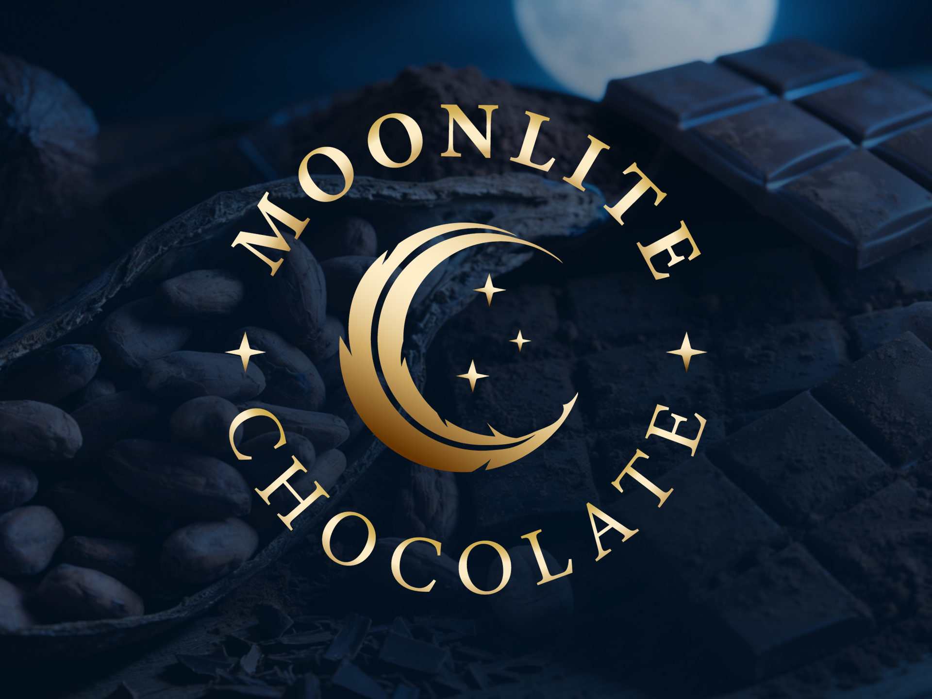
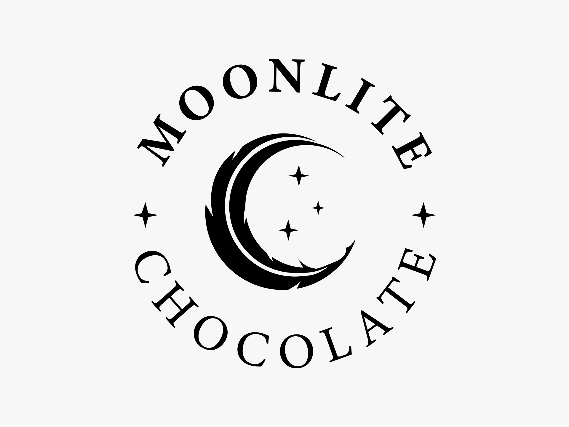
Final Logo
The Design Solution
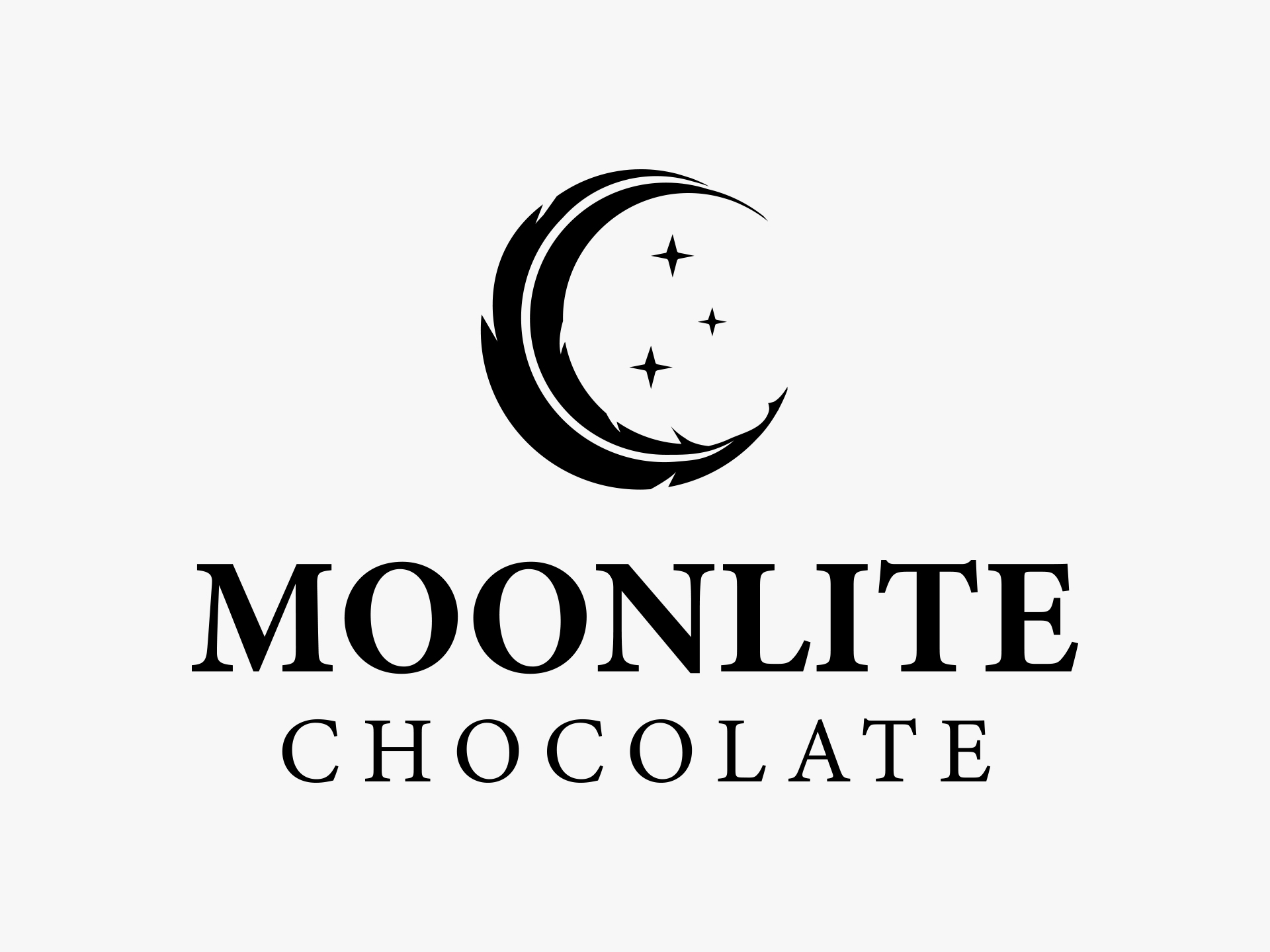
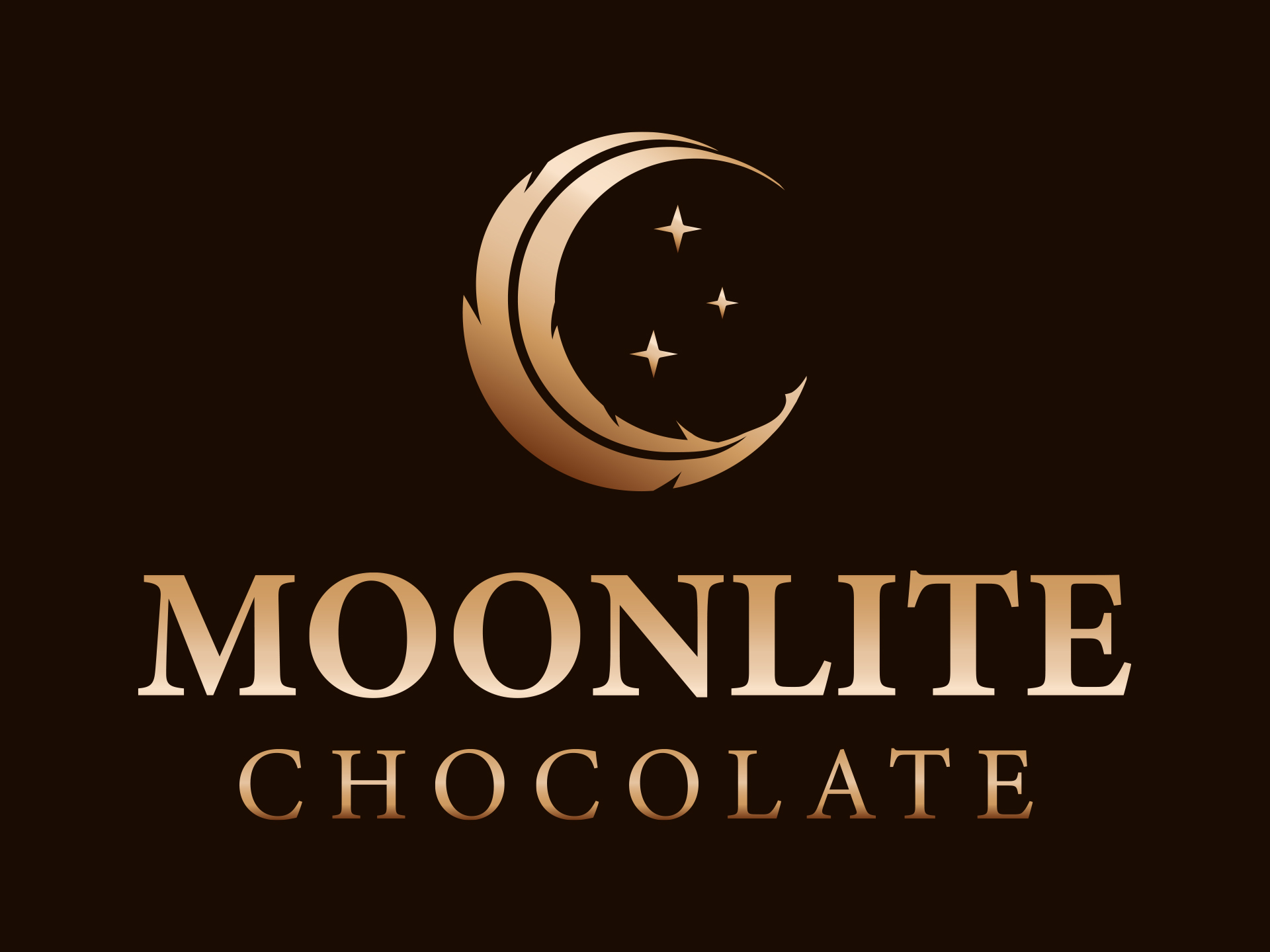
The final identity designed for MoonLite Chocolate Co. seamlessly bridges the gap between high-end luxury and soulful, bohemian sophistication. Inspired by the rich cultural heritage and intentional artistry outlined during our discovery phase, the brand mark centers around a striking, hand-carved celestial motif. The feather elegantly details the outer curvature of the crescent moon, evoking a sense of lightness and inner peace while remaining an organic extension of the silhouette. Nestled within its curve, a trio of sharp, multi-pointed stars acts as a visual nod to illumination and the magic of a night sky, bringing to life the concept of being completely “enlightened by the moonlight”.
To fulfill the client’s request for a bold, upscale presence, the typography utilizes a structured, high-contrast serif typeface. By purposefully steering clear of standard cursive fonts, the logotype anchors the brand in a more mature, regal space while still feeling deeply grounded and artisanal. The clean lines of the typography beautifully balance the intricate, layered depth of the illustration, creating a balanced culinary mark designed to appeal to intellectuals, foodies, and discerning creatives alike.
Versatility & Core Identity
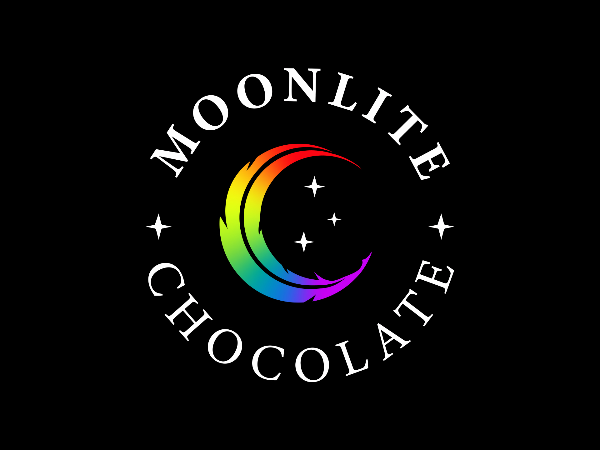
Beyond the pure aesthetics, the three stars intentionally represent the foundational pillars of MoonLite’s brand essence: the “Heart, Mind, and Soul Connection” that the company aims to evoke in every culinary experience. Recognizing that a modern luxury brand must seamlessly pivot across a diverse range of physical and digital touchpoints, versatility was baked directly into the visual system. The client ultimately fell in love with two distinct variations of the identity to be used depending on the application: a circular badge format, which wraps the typography into a self-contained seal ideal for stickers, packaging labels, and digital profile icons, and a stacked configuration, which provides immediate legibility on standard rectangular chocolate bars and storefront signage.
Color Strategy & Intentionality
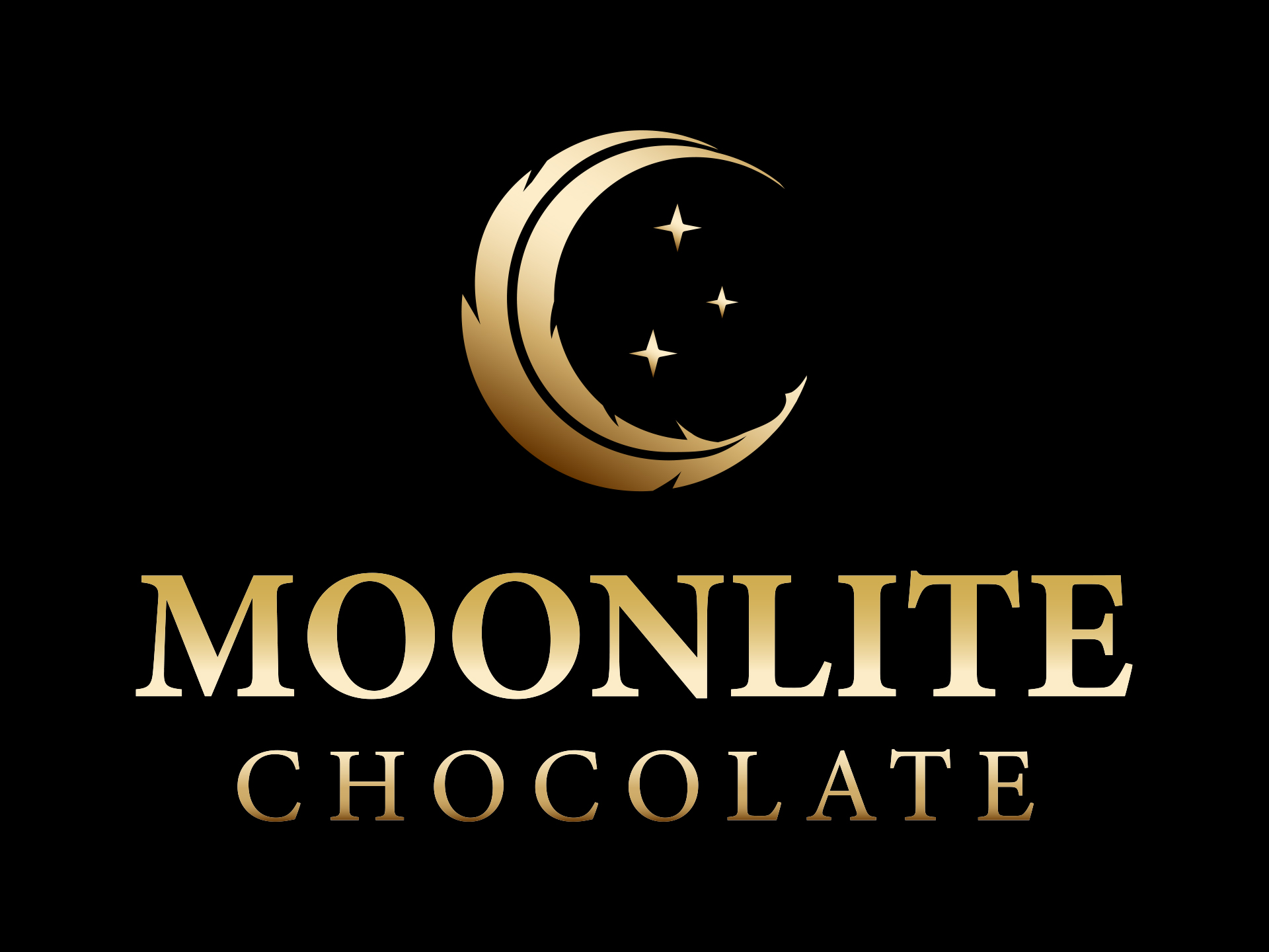
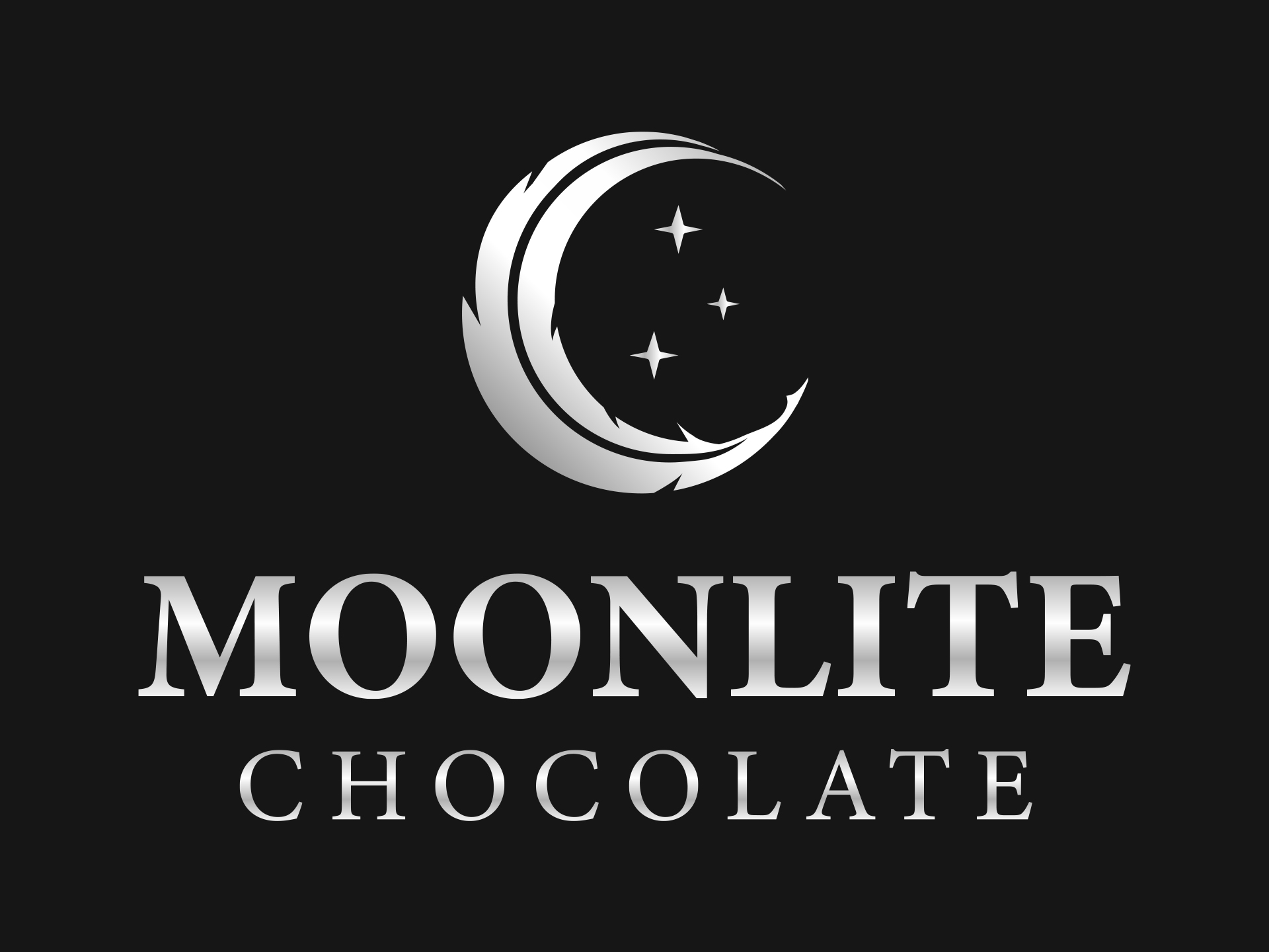
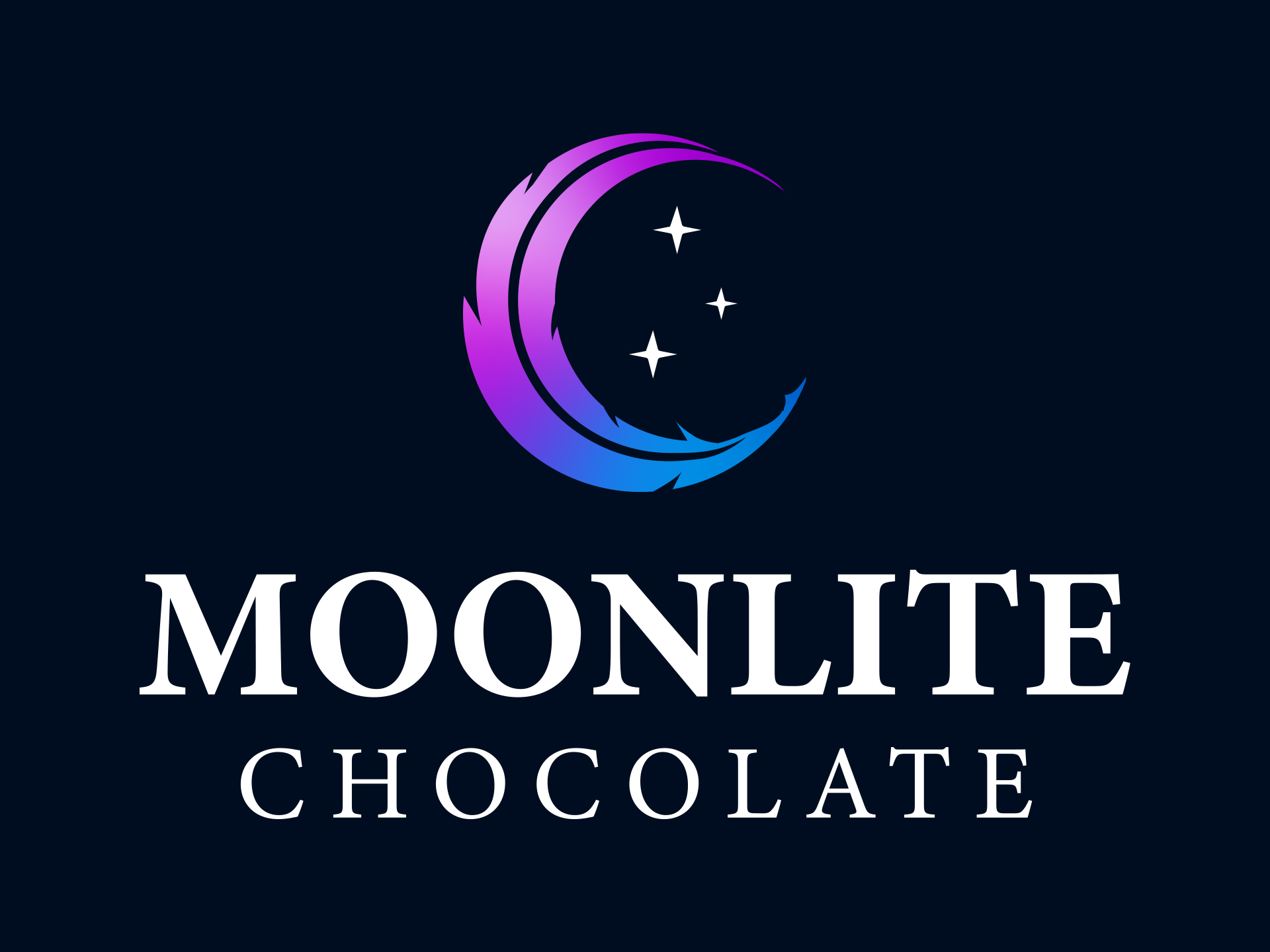
While the visual identity was initially designed in a stark black and white for maximum foundational versatility, the brand strategy leans heavily into a dynamic, shifting color palette to support diverse packaging needs and unique marketing initiatives. The client loved the capability of adapting the logo into different colorways across product lines, including specialized seasonal rollouts—such as vibrant rainbow gradient adaptations that honor the brand’s LGBTQ+ roots while maintaining an uncompromised sense of high-end luxury. Guided by the color preferences from our initial discovery phase, I explored rich jewel tones, smooth metallics, and flowing gradients, including rose gold, silver, and purple. However, the primary color selected for the master brand is a refined gold. Gold directly fulfills the core objectives of the creative brief, evoking an immediate sense of majesty and royalty while remaining deeply tied to the celestial “MoonLite” illumination that shines through darkness. This metallic choice elevates the artisanal product to an indulgent, premium experience, firmly positioning the chocolate alongside the sophistication of the luxury fine wine and whiskey industries.
Typography
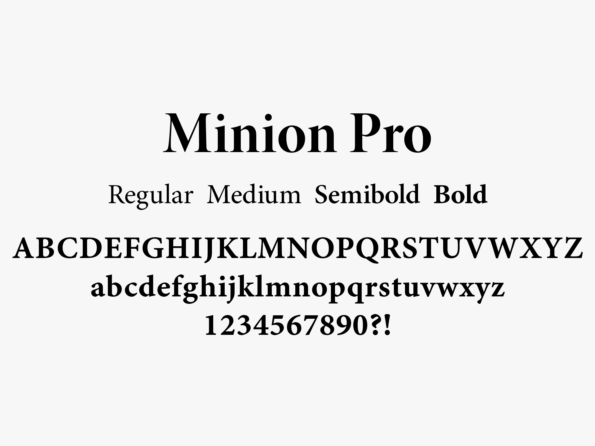
To ground the brand in a space of timeless elegance, I selected Minion Pro as the primary typeface for the visual identity. Designed with classical proportions and subtle, refined serifs, Minion Pro perfectly achieves the client’s objective of moving away from common cursive scripts in favor of a structured, bold, and upscale aesthetic. This typeface acts as a bridge between the brand attributes of Regal and Artisanal, offering a sophisticated, high-contrast weight that naturally commands authority, much like the premium branding seen in luxury fine wine, whiskey, or high-end publishing markets. Its clean legibility ensures the text remains striking and clear across all packaging variations, while its historic, literary undercurrent beautifully mirrors the soulful, Bohemian spirit of a poetry open mic or an intimate jazz lounge. By pairing the organic curves of the celestial emblem with the architectural stability of Minion Pro, the logotype delivers a mature, premium culinary experience that feels both deeply rooted and exquisitely high-end.
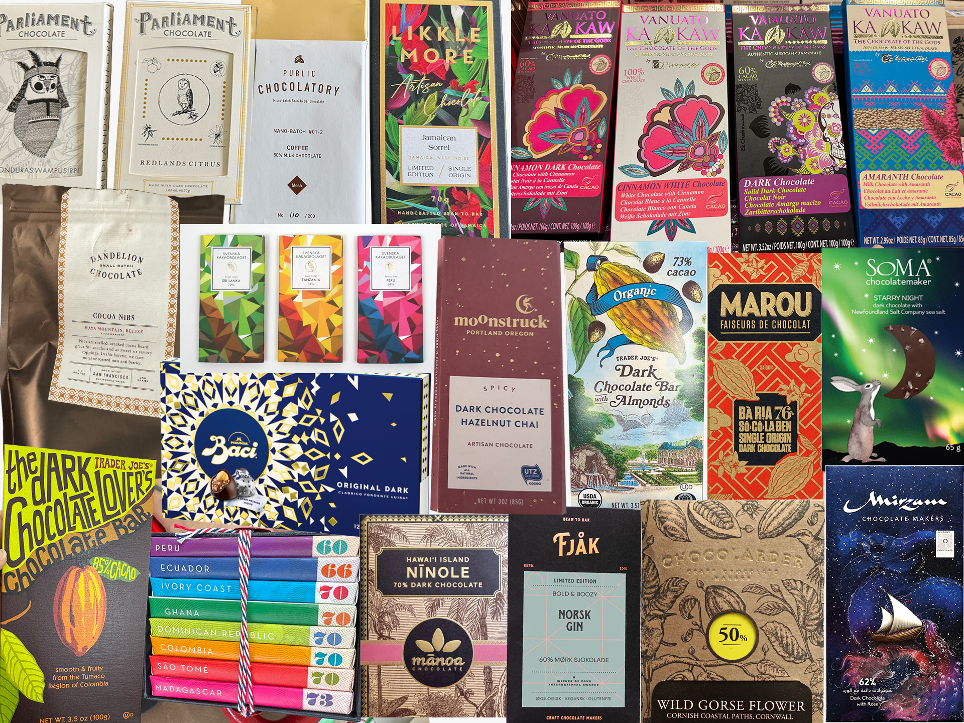
Packaging Competitive Analysis
In addition to auditing the visual presence of our direct competitors, the strategic research shifted toward a deep structural and aesthetic analysis of global packaging layouts, type hierarchies, and unboxing experiences. To gain fresh inspiration, I expanded the competitive lens beyond the immediate chocolate market to evaluate premium packaging designs from high-end luxury chocolate makers, fine wine labels, and boutique spirits that mirrored the exact look and lifestyle style my client was aiming for. A particularly compelling discovery emerged when reviewing origin-specific imports, where many traditional and single-origin products suffered from overly sterile, basic, or predictable packaging designs.
I recognized this widespread simplicity as a massive visual opportunity, setting clear objectives for the upcoming packaging design phase. The goal became to explore how we could reject generic, uninspired layouts in favor of a narrative-driven canvas. Specifically, the objective was to determine how to weave intricate, culturally conscious geometric patterns alongside rich educational back-panel storytelling that details the bean-to-bar process, ethical traceability, and the regional roots of the cacao. By framing the packaging as both a luxury art piece and an informative guide, the goal was to ensure the product stands out prominently on the shelf while inviting the consumer into a complete, multi-sensory unboxing ritual.