Competitive Analysis
In order to solidify Real Estate News’ position as the most trusted source for residential real estate news, I spearheaded a comprehensive competitive analysis. This involved a deep dive into the visual branding strategies of our main competitors. We examined their logos, color palettes, fonts, and overall design aesthetics to identify trends and potential areas for differentiation. Beyond branding, the analysis focused on understanding “real estate news” itself. We explored the types of content offered by competitors, including news articles, market forecasts, legal analyses, and technological advancements. This provided valuable insights into the current landscape of real estate journalism, allowing us to refine our editorial focus and content strategy. Finally, the competitive analysis included a thorough examination of our target audience. By analyzing competitor platforms and industry publications, we gained a deeper understanding of the demographics and information needs of real estate professionals, buyers, and sellers. This allowed us to tailor our visual design and content approach to resonate most effectively with these key audiences.

Logo Concepts
Brand Attributes: Authentic, Impartial, Trustworthy
Initially, Real Estate News had an existing logo. However, upon joining the team, I presented a compelling case for redesigning the logo before launching. Through a series of design iterations and presentations, I successfully convinced the team to adopt a new visual identity that better aligned with our brand’s values and target audience.
Final Logo
The logomark’s imagery reflects the essence of Real Estate News. Signals atop a house symbolize our coverage of the real estate industry, while the three rings represent our core values of authenticity, impartiality, and trustworthiness. The logo’s overall structure resembles a target, with the roof pointing towards the center, signifying our commitment to delivering concise and informative content. Additionally, the light blue color evokes the image of a keyhole, suggesting that subscribers are part of an exclusive inner circle, gaining access to the most valuable and insightful real estate news.
Color scheme
The two shades of blue selected for the Real Estate News logo were carefully chosen to reflect the brand’s values of authenticity, impartiality, and trustworthiness. Cobalt blue, often associated with stability, reliability, and trust, evokes a sense of confidence and credibility. French blue, a lighter shade, adds a touch of approachability and friendliness, suggesting that the brand is accessible and easy to engage with. The interplay between these two shades creates a visually pleasing contrast that enhances the logo’s overall impact and memorability.
#0D47A1 – Cobalt Blue
#1976D2 – French Blue
Typography
To ensure that the Real Estate News logo stands out from the surrounding content, I selected Alternative Gothic ATF as the primary typeface. This bold and condensed font provides a strong visual contrast to the main typeface, preventing the logo from blending in with headlines and stories. Its distinctive character conveys a sense of authority and trust, reinforcing the brand’s commitment to providing reliable and informative content. Additionally, Alternative Gothic ATF’s versatility ensures that the logo scales well across various platforms, maintaining its impact and readability on both digital and print materials.

Branded Pattern
The brand pattern for Real Estate News effectively encapsulates the core elements that contribute to their trusted storytelling. The circles, symbolizing reporting, writing, design, and visual storytelling, visually represent the interconnectedness of these components in creating compelling content. The dynamic movement of the circles coming together from various angles signifies the collaborative effort and synergy involved in producing high-quality real estate news. This pattern not only complements the REN logo but also adds a visually engaging dimension to the brand landscape, making it instantly recognizable and memorable. Moreover, a brand pattern serves as a valuable tool for establishing a strong brand identity. It creates a visual language that is unique to Real Estate News, helping them differentiate themselves from competitors and resonate with their target audience. By incorporating the brand pattern into various marketing materials, such as websites, social media posts, and print advertisements, REN can reinforce their brand message and create a cohesive and professional image.

Iconography
To enhance the visual appeal and clarity of RealEstateNews.com, I designed a comprehensive set of custom icons. Some of these icons were integrated into the website’s interface, while others were created as part of a broader design package. These icons serve as visual cues, guiding users towards specific content or features.
Brand Guidelines

Website Design
RealEstateNews.com is a comprehensive resource for real estate professionals, providing timely updates on industry trends, business tips, legal news, and agent success stories. My involvement in the project extended to the design and layout of the website’s pages. I worked closely with the development team to create a visually appealing and intuitive interface that enhances user experience and facilitates easy navigation.
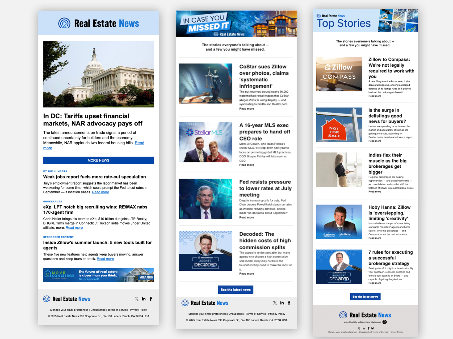
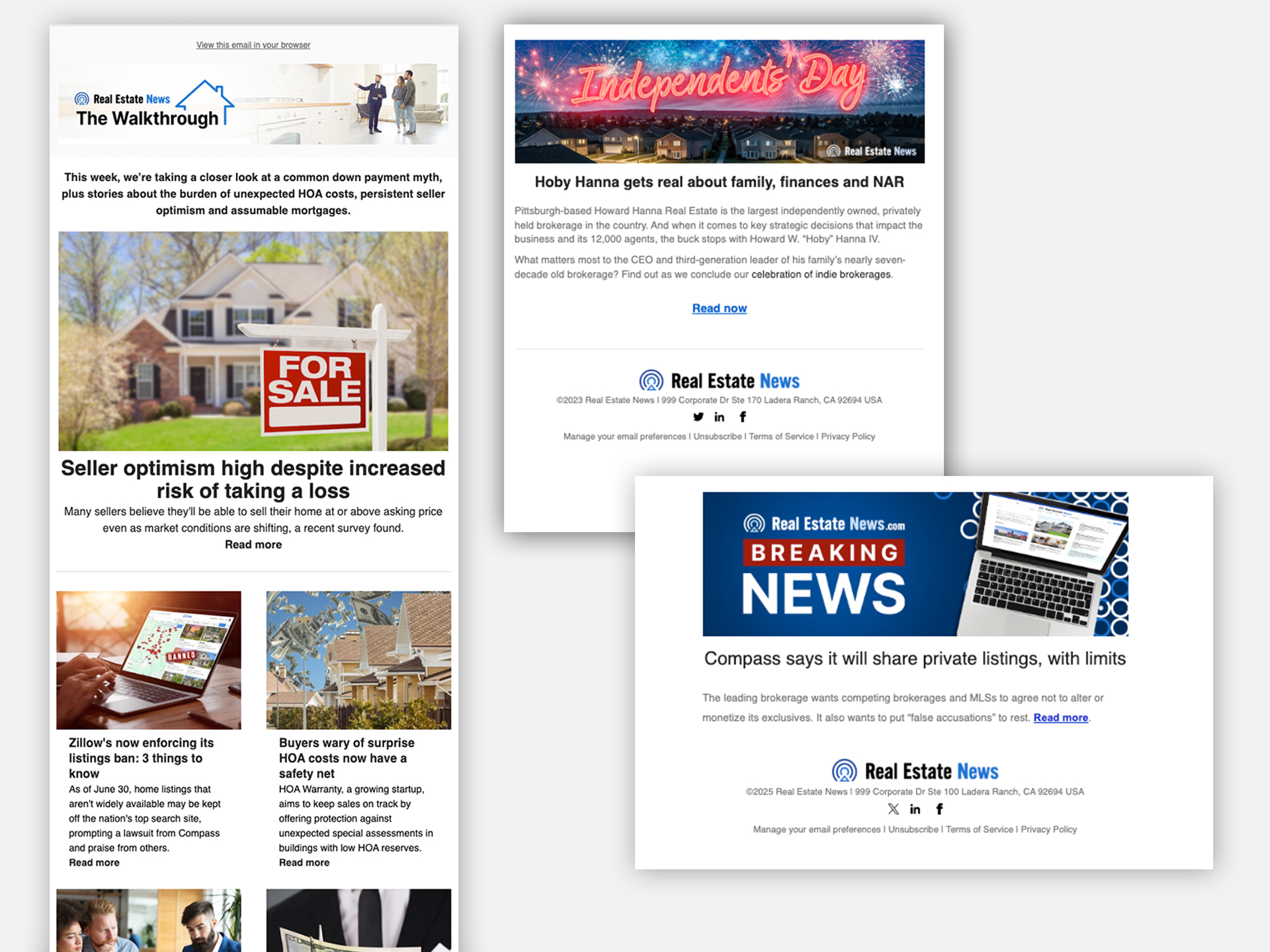
I was responsible for the complete email design process, from conceptualizing and creating impactful header images to developing the full layout and aesthetic. Through striking and cohesive visual design, I significantly increased email engagement and open rates. For the “In Case You Missed It” banner, I strategically redesigned the prior version to be more creative and engaging, which helped drive a remarkable open rate of 51% from the previous 45% average. This demonstrates a direct correlation between my design work and heightened user interaction.
Social Media
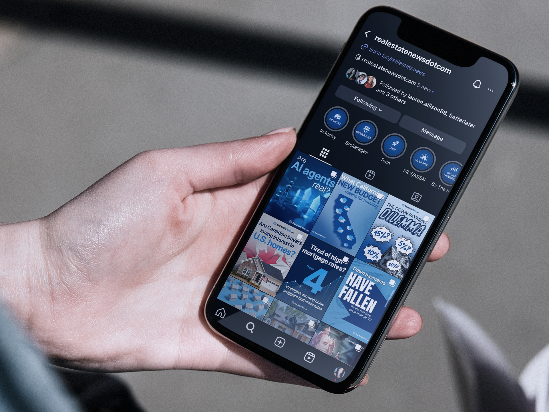
My role involved creating all social media graphics. I transformed complex news stories into engaging, bite-sized visuals with striking imagery to increase engagement and grow our social media following.
I also led the creative direction for our paid social media marketing campaigns, specifically designing advertisements to drive subscriptions to the real estate news website. These efforts have yielded successful results.