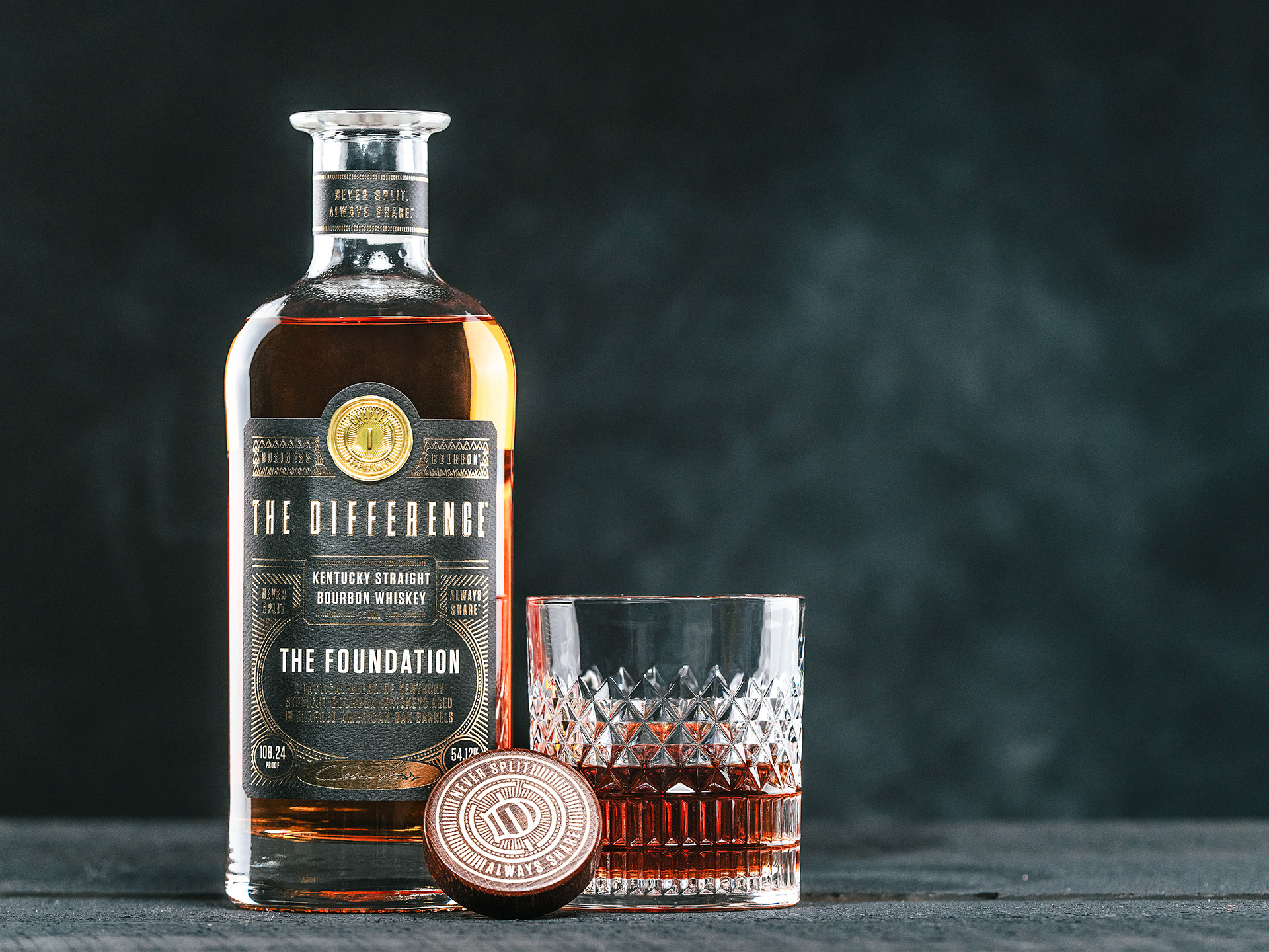
Package Design
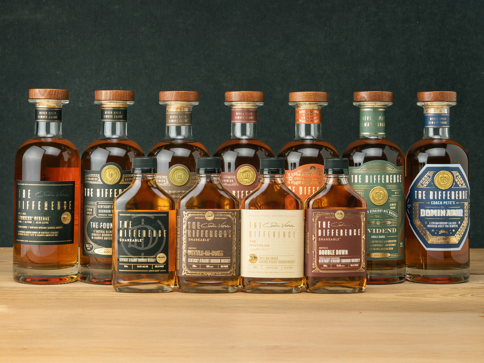
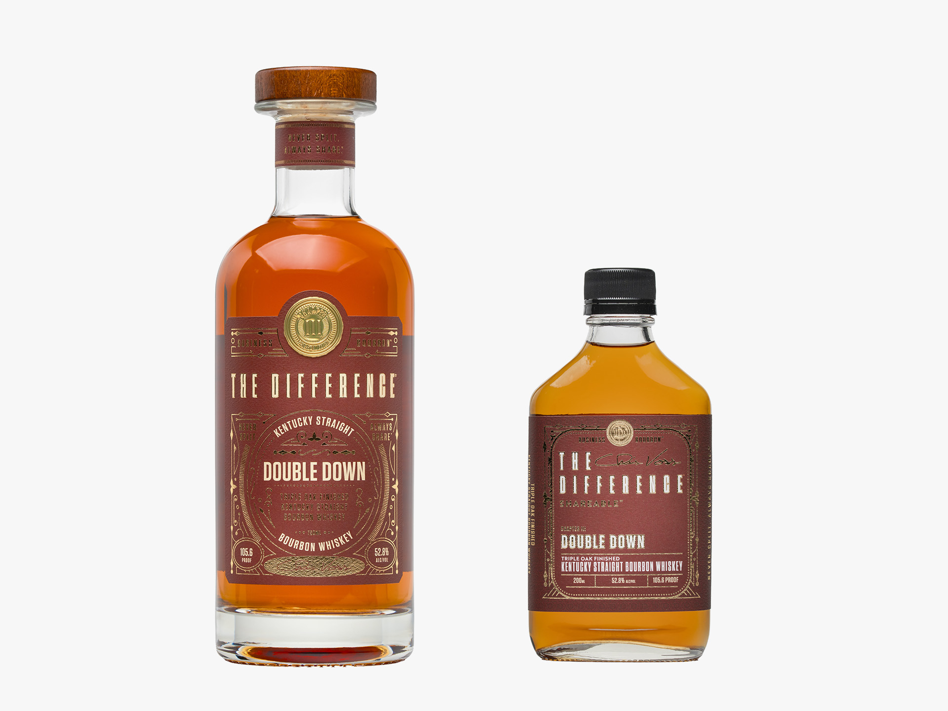
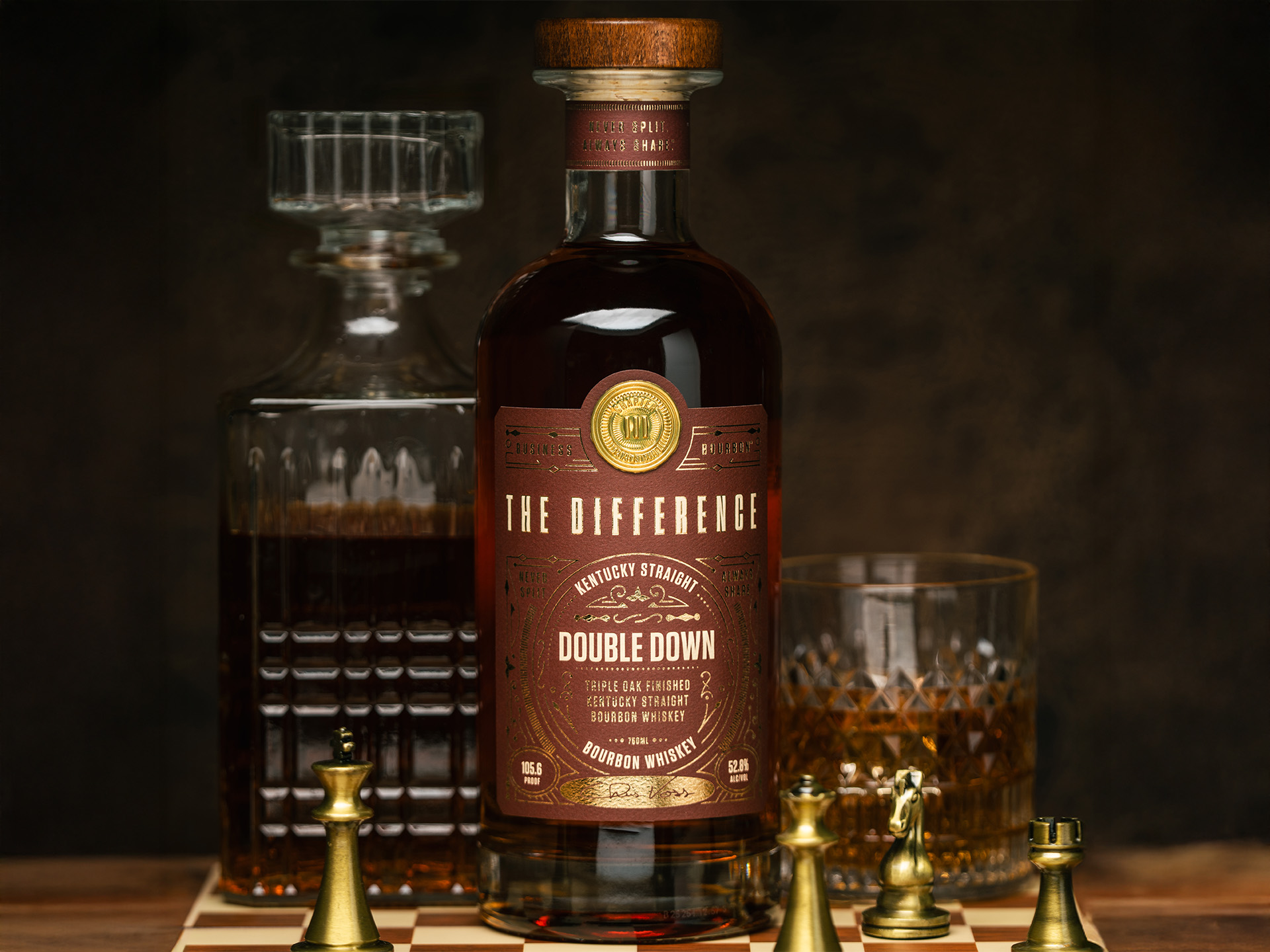
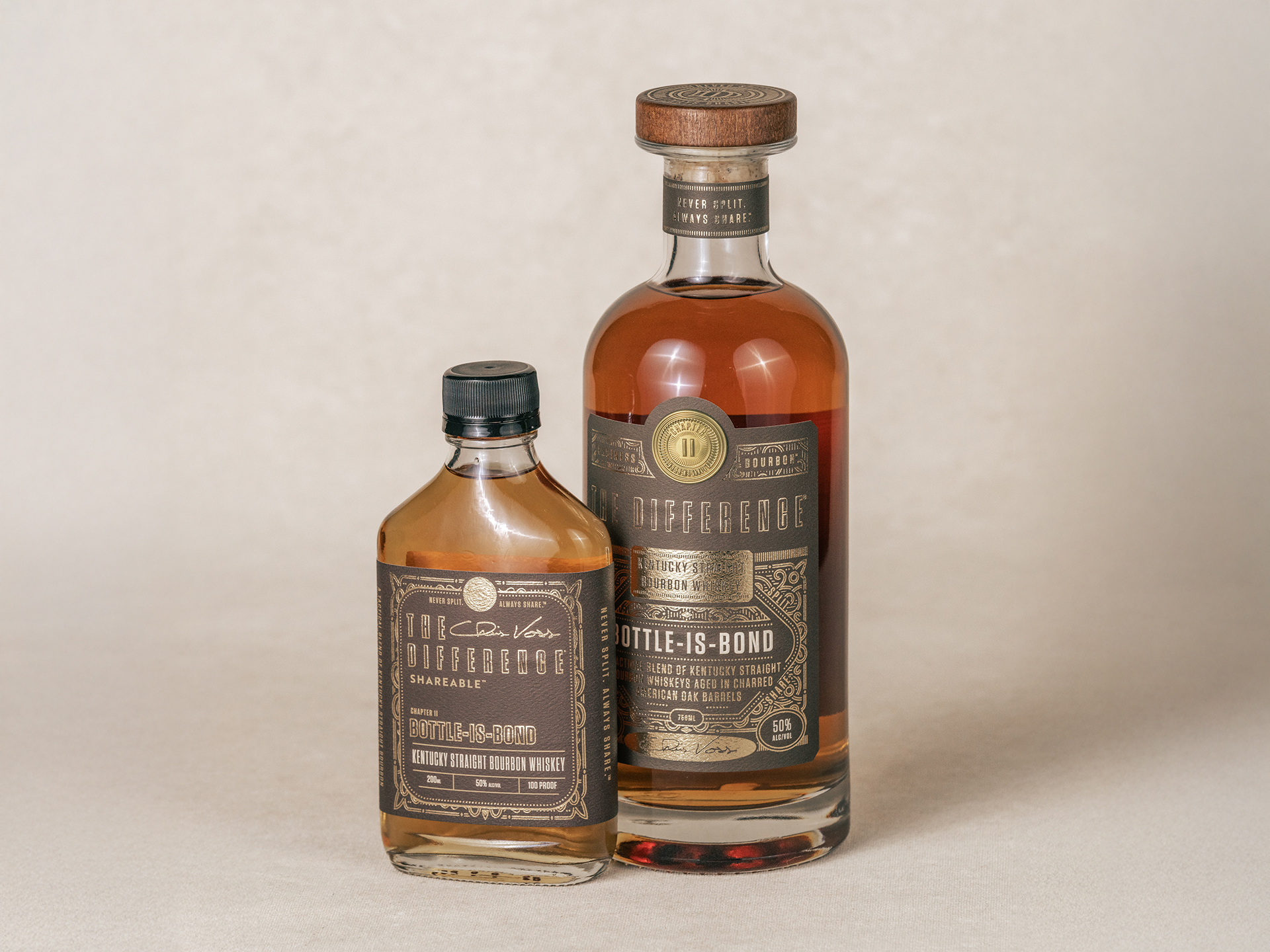
The design challenge for The Difference Bourbon was to move beyond the traditional “rustic distillery” aesthetic and instead create a visual language that felt at home in a high-stakes boardroom. To achieve this, I focused on a “Relationship Asset” strategy, utilizing a heavy, architectural bottle silhouette paired with a dual-format presentation. The 750ml bottle, topped with a premium wood and cork stopper, acts as a centerpiece for professional environments, while the 200ml “Shareable” flask was engineered as a tactical tool for gifting and opening doors. The typography leans into a clean, authoritative serif and sans-serif mix, utilizing gold foil and deep, textured earth tones to signify prestige. By balancing these classic luxury elements with modern touches like integrated QR access for the Shareholders Society, the packaging transforms the bourbon from a simple beverage into a trophy of professional achievement.
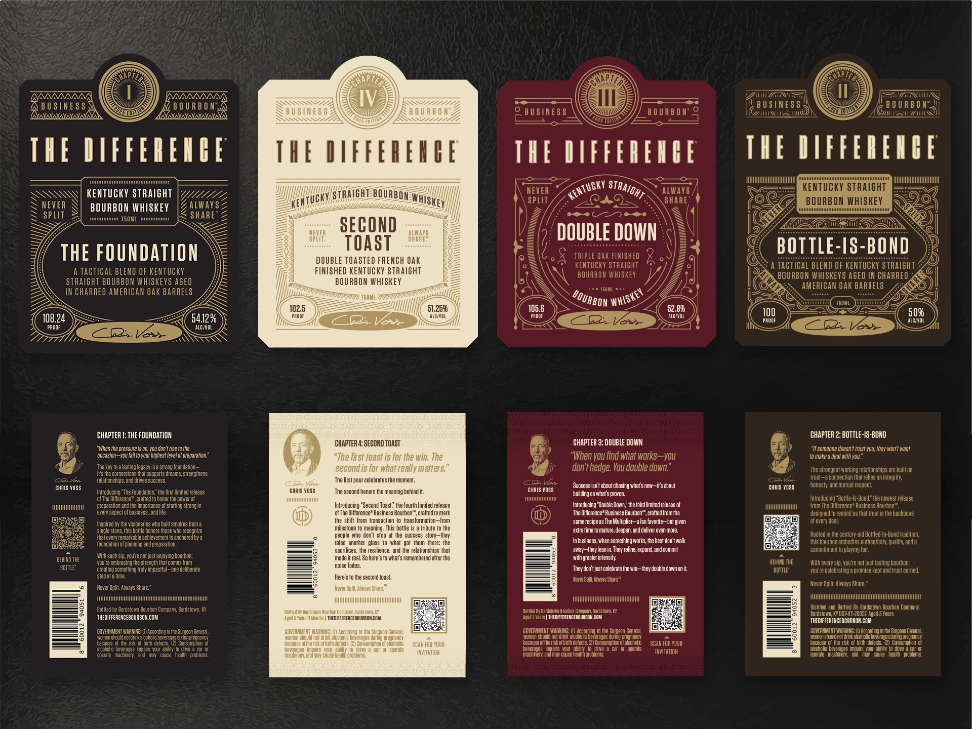
To ensure a cohesive brand experience across the entire product line, I executed a design system that maintains visual gravity while distinguishing various “Chapters.” This was achieved through a rigorous color-coding system and varied geometric label shapes—ranging from traditional rectangles to modern hexagons—that all share the same tactile, embossed paper quality. The resulting identity bridges the gap between a digital-first membership model and a physical luxury product, ensuring that every touchpoint, whether it’s a social media graphic or the physical bottle on a mahogany desk, reinforces the brand’s core pillars: professional exclusivity and strategic excellence. The final design doesn’t just look expensive; it looks authoritative, successfully positioning the brand as the world’s first business-centric spirit.


Brand Collateral
Building on the premium visual identity of The Difference, the Shareholders Society Bar Mat was designed to serve as a high-value tactile touchpoint within a member’s private office or boardroom. Moving away from traditional, rustic bar aesthetics, the mat features an authoritative black and gold palette with intricate, architectural line work that echoes the brand’s “Relationship Asset” strategy. Every design choice, from the clean serif typography to the gold-foiled appearance of the scrollwork, reinforces the brand’s core pillars of professional exclusivity and strategic excellence. By centering the “Shareholder Society” wordmark, the mat transforms a functional object into a symbol of membership within the world’s first business-centric spirit ecosystem, ensuring the brand commands presence even when the bottle is put away.