Bbee’s Home Cooking
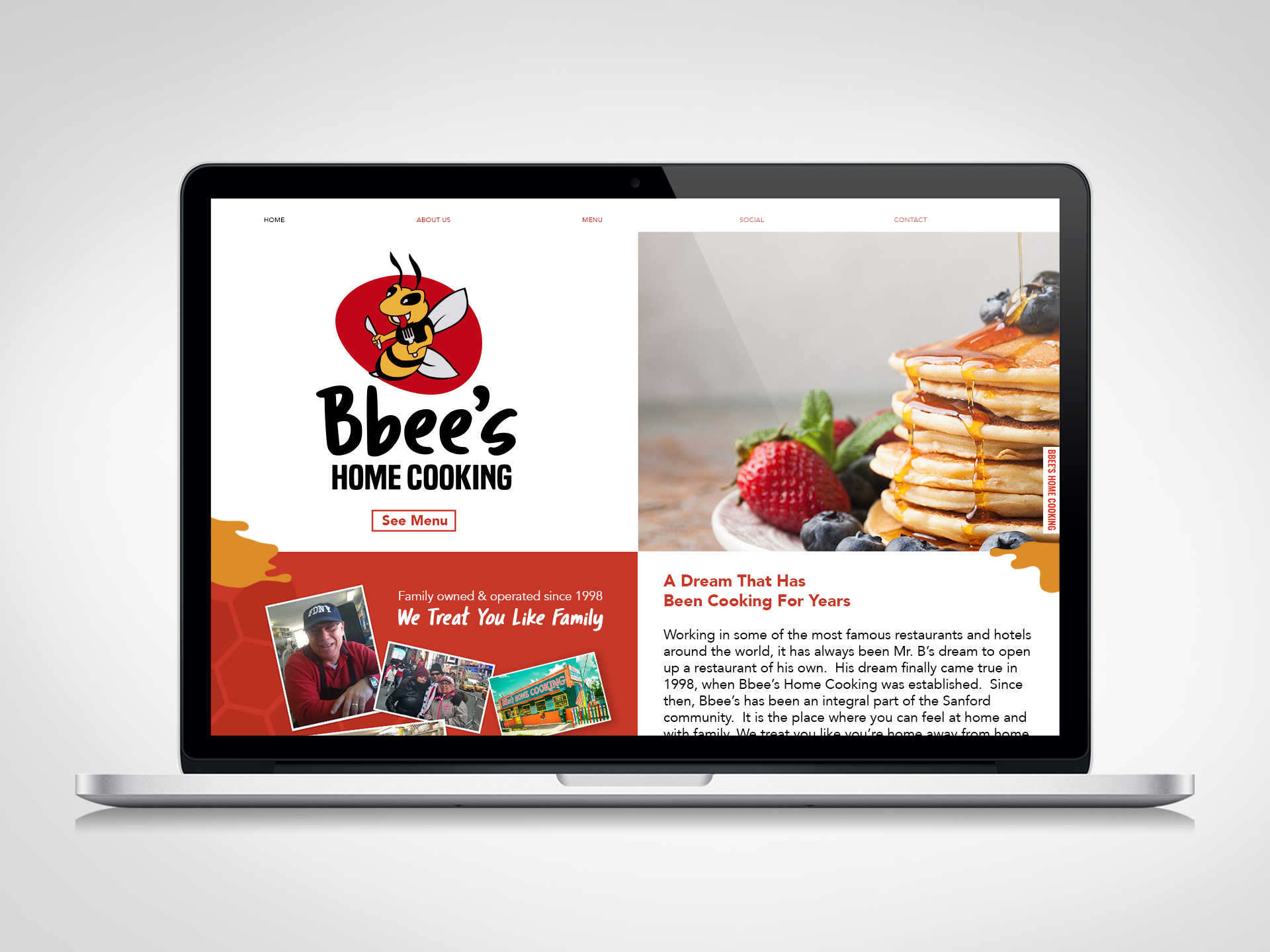
Bbees Home Cooking has been family owned since 1998. Over the years they have been considered as an important part of the community through it’s established history of being located right in the center of Sanford, Florida. Serving breakfast and lunch, the locals come to Bbees Home Cooking to find a place where it feels like home. Family and serving their community is a huge part of their brand, so the overall goal of this project was to clean up the brand with more of a clean professional look, but yet still have a friendly homely quality.
ServicesBranding, Logo, Business Cards, Menu, WebsiteYear2017
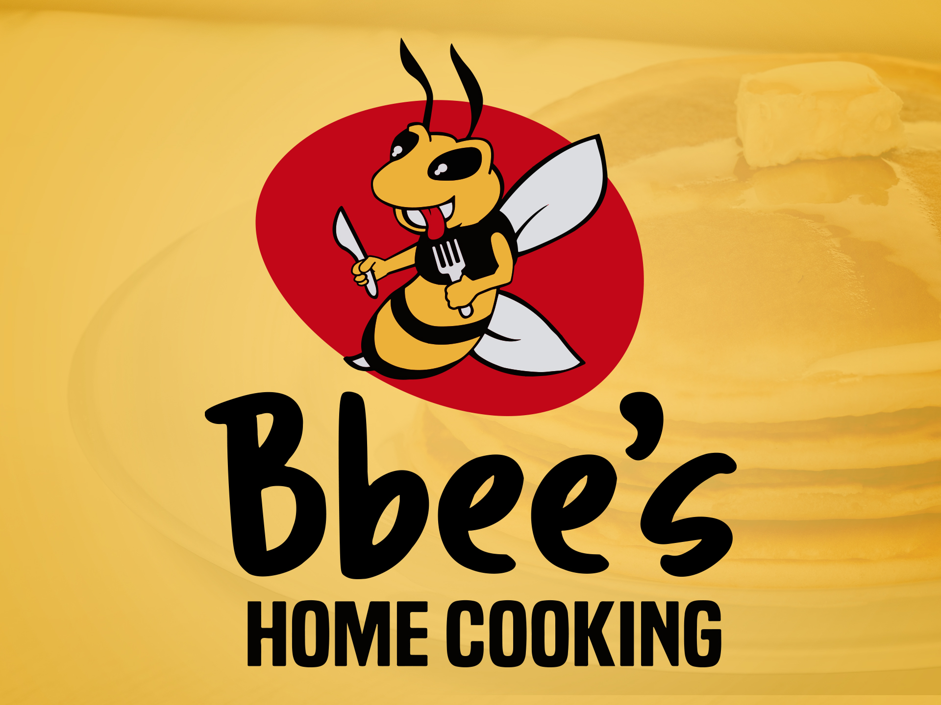
Competitive Analysis
The first step when creating a brand involves a lot of research. I take a look at the Bbee’s local competitors, their preference of styles, and learn more about their business and objectives. All of these things are collectively used to provide a sense of clear direction and provide inspiration when creating a logo.
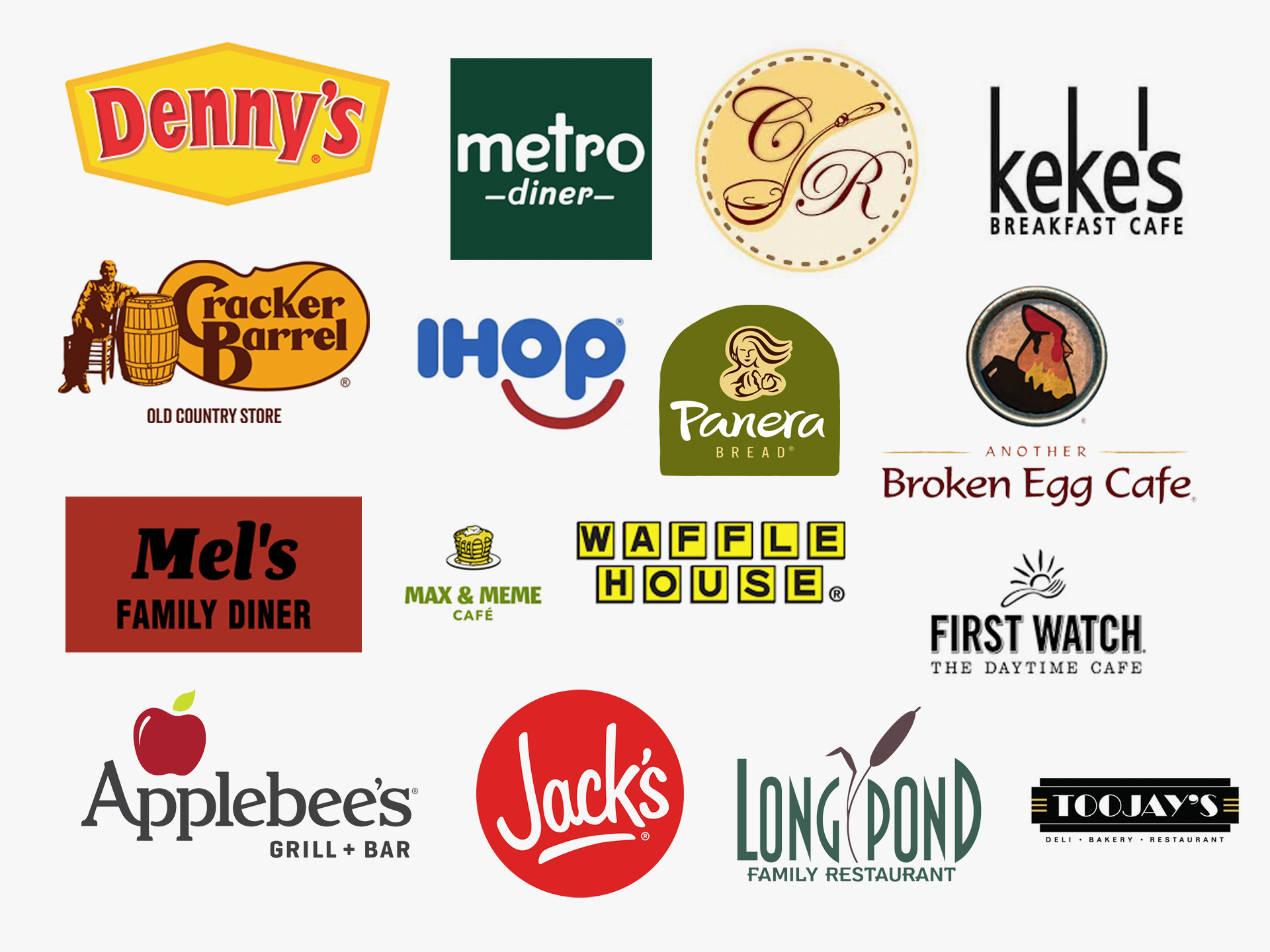
Logo Concepts
Brand Attributes: Authentic, Quality, Affordable, Family-Friendly
Once I had a solid understand of the client’s expectations combined with the research conducted, I was ready to start developing some logo concepts. The task was to modernize their brand without stripping away the character, work ethic and quality that makes their service legendary. The client loved the idea of having a hungry bee as their logo mark which would play off the businesses name. It was crucial to ensure that the illustration of the bee would not appear threatening as to not give the wrong message to their customers.
Final Logo
Bbee’s was really thrilled with this version, since they felt it captured their idea best with having a friendly hungry bee ready to chow down holding his knife and fork in hand.
Color scheme
In my research, I learned that the use of oranges and reds are a great way to invoke hunger. I felt this was a great subtle way to drive more business and really provided a nice color scheme going with the bumble bee and honey theme.
#edb23a – Yellow Red
#c20819 – Venetian Red
#dcdde1 – Gainsboro
#000000 – Black
Typography
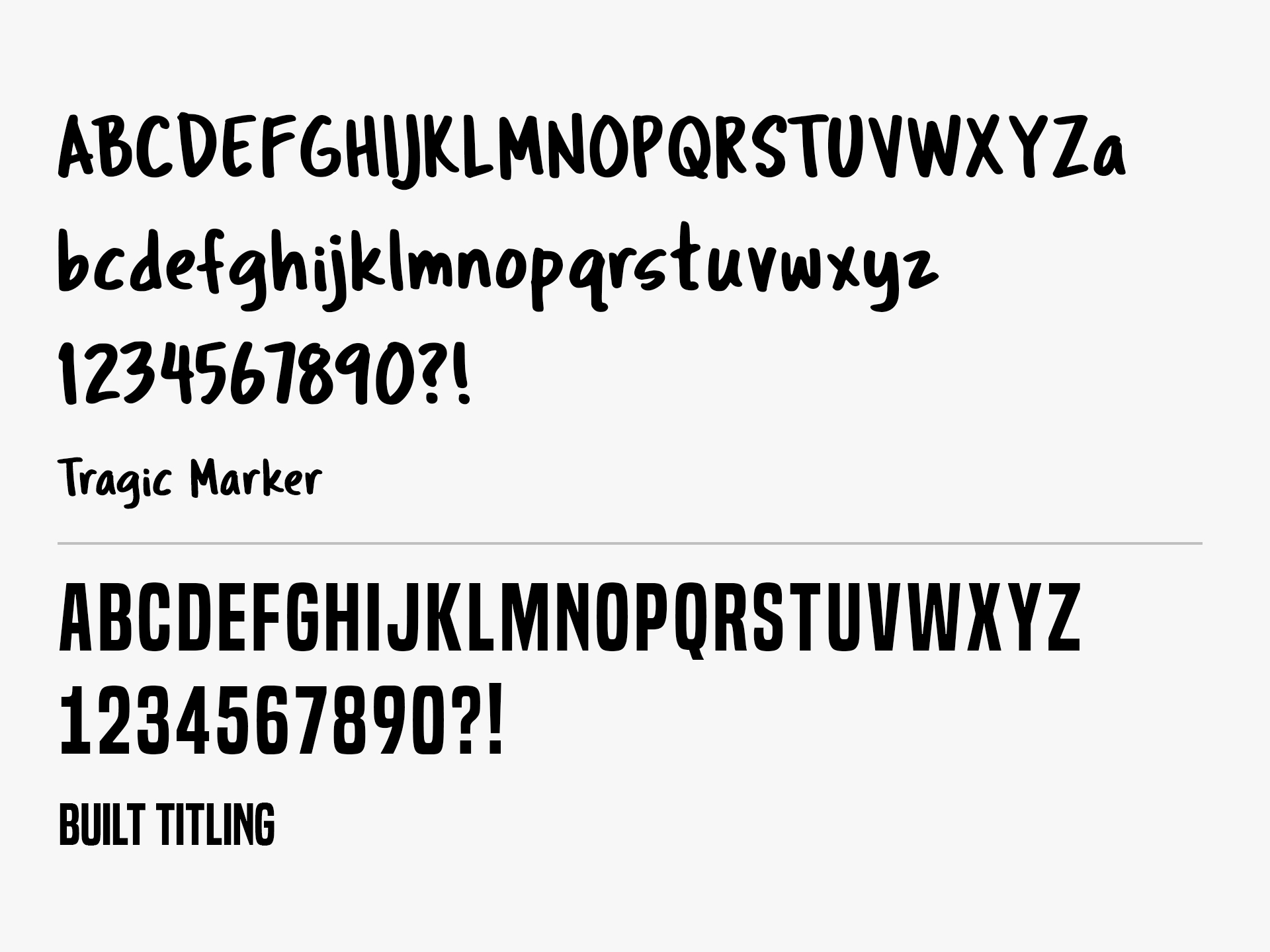
With having a really fun illustrated bee as their logo mark, it really needed a font that would tie in nicely to give it that drawn look. With using a hand-written font for Bbee’s, it drives the brand’s attributes of being authentic. The modern font below for Home Cooking, creates a nice balance between the two and makes the logo easily readable.
Branded Pattern
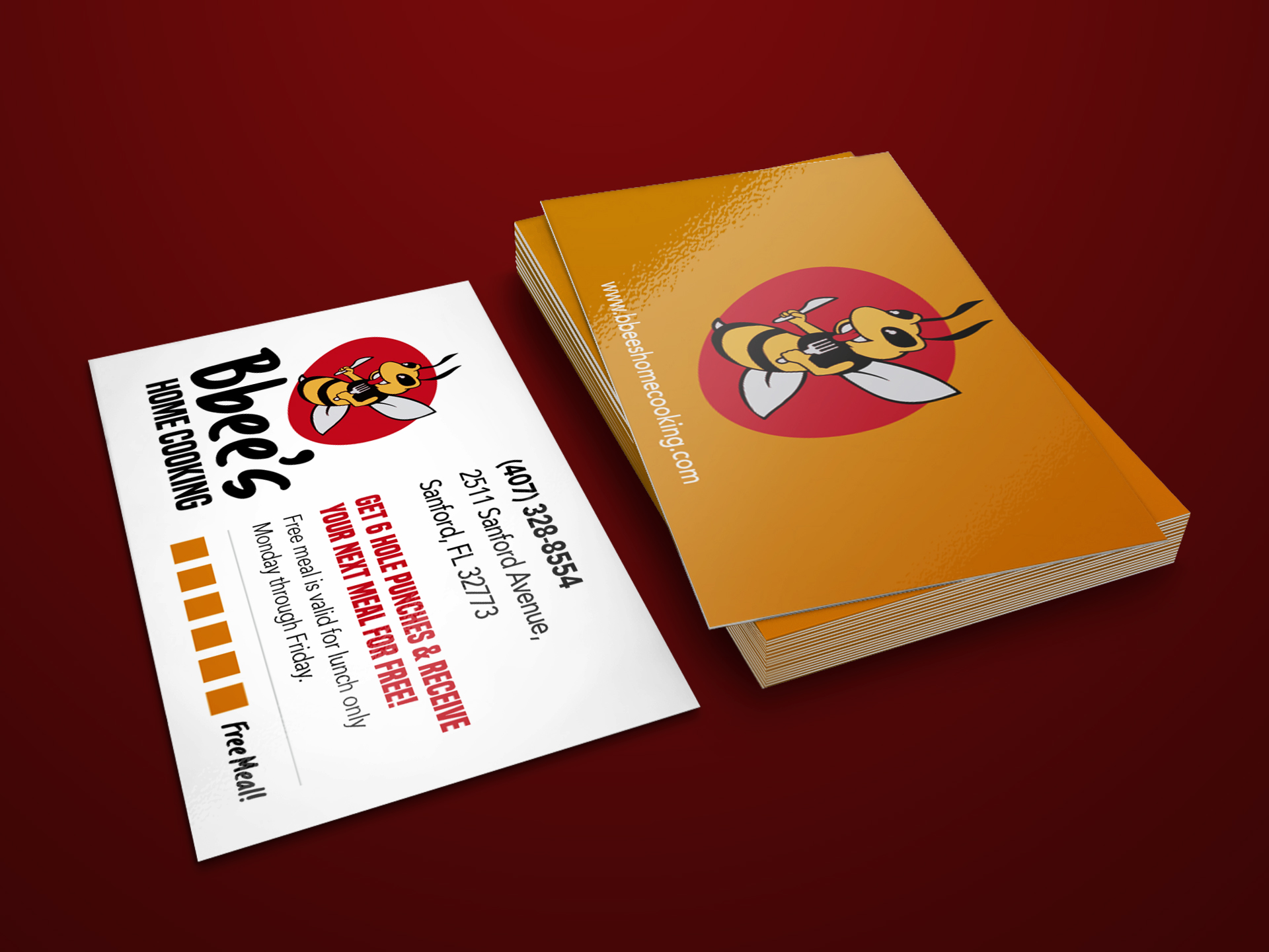
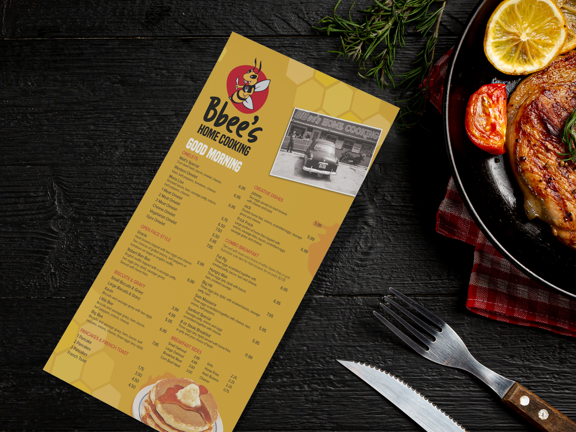
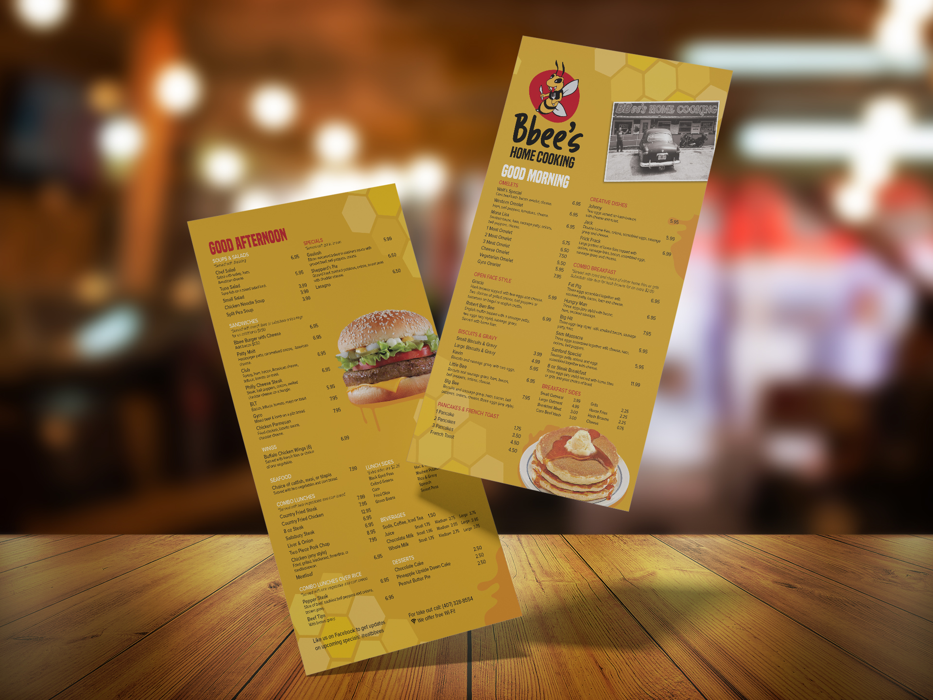
Once a logo was established, a brand pattern was created with the goal of providing visual interest and energy to Bbee’s identity. The honeycomb pattern with dripping honey elements to embody the theme of the bee were used as embellishments across all of the marketing created for Bbee’s.

Printed Collateral & Website
